Genome-wide fine-scale recombination rate variation in Drosophila melanogaster
- PMID: 23284288
- PMCID: PMC3527307
- DOI: 10.1371/journal.pgen.1003090
Genome-wide fine-scale recombination rate variation in Drosophila melanogaster
Abstract
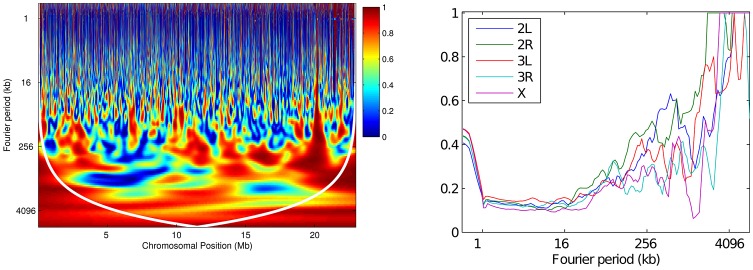
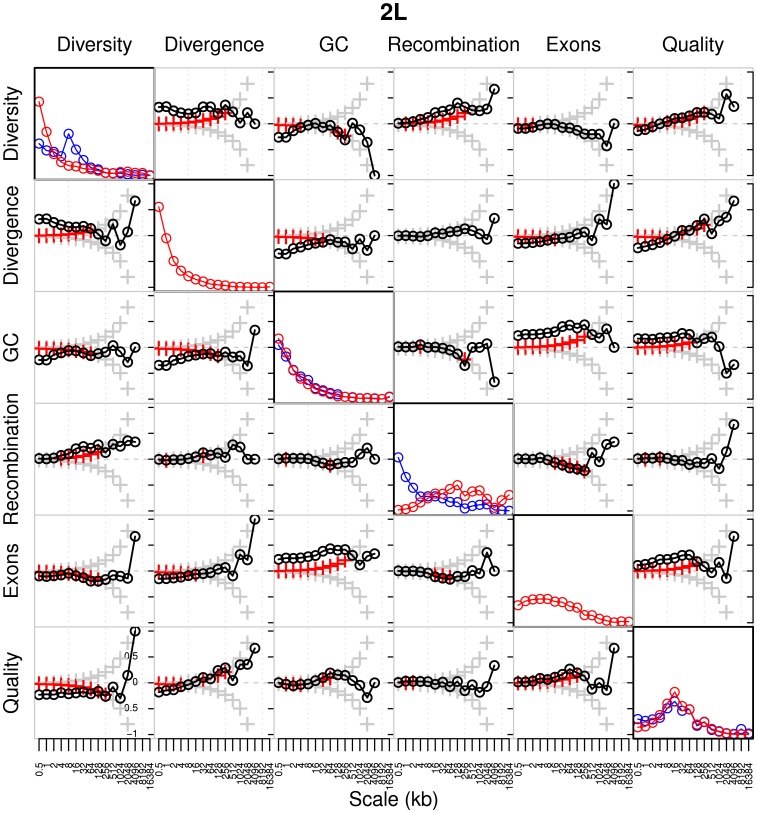
Estimating fine-scale recombination maps of Drosophila from population genomic data is a challenging problem, in particular because of the high background recombination rate. In this paper, a new computational method is developed to address this challenge. Through an extensive simulation study, it is demonstrated that the method allows more accurate inference, and exhibits greater robustness to the effects of natural selection and noise, compared to a well-used previous method developed for studying fine-scale recombination rate variation in the human genome. As an application, a genome-wide analysis of genetic variation data is performed for two Drosophila melanogaster populations, one from North America (Raleigh, USA) and the other from Africa (Gikongoro, Rwanda). It is shown that fine-scale recombination rate variation is widespread throughout the D. melanogaster genome, across all chromosomes and in both populations. At the fine-scale, a conservative, systematic search for evidence of recombination hotspots suggests the existence of a handful of putative hotspots each with at least a tenfold increase in intensity over the background rate. A wavelet analysis is carried out to compare the estimated recombination maps in the two populations and to quantify the extent to which recombination rates are conserved. In general, similarity is observed at very broad scales, but substantial differences are seen at fine scales. The average recombination rate of the X chromosome appears to be higher than that of the autosomes in both populations, and this pattern is much more pronounced in the African population than the North American population. The correlation between various genomic features-including recombination rates, diversity, divergence, GC content, gene content, and sequence quality-is examined using the wavelet analysis, and it is shown that the most notable difference between D. melanogaster and humans is in the correlation between recombination and diversity.
Conflict of interest statement
The authors have declared that no competing interests exist.
Figures
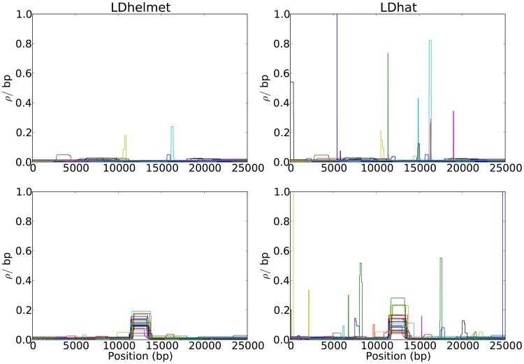
 per bp. (Second Row) Each dataset was simulated with a hotspot of width
  kb starting at location
  kb. The background recombination rate was
  per bp, while the hotspot intensity was
  the background rate, i.e.,
  per bp. The maps are shown in their entirety, including potential edge effects.
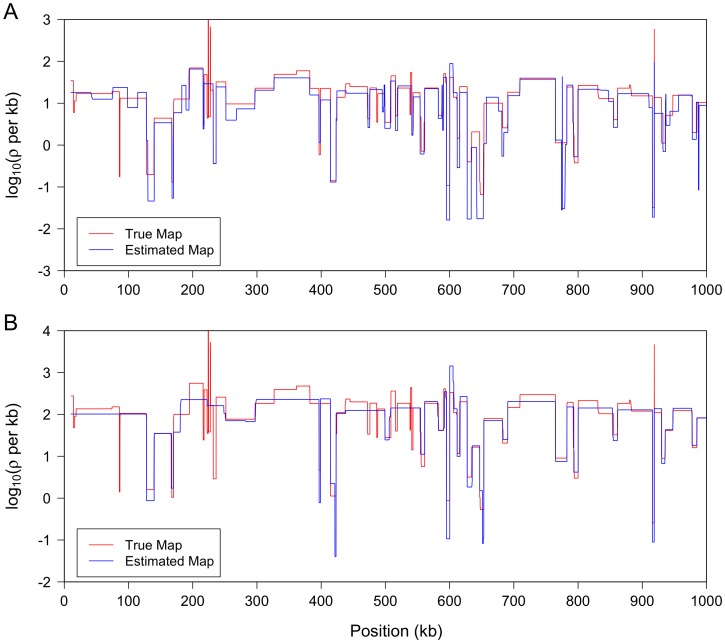
 ; output was postprocessed to incorporate an empirical quadra-allelic mutation model.) Estimated recombination maps are shown in blue. The same block penalty of 50 was used in both cases. (A) The average recombination rate for the region is
  per kb, representative of the interior of the North American X. (B) The average recombination rate for the region is
  per kb, representative of the interior of the African X.
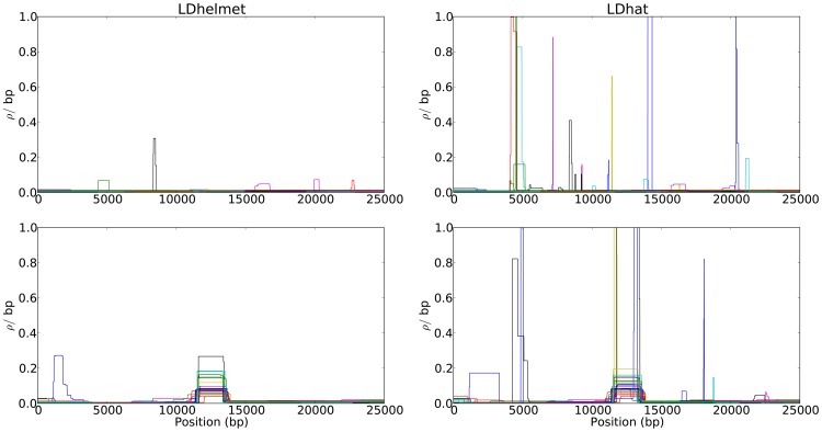
 kb and the population-scaled selection coefficient was set to
  . The fixation time of the selected site was
  coalescent unit in the past. Although the estimated recombination maps are in general noisier than that for the neutral case (c.f., Figure 1), LDhelmet is more robust than LDhat. As illustrated in the plots, LDhat produces false inference of elevated recombination rates near the selected site more frequently than does LDhelmet. The same scenarios of recombination patterns as in Figure 1 were considered: (First Row) with a constant recombination rate of
  per bp, and (Second Row) with a hotspot of width
  kb starting at location 11.5 kb. The background recombination rate was
  per bp, while the hotspot intensity was
  the background rate, i.e.,
  per bp. The maps are shown in their entirety, including potential edge effects.
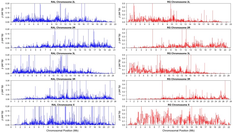
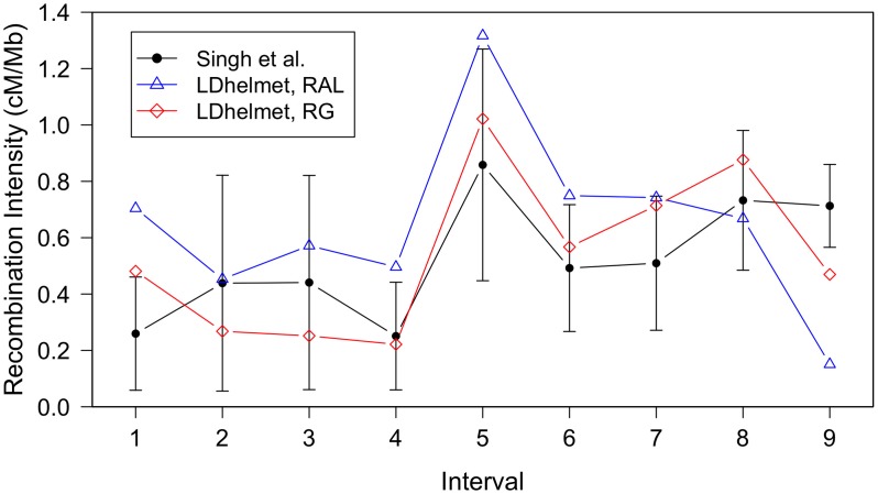
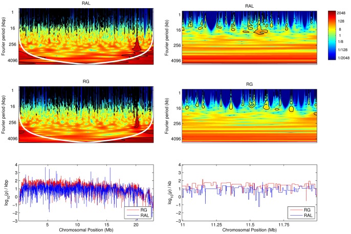
 confidence intervals. The LDhelmet estimate for the RAL sample is shown in blue, while the estimate for the RG sample is shown in red. The LDhelmet estimates were converted into units of cM/Mb by normalizing them to have the same total genetic distance as the empirical map for the region. The three maps demonstrate high correlation, especially near the center of the region, where they share the highest peak in the same interval.
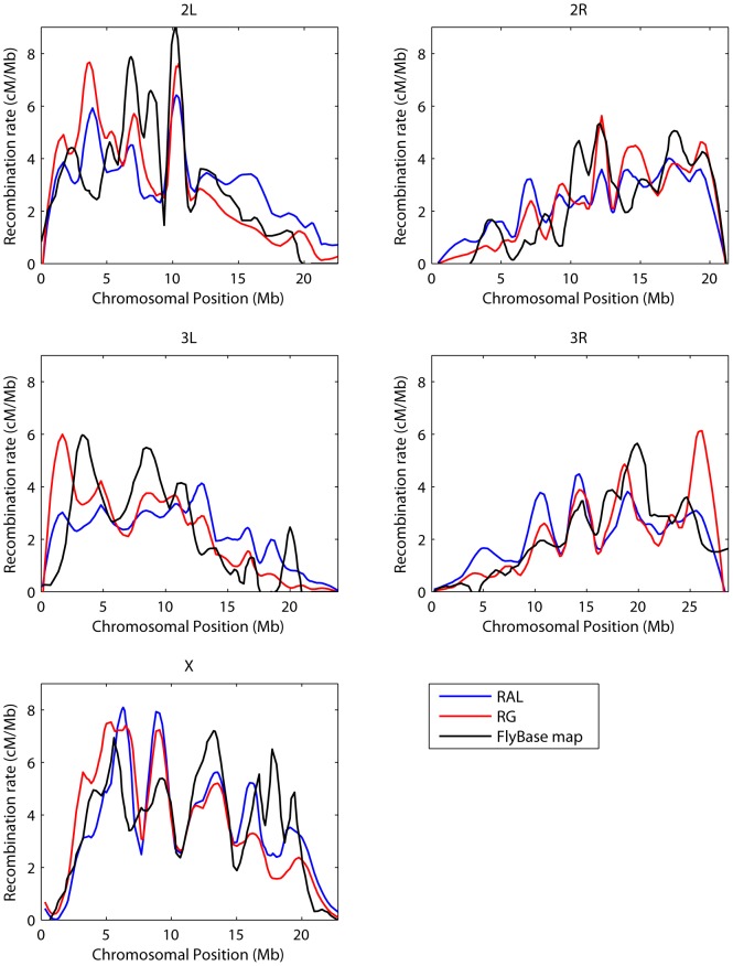
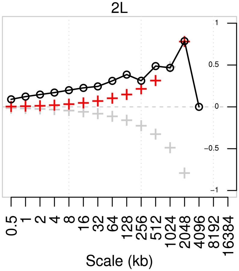

 -value of the regression coefficient at the given scale, as determined by a t-test. Colored boxes indicate significant relationships, with red positive and blue negative. Also shown in the adjusted
  . (B) As above, but with the recombination map of the other population as an additional covariate.
References
-
- Sattath S, Elyashiv E, Kolodny O, Rinott Y, Sella G (2011) Pervasive adaptive protein evolution apparent in diversity patterns around amino acid substitutions in Drosophila simulans. PLoS Genet 7: e1001302 doi:10.1371/journal.pgen.1001302. - DOI - PMC - PubMed
-
- Price AL, Tandon A, Patterson N, Barnes KC, Rafaels N, et al. (2009) Sensitive detection of chromosomal segments of distinct ancestry in admixed populations. PLoS Genet 5: e1000519 doi:10.1371/journal.pgen.1000519. - DOI - PMC - PubMed
-
- Ortiz-Barrientos D, Chang AS, Noor MAF (2006) A recombinational portrait of the Drosophila pseudoobscura genome. Genetics Research Cambridge 87: 23–31. - PubMed
Publication types
MeSH terms
Grants and funding
LinkOut - more resources
Full Text Sources
Molecular Biology Databases
Research Materials
Miscellaneous