. 2013 Mar 20:14:101.
doi: 10.1186/1471-2105-14-101.

Adaptive filtering of microarray gene expression data based on Gaussian mixture decomposition

Affiliations

Adaptive filtering of microarray gene expression data based on Gaussian mixture decomposition

Michal Marczyk et al. BMC Bioinformatics. .

Abstract

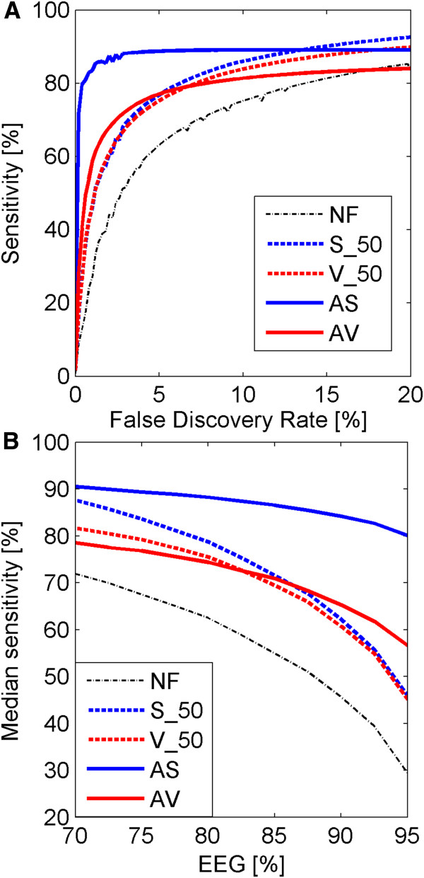
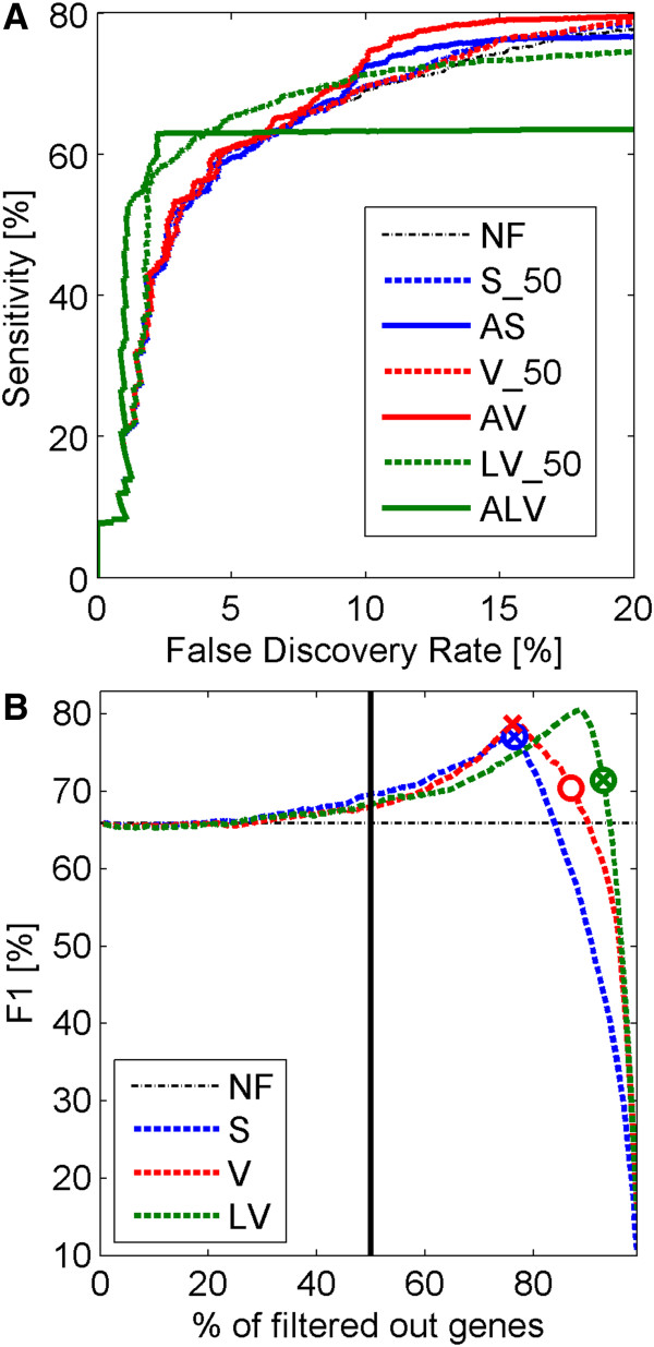
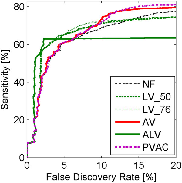
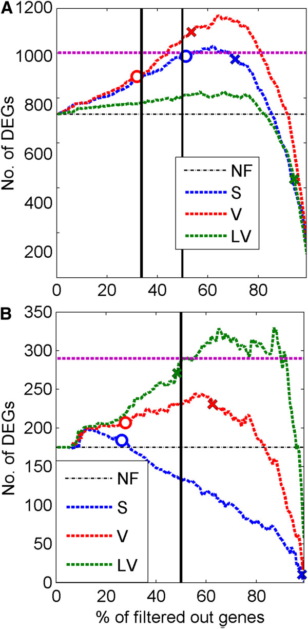
Background: DNA microarrays are used for discovery of genes expressed differentially between various biological conditions. In microarray experiments the number of analyzed samples is often much lower than the number of genes (probe sets) which leads to many false discoveries. Multiple testing correction methods control the number of false discoveries but decrease the sensitivity of discovering differentially expressed genes. Concerning this problem, filtering methods for improving the power of detection of differentially expressed genes were proposed in earlier papers. These techniques are two-step procedures, where in the first step some pool of non-informative genes is removed and in the second step only the pool of the retained genes is used for searching for differentially expressed genes.

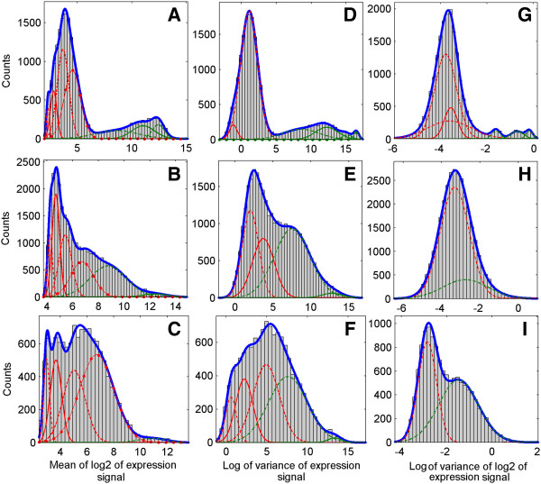
Results: A very important parameter to choose is the proportion between the sizes of the pools of removed and retained genes. A new method, which we propose, allow to determine close to optimal threshold values for sample means and sample variances for gene filtering. The method is adaptive and based on the decomposition of the histogram of gene expression means or variances into mixture of Gaussian components.

Conclusions: By performing analyses of several publicly available datasets and simulated datasets we demonstrate that our adaptive method increases sensitivity of finding differentially expressed genes compared to previous methods of filtering microarray data based on using fixed threshold values.


Figures

Figure 1
Figure 1
Histograms of gene expression means and variances for analyzed datasets and their Gaussian mixture models. Rows correspond to datasets, first row (A, D, G) – spike in dataset, second row (B, E, H) – rat diabetes dataset, third row (C, F, I) – leukemia dataset. Columns correspond to signals, first column – sample mean signal (S – method), second column – sample variance in the original scale signal (V – method), third column – sample variance in the log2 scale (LV –method). Probability density functions corresponding to separate Gaussian components are drawn with the use of different line styles, red color corresponds to components assigned to removal and green color – to components assigned to retain. Removal or retaining is decided by using the k-means method (explanations in the text). Plots of probability density function of mixture models given by sums of probability density functions of components are drawn in blue.
Figure 2
Figure 2
Comparison of different filtering methods for simulated data. Upper panel (A): ROC curves (computed by averaging over the 50 simulations) corresponding to different filtering methods in the simulated dataset. The proportion between informative and non-informative genes was set to 85% EEGs versus 15% DEGs. Lower panel (B): Change of median sensitivity at 5% FDR calculated across 50 iterations, resulting from the change of proportions between EEGs and DEGs from 70% to 95% in the simulated dataset. Different colors correspond to different filtering types of filters: red color is assigned to the filtration in sample variance domain, blue – sample mean, and black – no filtration. Different line styles correspond to different methods: solid line shows the results for adaptive filtering, dashed line – fixed threshold filtering.
Figure 3
Figure 3
Comparisons of different filtering methods for spike-in data. Upper panel (A): ROC curves for different filtering methods. Adaptive filtering results are based on k-means method. The line representing S_50 filtering method, in the upper panel (A) is hard to notice due to the fact that it is obstructed by other lines. Lower panel (B): Change of F1 measure versus percentage of genes filtered out by different filtering methods. 50% threshold is additionally marked with vertical black line. Circles and x-signs on the plot correspond to points given by percentages following from our adaptive filtering methods (top3 and k-means respectively) and corresponding values of the F1 measure. Different colors correspond to different filtering types of filters: red color is assigned to the filtration in sample variance domain, blue – sample mean, green – sample variance in log scale, and black – no filtration. Different line styles correspond to different methods: solid line shows the results for adaptive filtering, dashed line – fixed threshold filtering. Percentages of the removed genes after AS, AV and ALV filtering are 76.4, 86.9 and 92.8, respectively, for the top3 method, and 76.4, 76.1 and 92.8, respectively, for the k-means method.
Figure 4
Figure 4
Comparison of methods for discovery of DEGs based on ALV and AV filtering to PVAC filtering algorithm. ROC curves for different filtering methods for spike-in dataset. Different colors correspond to different filtering types of filters: red color is assigned to the filtration in sample variance domain, blue – sample mean, green – sample variance in log scale, purple – PVAC method, and black – no filtration. Different line styles correspond to different methods: solid line shows the results for adaptive filtering, dashed and dashdot line – fixed threshold filtering. Percentage of the removed genes after PVAC filtering is 76.2.
Figure 5
Figure 5
Comparison of different filtering methods on diabetes and leukemia data. Numbers of genes called DEGs (found by using t-test and q value correction for FDR) versus percentages of genes filtered out. Upper plot (A): diabetes dataset, lower plot (B): leukemia dataset. Different colors correspond to different filtering types of filters: red color is assigned to the filtration in sample variance domain, blue – sample mean, green – sample variance in log scale, and black – no filtration. Circles and x-signs on the plot correspond to points given by percentages following from our adaptive filtering methods (top3 and k-means respectively) and corresponding values of the DEGs. Top3 method for the ALV filter for the data sets in both plots A and B is equivalent to NF because we have only 2 Gaussian components in the mixture distribution. For the top3 method percentages of removed genes after AS and AV filtering are 51.3 and 31.9, respectively, in the rat diabetes dataset and 26.2 and 27.7, respectively, in the leukemia dataset. For the k-means method percentages of removed genes after AS, AV and ALV filtering are 70.1, 53.4 and 93.2, respectively, for the rat diabetes dataset and 98.2, 62.5 and 48.35, respectively, for the leukemia dataset. In the upper plot (A) the 34% threshold used in (6), 50% threshold and in the lower plot (B) 50% threshold used in (7) are marked with black vertical lines. Gene level related to the use of PVAC method is marked by purple horizontal dashed line. Estimated proportions of EEGs in the two datasets are as follows. Rat diabetes dataset: 0.968 (AS, top3 method), 0.971 (AV, top3 method), 0.968 (AS, k-means method), 0.964 (AV, k-means method), 0.985 (ALV, k-means method), 0.967 (PVAC). Leukemia dataset: 0.985 (AS, top3 method), 0.983 (AV, top3 method), 0.999 (AS, k-means method), 0.982 (AV, k-means method), 0.978 (ALV, k-means method), 0.977 (PVAC).

References

    1. Draminski M, Rada-Iglesias A, Enroth S, Wadelius C, Koronacki J, Komorowski J. Monte Carlo feature selection for supervised classification. Bioinformatics. 2008;24(1):110–117. doi: 10.1093/bioinformatics/btm486. - DOI - PubMed
    1. Benjamini Y, Hochberg Y. Controlling the false discovery rate - a practical and powerful approach to multiple testing. J Roy Stat Soc B Met. 1995;57(1):289–300.
    1. Storey JD, Tibshirani R. Statistical significance for genomewide studies. Proc Natl Acad Sci USA. 2003;100(16):9440–9445. doi: 10.1073/pnas.1530509100. - DOI - PMC - PubMed
    1. McClintick JN, Edenberg HJ. Effects of filtering by present call on analysis of microarray experiments. BMC Bioinformatics. 2006;7:49. doi: 10.1186/1471-2105-7-49. - DOI - PMC - PubMed
    1. Calza S, Raffelsberger W, Ploner A, Sahel J, Leveillard T, Pawitan Y. Filtering genes to improve sensitivity in oligonucleotide microarray data analysis. Nucleic Acids Res. 2007;35(16):e102. doi: 10.1093/nar/gkm537. - DOI - PMC - PubMed

Publication types