. 2013 Jun;31(6):545-52.
doi: 10.1038/nbt.2594. Epub 2013 May 19.

viSNE enables visualization of high dimensional single-cell data and reveals phenotypic heterogeneity of leukemia

Affiliations

viSNE enables visualization of high dimensional single-cell data and reveals phenotypic heterogeneity of leukemia

El-ad David Amir et al. Nat Biotechnol. 2013 Jun.

Abstract

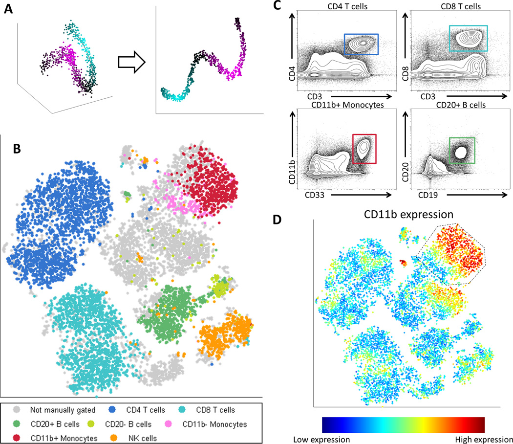
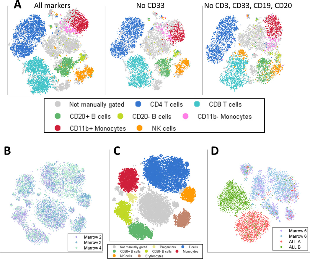
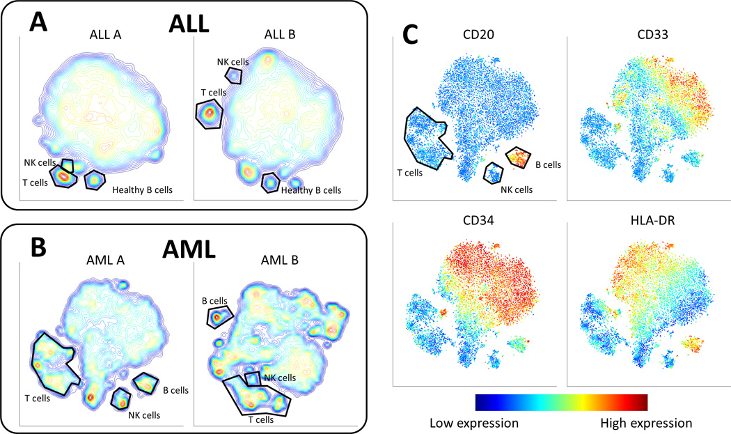
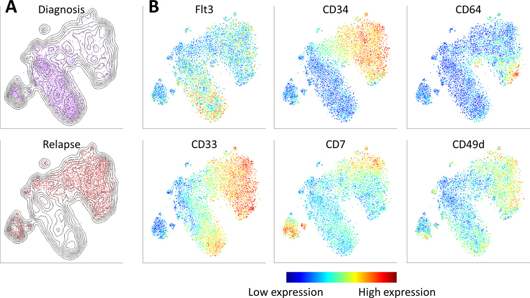
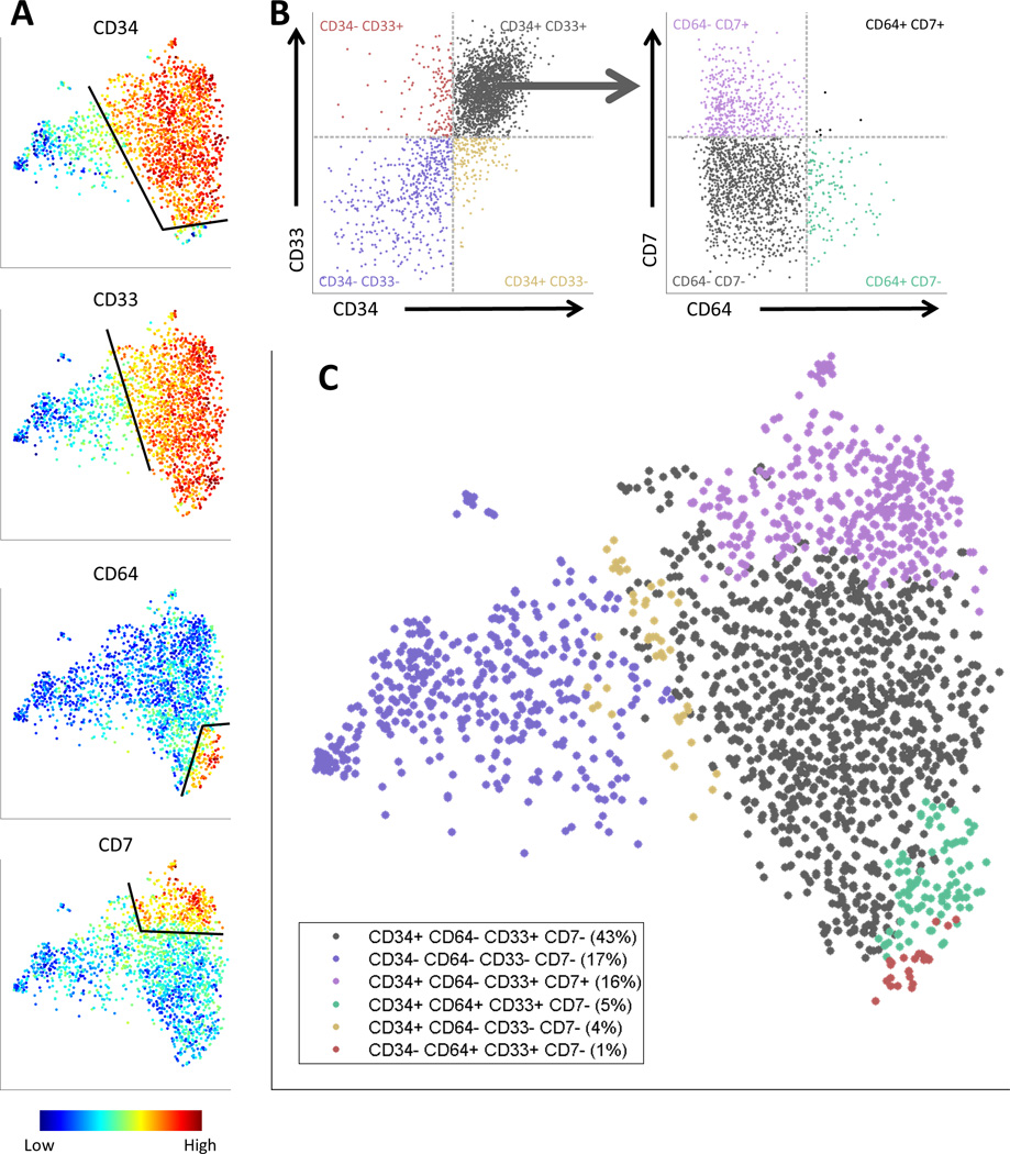
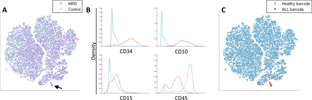
New high-dimensional, single-cell technologies offer unprecedented resolution in the analysis of heterogeneous tissues. However, because these technologies can measure dozens of parameters simultaneously in individual cells, data interpretation can be challenging. Here we present viSNE, a tool that allows one to map high-dimensional cytometry data onto two dimensions, yet conserve the high-dimensional structure of the data. viSNE plots individual cells in a visual similar to a scatter plot, while using all pairwise distances in high dimension to determine each cell's location in the plot. We integrated mass cytometry with viSNE to map healthy and cancerous bone marrow samples. Healthy bone marrow automatically maps into a consistent shape, whereas leukemia samples map into malformed shapes that are distinct from healthy bone marrow and from each other. We also use viSNE and mass cytometry to compare leukemia diagnosis and relapse samples, and to identify a rare leukemia population reminiscent of minimal residual disease. viSNE can be applied to any multi-dimensional single-cell technology.


Figures

Figure 1
Figure 1
viSNE, a Nonlinear Dimensionality Reduction algorithm, creates a map of the immune system. (A) In this toy example, viSNE projects a one-dimensional curve embedded in 3D (left) to 2D (right). The color gradient demonstrates that nearby points in 3D remain close in 2D. (B) Application of viSNE to a healthy human bone marrow sample [21]. viSNE automatically separates cells based on their subtype (see Supplementary Figure 1 for further analysis). Each point in the viSNE map represents an individual cell and its color represents its immune subtype based on independent manual gating. The axes are in arbitrary units. (C) Biaxial plots representing the same data shown in 1B, select subpopulations are shown with canonical markers, square color matches subtype in 1B. The actual gating used is more complex and uses a series of biaxial plots for each population [21]. Note, unlike 1B, these plots do not separate between all subtypes in a single viewpoint. (D) The same viSNE map represented in 1B, this time each cell is colored based on CD11b expression. Gated cells are all CD33 high and show a CD11b (maturity) gradient. Many of these cells were not classified as monocytes by manual gating (grey cells 1B).
Figure 2
Figure 2
viSNE is robust: it does not require canonical markers and the viSNE map has a conserved structure across healthy samples and a distinct structure in each cancer sample. (A) Left: Same as 1B, viSNE map based on all 13 markers. Middle: viSNE map of the same cells, projected after removing CD33, results in a very similar map and still identifies monocytes. Right: viSNE map of same cells, removing CD33, CD3, CD19 and CD20. Despite removing four canonical markers, viSNE separates most major subtypes using the remaining nine channels. See Supplementary Figure 3 for additional marker subsets. (B) Samples from three healthy donors were mapped using viSNE. Each point represents a single cell, color coded by sample. The different samples overlap over all regions of the map. See Supplementary Figure 5 for a separate plot for each sample. (C) The same map as in 2B, color coded by subtypes, as identified by marker expression levels (Supplementary Figure 6). (D) Samples from two healthy donors and two ALL patients were mapped using viSNE. Each cell is colored based on sample. While the healthy samples overlap, the cancer samples are separate from both the healthy samples and each other.
Figure 3
Figure 3
Cancer samples form contiguous but heterogeneous shapes. (A) Contour plots of the viSNE maps of two different ALL samples. The contours represent cell density in each region of the map. Each map has a single large population and a number of small separated subpopulations. These small populations are healthy immune subtypes as identified by their marker expression combination. Such healthy subtypes are highlighted in black. (B) Contour maps of two different AML samples. (C) viSNE map of a diagnosis bone marrow sample from AML patient 1. Cells are colored by marker expression levels. CD20 helps identify the healthy B cell subpopulation. The other markers form gradients on the viSNE map (blue to red) in different regions and directions.
Figure 4
Figure 4
viSNE reveals the progression of cancer, from diagnosis to relapse. (A) Contour plots of the viSNE map combining diagnosis and relapse samples. The contours represent cell density in each region in the map. Points are cells from the diagnosis (top, purple) and relapse (bottom, red) samples. While some of the regions overlap, the two samples largely reside in different regions of the viSNE map. (B) The same map as in (A), cells from both samples are shown colored by marker expression levels, enabling the comparison of expression patterns before and after relapse. Flt3 is prevalent largely in the diagnosis sample. CD34 emerges in the relapse sample, as do CD64 and CD7. There is a CD33 gradient in both samples. The overlapping region has cells that express high levels of CD49d.
Figure 5
Figure 5
A gating scheme for fluorescence-activated cell sorting (FACS) of the AML relapse sample based on the viSNE map. (A) The viSNE map, colored by (from top to bottom) CD34, CD33, CD64 and CD7. For each marker, cells were separated into two subpopulations: “on” (positive) and “off” (negative), based on an expression threshold for the marker (black lines). (B) Left: Biaxial plot of CD34 versus CD33, demonstrating the intersection of each of the CD34+/− subpopulations with each of the CD33+/− subpopulations. Each point is a cell, the X-axis is CD34 expression level and the Y-axis is CD33 expression level. The 4 quadrants correspond to different CD34+/− and CD33+/− combinations; the cells are colored and labeled by the quadrants. Right: Biaxial plot of CD64 versus CD7, demonstrating the intersection of the CD34+ CD33+ subpopulation with each of the four CD64+/− CD7+/− subpopulations. The X-axis is CD64 expression and the Y-axis is CD7 expression. As in the left side, the cells are colored and labeled by the quadrants. (D) The six subpopulation gating scheme projected onto the viSNE map. Cells are colored by their respective subpopulation from B. The relapse sample can now be sorted into these subpopulations via fluorescence-activated cell sorting (FACS) and further studied through downstream experiments such as DNA and RNA sequencing.
Figure 6
Figure 6
Identification of Minimal Residual Disease (MRD). (A) An in vitro synthetic MRD sample was created by spiking a healthy sample with ALL cells (see Methods). The viSNE map of the MRD sample (purple) and a healthy control sample (cyan) includes a suspect region (marked by an arrow) that is almost entirely cells from the MRD sample (purple). (B) Marker expression of cells in the suspect region (red) and the non-suspect region (cyan). Marker distributions are plotted, x-axis represents marker expression level and y-axis represents density of cells. The suspect region is CD34+ CD10+ CD15+ CD45−, a possible fingerprint for ALL. (C) The viSNE map from 6A, color coded by healthy barcode (cyan) and ALL barcode (red). The suspect region is indeed almost entirely composed of ALL cells. The viSNE algorithm was blinded to this barcode, yet managed to separate this small sub-population from the healthy cells. ALL cells outside of the suspect region have marker expression levels conforming to healthy cells. See Supplementary Figure 13 for an additional example.

Comment in

References

    1. Bendall SC, et al. A deep profiler's guide to cytometry. Trends Immunol. 2012;33(7):323–332. - PMC - PubMed
    1. Petilla Interneuron Nomenclature, G et al. Petilla terminology: nomenclature of features of GABAergic interneurons of the cerebral cortex. Nat Rev Neurosci. 2008;9(7):557–568. - PMC - PubMed
    1. Irish JM, et al. Single cell profiling of potentiated phospho-protein networks in cancer cells. Cell. 2004;118(2):217–228. - PubMed
    1. Sachs K, et al. Causal protein-signaling networks derived from multiparameter single-cell data. Science. 2005;308(5721):523–529. - PubMed
    1. Majeti R, Park CY, Weissman IL. Identification of a hierarchy of multipotent hematopoietic progenitors in human cord blood. Cell Stem Cell. 2007;1(6):635–645. - PMC - PubMed

Publication types

Substances