. 2013 Oct 15:80:202-19.
doi: 10.1016/j.neuroimage.2013.05.077. Epub 2013 May 24.

Human Connectome Project informatics: quality control, database services, and data visualization

Affiliations

Human Connectome Project informatics: quality control, database services, and data visualization

Daniel S Marcus et al. Neuroimage. .

Abstract

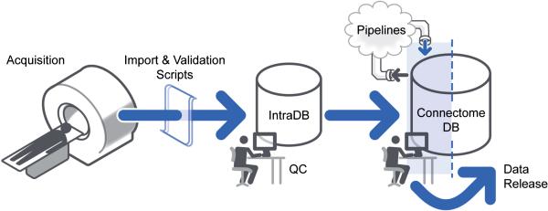
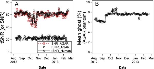
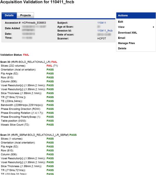
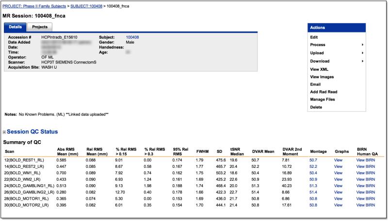
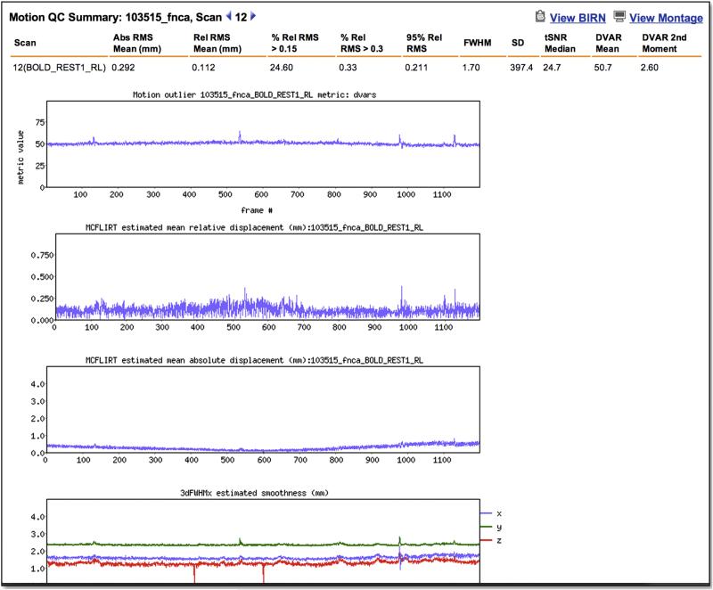
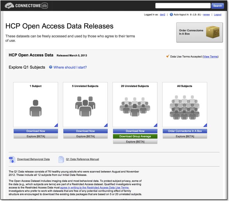
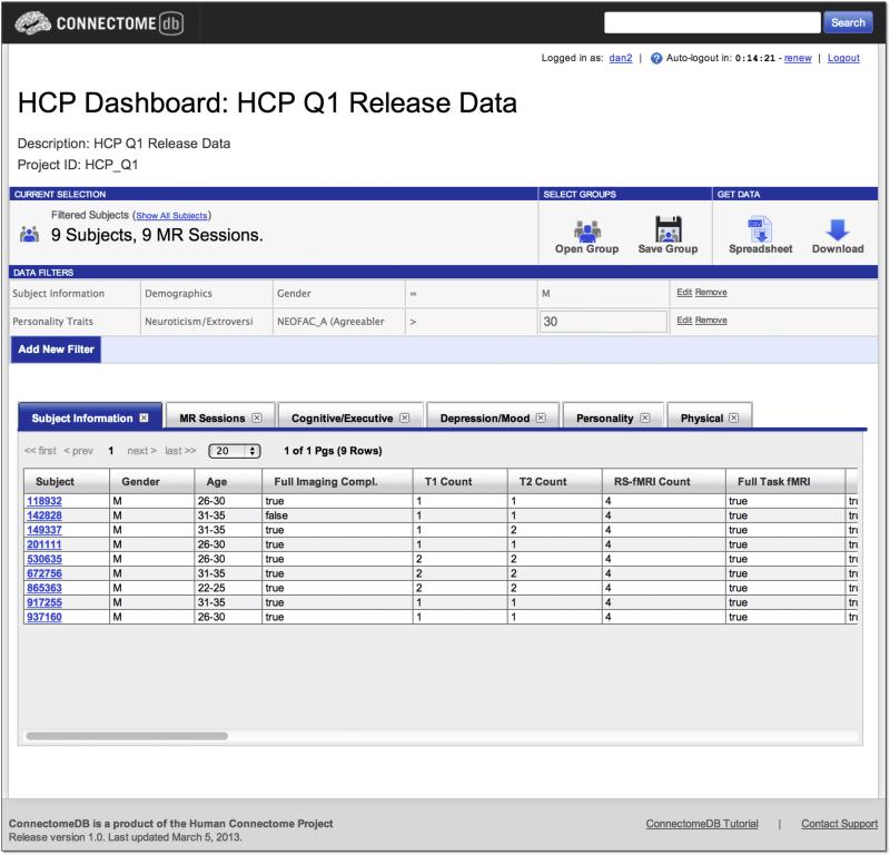
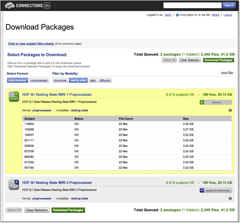
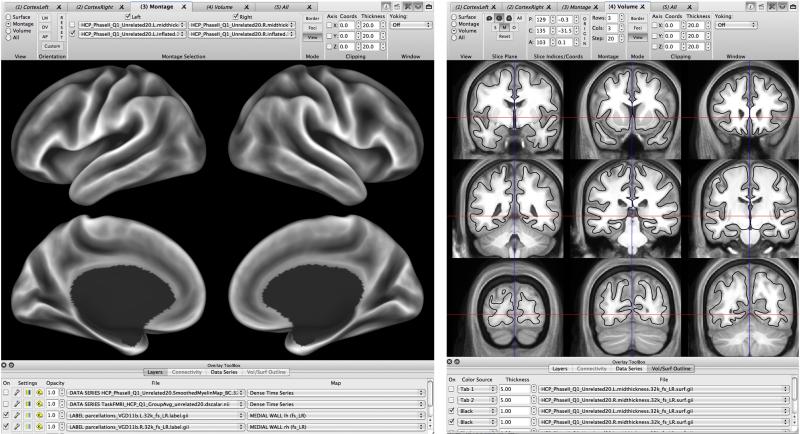
The Human Connectome Project (HCP) has developed protocols, standard operating and quality control procedures, and a suite of informatics tools to enable high throughput data collection, data sharing, automated data processing and analysis, and data mining and visualization. Quality control procedures include methods to maintain data collection consistency over time, to measure head motion, and to establish quantitative modality-specific overall quality assessments. Database services developed as customizations of the XNAT imaging informatics platform support both internal daily operations and open access data sharing. The Connectome Workbench visualization environment enables user interaction with HCP data and is increasingly integrated with the HCP's database services. Here we describe the current state of these procedures and tools and their application in the ongoing HCP study.


Figures

Figure 1
Figure 1. The HCP data flow
HCP data are acquired on a dedicated scanner and immediately sent to IntraDB, where a series of manual and automated quality and anonymization processes are executed. Data that pass quality control are re-organized and exported to ConnectomeDB for public sharing.
Figure 2
Figure 2. Selected measures from the BIRN Agar phantom QA over a 7-month period
Panel (A) shows temporal SNR [tSNR; also called the summary signal-to-fluctuation-noise value in Friedman and Glover (2006)] and static image SNR in the Agar phantom. tSNR from one resting-state scan of each human participant over this time window is also shown. Panel (B) shows the percent ghost intensity, calculated by shifting an original phantom mask by N/2 voxels in the appropriate axis to create a “ghost mask” and then computing the mean intensity in that mask relative to the non-ghost voxels.
Figure 3
Figure 3. Protocol validation reports
Reports are generated immediately after acquisition to detail whether each series with the session was acquired according to the HCP protocol. Here, the series 30 scan failed owing to an insufficient number of frames, likely due to scan being aborted prior to completion.
Figure 4
Figure 4. Quality control reports
IntraDB includes detailed reports for reviewing data and quality control information. A session-level report (top) provides modality-specific summary statistics for each scan. For fMRI, this includes the output of the FUNCTIONAL_QC pipeline (temporal SNR, DVARS, FWHW, etc). Detailed plots of these measures across time (bottom) can be viewed by clicking on a link within the report. The full report generated by the BIRN QA pipeline can also be accessed.
Figure 5
Figure 5. Basic navigation in ConnectomeDB
The landing page guides users to different pre-selected data sets and to the full Q1 open access data release. The pre-selected groups were specifically identified to provide user friendly access to various subject group sizes, all containing high quality data from unrelated subjects.
Figure 6
Figure 6. Data Dashboard
The Data Dashboard allows users to filter the data set by any of the metadata and data fields in the database. Here, the user has selected all male subjects with an agreeableness score on the Neuroticism-Extraversion-Openness Inventory greater than 30. The results set of 9 subjects is displayed in the data tables, with tabs for the each of the data categories. The user can then choose an action (download a spreadsheet, download images) for the subject group they have generated.
Figure 7
Figure 7. Download Packages
The Download Packages interface allows users to filter the set of packages to download by format and modality and to review the data that will be downloaded. The interface automatically uses the subject group previously selected by the user, in this case the 9 subjects generated in the search illustrated in Figure 6. After queuing the packages of interest, clicking the “Download Packages” launches the Aspera Connect client to execute the actual download.
Figure 8
Figure 8. Example of surface and volume visualization in Connectome Workbench
Left: A montage view of a population-average inflated surface showing the FreeSurfer-generated average ‘sulc’ map displayed on medial and lateral views of left and right hemispheres. Right. A montage volume-slice view of the population-average T1w volume. The population-average midthickness surface (black contour) does not perfectly overlay the average T1w gray-matter pattern, because there are significant differences in the inter-subject alignment achieved by nonlinear volume-based vs surface-based registration.
Figure 9
Figure 9. Multi-modal comparisons in Connectome Workbench
A. Group-average myelin map, with 5 surface vertices highlighted on the left hemisphere (black) and geographically corresponding vertices displayed on the right hemisphere (white). B. Functional connectivity map for vertex 1, centered on MT+ in the left hemisphere. Many hotspots of functional connectivity are centered on regions of heavy myelination. C. Functional connectivity map for vertex 2, situated just dorsal to MT+. The pattern of functional connectivity is very different and is largely centered in regions of low or moderate myelination. To reduce complexity, the medial views of each hemisphere visible in Workbench montage view are not illustrated here.

References

    1. Aspera [March 11, 2013];Aspera fasp High Speed Transport. 2013 at http://asperasoft.com/fileadmin/media/Asperasoft.com/Resources/White_Pap....
    1. Barch DM, Burgess G, Harms MP, Petersen SE, Schlaggar BL, Corbetta M, Glasser MF, Curtiss SW, Dixit S, Feldt C, Nolan D, Bryant E, Hartley T, Footer O, Bjork JM, Poldrack R, Smith S, Snyder AZ, Van Essen DC. Function in the human connectome: Task-fMRI and individual differences in behavior. Neuroimage. 2013 (Special issue on Mapping the Connectome) - PMC - PubMed
    1. Beckmann CF, DeLuca M, Devlin JT, Smith SM. Investigations into resting-state connectivity using independent component analysis. Philosophical Transactions of the Royal Society B: Biological Sciences. 2005;360(1457):1001. - PMC - PubMed
    1. Biswal B, Yetkin FZ, Haughton VM, Hyde JS. Functional connectivity in the motor cortex of resting human brain using echo-planar MRI. Magn Reson Med. 1995;34:537–541. - PubMed
    1. Bodurka J, Ye F, Petridou N, Murphy K, Bandettini PA. Mapping the MRI voxel volume in which thermal noise matches physiological noise--implications for fMRI. Neuroimage. 2007;34:542–549. - PMC - PubMed

Publication types

MeSH terms