The geography of happiness: connecting twitter sentiment and expression, demographics, and objective characteristics of place
- PMID: 23734200
- PMCID: PMC3667195
- DOI: 10.1371/journal.pone.0064417
The geography of happiness: connecting twitter sentiment and expression, demographics, and objective characteristics of place
Abstract
We conduct a detailed investigation of correlations between real-time expressions of individuals made across the United States and a wide range of emotional, geographic, demographic, and health characteristics. We do so by combining (1) a massive, geo-tagged data set comprising over 80 million words generated in 2011 on the social network service Twitter and (2) annually-surveyed characteristics of all 50 states and close to 400 urban populations. Among many results, we generate taxonomies of states and cities based on their similarities in word use; estimate the happiness levels of states and cities; correlate highly-resolved demographic characteristics with happiness levels; and connect word choice and message length with urban characteristics such as education levels and obesity rates. Our results show how social media may potentially be used to estimate real-time levels and changes in population-scale measures such as obesity rates.
Conflict of interest statement
Figures


 are shown in red. Spearman’s r and p-value are reported in the inset.

 of nearby tweets: red is happier, blue is sadder. For a point to be colored, we require that there be at least 200 LabMT words within a 500 meter radius of the location; points which do not satisfy this criterion are colored black. Maps for all other cities can be found in Appendix C in Appendix S1 (online) .


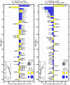
 varies for all US cities considered versus the cities Napa, California (left) and Beaumont, Texas (right), having the highest and lowest
  respectively. Words are ranked in order of decreasing percentage contribution to the overall average happiness difference
  . The symbols
  indicate whether a word is relatively happy or sad compared to
  for the entire US (text
  ), while the arrows
  indicate whether the word was used more or less in the text
  for each city than in
  . The left inset panel shows how the ranked LabMT words combine in sum. The four circles at bottom right show the total contribution of the four kinds of words (
 ,
,  ,
,  ,
,  ). Relative text size is indicated by the areas of the gray squares.


 and obesity level, as taken from the 2011 Gallup and Healthways survey. The red line is the straight line of best fit to the data, while the r value is the Spearman correlation coefficient for the data.
References
-
- Jacobs J (1961) The Death and Life of Great American Cities. New York: Vintage Books, 458 p.
-
- Sachs JD, Layard R, Helliwell JF (2012) World Happiness Report. Technical report, Columbia University/Canadian Institute for Advanced Research/London School of Economics.
-
- Gallup-Healthways (2012) State of well-being 2011: City, state and congressional district wellbeing reports. Technical report, Gallup Inc. Available: http://www.well-beingindex.com/files/2011CompositeReport.pdf.
-
- Gallup-HealthwaysWell-Being Index. Available: http://www.well-beingindex.com/. Accessed February 2013.
Publication types
MeSH terms
LinkOut - more resources
Full Text Sources
Other Literature Sources

