. 2013:531:371-444.
doi: 10.1016/B978-0-12-407863-5.00019-8.

Advancing our understanding of the human microbiome using QIIME

Affiliations

Advancing our understanding of the human microbiome using QIIME

José A Navas-Molina et al. Methods Enzymol. 2013.

Abstract

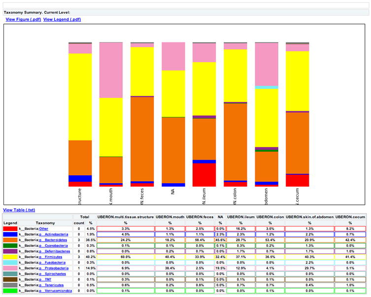
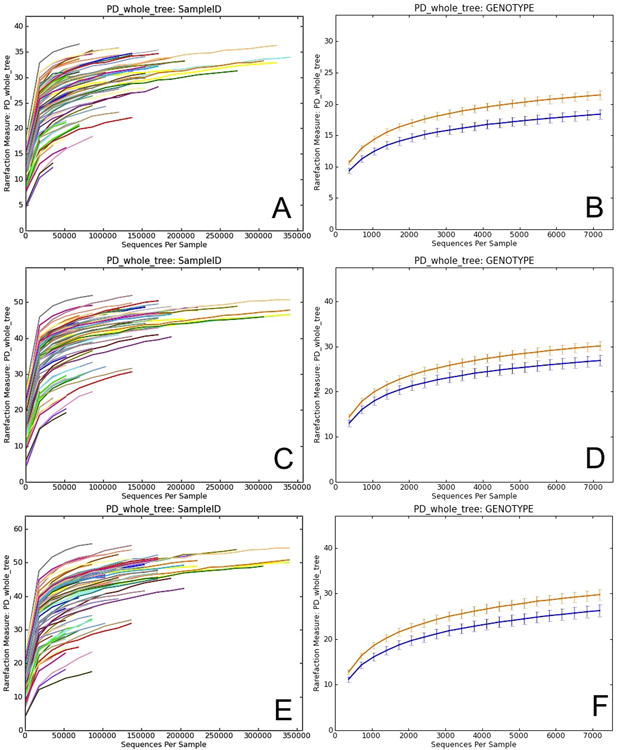
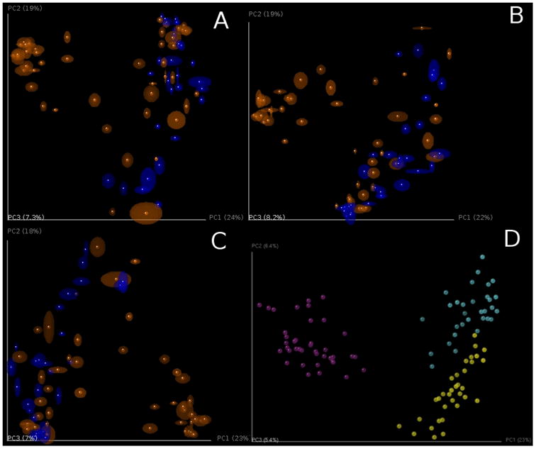
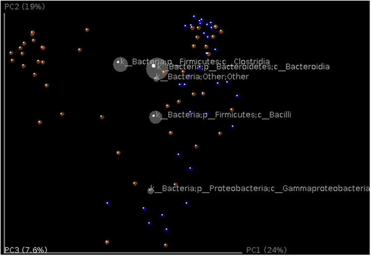
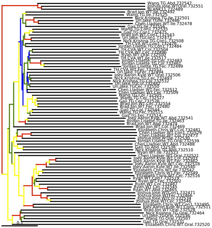
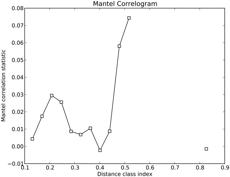
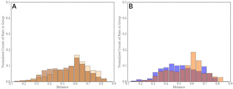
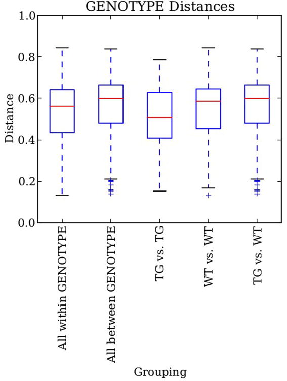
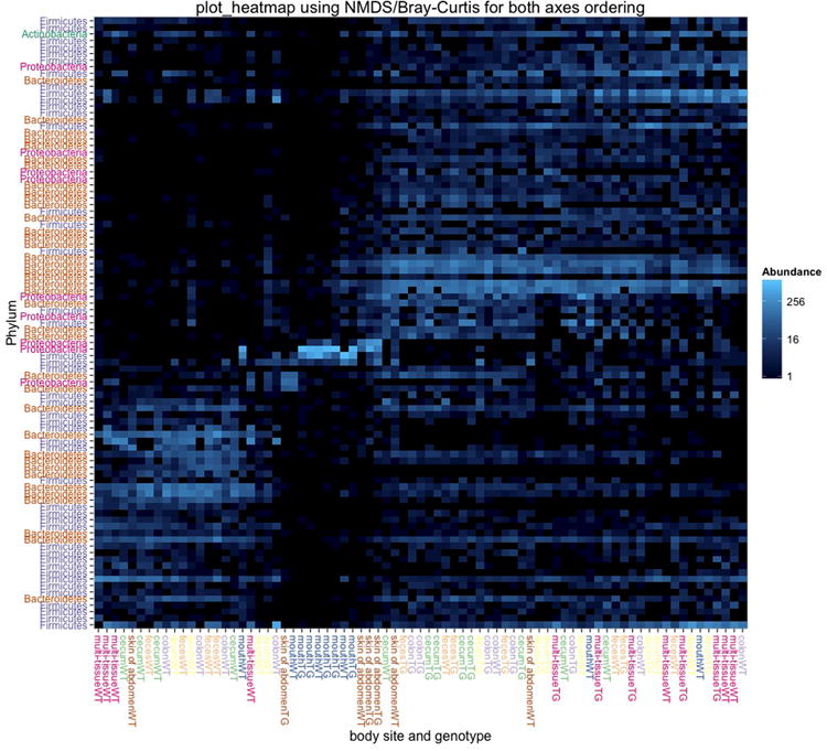
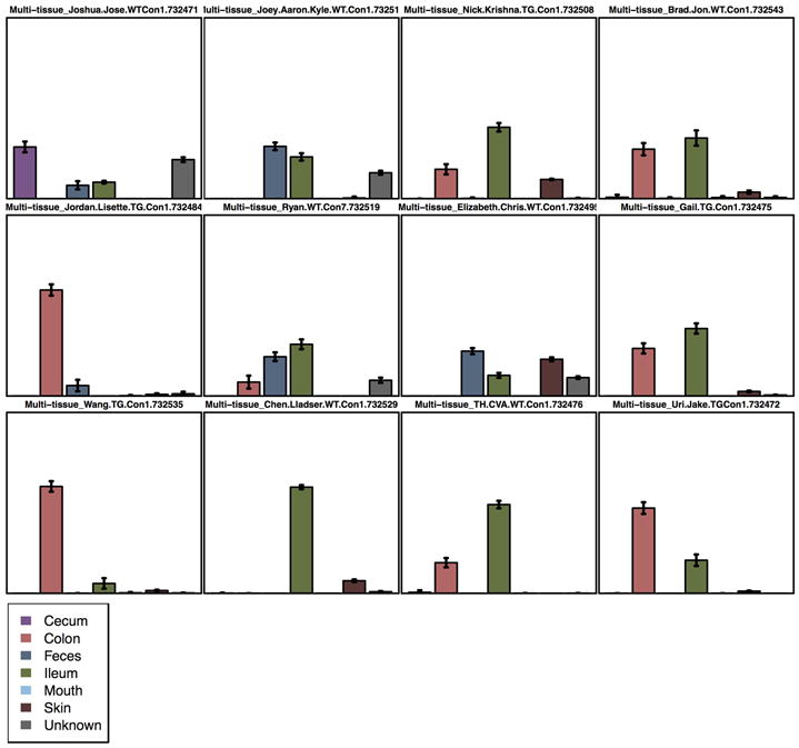
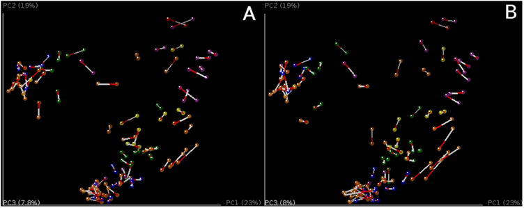
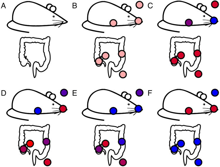
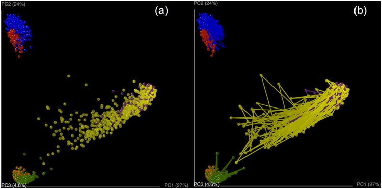
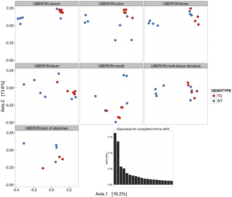
High-throughput DNA sequencing technologies, coupled with advanced bioinformatics tools, have enabled rapid advances in microbial ecology and our understanding of the human microbiome. QIIME (Quantitative Insights Into Microbial Ecology) is an open-source bioinformatics software package designed for microbial community analysis based on DNA sequence data, which provides a single analysis framework for analysis of raw sequence data through publication-quality statistical analyses and interactive visualizations. In this chapter, we demonstrate the use of the QIIME pipeline to analyze microbial communities obtained from several sites on the bodies of transgenic and wild-type mice, as assessed using 16S rRNA gene sequences generated on the Illumina MiSeq platform. We present our recommended pipeline for performing microbial community analysis and provide guidelines for making critical choices in the process. We present examples of some of the types of analyses that are enabled by QIIME and discuss how other tools, such as phyloseq and R, can be applied to expand upon these analyses.

Keywords: Highthroughput sequencing; Microbial community analyses; Microbial ecology; Microbiome; QIIME.


Figures

Figure 1
Figure 1
QIIME workflow overview. The Upstream process (brown boxes) includes all the steps that generate the OTU table and the phylogenetic tree. This step starts by preprocessing the sequence reads and ends by building the OTU table and the phylogenetic tree. The Downstream process (blue boxes) includes steps involved in analysis and interpretation of the results, starting with the OTU table and the phylogenetic tree and ending with alpha and beta diversity analyses, visualizations and statistics.
Figure 2
Figure 2
Cartoon representation of the OTU picking approaches. (a) de novo, (b) closed-reference and (c) open reference OTU picking respectively. In the de novo method, sequences are compared to each other and then clusters are formed. In the closed-reference method, sequences are compared directly to a reference dataset (e.g. GreenGenes). Sequences that match a reference sequence are clustered; the remaining sequences are discarded. In both OTU picking methods, once clusters are formed, a representative sequence is selected and then taxonomy is assigned to that sequence (and applied to the rest of the sequences that make up the OTU). Open-reference combines the closed-reference and open-reference methods. The first step is identical to closed-reference, sequences discarded in the first step are clustered into OTUs by the de novo method, and both OTU tables are merged into a single final OTU table. De novo and open-reference cluster all the sequences, but closed-reference allows better comparisons between studies, especially those using different primers, because all OTUs occur in a common reference space.
Fig 3
Fig 3
Cartoon demonstrating different clustering algorithms. Circles representing sequences linked with lines are within the distance threshold. The two numbered sequences are the first and second sequences in order in the file. The reference algorithms only consider the distance between reference (R) and sequences.
Figure 4
Figure 4
HTML result from core_diversity_analyses.py. This HTML file summarizes and gives access to the results of the diversity analyses conducted on the given OTU table.
Figure 5
Figure 5
Taxa summary of the example dataset. Samples have been grouped and averaged by body site, and taxonomic composition is shown on the phylum level. Each column in the plot represents a body site, and each color in the column represents the percentage of the total sample contributed by each taxon group at phylum level. The taxa summaries plot help us to see which taxon groups are more prevalent in a sample. For example, the fecal samples are dominated by Bacteroidetes, while mouth and skin samples are dominated by Proteobacteria. We can also see that Fusobacteria is only present at appreciable levels in the skin samples.
Figure 6
Figure 6
Alpha diversity curves at different rarefaction depths using different OTU picking methods. Each line represents the results of the alpha diversity phylogenetic diversity whole tree metric (PD Whole Tree in QIIME). A, C and E represent alpha diversity of each sample at a different sequence depth in each of the OTU picking protocols (closed-, open-reference and de novo). In closed-reference, the diversity plateaus (reaches an asymptote) because only OTUs in the reference database already can be considered, greatly reducing the OTU number over what is possible if the sequences are clustered de novo. Comparing these curves is difficult because the sequencing depth differs among samples. B, D and F show differences in alpha diversity between the two mouse genotypes, wild type (WT - orange) and transgenic (TG - blue), using the different OTU picking approaches. Both curves show the same rarefaction levels, allowing easier comparisons between categories. The curves again level off, showing that the sequencing effort is sufficient to detect most of the OTUs (this saturation can be confirmed using Good's coverage, or conditional uncovered probability, or other formal coverage statistics). The error bars show the standard error of the mean diversity at each rarefaction level across the multiple iterations.
Figure 7
Figure 7
PCoA plots of unweighted Unifrac beta diversity. Panels A-C shows jackknifed replicate results for the example data set using de novo OTU picking, closed-reference OTU picking and open-reference OTU picking, illustrating different results from the three OTU picking approaches (Table 3). Each dot represents a sample, either from a WT mouse (orange) or TG mouse (blue). The two groups are not clearly separated, probably because the data set is contaminated (recall that this is a class project and different participants varied in their dissection skills). The size of the ellipsoids show the variation for each sample calculated from jackknife analysis. These plots are generated by the command jackknifed_beta_diversity.py -i $PWD/denovo_otus/otu_table_filtered.biom -t $PWD/denovo_otus/rep_set.tre -m $PWD/IQ_Bio_16sV4_L001_map.txt -o $PWD/diversity_analysis/jk_denovo -e 7205 -a -O 64 (the input parameters should be adapted for using the OTU tables from different OTU picking approaches). Panel D shows the beta diversity PCoA plot of a data set from the “keyboard” data set (Fierer, Lauber, Zhou, McDonald, Costello, & Knight, 2010) which links individuals to their computer keyboard through microbial community similarity. Each dot represents a microbial community sampled from either fingertips or keyboard keys from three individuals, annotated by the three colors shown in the plot. In contrast to panels A-C, Panel D shows the microbial communities well-separated by individual in the PCoA plot.
Figure 8
Figure 8
Biplot of the example data set. This is the unweighted Unifrac beta diversity plot, similar to Figure 7, with labels for the most 5 abundant phylum-level taxa added. The size of the sphere for each taxon is proportional to the mean relative abundance of that taxon across all samples. This plot is created by the command make_3d_plots.py -i $PWD/diversity_analysis/open_ref/bdiv_even7205/unweighted_unifrac_pc.txt -m $PWD/IQ_Bio_16sV4_L001_map.txt -t $PWD/diversity_analysis/open_ref/taxa_plots/table_mc7205_sorted_L3.txt --n_taxa_keep 5 -o $PWD/diversity_analysis/3d_biplot
Figure 9
Figure 9
Bootstrapped UPGMA clustering on the example data set. The tree is shown with the internal nodes colored by bootstrap support (red: 75-100%, yellow: 50-75%, green: 25-50% and blue: < 25%). Although this visualization is popular in the literature, we generally recommend alternatives such as PCoA.
Figure 10
Figure 10
Mantel Correlogram showing the Mantel correlation statistics between unweighted Unifrac distance matrix and each class in the days after experiment started distance matrix. Classes in the second distance matrix are determined by Sturge's rule. White dots show non-significant relationship since black dots show significant ones.
Figure 11
Figure 11
(A) Histogram showing distribution of distances between (light brown) and within (dark brown) mice gut microbiota taking into account both wild type and transgenic mouse groups. (B) Distribution of within distances in gut bacterial community of wild type mice (light orange) and transgenic ones (blue).
Figure 12
Figure 12
Box-plots of the unweighted UniFrac distances for bacterial gut microbiota in both mouse type (WT: wild type; TG: transgenic). “Within” distances represent distances within any of the two groups since “between” distances show distances between both groups. “TG vs. TG” and “WT vs. WT” represent within distances in transgenic and wild type groups respectively. Although averages are different, standard error overlaps in all cases.
Figure 13
Figure 13
OTU-Network bacterial community analysis applied in wild type and transgenic mice. (A) Network colored by genotype (wild type: blue; transgenic: red). Control sample (yellow dot) is external in the network and several OTU are not shared with mice. Although we can see some degree of clustering, discrimination by genotypes is difficult to assess. (B) Network colored by body site (mouth: yellow; skin: in red; ileum: in blue; colon: in pink; cecum: in orange; feces: in brown; and multi-tissue samples: in green). A control sample is colored in grey. There is no clear sample clustering by body site, suggesting that there is not a core set of OTUs that differentiates one site from another.
FIGURE 14
FIGURE 14
Heatmap of OTUs present in the different samples from transgenic and wild type mice. The intensity of black shows the abundance of certain OTU in each sample. Both samples and OTUs are sorted by UPGMA tree and the OTU phylogenetic tree, respectively.
Figure 15
Figure 15
Interactive heatmap of OTUs present in the different samples from transgenic and wild type mice. This visualization is a result of an HTML file that can be opened in any web browser. The advantage of this heatmap is that it is easy to manipulate the abundance level for coloring, or transpose samples and OTUs between columns and rows.
Figure 16
Figure 16
Example heatmap of the high-level patterns in the open-reference dataset. The graphic was produced by the plot_heatmap() function in phyloseq implemented in R after sub-setting the data to the most-prevalent 100 OTUs (Supplemental File 1). The order of sample and OTU elements was determined by the radial position of samples/OTUs in the first two aces of a Non-metric multidimensional scaling (NMDS) of the Bray-Curtis distance. Other choices for distance and ordination method can be also useful. The horizontal axis represents samples, with the genotype and body site labeled, while the vertical axis represents OTUs, labeled by phyla. Both axes are further color-coded to emphasize the different categories of labels. The blue-shade color scale indicates the abundance of each OTU in each sample, from black (zero, not observed) to very light blue (highly abundant, >1000 reads). The call used to create this figure was the following, omitting some details to improve the axis labels for publication: “plot heatmap (openfpp, “NMDS”, “bray”, taxa.label=“Phylum”, sample.label=“bsgt”, title=”plot heatmap using NMDS/Bray-Curtis for both axes ordering”)
Figure 17
Figure 17
SourceTracker output showing a bar plot for each sink (mouse) present in the dataset. Each bar is a potential source (body site) and the height of each bar represents the percentage of taxa the source contributes to the taxa in the sink. The advantage of this visualization over the other two (area and pie chart) is that it shows error bars that allow to see the variance of the prediction.
Figure 18
Figure 18
Procrustes analysis of different picking algorithms, where we can see that different OTU clustering methods yield similar PCoA distributions. PCoA plots are colored by BODY_HABITAT. A) Comparing samples with clusters picked using the de novo picking protocol against the closed-reference. B) Comparing samples with clusters picked using the open-reference picking protocol against the closed-reference.
Figure 19
Figure 19
Image representing the mouse and its gastrointestinal tract. A) Raw image without samples. B) Image in SitePainter with samples. C-D) PCoA axis 1 and 2, in red high values, in blue low values, similar colors represent similar communities. E-F) Taxonomic distributions of (E) Betaproteobacteria and (F) Gammaproteobacteria, in red high abundance, in blue low abundance.
Figure 20
Figure 20
Beta diversity plots for the moving pictures dataset using unweighted UniFrac as the dissimilarity metric (Caporaso et al., 2011). (a) PCoA plot colored by the body site and subject. (b) PCoA plot colored by the body site and subject with connecting lines between samples. Note in (b) that these lines allow us to track the individual body sites with a different approach.
Figure 21
Figure 21
Three dimensional plots in which two of the axes are PC1 and PC2 and the other is the day when that sample was collected in reference to the epoch time. Although this is not explicitly a beta diversity plot, this representation allows differentiation of the individual trajectories over time.
Figure 22
Figure 22
Categorically summarized OTU richness estimates using the plot_richness function. Samples are grouped on the horizontal axis according to body site, and color shading indicates the mouse genotype. The vertical axis indicates the richness estimates in number of distinct OTUs, and a separate boxplot is overlaid on the points for each combination of genotype and body site. The “S.obs”, “S.chao1”, and “S.ACE” panels show the “rarefied” observed richness, Chao-1 richness, and ACE richness estimates, respectively.
Figure 23
Figure 23
Stacked bar plot of the abundance values in the open-reference dataset. The bars are shaded according to phyla, with each rectangle representing the relative abundance of a phylum in a particular sample group. The OTU rectangle in each stack is ordered according to abundance. The horizontal and vertical axes indicate the body site of the samples and the average fractional abundance of the OTU within the sample group, respectively. The separate panels “TG” and “WT” indicate the mouse genotype, achieved automatically by the facet_grid(∼GENOTYPE) layer in the command.
Figure 24
Figure 24
Alteration of the stacked bar plot shown in Figure 23 with an additional facet dimension. In this case, an additional argument has been added to the faceting formula so that the data is separated by a row of panels for each phyla, as well as a column of panels for each mouse genotype. The color shading and other attributes generally remain the same, with the average cross-category changes for each phylum more discernible.
Figure 25
Figure 25
MDS ordination results on the unweighted UniFrac distances of the open reference dataset. The samples are separated into different panels according to body site, and shaded red or blue if they were from transgenic or wild type mice, respectively. The horizontal and vertical axis of each panel represents the first and second axis of the ordination, respectively, with the relative fraction of variability indicated in brackets. (Inset) A scree plot showing the distribution of eigenvalues associated with each ordination axis.

Similar articles

Cited by

References

    1. Altschul SF, Gish W, Miller W, Myers EW, Lipman DJ. Basic local alignment search tool. J Mol Biol. 1990;215(3):403–410. - PubMed
    1. Allaire J, Horner J, Marti V, Porte N. markdown: Markdown rendering for R. from http://CRAN.R-project.org/package=markdown.
    1. Arumugam M, Raes J, Pelletier E, Le Paslier D, Yamada T, Mende DR, et al. Enterotypes of the human gut microbiome. Nature. 2011;473(7346):174–180. - PMC - PubMed
    1. Atlas RM, Bartha R. Microbial ecology : fundamentals and applications. 4. Menlo Park, Calif: Harlow: Benjamin/Cummings; 1998.
    1. Bokulich NA, Subramanian S, Faith JJ, Gevers D, Gordon JI, Knight R, et al. Quality-filtering vastly improves diversity estimates from Illumina amplicon sequencing. Nat Methods. 2013;10(1):57–59. - PMC - PubMed

Publication types