Clinical Trial
. 2013 Nov 11;8(11):e80325.
doi: 10.1371/journal.pone.0080325. eCollection 2013.

Enhanced text spacing improves reading performance in individuals with macular disease

Affiliations
Clinical Trial

Enhanced text spacing improves reading performance in individuals with macular disease

Sally Blackmore-Wright et al. PLoS One. .

Abstract

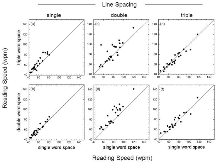
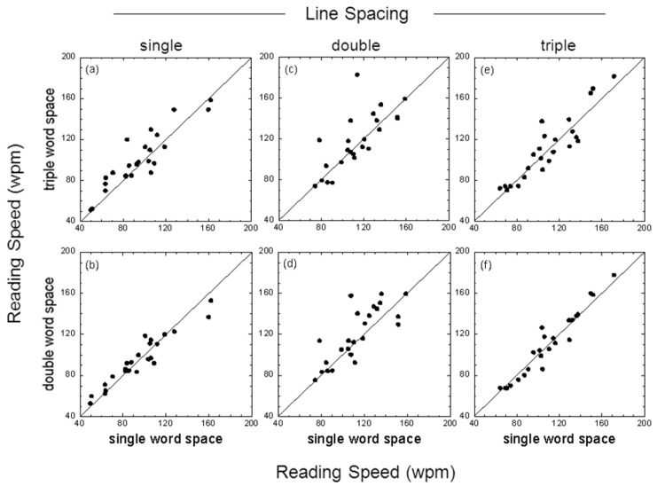
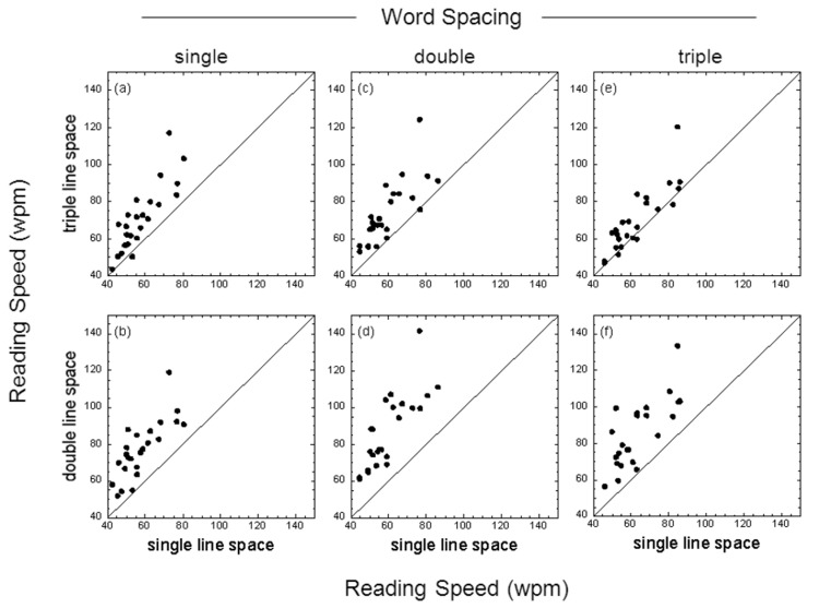
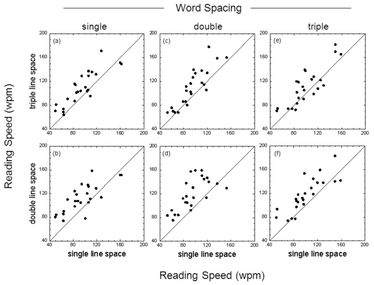
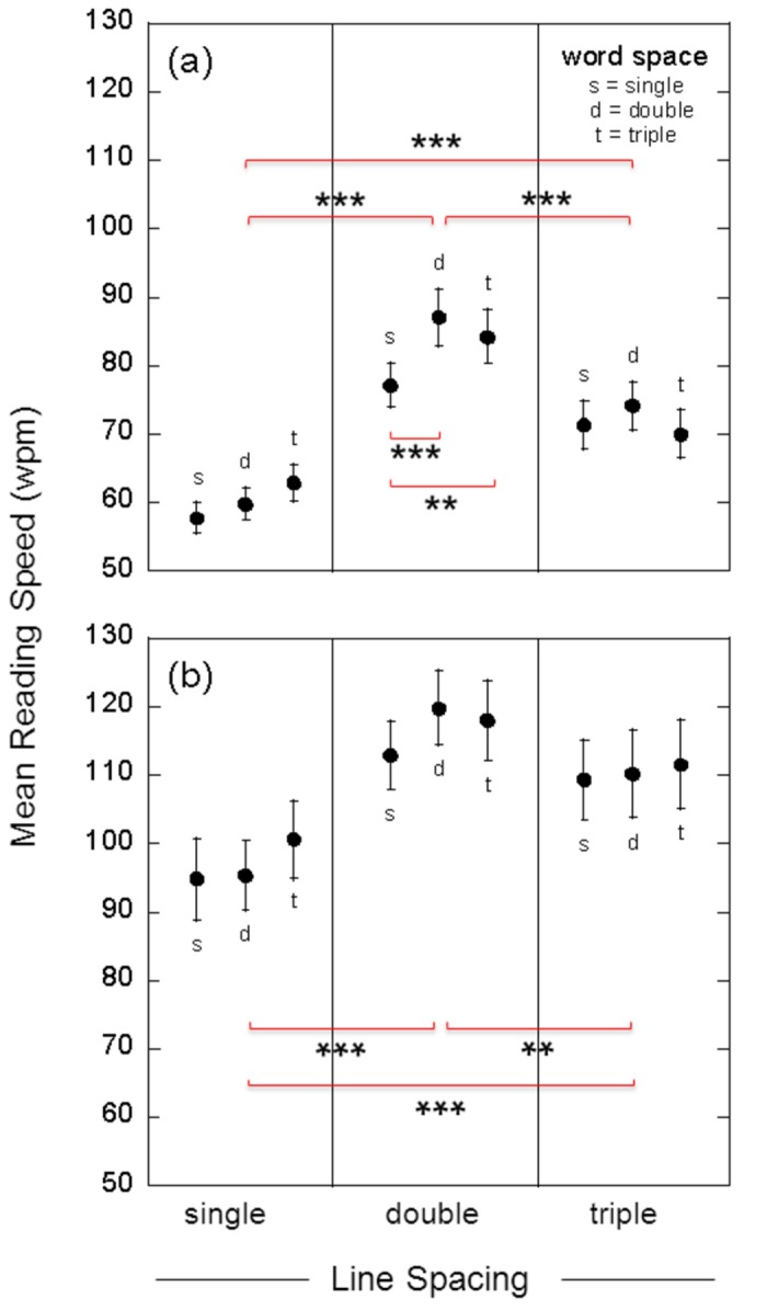
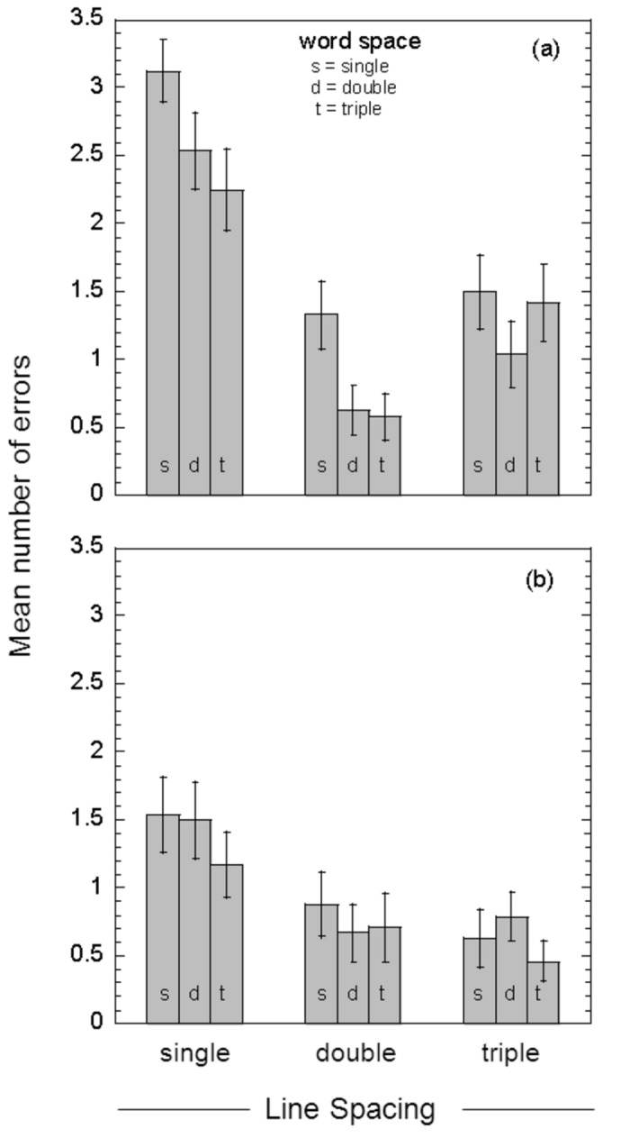
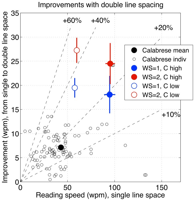
The search by many investigators for a solution to the reading problems encountered by individuals with no central vision has been long and, to date, not very fruitful. Most textual manipulations, including font size, have led to only modest gains in reading speed. Previous work on spatial integrative properties of peripheral retina suggests that 'visual crowding' may be a major factor contributing to inefficient reading. Crowding refers to the fact that juxtaposed targets viewed eccentrically may be difficult to identify. The purpose of this study was to assess the combined effects of line spacing and word spacing on the ability of individuals with age-related macular degeneration (ARMD) to read short passages of text that were printed with either high (87.5%) or low contrast (17.5%) letters. Low contrast text was used to avoid potential ceiling effects and to mimic a possible reduction in letter contrast with light scatter from media opacities. For both low and high contrast text, the fastest reading speeds we measured were for passages of text with double line and double word spacing. In comparison with standard single spacing, double word/line spacing increased reading speed by approximately 26% with high contrast text (p < 0.001), and by 46% with low contrast text (p < 0.001). In addition, double line/word spacing more than halved the number of reading errors obtained with single spaced text. We compare our results with previous reading studies on ARMD patients, and conclude that crowding is detrimental to reading and that its effects can be reduced with enhanced text spacing. Spacing is particularly important when the contrast of the text is reduced, as may occur with intraocular light scatter or poor viewing conditions. We recommend that macular disease patients should employ double line spacing and double-character word spacing to maximize their reading efficiency.


Conflict of interest statement

Competing Interests: The authors have declared that no competing interests exist.

Figures

Figure 1
Figure 1. Effect of word spacing with low contrast text.
Reading speed (number of correctly-read words per minute, wpm) for single- versus double-character word spacing (bottom panels) and single- versus triple-character word spacing (top panels) for text passages with single, double or triple line spacing. Results shown are for reading text with a Michelson letter contrast of 17.5%.The individual data points in each panel show the results for each participant; the diagonal line in each panel is the ‘line of no effect’.
Figure 2
Figure 2. Effect of word spacing with high contrast text.
Reading speed (wpm) for single- versus double-character word spacing (bottom panels) and single- versus triple-character word spacing (top panels) for text passages with single, double or triple line spacing. Results shown are for reading text with a letter contrast of 87.5%.The individual data points in each panel show the results for each participant; the diagonal line in each panel is the ‘line of no effect’.
Figure 3
Figure 3. Effect of line spacing with low contrast text.
Reading speed (wpm) for single- versus double-line spacing (bottom panels) and single- versus triple-line spacing (top panels) for text passages with single-, double- or triple-character word spacing. Results shown are for text with a Michelson letter contrast of 17.5%. The individual data points in each panel show the results for each participant; the diagonal line in each panel is the ‘line of no effect’.
Figure 4
Figure 4. Effect of line spacing with high contrast text.
Reading speed (wpm) for single- versus double-line spacing (bottom panels) and single- versus triple-line spacing (top panels) for text passages with single-, double- or triple-character word spacing. Results shown are for text with a letter contrast of 87.5%. The individual data points in each panel show the results for each participant; the diagonal line in each panel is the ‘line of no effect’.
Figure 5
Figure 5. Group-mean reading speeds.
Group mean (n = 24) reading speeds (words per minute, wpm) for single, double and triple line spacing. Results are shown for both low contrast text (17.5%, panel a) and high contrast text (87.5%, panel b). For each line spacing, results are shown for single- (s), double- (d) and triple-character (t) word spacing. Error bars show +/- one standard error. Statistical analysis of the data, using a two-way repeated measures ANOVA, is reported in the text. The horizontal red brackets indicate significant differences between conditions, as determined using post-hoc comparisons with Tukey’s HSD test. Shown are the significant differences in mean reading speed between line spacing conditions (averaged across word spacing), and the significant differences between word spacing conditions for low contrast text displayed with double line space (**, p < 0.01; ***, p < 0.001).
Figure 6
Figure 6. Group-mean reading errors.
Group-mean reading errors (number of incorrectly-read or omitted words) for both low contrast text (17.5% contrast, panel a) and high contrast text (87.5% contrast, panel b), plotted as a function of line spacing. For each line spacing, results are shown for single- (s), double- (d) and triple-character (t) word spacing. Error bars show +/- one standard error.
Figure 7
Figure 7. Comparison of reading studies in ARMD.
Improvements in mean reading speed of ARMD patients produced by double line spacing, from the present study and Calabrese et al. [45]. Improvement is defined as reading speed with double line spacing minus reading speed with single line spacing, in wpm. Abscissa plots baseline reading speed with single line spacing. Dashed lines represent 10%, 20%, 40% and 60% improvement, as marked. Large circles are mean reading speeds (wpm): black circle, Calabrese et al. [45]; red and blue circles, means ± 1 se from the present study, with single or double word spacing (WS), and low or high contrast (C). Small circles: individual observers from Calabrese et al. [45]. See Discussion, and Table 2.

References

    1. Pascolini D, Mariotti SPM (2012) Global estimates of visual impairment: 2010. Br J Ophthalmol 96: 614-618. doi:10.1136/bjophthalmol-2011-300539. PubMed: 22133988. - DOI - PubMed
    1. Arditi A (2004) Adjustable typography: an approach to enhancing low vision text accessibility. Ergonomics 47: 469-482. doi:10.1080/0014013031000085680. PubMed: 15204299. - DOI - PubMed
    1. Arditi A, Cho J (2005) Serifs and font legibility. Vis Resour 45: 2926-2933. PubMed: 16099015. - PMC - PubMed
    1. Tarita-Nistor L, Lam D, Brent MH, Steinbach MJ, González EG (2013) Courier: a better font for reading with age-related macular degeneration. Can J Ophthalmol 48: 56-62. doi:10.1016/j.jcjo.2012.09.017. PubMed: 23419299. - DOI - PubMed
    1. Legge GE, Pelli DG, Rubin GS, Schleske MM (1985) Psychophysics of reading: I Normal vision. Vis Resour 25: 239-252. - PubMed

Publication types