Topological organization of the human brain functional connectome across the lifespan
- PMID: 24333927
- PMCID: PMC6987957
- DOI: 10.1016/j.dcn.2013.11.004
Topological organization of the human brain functional connectome across the lifespan
Abstract
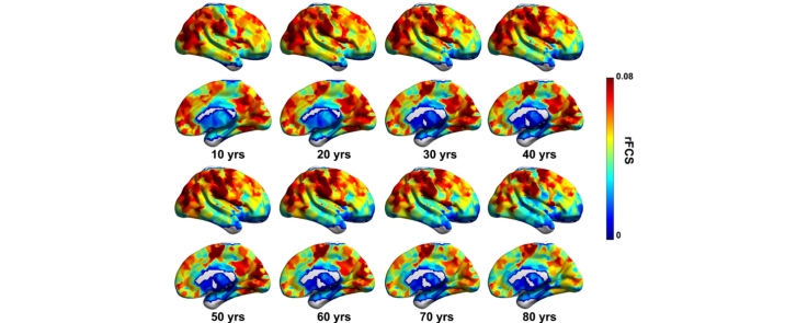
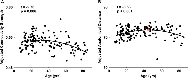
Human brain function undergoes complex transformations across the lifespan. We employed resting-state functional MRI and graph-theory approaches to systematically chart the lifespan trajectory of the topological organization of human whole-brain functional networks in 126 healthy individuals ranging in age from 7 to 85 years. Brain networks were constructed by computing Pearson's correlations in blood-oxygenation-level-dependent temporal fluctuations among 1024 parcellation units followed by graph-based network analyses. We observed that the human brain functional connectome exhibited highly preserved non-random modular and rich club organization over the entire age range studied. Further quantitative analyses revealed linear decreases in modularity and inverted-U shaped trajectories of local efficiency and rich club architecture. Regionally heterogeneous age effects were mainly located in several hubs (e.g., default network, dorsal attention regions). Finally, we observed inverse trajectories of long- and short-distance functional connections, indicating that the reorganization of connectivity concentrates and distributes the brain's functional networks. Our results demonstrate topological changes in the whole-brain functional connectome across nearly the entire human lifespan, providing insights into the neural substrates underlying individual variations in behavior and cognition. These results have important implications for disease connectomics because they provide a baseline for evaluating network impairments in age-related neuropsychiatric disorders.
Keywords: Functional connectomics; Graph theory; Lifespan trajectory; Rich club.
Copyright © 2013 The Authors. Published by Elsevier Ltd.. All rights reserved.
Figures


Similar articles
-
Age-related changes in the topological organization of the white matter structural connectome across the human lifespan.Hum Brain Mapp. 2015 Oct;36(10):3777-92. doi: 10.1002/hbm.22877. Epub 2015 Jul 14. Hum Brain Mapp. 2015. PMID: 26173024 Free PMC article.
-
Changes in structural and functional connectivity among resting-state networks across the human lifespan.Neuroimage. 2014 Nov 15;102 Pt 2:345-57. doi: 10.1016/j.neuroimage.2014.07.067. Epub 2014 Aug 7. Neuroimage. 2014. PMID: 25109530
-
Disrupted functional brain connectome in individuals at risk for Alzheimer's disease.Biol Psychiatry. 2013 Mar 1;73(5):472-81. doi: 10.1016/j.biopsych.2012.03.026. Epub 2012 Apr 25. Biol Psychiatry. 2013. PMID: 22537793
-
Meta-connectomics: human brain network and connectivity meta-analyses.Psychol Med. 2016 Apr;46(5):897-907. doi: 10.1017/S0033291715002895. Epub 2016 Jan 26. Psychol Med. 2016. PMID: 26809184 Free PMC article. Review.
-
The parcellation-based connectome: limitations and extensions.Neuroimage. 2013 Oct 15;80:397-404. doi: 10.1016/j.neuroimage.2013.03.053. Epub 2013 Apr 1. Neuroimage. 2013. PMID: 23558097 Review.
Cited by
-
Disentangling age- and disease-related alterations in schizophrenia brain network using structural equation modeling: A graph theoretical study based on minimum spanning tree.Hum Brain Mapp. 2021 Jul;42(10):3023-3041. doi: 10.1002/hbm.25403. Epub 2021 May 7. Hum Brain Mapp. 2021. PMID: 33960579 Free PMC article.
-
Molecular Determinants of Neurocognitive Deficits in Glioma: Based on 2021 WHO Classification.J Mol Neurosci. 2024 Feb 5;74(1):17. doi: 10.1007/s12031-023-02173-4. J Mol Neurosci. 2024. PMID: 38315329 Free PMC article.
-
Principles and open questions in functional brain network reconstruction.Hum Brain Mapp. 2021 Aug 1;42(11):3680-3711. doi: 10.1002/hbm.25462. Epub 2021 May 20. Hum Brain Mapp. 2021. PMID: 34013636 Free PMC article. Review.
-
Volume entropy for modeling information flow in a brain graph.Sci Rep. 2019 Jan 22;9(1):256. doi: 10.1038/s41598-018-36339-7. Sci Rep. 2019. PMID: 30670725 Free PMC article.
-
Application of Graph Theory for Identifying Connectivity Patterns in Human Brain Networks: A Systematic Review.Front Neurosci. 2019 Jun 6;13:585. doi: 10.3389/fnins.2019.00585. eCollection 2019. Front Neurosci. 2019. PMID: 31249501 Free PMC article.
References
-
- Akaike H. A new look at statistical-model identification. IEEE Trans. Automat. Control. 1974;19:716–723.
-
- Alavi A., Newberg A.B., Souder E., Berlin J.A. Quantitative analysis of PET and MRI data in normal aging and Alzheimer's disease: atrophy weighted total brain metabolism and absolute whole brain metabolism as reliable discriminators. J. Nucl. Med. 1993;34:1681–1687. - PubMed
Publication types
MeSH terms
LinkOut - more resources
Full Text Sources
Other Literature Sources
Medical