. 2014 Feb 27;506(7489):494-7.
doi: 10.1038/nature12904. Epub 2014 Jan 8.

Genetics of single-cell protein abundance variation in large yeast populations

Affiliations

Genetics of single-cell protein abundance variation in large yeast populations

Frank W Albert et al. Nature. .

Abstract

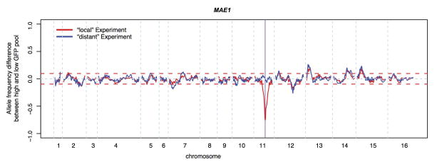
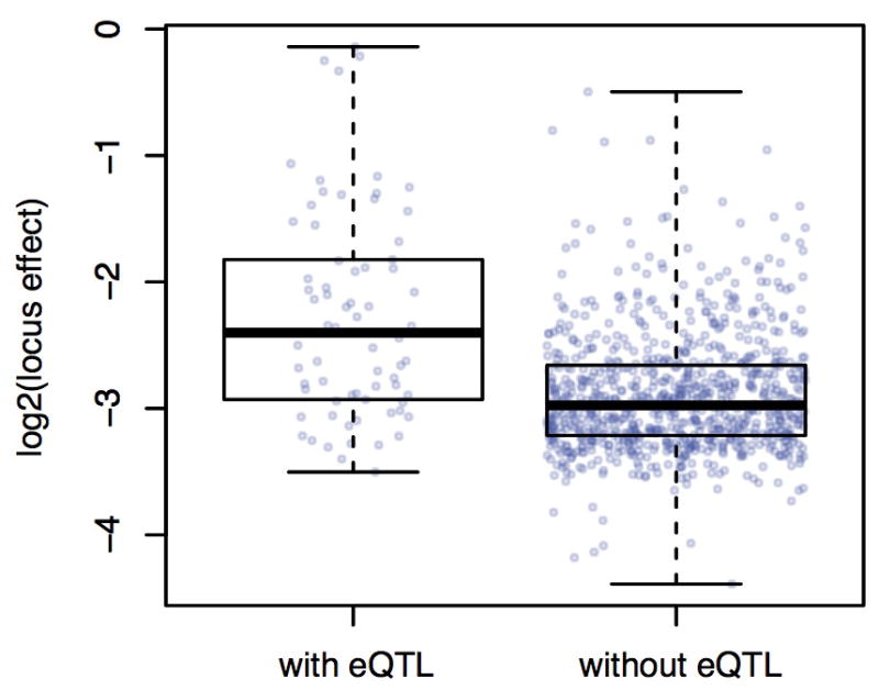
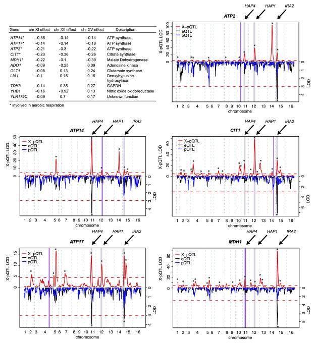
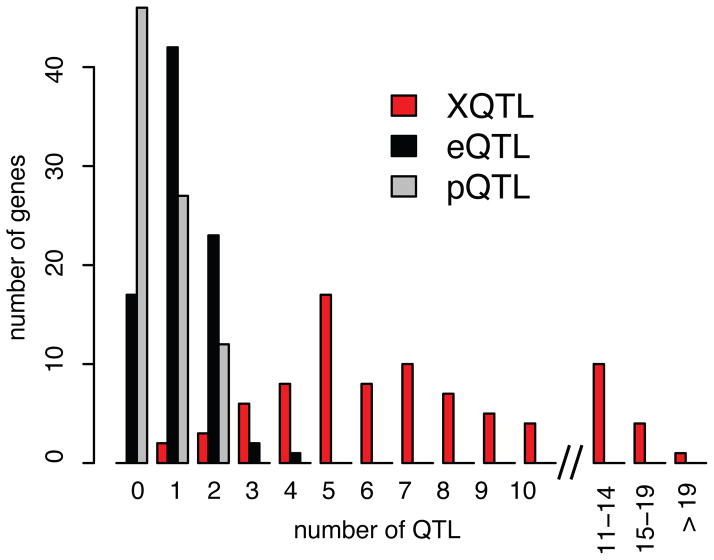
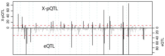
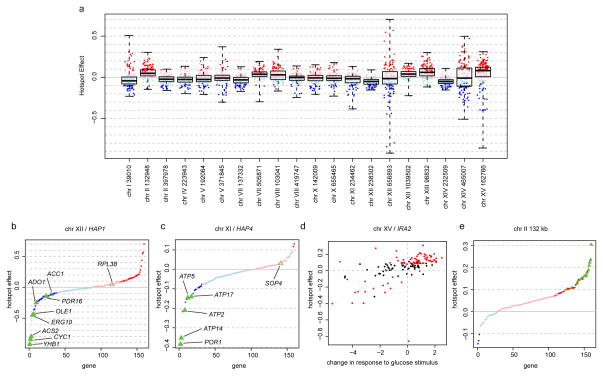
Variation among individuals arises in part from differences in DNA sequences, but the genetic basis for variation in most traits, including common diseases, remains only partly understood. Many DNA variants influence phenotypes by altering the expression level of one or several genes. The effects of such variants can be detected as expression quantitative trait loci (eQTL). Traditional eQTL mapping requires large-scale genotype and gene expression data for each individual in the study sample, which limits sample sizes to hundreds of individuals in both humans and model organisms and reduces statistical power. Consequently, many eQTL are probably missed, especially those with smaller effects. Furthermore, most studies use messenger RNA rather than protein abundance as the measure of gene expression. Studies that have used mass-spectrometry proteomics reported unexpected differences between eQTL and protein QTL (pQTL) for the same genes, but these studies have been even more limited in scope. Here we introduce a powerful method for identifying genetic loci that influence protein expression in the yeast Saccharomyces cerevisiae. We measure single-cell protein abundance through the use of green fluorescent protein tags in very large populations of genetically variable cells, and use pooled sequencing to compare allele frequencies across the genome in thousands of individuals with high versus low protein abundance. We applied this method to 160 genes and detected many more loci per gene than previous studies. We also observed closer correspondence between loci that influence protein abundance and loci that influence mRNA abundance of a given gene. Most loci that we detected were clustered in 'hotspots' that influence multiple proteins, and some hotspots were found to influence more than half of the proteins that we examined. The variants that underlie these hotspots have profound effects on the gene regulatory network and provide insights into genetic variation in cell physiology between yeast strains.


Conflict of interest statement

Competing financial interest statement

The authors declare that no competing financial interests exist.

Figures

Extended Data Figure 1
Overview of the experimental design
Extended Data Figure 2
Extended Data Figure 2. Illustration of FACS design
Shown is GFP intensity and forward scatter (FSC, a measure of cell size) recorded during FACS. The correlation between cell size and GFP intensity is clearly visible. The superimposed collection gates are an illustration, and do not show the actual gates used for this gene. A. The low GFP (blue) and high GFP (red) gates sample extreme levels of GFP within a defined range of cell sizes. B. For the “null” experiments, the same cell size range is collected, but without selecting on GFP.
Extended Data Figure 3
Extended Data Figure 3. Sequence analyses and X-pQTL detection example
In all panels, physical genomic coordinates are shown on the x-axes. The position of the gene (LEU1) is indicated by the purple horizontal line. Top panel: Frequency of the BY allele in the high (red) and low (blue) GFP population. SNPs are indicated by dots, and loess-smoothed averages as solid lines. Note the fixation for the BY allele in all segregants at the gene position as well as at the mating type locus on chromosome III, as well as the fixation for the RM allele at the SGA marker integrated at the CAN1 locus on the left arm of chromosome V. Middle panel: Subtraction of allele frequencies in the low from those in the high GFP population. SNPs are indicated by grey dots, with the loess-smoothed average indicated in black. Note that on average, there is no difference between the high and the low populations. Positive difference values correspond to a higher frequency of the BY allele in the high GFP population, which we interpret as higher expression being caused by the BY allele at that locus. The red horizontal lines indicate the 99.99% quantile from the empirical “null” sort experiments. They are shown for illustration only and were not used for peak calling. The blue vertical boxes indicate positions of genome-wide X-pQTL, with the width representing the 2-LOD drop interval. Bottom panel: LOD scores obtained from MULTIPOOL . The red horizontal line is the genome-wide significance threshold (LOD = 4.5). Stars indicate X-pQTL called by our algorithm; these positions correspond to the blue bars in the middle panel. For this gene, 14 X-pQTL are called.
Extended Data Figure 4
Extended Data Figure 4. Reproducibility examples
Shown are allele frequency differences between the high and low GFP populations along the genome for three examples of replicates for three genes. The gene positions are indicated by purple vertical lines; note that YMR315W and GCN1 were “local” experiments where peaks at the gene position are visible. The red horizontal lines indicate the 99.99% quantile from the empirical “null” sort experiments. Note the near-perfect agreement for strong X-pQTL, with some differences discernable at weaker loci. See Supplementary Note 1 for details.
Extended Data Figure 5
Extended Data Figure 5. Example for a local X-pQTL in the gene MAE1
Shown is the difference in the frequency of the BY allele between the high and the low GFP population along the genome. Red dashed horizontal lines indicate the 99.99% quantile from the empirical “null” sort experiments. They are shown for illustration only and were not used for peak calling.
Extended Data Figure 6
Extended Data Figure 6. Distributions of X-pQTL effect sizes for X-pQTL with and without a corresponding eQTL
Effect sizes are shown as the allele frequency differences between the high and low GFP population.
Extended Data Figure 7
Extended Data Figure 7. The impact of small effect sizes on the π1 estimate
Each panel shows the p-value distribution obtained from 5,000 tests of a given effect size x, if two groups of 50 individuals each are compared using a T-test. The effect size x is given along with the corresponding variance explained (VE), the π1 estimate, and the fraction of tests that achieved nominal significance (p < 0.05). Note that π1 reaches 0.3 at VE = 0.5% – 1% (middle row, right columns). See Supplementary Note 2 for details.
Extended Data Figure 8
Extended Data Figure 8. Genes regulated by the hotspots on chromosomes XI, XII, and XV
The table shows genes that have an X-pQTL at three hotspots. For each gene involved in aerobic respiration, we show the X-pQTL LOD scores along the genome in the top half of the plot, and the eQTL and pQTL LOD scores in the bottom half on an inverted scale. The hotspot locations are shown as grey bars labeled with the names of the causative genes. Purple vertical lines indicate the gene positions. Red dashed horizontal lines are significance thresholds. Stars indicate significant QTL.
Figure 1
Figure 1. Distant and local variation affects protein levels
Histogram showing the number of loci per gene among 85 genes with X-pQTL, eQTL and pQTL data.
Figure 2
Figure 2. X-pQTL hotspots
Number of X-pQTL (top) vs. eQTL (bottom, inverted scale) in 20cM bins along the genome. The red dashed lines correspond to the expectation if QTL were distributed randomly. Bins where the QTL count exceeds this threshold are shown in black, others in grey. Note that the eQTL axis is truncated to permit easier visual comparison. The eQTL hotspot glu1 (Extended Data Table 2) narrowly failed the permutation threshold in our re-analysis. The eQTL hotspots on chromosomes II and III (glu3, glu4, glu5) correspond to polymorphisms that do not segregate in our strains.
Figure 3
Figure 3. Hotspot effects
A. Distribution of hotspot effects. Red (blue): higher (lower) expression associated with the BY allele. Darker dots: significant X-pQTL. Boxplots show the median (central line), central quartiles (boxes), and data extremes (whiskers). B & C. Effects of the HAP1 and HAP4 hotspots sorted by effect size. Green triangles: direct transcriptional targets of HAP1 or HAP4. Filled triangles: significant X-pQTL. D. Correlation of hotspot effects with expression changes triggered by glucose response. Red circles: genes significantly regulated by the hotspot. E. Effects of the chromosome II hotspot at position 132,948. Green triangles: genes with ribosomal and translation-related functions (Supplementary Table 3).

References

    1. Rockman MV, Kruglyak L. Genetics of global gene expression. Nature Reviews Genetics. 2006;7:862–872. - PubMed
    1. Smith EN, Kruglyak L. Gene–Environment Interaction in Yeast Gene Expression. PLoS Biology. 2008;6:e83. - PMC - PubMed
    1. Rockman MV, Skrovanek SS, Kruglyak L. Selection at linked sites shapes heritable phenotypic variation in C. elegans. Science. 2010 - PMC - PubMed
    1. Huang GJ, et al. High resolution mapping of expression QTLs in heterogeneous stock mice in multiple tissues. Genome Research. 2009;19:1133–1140. - PMC - PubMed
    1. West MAL, et al. Global eQTL Mapping Reveals the Complex Genetic Architecture of Transcript-Level Variation in Arabidopsis. Genetics. 2006;175:1441–1450. - PMC - PubMed

Publication types

MeSH terms