

doi: 10.1093/ije/dyu105.
Epub 2014 Apr 23.
Avoiding blunders involving 'immortal time'
Affiliations
- PMID: 24760815
- PMCID: PMC4052143
- DOI: 10.1093/ije/dyu105
Item in Clipboard
Avoiding blunders involving 'immortal time'
Int J Epidemiol.
2014 Jun.
No abstract available
Figures
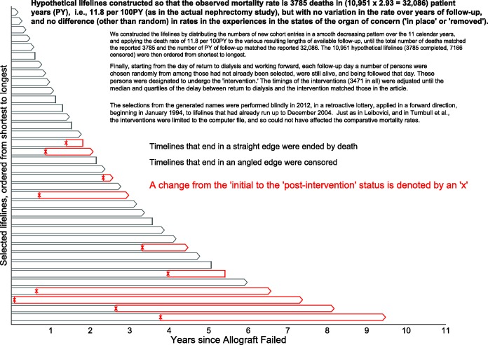
Excerpts from the simulated mortality experience in the contrasted (‘organ intact’ vs ‘organ removed’) states. Hypothetical lifelines were generated to have an average mortality rate of 3785 deaths in (10 951 × 2.93 = 32 086) patient-years (PY), i.e.,11.8 per 100 PY (as in the actual nephrectomy study1), but with no variation over years of follow-up, and no difference (other than random) between states (‘name intact’ or ‘name removed’). We constructed the dataset by first generating names for 10 951 fictional persons, then distributing the numbers of new cohort entries in a smooth decreasing pattern over the 11 calendar years, and then applying the death rate of 11.8 per 100 PY to the various resulting lengths of available follow-up, until the total number of deaths matched the reported 3785 and the number of PY of follow-up matched the reported 32 086. The 10 951 hypothetical lifelines (3785 completed, 7166 censored) were then ordered from shortest to longest. Finally, starting from the day of return to dialysis and working forward, each follow-up day a number of persons were chosen randomly from among those who had not already been selected, were still alive and were being followed that day. These persons were designated to undergo an electronic ‘removal’ whereby, within the database, just their names (not their failed transplants) were (electronically rather than surgically) removed. The timings of these ‘removals’ (3471 in all) were set so that the median and quartiles of the delay between return to dialysis and becoming nameless matched the delays in the article. The selections, made by a random number generator in 2012, were made blindly, in a retroactive lottery, applied in a forward direction, beginning in January 1994, to lifelines that had already run up to December 2004. Just as in Leibovici and in Turnbull et al., these interventions were limited to the 2012 computer file, and could not have affected the comparative mortality rates. Shown are 30 such lifelines selected systematically from these 10 951 ordered hypothetical ones, with a completed lifeline indicated by a single straight line, and a censored one by a pair of lines forming an arrowhead. The timing of the name removal is indicated by an x, and the post-intervention PY by red rather than grey boundary lines.
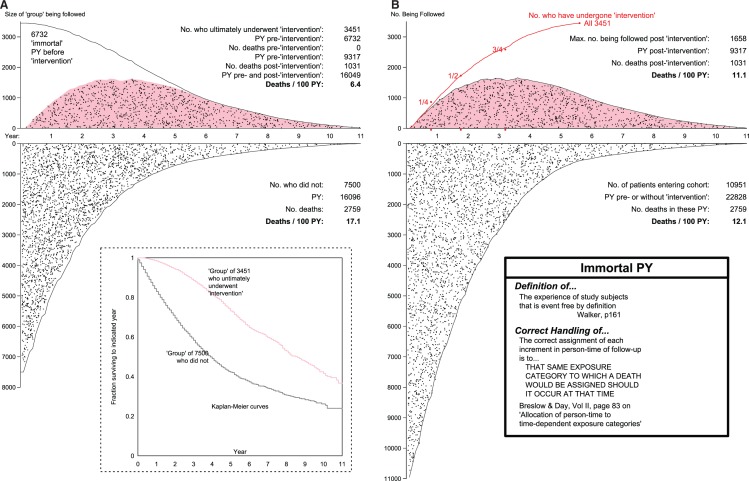
Mortality rates and rate ratios produced by the (A) mis- and (B) proper allocation of pre-‘intervention’ patient years. As explained in Figure 1, the hypothetical data for the 10 951 patients were constructed to have an average mortality rate of 3785 deaths in (10 951 × 2.93 = 32 086) patient-years (PY), i.e. 11.8 deaths per 100PY (as in the actual study), but with no variation over years of follow-up, or between states (no, or pre-‘intervention’ (white background) and post-‘intervention’ (pink background). Indeed, the selection of those who changed states (from white to pink polygon, in B) was made at random, and retroactively. The time location (relative to when the allograft failed) of each death is indicated by a black dot. In B, upper panel, the number being followed at any time is smaller than 3451 because some who had received the ‘intervention’ were already dead before the last ones received it.
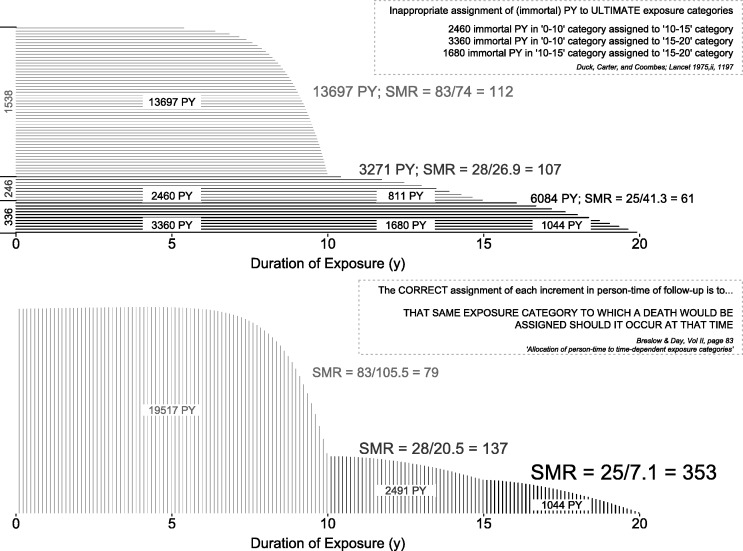
Incorrect (at termination) and correct (as time progresses) allocation of follow-up time in the Duck et al. study. Horizontal timelines represent exposure to vinyl chloride, with durations categorized into 0–10, 10–15 and 15+ years. See also the small worked example, based on this study, in Breslow and Day.
Comment in
-
Getting it Straight: Avoiding Blunders While Criticizing a Peer's Work.Int J Epidemiol. 2016 Jun;45(3):619-20. doi: 10.1093/ije/dyv154. Epub 2015 Aug 14. Int J Epidemiol. 2016. PMID: 26275449 No abstract available.
-
Immortal time bias. Response to: Achinger, Go and Ayus.Int J Epidemiol. 2016 Jun;45(3):965-6. doi: 10.1093/ije/dyv300. Epub 2015 Nov 11. Int J Epidemiol. 2016. PMID: 26559545 No abstract available.
References
Annotated references
-
- Ayus JC, Achinger SG, Lee S, Sayegh MH, Go AS. Transplant nephrectomy improves survival following a failed renal allograft. J Am Soc Nephrol 2010;21:374–80 See also the editorial in the same issue. We provide extensive commentary in sections 2 of our article, and in the Supplementary material - PMC - PubMed
-
- Farr W. Vital Statistics. A memorial volume of selections from the reports and writings of William Farr. London: The Sanitary Institute, 1885. The now-easy access, clear writing, and opportunities to compare the concepts and principles with those in modern textbooks, make several portions of this volume worth studying even today
-
- Hill AB. Principles of medical statistics. XIV: Further fallacies and difficulties. Lancet 1937;229:825–27 ‘The average age at death is not often a particularly useful measure. Between one occupational group and another it may be grossly misleading … the average age at death in an occupation must, of course, depend in part upon the age of entry to that occupation and the age of exit from it—if exit takes place for other reasons than death’
-
- Hill AB. Principles of medical statistics, XII: Common fallacies and difficulties. Lancet 1937;229:706–08 With the dates changed, the worked example could easily pass for a modern one: ‘Suppose on Jan. 1st, 1936, there are 5000 persons under observation, none of whom are inoculated; that 300 are inoculated on April 1st, a further 600 on July 1st, and another 100 on Oct. 1st. At the end of the year there are, therefore, 1000 inoculated persons and 4000 still uninoculated. During the year there were registered 110 attacks amongst the inoculated persons and 890 amongst the uninoculated, a result apparently very favourable to inoculation. This result, however, must be reached even if inoculation is completely valueless, for no account has been taken of the unequal lengths of time over which the two groups were exposed. None of the 1000 persons in the inoculated group were exposed to risk for the whole of the year but only for some fraction of it; for a proportion of the year they belong to the uninoculated group and must be counted in that group for an appropriate length of time.’ A mathematical proof that ‘neglect of the durations of exposure to risk must lead to fallacious results and must favour the inoculated’ can be found in the paper by Beyersmann et al., J Clin Epidemiol 2008;61:1216–21. Hill goes on to describe a ‘cruder neglect of the time-factor [that] sometimes appears in print, and may be illustrated as follows. In 1930 a new form of treatment is introduced and applied to patients seen between 1930 and 1935. The proportion of patients still alive at the end of 1935 is calculated. This figure is compared with the proportion of patients still alive at the end of 1935 who were treated in 1925–29, prior to the introduction of the new treatment. Such a comparison is, of course, inadmissible’. Today’s readers are encouraged to compare their reason why with that given by Hill
-
- Hill AB. Cricket and its relation to the duration of life. Lancet 1927;949–950
Additional references
-
- Redelmeier DA, Singh SM. Survival in Academy Award-winning actors and actresses. Ann Intern Med 2001;134:955–62 The widely reported almost four-year longevity advantage over their ‘nominated but never won’ peers includes the immortal years between being nominated and winning. Use of the years between birth and nomination is an example of many researchers’ reluctance to subdivide each person’s relevant experience. See the re-analyses by Sylvestre et al. (2006) in the same journal, and by Wolkewitz et al. (Am Statistician 2010;64:205–11) and Han et al. (Applied Statistics 2011;5:746–72) - PubMed
-
- Mantel N, Byar DP. Evaluation of response-time data involving transient states—illustration using heart-transplant data. J Am Stat Assoc 1974;69:81–86 In 1972, Gail had identified several biases in the first reports from Houston and Stanford. One was the fact that ‘patients in the [transplanted] group are guaranteed (by definition) to have survived at least until a donor was available, and this grace period has been implicitly added into [their] survival time’. Mantel was one of the first to suggest statistical methodologies for avoiding what he termed this ‘time-to-treatment’ bias, where ‘the survival of treated patients is compared with that of untreated controls, results from a failure to make allowance for the fact that the treated patients must have at least survived from time of diagnosis to time of treatment, while no such requirement obtained for their untreated controls’. He introduced the idea of crossing over from one life table (‘waiting for a transplant’ state) to another (‘post-transplant’) and make comparisons matched on day since entering the waitlist. Incidentally, Mantel’s choice of the word ‘guarantee’ is not arbitrary: textbooks on survival data refer to a ‘guarantee time’ such that the event of interest many not occur until a threshold time is attained. In oncology trials, a common error—usually referred to as ‘time-to-response’ or ‘guarantee-time’ bias—is to attribute the longer survival of ‘responders’ than ‘nonresponders’ entirely to the therapy, and to ignore the fact that, by definition, responders have to live long enough for a response to be noted (see Anderson, J Clin Oncol. 1983;1:710–19, and, more recently, Giobbie-Hurder et al. J Clin Oncol 2013;31:2963–69)
-
- Glesby MJ, Hoover DR. Survivor treatment selection bias in observational studies: examples from the AIDS literature. Ann Intern Med 1996;124:999–1005 ‘Patients who live longer have more opportunities to select treatment; those who die earlier may be untreated by default’ and their three words ‘survivor treatment selection’, to describe the bias explain why some person-time is ‘immortal’ - PubMed
-
- Wolkewitz M, Allignol A, Harbarth S, de Angelis G, Schumacher M, Beyersmann J. Time-dependent study entries and exposures in cohort studies can easily be sources of different and avoidable types of bias. J Clin Epidemiol 2012;65:1171–80 - PubMed
-
- Using an example from hospital epidemiology, the authors give ‘innovative and easy-to-understand graphical presentations of how these biases corrupt the analyses via distorted time-at-risk’. See also: Schumacher et al. Hospital-acquired infections—appropriate statistical treatment is urgently needed! Int J Epidemiol 2013;42:1502–08. - PubMed
MeSH terms
LinkOut - more resources
Full Text Sources
Other Literature Sources
