Portraying the Expression Landscapes of B-CellLymphoma-Intuitive Detection of Outlier Samples and of Molecular Subtypes
- PMID: 24833231
- PMCID: PMC4009791
- DOI: 10.3390/biology2041411
Portraying the Expression Landscapes of B-CellLymphoma-Intuitive Detection of Outlier Samples and of Molecular Subtypes
Abstract
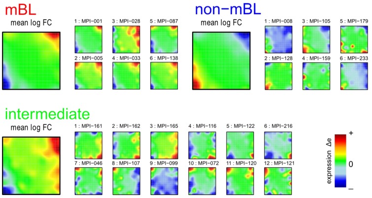
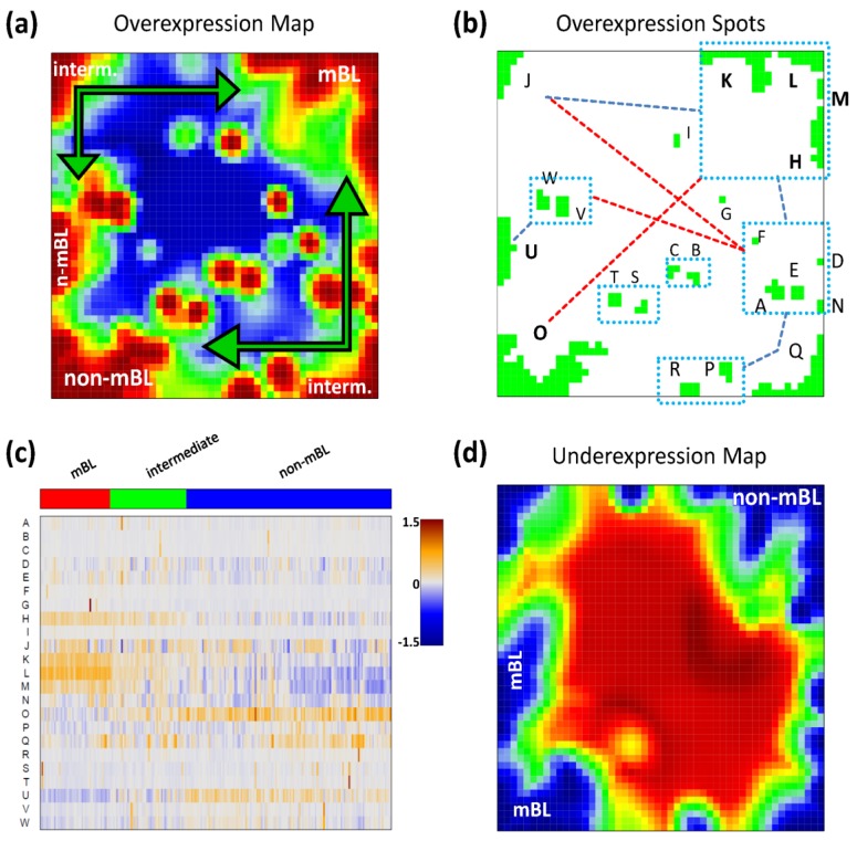
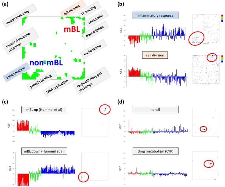
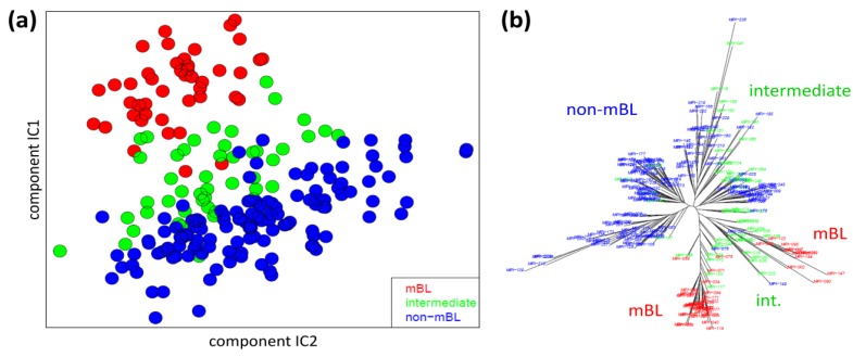
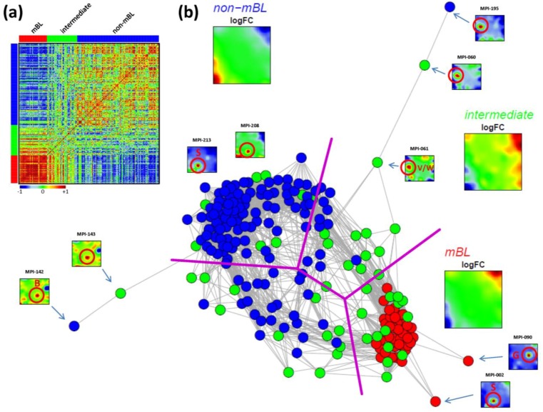
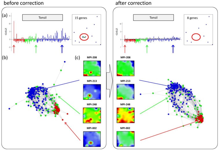
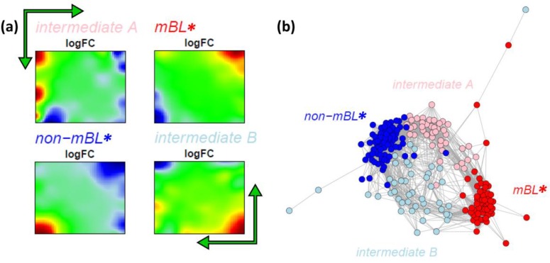
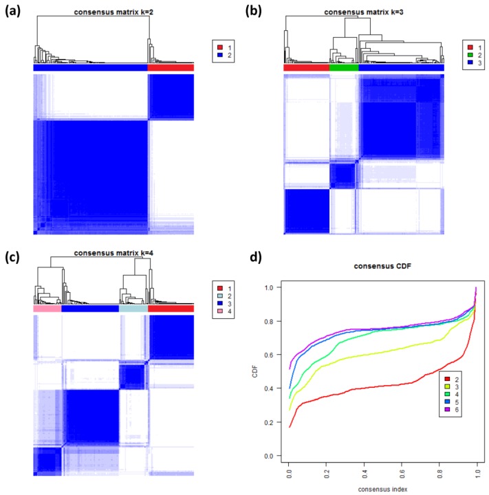
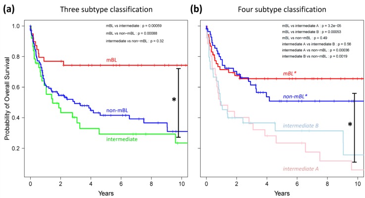
We present an analytic framework based on Self-Organizing Map (SOM) machine learning to study large scale patient data sets. The potency of the approach is demonstrated in a case study using gene expression data of more than 200 mature aggressive B-cell lymphoma patients. The method portrays each sample with individual resolution, characterizes the subtypes, disentangles the expression patterns into distinct modules, extracts their functional context using enrichment techniques and enables investigation of the similarity relations between the samples. The method also allows to detect and to correct outliers caused by contaminations. Based on our analysis, we propose a refined classification of B-cell Lymphoma into four molecular subtypes which are characterized by differential functional and clinical characteristics.
Figures
Similar articles
-
Clustering of the SOM easily reveals distinct gene expression patterns: results of a reanalysis of lymphoma study.BMC Bioinformatics. 2002 Nov 24;3:36. doi: 10.1186/1471-2105-3-36. Epub 2002 Nov 24. BMC Bioinformatics. 2002. PMID: 12445336 Free PMC article.
-
Combined SOM-portrayal of gene expression and DNA methylation landscapes disentangles modes of epigenetic regulation in glioblastoma.Epigenomics. 2018 Jun;10(6):745-764. doi: 10.2217/epi-2017-0140. Epub 2018 Jun 11. Epigenomics. 2018. PMID: 29888966
-
oposSOM: R-package for high-dimensional portraying of genome-wide expression landscapes on bioconductor.Bioinformatics. 2015 Oct 1;31(19):3225-7. doi: 10.1093/bioinformatics/btv342. Epub 2015 Jun 10. Bioinformatics. 2015. PMID: 26063839
-
[Analysis of genomic copy number alterations of malignant lymphomas and its application for diagnosis].Gan To Kagaku Ryoho. 2007 Jul;34(7):975-82. Gan To Kagaku Ryoho. 2007. PMID: 17637530 Review. Japanese.
-
Histopathology in the light of molecular profiling.Ann Oncol. 2006 May;17 Suppl 4:iv5-7. doi: 10.1093/annonc/mdj990. Ann Oncol. 2006. PMID: 16702185 Review.
Cited by
-
Epigenetic Heterogeneity of B-Cell Lymphoma: Chromatin Modifiers.Genes (Basel). 2015 Oct 21;6(4):1076-112. doi: 10.3390/genes6041076. Genes (Basel). 2015. PMID: 26506391 Free PMC article.
-
A modular transcriptome map of mature B cell lymphomas.Genome Med. 2019 Apr 30;11(1):27. doi: 10.1186/s13073-019-0637-7. Genome Med. 2019. PMID: 31039827 Free PMC article.
-
Transcriptional states of CAR-T infusion relate to neurotoxicity - lessons from high-resolution single-cell SOM expression portraying.Front Immunol. 2022 Sep 28;13:994885. doi: 10.3389/fimmu.2022.994885. eCollection 2022. Front Immunol. 2022. PMID: 36248848 Free PMC article.
-
Variation of RNA Quality and Quantity Are Major Sources of Batch Effects in Microarray Expression Data.Microarrays (Basel). 2014 Dec 16;3(4):322-39. doi: 10.3390/microarrays3040322. Microarrays (Basel). 2014. PMID: 27600351 Free PMC article.
-
Mapping heterogeneity in patient-derived melanoma cultures by single-cell RNA-seq.Oncotarget. 2017 Jan 3;8(1):846-862. doi: 10.18632/oncotarget.13666. Oncotarget. 2017. PMID: 27903987 Free PMC article.
References
-
- Barretina J., Caponigro G., Stransky N., Venkatesan K., Margolin A.A., Kim S., Wilson C.J., Lehár J., Kryukov G.V., Sonkin D., et al. The Cancer Cell Line Encyclopedia enables predictive modelling of anticancer drug sensitivity. Nature. 2012;483:603–607. doi: 10.1038/nature11003. - DOI - PMC - PubMed
LinkOut - more resources
Full Text Sources
Other Literature Sources