. 2014 Jun 13:4:5276.
doi: 10.1038/srep05276.

From mobile phone data to the spatial structure of cities

Affiliations

From mobile phone data to the spatial structure of cities

Thomas Louail et al. Sci Rep. .

Abstract

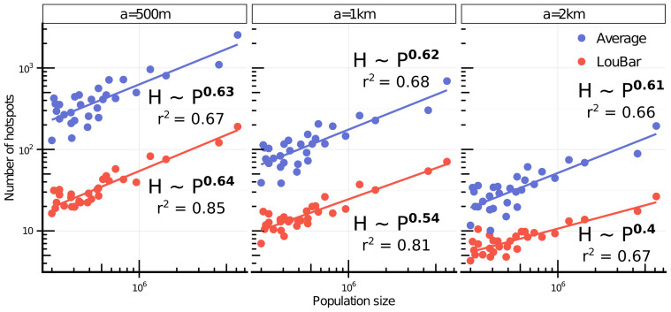
Pervasive infrastructures, such as cell phone networks, enable to capture large amounts of human behavioral data but also provide information about the structure of cities and their dynamical properties. In this article, we focus on these last aspects by studying phone data recorded during 55 days in 31 Spanish cities. We first define an urban dilatation index which measures how the average distance between individuals evolves during the day, allowing us to highlight different types of city structure. We then focus on hotspots, the most crowded places in the city. We propose a parameter free method to detect them and to test the robustness of our results. The number of these hotspots scales sublinearly with the population size, a result in agreement with previous theoretical arguments and measures on employment datasets. We study the lifetime of these hotspots and show in particular that the hierarchy of permanent ones, which constitute the 'heart' of the city, is very stable whatever the size of the city. The spatial structure of these hotspots is also of interest and allows us to distinguish different categories of cities, from monocentric and "segregated" where the spatial distribution is very dependent on land use, to polycentric where the spatial mixing between land uses is much more important. These results point towards the possibility of a new, quantitative classification of cities using high resolution spatio-temporal data.


Figures

Figure 1
Figure 1. The 31 Spanish urban areas with more than 200,000 inhabitants in 2011.
Map of their locations and spatial extensions. The set of cities analyzed in this article includes very different types of very different types: central cities, port cities and cities on islands. (NB: the municipalities included in each urban area are those included in the AUDES database. This map was generated using standard packages of the R statistical software for handling spatial data. The vector layer of the Spanish municipalities boundaries is available under free licence on multiple websites, e.g. gadm.org.).
Figure 2
Figure 2. Population sizes, areas and densities of 31 Spanish cities (urban areas) with more than 200,000 inhabitants in 2011.
(a) Population size vs. area. The set of cities under study displays a large variety of sizes. We also note that there is no general statistical relation between the population size of Spanish urban areas and their spatial extension. (b) Rank-size distribution of their residential density and phone activity density (rescaled by a constant factor given by the inverse of the fraction of phone users in the denser urban area, ρBarcelona,residential/ρBarcelona,phoneusers). The distribution shows that the fraction of phone users is almost constant in all cities. This figure was created with R and LibreOffice Draw.
Figure 3
Figure 3. Map of the metropolitan area of Barcelona.
The white area represents the metropolitan area (administrative delimitation), the brown area represents territories surrounding the metropolitan area and the blue area the sea. (a) Voronoi cells of the mobile phone antennas point pattern. (b) Intersection between the Voronoi cells and the metropolitan area. (c) Grid composed of 1 km2 square cells on which we aggregated the number/density of unique phone users associated to each phone antenna (NB: these maps were created with R standard packages for handling spatial data and freely available layers).
Figure 4
Figure 4. Number of mobile phone users according to the hour of the day, for each day of the week, in six Spanish metropolitan areas.
This figure was created with R.
Figure 5
Figure 5
Time evolution of the number of mobile phone users per hour during an average weekday (a) Total number of unique mobile phone users per hour (shown here for the eight biggest Spanish cities). (b) Rescaled numbers of unique users per hour for 31 cities. Each value Ui(t) is equal to the number of phone users in city i at time t, Ni(t), divided by the total number of phone users in i during the entire day: formula image
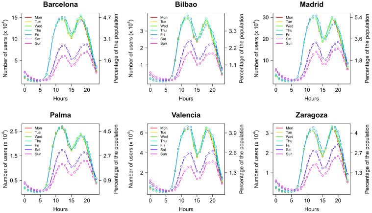
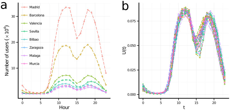
. The good collapse suggests the existence of an urban rhythm common to all cities. This figure was created with R and LibreOffice Draw.
Figure 6
Figure 6. Time evolution of the average distance DV (t) between phone users in the city, and the values of the dilatation index µ = max DV (t)/min DV (t) for the 31 Spanish metropolitan areas studied.
(a) Illustration of the time evolution of DV in three urban areas: Madrid, Sevilla and Zaragoza. This distance DV is equal to the average of the distances between each pair of cells weighted by the density of each of the cells. The resulting distance is then divided by the typical spatial size of the city (given by formula image 
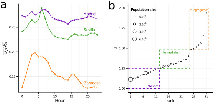
the square root of the city's area) in order to compare the curves across cities. (b) Rank-size distribution of the dilatation index µ in the 31 metropolitan areas. This figure was created with R and LibreOffice Draw.
Figure 7
Figure 7. Scatter plot and fit of the number of hotspots H vs. the population size P for the 31 cities studied.
Each point in the scatterplot corresponds to the average number of hotspots determined for each one-hour time bin of a weekday (for five weekdays considered here). The power law fit is consistent, for both hotspots identification methods, with a sublinear behavior characterized by an exponent of order 0.6, a value in agreement with theoretical predictions and empirical observations on employment data. This figure was created with R.
Figure 8
Figure 8. Histogram of lifetime duration of hotstpots for eight cities and for the two hotspots identification methods (top: ‘Average' method and bottom: ‘Loubar' method).
In the case of the ‘Loubar' hotspots, we can essentially distinguish three groups: the permanent (24 h hotspots), intermittent (from 1 up to 7 hours) and intermediary (all the others) hotspots. This figure was created with R.
Figure 9
Figure 9. Different spatial structure of hotspots in cities.
Rank plot of the compacity coefficient formula image 
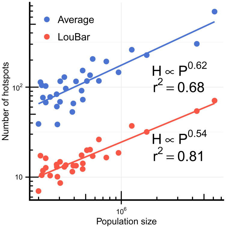
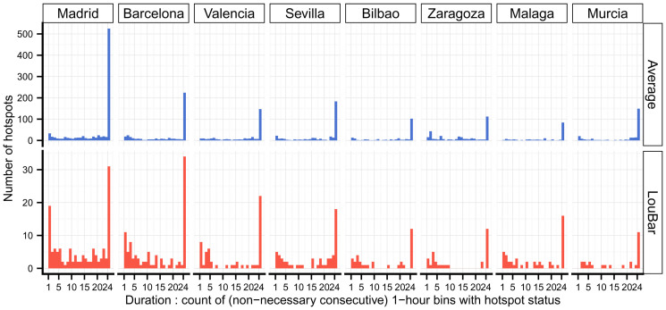
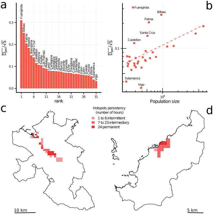
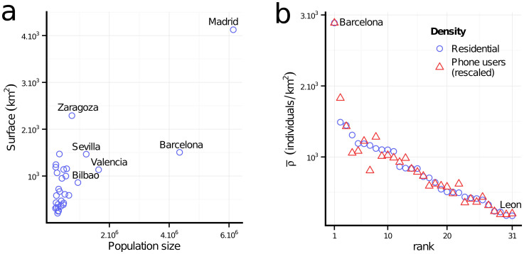
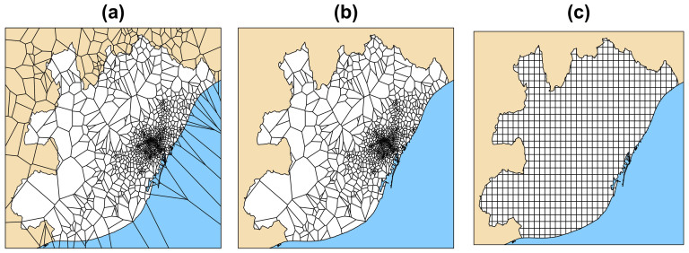
among the 31 metropolitan areas. (b) Compacity versus population size. We observe a trend (at least for a large subset of cities, the corresponding fit is shown as a guide to the eye). (c) and (d) The spatial organization of the 1 km2 permanent hotspots determined by the Loubar method, in the urban areas of Bilbao (950, 000 inhabitants) and Vigo (385,000 inhabitants). These figures reveal two types of spatial organization: polycentric in the case of Bilbao (c), whose permanent hotspots are not contiguous and more spread over the space of the urban area, and clearly compact and monocentric in the case of Vigo (d) (The maps (c) and (d) were generated with R standard packages for handling spatial data and make use of freely available vector layers). This figure was created with R and LibreOffice Draw.
Figure 10
Figure 10. Histograms of the coefficients < Dper >/< Dint > (a) and < Dmed >/< Dint > (b).
While the spatial features of intermittent and intermediary hotspots are similar, the main difference between cities lies in how the permanent hotspots are distributed in space. This figure was created with R and LibreOffice Draw.
Figure 11
Figure 11. Illustration of the criteria selection on the Lorenz curve.
This figure was created with R and LibreOffice Draw.
Figure 12
Figure 12. Location of the hotspots in the metropolitan area of Barcelona, selected with two different criteria: the Average criterion and our more restrictive criterion (‘LouBar').
Here density data are aggregated on a grid composed of 1 km2 square cells. This figure was created with R and LibreOffice Draw. It makes use of a vector layer of the boundaries of Spanish municipalities that is available under free licence.
Figure 13
Figure 13. Time evolution of the ratio for two hotspots definitions and different sizes of grid cells, for eight different cities of very different sizes.
The cities chosen cover the full range of the poulation size distribtion of the set of the 31 cities studied. Every reasonable method for defining hotspots would give a value between the two lines of each plot. One can see that qualitatively pattern stays identical whatever the grid size for couple (city, method). This figure was created with R.
Figure 14
Figure 14. Scatter plot and model fit line of the number of hotspots H vs. the population size P for the 31 cities studied.
Each point in the scatterplot corresponds to the average number of hotspots determined for each one-hour time bin of a weekday time period considered for the five weekdays. The linear relationship on a log-log plot indicates a power-law relationship between the two quantities, with an exponent value β < 1, indicating that the number of activity centers in a city grows sublinearly with its population size. This figure was created with R.
Figure 15
Figure 15. Evolution of Kendall τ values for permament hotspots during daytime for an average weekday.
This figure was created with R.

Similar articles

Cited by

References

    1. Asgari F., Gauthier V. & Becker M. A survey on human mobility and its applications. arXiv:13070814 [physics] (2013).
    1. Gallotti R., Bazzani A. & Rambaldi S. Towards a statistical physics of human mobility. Int. J. Mod. Phy. C 23 (2012).
    1. Roth C., Kang S.-M., Batty M. & Barthelemy M. Structure of urban movements: polycentric activity and entangled hierarchical flows. Plos ONE 6, e15923 (2011). - PMC - PubMed
    1. Hawelka B. et al. Geo-located twitter as the proxy for global mobility patterns. arXiv:13110680 [physics] (2013). - PMC - PubMed
    1. Noulas A., Scellato S., Lambiotte R., Pontil M. & Mascolo C. A tale of many cities: universal patterns in human urban mobility. Plos ONE 7, e37027. (2012) - PMC - PubMed

Publication types

LinkOut - more resources