. 2014 Aug 18;9(8):e105184.
doi: 10.1371/journal.pone.0105184. eCollection 2014.

Cross-checking different sources of mobility information

Affiliations

Cross-checking different sources of mobility information

Maxime Lenormand et al. PLoS One. .

Abstract

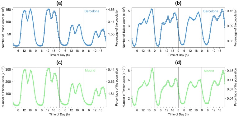
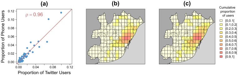
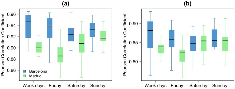
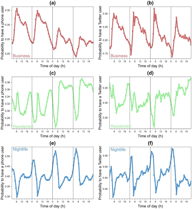
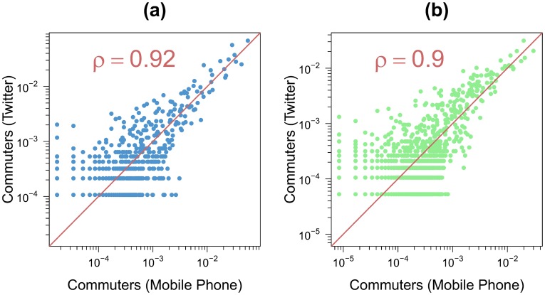
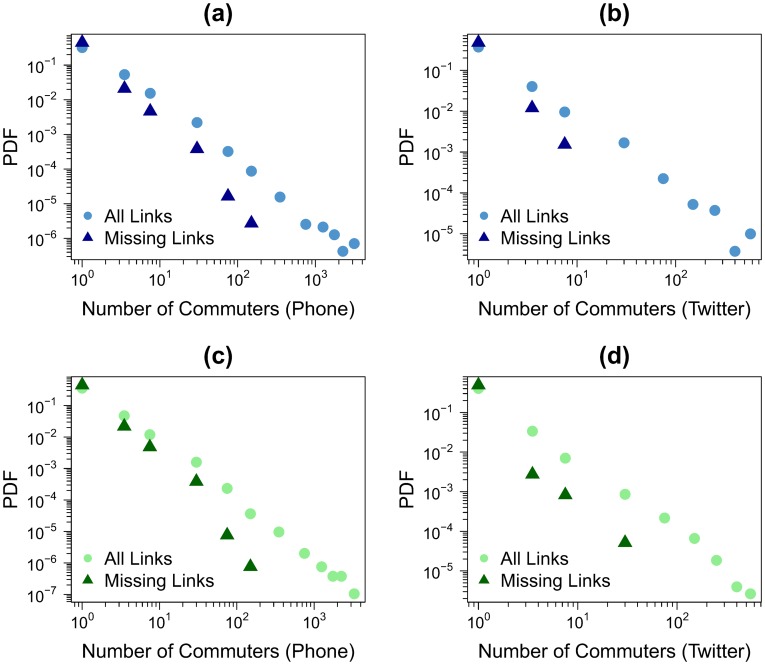
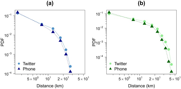
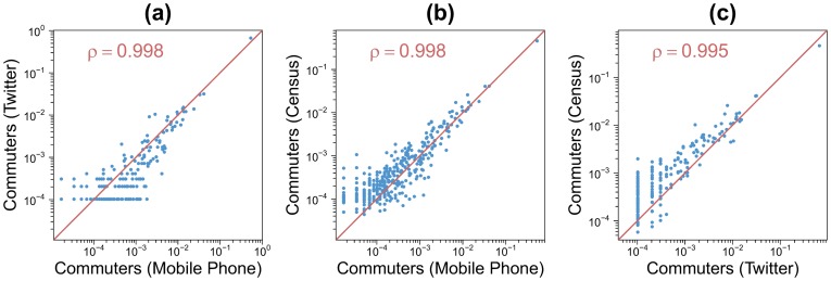
The pervasive use of new mobile devices has allowed a better characterization in space and time of human concentrations and mobility in general. Besides its theoretical interest, describing mobility is of great importance for a number of practical applications ranging from the forecast of disease spreading to the design of new spaces in urban environments. While classical data sources, such as surveys or census, have a limited level of geographical resolution (e.g., districts, municipalities, counties are typically used) or are restricted to generic workdays or weekends, the data coming from mobile devices can be precisely located both in time and space. Most previous works have used a single data source to study human mobility patterns. Here we perform instead a cross-check analysis by comparing results obtained with data collected from three different sources: Twitter, census, and cell phones. The analysis is focused on the urban areas of Barcelona and Madrid, for which data of the three types is available. We assess the correlation between the datasets on different aspects: the spatial distribution of people concentration, the temporal evolution of people density, and the mobility patterns of individuals. Our results show that the three data sources are providing comparable information. Even though the representativeness of Twitter geolocated data is lower than that of mobile phone and census data, the correlations between the population density profiles and mobility patterns detected by the three datasets are close to one in a grid with cells of 2×2 and 1×1 square kilometers. This level of correlation supports the feasibility of interchanging the three data sources at the spatio-temporal scales considered.


Conflict of interest statement

Competing Interests: The authors confirm that José Javier Ramasco is a PLOS ONE Editorial Board member and this does not alter our adherence to PLOS ONE Editorial policies and criteria. Oliva García-Cantú, Miguel Picornell, and Ricardo Herranz are employed by Nommon Solutions and Technologies, S.L.. This affiliation does not alter the authors' adherence to all PLOS ONE policies on the sharing of data and materials.

Figures

Figure 1
Figure 1. Map of the metropolitan area of Barcelona.
The white area represents the metropolitan area, the dark grey zones correspond to territory surrounding the metropolitan area and the gray zones to the sea. (a) Voronoi cells around the BTSs. (b) Gird cells of size 2×2 km 2.
Figure 2
Figure 2. Number of mobile phone users per day in Barcelona (a) and Madrid (c) and number of Twitter users in Barcelona (b) and Madrid (d) as a function of the time according to day group w.
From left to right: weekdays (aggregation from Monday to Thursday), Friday, Saturday and Sunday.
Figure 3
Figure 3. Correlation between the spatial distribution of Twitter users and mobile phone users for the weekdays (aggregation from Monday to Thursday) and from noon to 1pm for the metropolitan area of Barcelona (l = 2 km).
(a) Scatter-plot composed by each pair (Tg,w,h, Pg,w,h), the values have been normalized (dividing by the total number of users) in order to obtain values between 0 and 1. The red line represents the perfect linear fit with slope equal to 1 and intercept equal to 0. ((b)–(c)) Spatial distribution of Twitter users (b) and mobile phone users (c). In order to facilitate the comparison of both distributions on the map, the proportion of users in each cell is shown (always bounded in the interval [0, 1]).
Figure 4
Figure 4. Box-plots of the Pearson correlation coefficients obtained for different hours between T and P (from the left to the right: the weekdays (aggregation from Monday to Thursday), Friday, Saturday and Sunday).
The blue boxes represent Barcelona. The green boxes represent Madrid. (a) l = 2 km. (b) l = 1 km.
Figure 5
Figure 5. Temporal distribution patterns for the metropolitan area of Barcelona (l = 2 km).
(a), (c) and (e) Mobile phone activity; (b), (d) and (f) Twitter activity; (a) and (b) Business cluster; (c) and (d) Residential/leisure cluster; (e) and (f) Nightlife cluster.
Figure 6
Figure 6. Comparison between the non-zero flows obtained with the Twitter dataset and the mobile phone dataset (the values have been normalized by the total number of commuters for both OD tables).
The points are scatter plot for each pair of grid cells. The red line represents the x = y line. (a) Barcelona. (b) Madrid. In both cases l = 2 km.
Figure 7
Figure 7. Probability density function of the weights considering all the links (points) and the missing links (triangles).
(a) Barcelona and cell phone data. (b) Barcelona and Twitter data. (c) Madrid and cell phone data. (d) Madrid and Twitter data. In both cases l = 2 km.
Figure 8
Figure 8. Commuting distance distribution obtained with both datasets.
We only consider individuals living and working in two different grid cells. The circles represent the Twitter data and the triangles the mobile phone data. (a) Barcelona. (b) Madrid. In both cases l = 2 km.
Figure 9
Figure 9. Comparison between the non-zero flows obtained with the three datasets for the Barcelona's case study (the values have been normalized by the total number of commuters for both OD tables).
Blue points are scatter plot for each pair of municipalities. The red line represents the x = y line. (a) Twitter and mobile phone. (b) Census and mobile phone. (c) Census and Twitter.

References

    1. Watts DJ (2007) A twenty-first century science. Nature 445: 489. - PubMed
    1. Lazer D, Pentland A, Adamic L, Aral S, Barabasi AL, et al. (2009) Computational social science. Science 323: 721. - PMC - PubMed
    1. Vespignani A (2009) Predicting the behavior of techno-social systems. Science 325: 425–428. - PubMed
    1. Liben-Nowell D, Novak J, Kumar R, Raghavan P, Tomkins A (2005) Geographic routing in social networks. Proc Natl Acad Sci USA 102: 11623–11628. - PMC - PubMed
    1. Onnela JP, Saramäki J, Hyvönen J, Szabó G, Lazer D, et al. (2007) Structure and tie strengths in mobile communication networks. Proc Natl Acad Sci USA 104: 7332–7336. - PMC - PubMed

Publication types

LinkOut - more resources