. 2014 Nov 5;25(22):3501-14.
doi: 10.1091/mbc.E13-01-0004. Epub 2014 Aug 20.

Local and global analysis of endocytic patch dynamics in fission yeast using a new "temporal superresolution" realignment method

Affiliations

Local and global analysis of endocytic patch dynamics in fission yeast using a new "temporal superresolution" realignment method

Julien Berro et al. Mol Biol Cell. .

Abstract

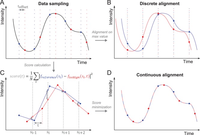
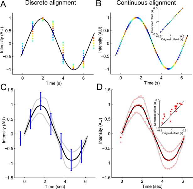
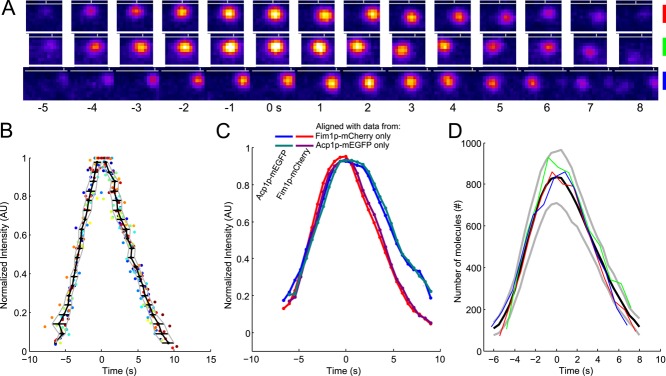
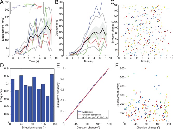
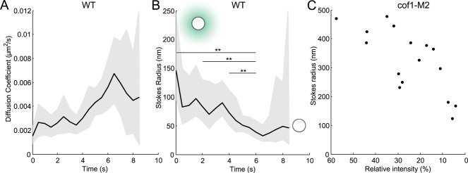
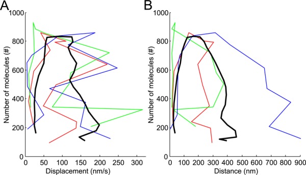
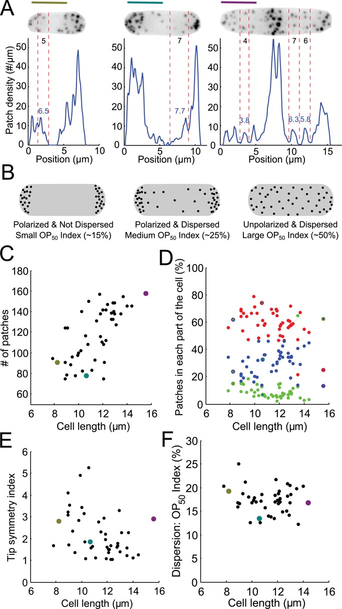
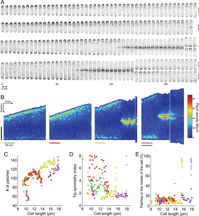
Quantitative microscopy is a valuable tool for inferring molecular mechanisms of cellular processes such as clathrin-mediated endocytosis, but, for quantitative microscopy to reach its potential, both data collection and analysis needed improvement. We introduce new tools to track and count endocytic patches in fission yeast to increase the quality of the data extracted from quantitative microscopy movies. We present a universal method to achieve "temporal superresolution" by aligning temporal data sets with higher temporal resolution than the measurement intervals. These methods allowed us to extract new information about endocytic actin patches in wild-type cells from measurements of the fluorescence of fimbrin-mEGFP. We show that the time course of actin assembly and disassembly varies <600 ms between patches. Actin polymerizes during vesicle formation, but we show that polymerization does not participate in vesicle movement other than to limit the complex diffusive motions of newly formed endocytic vesicles, which move faster as the surrounding actin meshwork decreases in size over time. Our methods also show that the number of patches in fission yeast is proportional to cell length and that the variability in the repartition of patches between the tips of interphase cells has been underestimated.


Figures

FIGURE 1:
FIGURE 1:
The continuous-alignment method. (A) Example of a signal that is sampled twice (red and blue vertical lines) at a regular interval but starting at different times delayed by toffset. No absolute time reference is available to align both data sets on the timescale. (B) A traditional discrete alignment. Both data sets are aligned on their peak value. The real offset is systematically misestimated. (C) Score calculation. The red and blue data sets are linearly interpolated (lines) between the measured data points (dots). The data set to align (red) is translated by an offset t along the x-axis and compared with reference curve (blue) by calculating the score function at scoring points si (crosses). (D) Minimization of the score function gives a good estimate of the original offset between the two data sets.
FIGURE 2:
FIGURE 2:
Example of application of the continuous-alignment method. (A and B) A sinusoidal signal is measured and the data sets are realigned with (A) the discrete-alignment method on peak values or (B) the continuous-alignment method. Dots of the same color are from the same data set. (B) Inset, comparison of offsets in the original data sets with offsets estimated by the continuous-alignment method. The estimates are accurate and allow reconstruction of the original signal with a higher temporal precision than the sampling time. (C and D) Noise representing biological variability (40% Gaussian noise proportional to the data) and the measurement variability (20% white noise) was added to the sinusoidal signal used in A and B. Data were collected in 20 independent simulated experiments with sampling times of 1 s. Data are realigned with (C) the discrete-alignment method or (D) the continuous-alignment method and then averaged. (C) Discrete alignment gives average values (blue dots) and their SDs (blue lines) different from the true average (black line) and SD (gray lines) of the original signal. (D) Continuous alignment gives average values (red dots) and SDs (pink points) close to the true average (black line) and SDs (gray lines). (D) Inset, comparison of offsets in the original data sets with offsets estimate by the continuous-alignment method. The agreement is good even in the presence of a fairly large noise in the original signal and/or in its measurement. Each dot represents the offset for one data set.
FIGURE 3:
FIGURE 3:
The time course of fimbrin and capping protein appearance and disappearance in endocytic patches is highly reproducible. (A) Example of three patches tracked with fimbrin (Fim1p-mEGFP) in wild-type cells (1 patch per line with the color code for each patch on the right). Each image represents the sum of Fim1p-mEGFP fluorescence intensities from five confocal sections at 1-s intervals. The horizontal gray lines represent the approximate position of the plasma membrane, and the vertical gray ticks mark the horizontal positions of each patch in the first image. Fim1p-mEGFP fluorescence intensity is color-coded from low to high intensities: black–blue–orange–red–yellow–white (ImageJ “fire” lookup table). Colored scale bars: 500 nm. (B) The variability in timing between patches is less than the measurement interval. Time course of the fluorescence of fimbrin-mEGFP in 24 patches matched by continuous alignment and normalized to their peak values. Each dot corresponds to a time point of a given track. Each color corresponds to a different track. The black curve is the average time for the normalized fluorescence to reach a given value. The horizontal black lines are the SDs of these mean times and are plotted in Figure S3A. The gray curves represent the average ± 1 SD. (C) Average of two-color data sets realigned using the data from only one channel. Blue, Acp1p-mEGFP, and red, Fim1p-mCherry: realigned using only Fim1p-mCherry data; teal, Acp1p-mEGFP, and purple, Fim1p-mCherry: realigned using only Acp1p-mEGFP data. The raw data used for this alignment are the same as for Figure S1K in Berro and Pollard (2014); N = 19. (D) Numbers of fimbrin molecules in 3 endocytic patches from A vs. time. These and 21 other data sets were aligned on the same timescale by temporal superresolution alignment of the intensities to calculate the averaged numbers over time (black curve) ± 1 SD from the average (gray curves). Time zero is the time when the average number of fimbrin molecules peaked.
FIGURE 4:
FIGURE 4:
Diffusive movements of the same sample of 24 endocytic patches as Figure 3D. (A) Endocytic patch displacements and (B) distances from their origins (i.e., position of first appearance). Black lines are average displacements and distances after continuous alignment; gray lines are ± 1 SD; gray shading is ± 1 SEM. Both figures feature three patches shown in inset in A and identified as red, green, and blue. Dots in the inset of A show the positions of the centers of these three patches in the x,y-plane at successive 1-s time intervals. All three tracks are aligned at a common origin at time zero. The brightness of the color decreases over time from dark at the beginning to light at the end. Gray horizontal line: position of the plasma membrane. Scale bar: 200 nm. (C) Changes in direction of 24 endocytic patches over time. Each dot is a different time point and each color corresponds to one of the 24 patches. (D) Histogram of the frequency of changes in direction angles for the 24 patches. (E) Cumulative frequency of changes in direction angles of the 24 patches. The distribution does not differ significantly from a uniform distribution, as expected for a diffusive motion. Blue: same data as C; red: a uniform distribution between 0 and 180°. (F) Plot of displacement vs. direction change of the 24 patches shows no obvious correlation. Only data after time zero are represented.
FIGURE 5:
FIGURE 5:
(A) Diffusion coefficients and (B) Stokes' radii of 24 moving actin patches over time estimated from the average displacements in Figure 4A. Gray area: confidence interval at 95% for the diffusion coefficient and the Stokes' radius. In B, the extremities of the horizontal lines represent time points where Stokes' radii are significantly different (z-test, 5%). More statistical tests are available in Figure S4. Cartoons represent the typical size of an endocytic vesicle with or without a typical actin network (teal). (C) Stokes' radii of actin patches in cof1-M2 mutant cells with deficient actin-filament severing. Each dot corresponds to one patch tracked over 20–60 s. Stokes' radii were estimated as a temporal average of individual patches, because their fluorescence intensity did not change over this time interval. Intensities are relative to the intensity of the brightest nonmotile isolated patch measured in the field. Only the patches with average displacement above 50 nm/s are represented to assure that these vesicles were released from the plasma membrane.
FIGURE 6:
FIGURE 6:
Polymerization efficiency plots of the number of molecules per patch vs. (A) the distance from origin or (B) the displacement of the patch. The data points in the lower left are the first measured on individual patches (colored lines) or averaged from 24 patches (black lines). The successive data points are at 1-s intervals for the individual patches (colored lines) and 0.5-s intervals for the averaged data (black line). Black lines: data based on the average for 24 patches after continuous alignment in time using intensities; blue, red, and green are representative data for individual patches from Figure 3A. The rate of patch movements increases only after the maximum fimbrin accumulation, as seen for individual tracks (colors) and for averaged data (black).
FIGURE 7:
FIGURE 7:
Distribution of patches along the long axis of asynchronous fission yeast cells imaged at single points in time. (A) Distributions of patches in small-sized (olive) and medium-sized (teal) cells in interphase and a cell in mitosis (purple). The images are sum projections of cells expressing Fim1p-mEGFP at their native locus from 18 consecutive confocal z-slices spaced at 360-nm intervals. Blue lines: distributions along the long axis measured from the fluorescence intensity and the mean fluorescence per patch. Black numbers: direct manual counts of patches in the zones between two red vertical dashed lines from stacks of confocal images. Blue numbers: count of patches in the same zone estimated from the patch density distribution. Scale bars: 5 μm. (B) Schematic explaining our definitions for polarization and dispersion and how the OP50 index changes accordingly. (C) Numbers of patches in 47 cells vs. their lengths, a proxy for stage of the cell cycle. Points colored olive, teal, and purple are data from the cells in A. (D) Distribution of patches in the cell vs. cell length. Red, left third of the cell; green, middle third of the cell; blue, right third of the cell. (E) Tip symmetry index, the ratio of the number of patches in each tip, vs. cell length. A perfectly symmetrical distribution would have a symmetry index of 1. (F) Dispersion index vs. cell length. The OP50 index represents the percentage of the length of a cell containing 50% of total patches (see Materials and Methods).
FIGURE 8:
FIGURE 8:
Evolution of patch distribution over time in individual living cells. (A) Montage of four different cells expressing Fim1p-mEGFP (inverted contrast) over 215 min, imaged every 5 min. Vertical bars are 5 μm, colored to identify these cells in the other panels. Micrographs are sum projections of 18 consecutive z-slices spaced by 360 nm. (B) Kymographs of the temporal evolution of the patch density along the lengths of the four cells in A. In each subpanel, each vertical strip corresponds to the density of patches along the long axis of the cell at a given time point. The densities are color coded from dark blue for the regions of the cell with the lowest density of patches to dark red for the regions with highest densities of patches. Vertical black bar: 5 μm. Colored horizontal bars: 60 min. (C–E) Changes in the distributions of patches in cells in A over time using their lengths as a proxy for time. (C) Evolution of the number of patches over time with each point corresponding to one image from A. (D) Evolution of tip symmetry with time. (E) Evolution of the proportion of patches in the middle of the cell with time. Points, cells in interphase; crosses, cells in mitosis. The bars in B and the dots and crosses in C, D, and E have the color assigned in A.

References

    1. Aghamohammadzadeh S, Ayscough KR. Differential requirements for actin during yeast and mammalian endocytosis. Nat Cell Biol. 2009;11:1039–1042. - PMC - PubMed
    1. Arasada R, Pollard TD. Distinct roles for F-BAR proteins Cdc15p and Bzz1p in actin polymerization at sites of endocytosis in fission yeast. Curr Biol. 2011;21:1450–1459. - PMC - PubMed
    1. Bahler J, Wu JQ, Longtine MS, Shah NG, McKenzie A, III, Steever AB, Wach A, Philippsen P, Pringle JR. Heterologous modules for efficient and versatile PCR-based gene targeting in Schizosaccharomyces pombe. Yeast. 1998;14:943–951. - PubMed
    1. Berg HC. Random Walks in Biology. Princeton, NJ: Princeton University Press; 1983.
    1. Berro J, Pollard TD. Synergies between Aip1p and capping protein subunits (Acp1p and Acp2p) in clathrin-mediated endocytosis and cell polarization in fission yeast. Mol Biol Cell. 2014;25:3515–3527. - PMC - PubMed

Publication types

MeSH terms

LinkOut - more resources