. 2014 Apr;104(4):1320-1349.
doi: 10.1257/aer.104.4.1320.

Do Physicians' Financial Incentives Affect Medical Treatment and Patient Health?

Affiliations

Do Physicians' Financial Incentives Affect Medical Treatment and Patient Health?

Jeffrey Clemens et al. Am Econ Rev. 2014 Apr.

Abstract

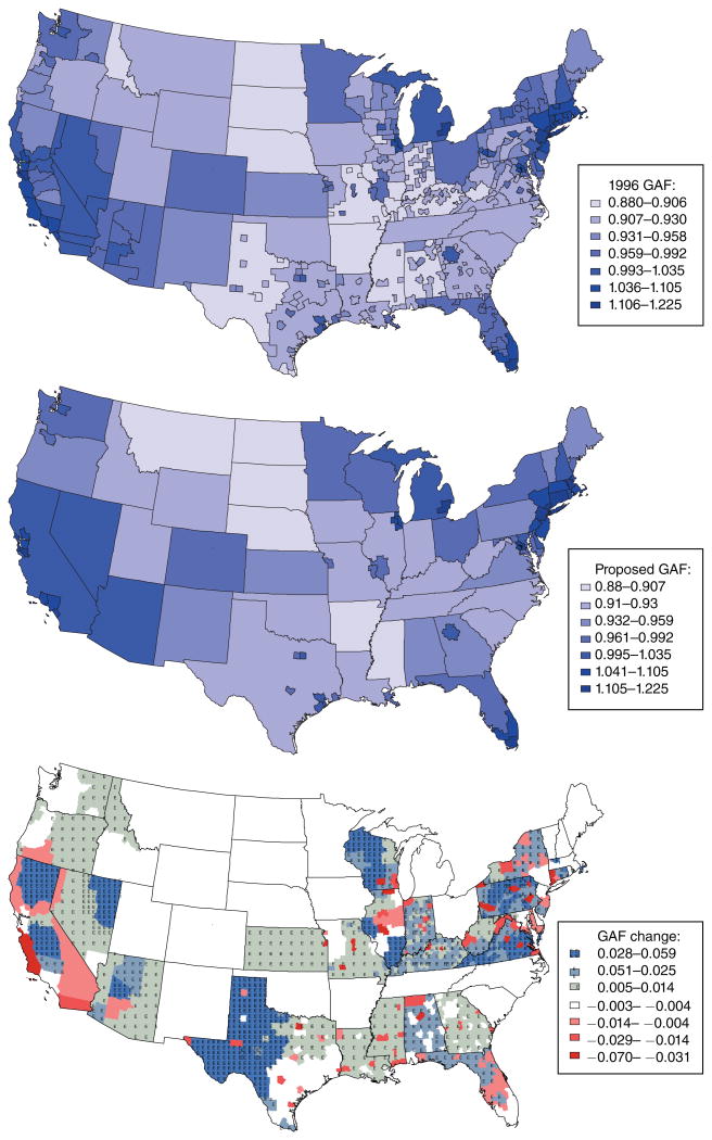
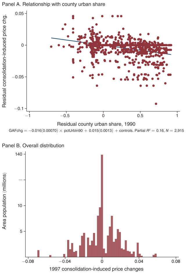
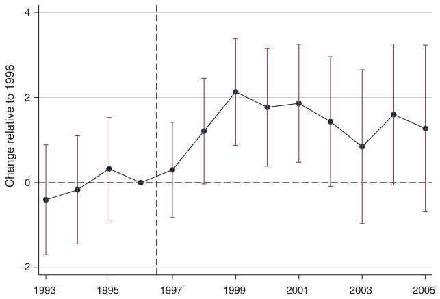
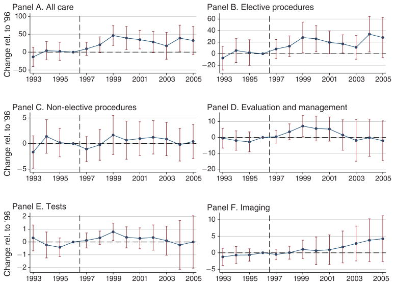
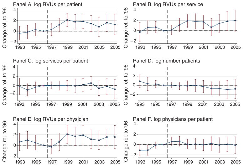
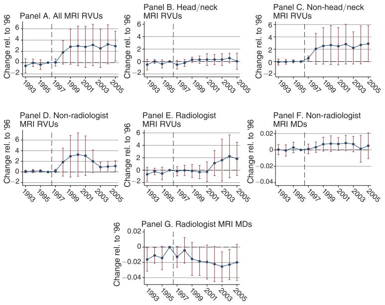
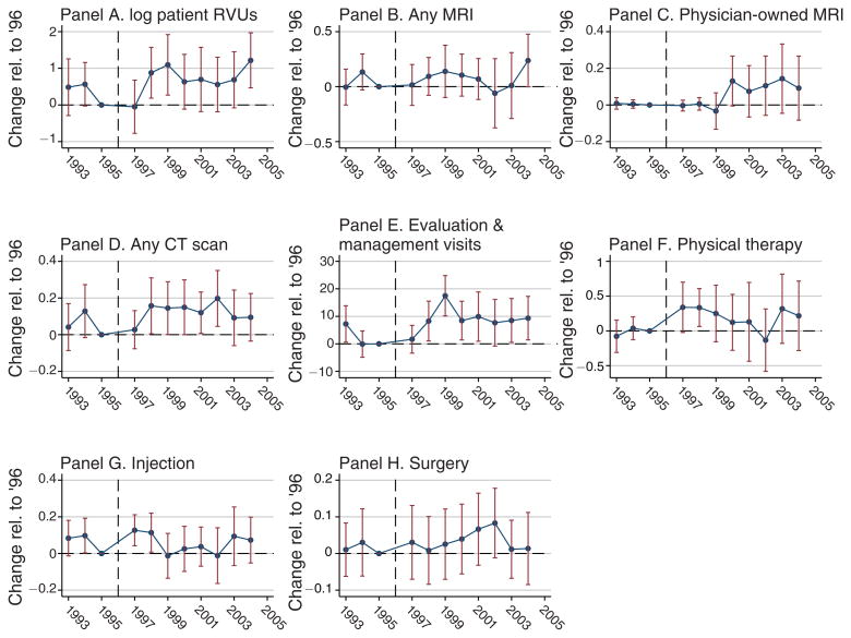
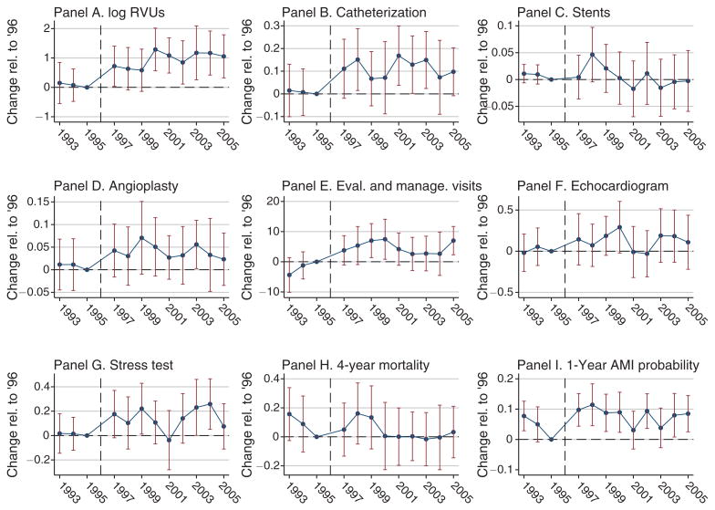
We investigate whether physicians' financial incentives influence health care supply, technology diffusion, and resulting patient outcomes. In 1997, Medicare consolidated the geographic regions across which it adjusts physician payments, generating area-specific price shocks. Areas with higher payment shocks experience significant increases in health care supply. On average, a 2 percent increase in payment rates leads to a 3 percent increase in care provision. Elective procedures such as cataract surgery respond much more strongly than less discretionary services. Non-radiologists expand their provision of MRIs, suggesting effects on technology adoption. We estimate economically small health impacts, albeit with limited precision.


Figures

Figure 1
Figure 1. Medicare Payment Areas
Notes: The first panel shows the 206 Medicare fee schedule areas in the continental United States as of 1996 and the second shows the 85 such localities after the consolidation in 1997. (These totals exclude Alaska, Hawaii, Puerto Rico, and the US Virgin Islands, each of which was its own unique locality throughout this period.) The colors indicate the Geographic Adjustment Factors (GAF) associated with each Payment Locality, with darker colors indicating higher reimbursement rates. The third panel shows the change in -GAF for each county due to the payment region consolidation that took place in 1997. Source: Federal Register, various issues.
Figure 2
Figure 2. Distribution of Consolidation-Induced Price Shocks
Notes: Panel A shows the relationship between the county-level changes in the Geographic Adjustment Factor (GAF) from Figure 1 and each county's urban population share in 1990, after controlling for state fixed effects. Letting i denote counties, s(i) each county's state, and ΔRRi the reimbursement rate change from Figure 1, we estimate: ΔRRi=ιs(i)+eiUrban Share(i)1990=κs(i)+ui across a cross section of counties. Panel A plots the residuals resulting from these regressions. Panel B shows the distribution of the county-level changes in the GAF, weighted by county population. Note that the y-axis scale has been adjusted at the high end to accommodate the large number of counties in states with no price change. Sources: Price change: Federal Register, various issues; county population: US Census.
Figure 3
Figure 3. Impact of Price Change on Aggregate Quantity Supplied
Notes: This figure shows coefficients and associated bootstrap standard errors from an ordinary least squares regression in which log health care quantity supplied per Medicare patient is the dependent variable. This quantity is regressed on reimbursement rate shocks resulting from the consolidation of Medicare's fee schedule areas in 1997, as interacted with indicator variables for each year. This regression is run at the payment area level after partialing out the controls listed below, as described in Section IB, and coefficients correspond to θp parameters in equation (3). The controls include county fixed effects, state-by-year effects, a set of year dummy variables interacted with each county's 1990 urban population share and an indicator for metropolitan status, as well as the fraction of beneficiaries aged 65–59, 70–74, 75–79, and 80–84, black, Hispanic, female, eligible for Medicare due to end-stage renal disease or due to disability, with 2 or more, 3 or more, 4 or more, and 6 or more comorbidities as defined by Elixhauser et al. (1998). Standard errors are calculated using the bootstrap method described in online Appendix B.1. Sources: Price change: Federal Register, various issues; Medicare claims data: Medicare Research Identifiable Files, 5 percent sample, described in Section IC; county population: Census Bureau.
Figure 4
Figure 4. Physicians' Production at Two Reimbursement Rates
Notes: This figure illustrates the effect of reimbursement rates change on physicians' threshold γ* for investing in intensive practice style. At a given reimbursement rate, whether rL or rH, more productive physicians (γ > γ*) invest in the intensive practice style, and quantity supplied is increasing with productivity γ. As shown in Proposition 1, an increase in reimbursement rates from rL to rH increases the quantity supplied for a physician with any fixed productivity γ, and also reduces the investment threshold γ*, meaning that more physicians invest. The increase in supply due to the threshold shift is labeled “Practice Style Adjustments.” The parameters underlying this calibration are given in online Appendix C.2.
Figure 5
Figure 5. Supply Response by Service Category
Notes: These graphs show coefficients and associated bootstrap standard errors from ordinary least squares regressions in which the quantities of health care supplied in different categories (as measured in Relative Value Units) are the dependent variables. These quantities are regressed on reimbursement rate shocks resulting from the consolidation of Medicare's fee schedule areas in 1997, as interacted with indicator variables for each year. These regressions are run at the payment area level after partialing out the following controls, as described in Section IB, and coefficients correspond to θp parameters in equation (3): county fixed effects, state-by-year effects, a set of year dummy variables interacted with each county's 1990 urban population share and an indicator for metropolitan status, the fraction of beneficiaries aged 65–59, 70–74, 75–79, and 80–84, black, Hispanic, female, eligible for Medicare due to end-stage renal disease or due to disability, with 2 or more, 3 or more, 4 or more, and 6 or more comorbidities as defined by Elixhauser et al. (1998). Standard errors are calculated with the bootstrap from online Appendix B.1. Sources: Price change: Federal Register, various issues; Medicare claims data: Medicare Research Identifiable Files, 5 percent sample, described in Section IC; demographics: Ruggles et al. (2010).
Figure 6
Figure 6. Potential Margins of Response
Notes: These graphs show coefficients and associated bootstrap standard errors from ordinary least squares regressions in which different aspects of health care supply are the dependent variable. These quantities are regressed on reimbursement rate shocks resulting from the consolidation of Medicare's fee schedule areas in 1997, as interacted with indicator variables for each year. These regressions are run at the payment area level after partialing out the following controls, as described in Section IB, and coefficients correspond to θp parameters in equation (3): county fixed effects, state-by-year effects, a set of year dummy variables interacted with each county's 1990 urban population share and an indicator for metropolitan status, the fraction of beneficiaries aged 65–59, 70–74, 75–79, and 80–84, black, Hispanic, female, eligible for Medicare due to end-stage renal disease or due to disability, with 2 or more, 3 or more, 4 or more, and 6 or more comorbidities as defined by Elixhauser et al. (1998). Standard errors are calculated with the bootstrap from online Appendix B.1. Sources: Price change: Federal Register, various issues; Medicare claims data: Medicare Research Identifiable Files, 5 percent sample, described in Section IC; demographics: Ruggles et al. (2010).
Figure 7
Figure 7. Impact of Price Change on MRI Provision and Ownership
Notes: These graphs show coefficients from ordinary least squares regressions in which the dependent variables are related to the provision of magnetic resonance imaging (MRI) services to Medicare beneficiaries. In columns 1 through 5 provision is measured in terms of Relative Value Units per patient. In panel A this represents total MRI-related RVUs. In panels B and C the total is divided into those associated with MRIs to the head/neck region and all other MRIs. In panels D and E the total is divided into those provided by non-radiologists and those provided by radiologists. Non-radiologist physician ownership of MRI imaging is defined in Section VB, following the method outlined in Baker (2010). In panels F and G the dependent variables are measures of the numbers of non-radiologist and radiologist MDs associated with these services. These variables are regressed on reimbursement rate shocks resulting from the consolidation of Medicare's fee schedule areas in 1997, as interacted with indicators for time relative to the payment area consolidation. These regressions are run at the payment area level after partialing out the following controls, as described in Section IB: county fixed effects, state-by-year effects, a set of year dummy variables interacted with the county's 1990 urban population share and an indicator for metropolitan status, the fraction of the county's sample beneficiary pool aged 65–59, 70–74, 75–79, and 80–84, the fraction black, Hispanic, female, eligible for Medicare due to end-stage renal disease or due to disability, and the share of beneficiaries with 2 or more, 3 or more, 4 or more, and 6 or more comorbidities as defined by Elixhauser et al. (1998). Standard errors are calculated with the bootstrap from online Appendix B.1. Sources: Price change: Federal Register, various issues; Medicare claims data: Medicare Research Identifiable Files, 5 percent sample, described in Section IC; demographics: Ruggles et al. (2010).
Figure 8
Figure 8. Impact of Price Change on Back Pain Treatment
Notes: These graphs show coefficients from regressions in which the treatment received by each Medicare patient in the back pain cohorts defined in online Appendix D.1 are the dependent variables. The sample is restricted to patients living in counties that satisfy our matching criterion, as described in the text (the results are essentially unchanged when we include the complete cohort defined in online Appendix D.1). The dependent variables are expressed as indicators for having received a given treatment at least once in the year after diagnosis, with the exception of panel E, which is a count of office visits. Panel C is conditional on having some MRI taken during the year following diagnosis; all other columns include the entire cohort. These variables are regressed on reimbursement rate shocks resulting from the consolidation of Medicare's fee schedule areas in 1997, in the county where the patient was first diagnosed, as interacted with indicators for time relative to the payment area consolidation. All specifications control for county fixed effects, state-by-year effects, a set of year dummy variables interacted with an indicator whether the patient resides in a metropolitan area, and indicators for the patient's age, race, gender, and whether or not the individual was eligible for Medicare due to end-stage renal disease. The results are robust to controlling additionally for each patient's health as proxied for by a set of indicators for having the individual comorbidities defined by Elixhauser et al. (1998), as well as having 2 or more, 3 or more, 4 or more, and 6 or more comorbidities. Standard errors are clustered by pre-consolidation payment area. Sources: Price change: Federal Register, various issues; Medicare claims data: Medicare Research Identifiable Files, 5 percent sample, described in Section IC; county demographics: Ruggles et al. (2010).
Figure 9
Figure 9. Impact of Price Change on Cardiac Patient Treatment
Notes: These graphs show coefficients from ordinary least squares regressions in which the treatments received by patients with cardiovascular disease are the dependent variables. The sample is restricted to patients living in counties that satisfy our matching criterion, as described in the text (the results are essentially unchanged when we include the complete cohort defined in online Appendix D.1). The dependent variable in panel A is total quantity of care, expressed in logs, and in panels B through F they are indicators for receiving the relevant treatment in the year after diagnosis (excepting physician visits, reported in panel E, which are expressed as counts). The outcomes in panels G and H are health outcomes, with panel G corresponding to 4-year mortality and panel H corresponding to 1-year admission to the hospital with a heart attack diagnosis. These quantities, measured for each patient, are regressed on the reimbursement rate shocks resulting from the consolidation of Medicare's fee schedule areas in 1997, in the county where the patient was first diagnosed, as interacted with indicators for time relative to the payment area consolidation. All specifications control for county fixed effects, state-by-year effects, a set of year dummy variables interacted with an indicator whether the patient resides in a metropolitan area, and indicators for the patient's age, race, gender, and whether or not the individual was eligible for Medicare due to end-stage renal disease. The results are robust to controlling additionally for each patient's health as proxied for by a set of indicators for having the individual comorbidities defined by Elixhauser et al. (1998), as well as having 2 or more, 3 or more, 4 or more, and 6 or more comorbidities. Standard errors are clustered by pre-consolidation payment area. Sources: Price change: Federal Register, various issues; Medicare claims data: Medicare Research Identifiable Files, 5 percent sample, described in Section IC; county demographics: Ruggles et al. (2010).

References

    1. Acemoglu Daron, Finkelstein Amy. Input and Technology Choices in Regulated Industries: Evidence from the Health Care Sector. Journal of Political Economy. 2008;116(5):837–80.
    1. Acemoglu Daron, Linn Joshua. Market Size in Innovation: Theory and Evidence from the Pharmaceutical Industry. Quarterly Journal of Economics. 2004;119(3):1049–90.
    1. Afendulis ChristopherC, Kessler DanielP. Tradeoffs from Integrating Diagnosis and Treatment in Markets for Health Care. American Economic Review. 2007;97(3):1013–20. - PMC - PubMed
    1. Arrow Kenneth J. Uncertainty and the Welfare Economics of Medical Care. American Economic Review. 1963;53(5):941–73.
    1. Arrow KennethJ, Auerbach Alan, Bertko John, Shannon Brownlee, Casalino LawrenceP, Cooper Jim, Crosson FrancisJ, et al. Toward a 21st-Century Health Care System: Recommendations for Health Care Reform. Annals of Internal Medicine. 2009;150(7):493–95. - PubMed

MeSH terms

LinkOut - more resources