Review
. 2014 Nov;76(5):633-42.
doi: 10.1002/ana.24282. Epub 2014 Oct 14.

Precision medicine in chronic disease management: The multiple sclerosis BioScreen

Affiliations
Review

Precision medicine in chronic disease management: The multiple sclerosis BioScreen

Pierre-Antoine Gourraud et al. Ann Neurol. 2014 Nov.

Abstract

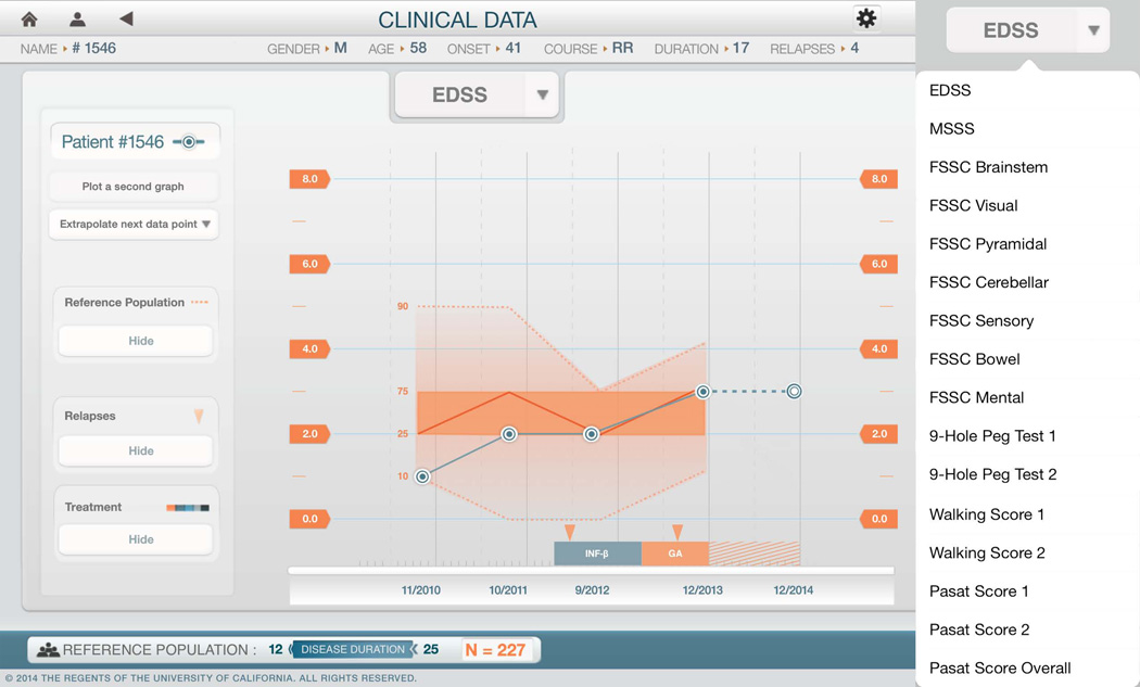
We present a precision medicine application developed for multiple sclerosis (MS): the MS BioScreen. This new tool addresses the challenges of dynamic management of a complex chronic disease; the interaction of clinicians and patients with such a tool illustrates the extent to which translational digital medicine-that is, the application of information technology to medicine-has the potential to radically transform medical practice. We introduce 3 key evolutionary phases in displaying data to health care providers, patients, and researchers: visualization (accessing data), contextualization (understanding the data), and actionable interpretation (real-time use of the data to assist decision making). Together, these form the stepping stones that are expected to accelerate standardization of data across platforms, promote evidence-based medicine, support shared decision making, and ultimately lead to improved outcomes.


Conflict of interest statement

Conflict of Interest Statements

Dr. Cree has received personal compensation for consulting from Abbvie, Biogen Idec, EMD Serono, Genzyme/Sanofi Aventis, MedImmune, Novartis and Teva Neurosciences and has received contracted research support (including clinical trials) from Acorda, Avanir, Biogen Idec, EMD Serono, Hoffman La Roche and Novartis. Dr. Green serves on Scientific Advisory Board (SAB) for Bionure and for Inception 5; he has served on committees for studies sponsored by Biogen, Medimmune and Novartis, and has served as a consultant for Mylan Pharma, Novartis, Accorda, Prana Pharma and Roche including expert witness work for Mylan. Dr. Gelfand has received compensation for medical legal consulting related to CNS inflammatory disease. Dr. Graves has served as a one-time ad hoc consultant for EMD-Serono.. Dr. Hauser has in the past served on the SAB for BioMarin and Receptos, and currently serves on the SAB of Symbiotix and Bionure. Dr Zamvil has served as a consultant and received honoraria from Biogen-Idec, EMD-Serono, Genzyme, Novartis, Questcor, Roche, and Teva Pharmaceuticals, Inc., and has served or serves on Data Safety Monitoring Boards for Lilly, BioMS, Teva and Opexa Therapeutics.

Figures

Figure 1
Figure 1. MS BioScreen prototype application: image capture from the overview screen illustrating an individual patient’s data presented in anonymous mode
The initial layer of the application is a visualization of an individual’s overall health information, providing a gateway to the full complement of accessible data. This view introduces the defining characteristics of the patient and the disease course: name, gender, age, disease onset, disease course, duration, and relapses on the top bar. It is otherwise organized by data type with clinical information (clinical presentation over time, treatments and attacks) displayed in the panels on the right, and imaging and biomarker data (including MS genetic risk markers) on the left. Figure 1 is displayed in anonymous mode. Copyright Regents of the University of California, all rights reserved.
Figure 2
Figure 2. A four panel view of a T2 weighted brain MRI image with cortical thickness z-score color overlay
MRI images are presented in a four-panel interactive display. Each panel can be manipulated manually to change planes and zoom in on a particular area. The cursor indicates the voxel used to display the quantification the cortical thickness presented as z-score compared with healthy age and gender matched controls (n=33). Color overlay represents the number of standard deviations from normative values in the considered region (-3 s.d. red. + 3 s.d. blue). Displayed in anonymous mode, copyright the Regents of the University of California, all rights reserved.
Figure 3
Figure 3. Implementation of time-dimension in imaging visualization
This screen capture illustrates, over a period of 6 years, the development and evolution of an MS lesion in the right frontal cortex. The left panel presents the series of exams and the number in red indicates the one on display. The figure represents axial views of a T1 weighted image. The cursor locates the voxel used to display quantification of the apparent myelin weighted map computed from a ratio of T1-weighted and T2-weighted volumes. Color overlay represents the range of the apparent myelin weighted metric. Displayed in anonymous mode, copyright Regents of the University of California, all rights reserved.
Figure 4
Figure 4. Contextualized representation of annual brain volume loss
This figure illustrates one subject’s loss of brain volume over time utilizing the SIENA program, computed from the images presented in Figure 2. Each blue data point in the central panel represents a computed value derived from the annual MRI examination relative to baseline, and these data points are connected to estimate the trajectory of brain atrophy progression over time. The various metrics available are shown in the right side panel. The orange background is computed from a reference group of 275 patients with similar disease duration. The solid orange line represents the median brain volume loss over time for the reference group; the darker orange area delimits the 25th and 75th percentiles; the 5th and 95th percentiles appear as light orange background lines. Similar to a simple growth chart used to monitor the weight and height of children, this representation enables an intuitive visualization of the trajectory of change for an individual patient compared to a peer reference group. By clicking on the blue bar at the bottom right, an additional screen (not shown) enables the user to refine the characteristics of the reference population used for comparison. Displayed in anonymous mode, copyright Regents of the University of California, all rights reserved.
Figure 5
Figure 5. Contextualized representation of the trajectory of clinical impairment
This screen capture illustrates the evolution of the EDSS score of an individual subject (dashed blue line) in the context of the percentile distribution (orange background) derived from a reference cohort of 227 patients with similar clinical characteristics. At each time point, the 5th, 25th, 50th, 75th, and 95th percentiles of the EDSS score is shown for the reference group. The various metrics available are shown in the right side panel. In addition, a prediction of the EDSS outcome for the patient one year into the future is shown based on the assumption that current treatment with GA continues, and derived from longer-term follow-up data drawn from the reference group. Displayed in anonymous mode, copyright Regents of the University of California, all rights reserved.
Figure 6
Figure 6. Display of biomarker information and contextualized representation of aggregated genetic risk scores
The left panel shows current values for various types of laboratory and biomarker information relevant to MS, including: typing for the disease-associated HLA-DRB1*15:01 allele, value of the Multiple Sclerosis Genetic Burden Score (MSGB) with and without the contribution of the MHC region; Vitamin D3; Vitamin B12; Tob1 gene expression; and cerebrospinal fluid analyses. In the right panel, the MSGB score was computed based on a weighted scoring algorithm using independent 64 SNPs associated with MS risk. Similar to Figures 4 and 5, the orange boxplot display the 5th, 25th, 50th, 75th, and 95th percentiles of the distribution of the score in the reference population is indicated in the bottom blue bar. Displayed in anonymous mode, copyright Regents of the University of California, all rights reserved.

References

    1. Topol EJ. Transforming medicine via digital innovation. Science translational medicine. 2010;2(16):16cm4. - PMC - PubMed
    1. Powsner SM, Tufte ER. Graphical summary of patient status. Lancet. 1994;344(8919):386–389. - PubMed
    1. Hood L, Heath JR, Phelps ME, Lin B. Systems biology and new technologies enable predictive and preventative medicine. Science. 2004;306(5696):640–643. - PubMed
    1. Yang JY, Yang MQ, Arabnia HR, Deng Y. Genomics, molecular imaging, bioinformatics, and bio-nano-info integration are synergistic components of translational medicine and personalized healthcare research. BMC genomics. 2008;9(Suppl 2):I1. - PMC - PubMed
    1. Steinhubl SR, Muse ED, Topol EJ. Can Mobile Health Technologies Transform Health Care? JAMA : the journal of the American Medical Association. 2013 - PubMed

Publication types