. 2014 Nov;9(11):2643-62.
doi: 10.1038/nprot.2014.174. Epub 2014 Oct 16.

Illumina human exome genotyping array clustering and quality control

Affiliations

Illumina human exome genotyping array clustering and quality control

Yan Guo et al. Nat Protoc. 2014 Nov.

Abstract

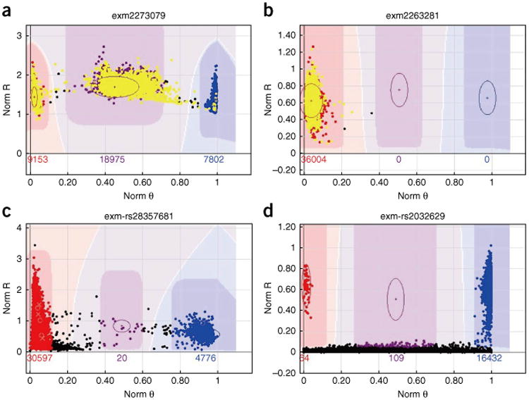
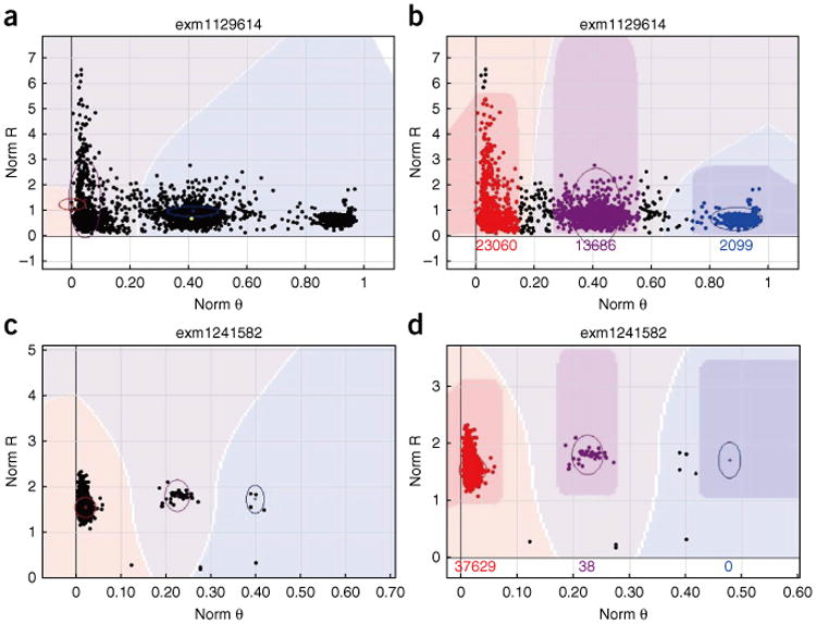
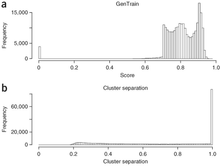
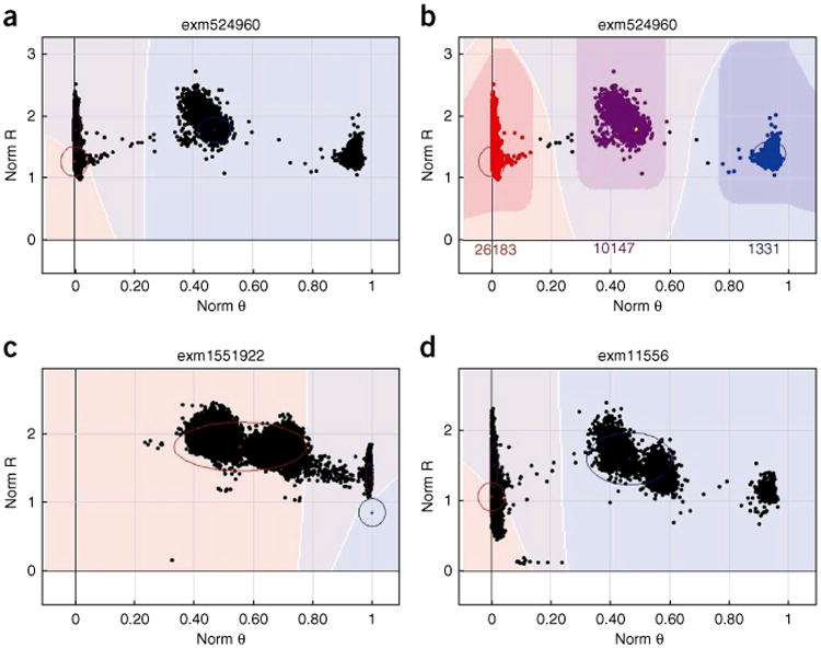
With the rise of high-throughput sequencing technology, traditional genotyping arrays are gradually being replaced by sequencing technology. Against this trend, Illumina has introduced an exome genotyping array that provides an alternative approach to sequencing, especially suited to large-scale genome-wide association studies (GWASs). The exome genotyping array targets the exome plus rare single-nucleotide polymorphisms (SNPs), a feature that makes it substantially more challenging to process than previous genotyping arrays that targeted common SNPs. Researchers have struggled to generate a reliable protocol for processing exome genotyping array data. The Vanderbilt Epidemiology Center, in cooperation with Vanderbilt Technologies for Advanced Genomics Analysis and Research Design (VANGARD), has developed a thorough exome chip-processing protocol. The protocol was developed during the processing of several large exome genotyping array-based studies, which included over 60,000 participants combined. The protocol described herein contains detailed clustering techniques and robust quality control procedures, and it can benefit future exome genotyping array-based GWASs.


Figures

Figure 1
Figure 1
Examples of low-quality clusters for the haploid genomes described in Steps 7–22. The x axis denotes normalized θ, which represents the angle of deviation from the pure A signal, where 0 denotes a pure A signal and 1.0 denotes a pure B signal. The y axis denotes normalized R representing the intensity of the B allele. The color configuration for the clusters is defined as follows: red = AA, purple = AB, blue = BB and black = no call. The number reported above the x axis denotes the number of participants included in the corresponding cluster. Male SNPs are denoted in yellow; all non-yellow dots denote female SNPs. (a) An example of a low-quality chromosome X cluster, in which male SNPs should not appear in the AB cluster. (b) An example of a low-quality chromosome Y cluster, in which female SNPs should not be called. (c) An example of heteroplasmy in mitochondria, where normally only AA and BB clusters should be called. (d) An example of a low-quality cluster caused by the vertical position of the AB cluster oval. The AB cluster oval is too low, which caused some samples to be called as the AB genotype.
Figure 2
Figure 2
Example clusters relevant to Steps 23–25. The x and y axes are denoted as in Figure 1. (a) GenomeStudio cannot make a correct call on this SNP, as the AA and AB cluster oval overlap results in a very low GenTrain score. (b) This SNP can be correctly called by manually adjusting the cluster ovals’ positions. (c) The AB and BB clusters are too close to each other, causing this SNP to be a no call. (d) By moving the BB cluster oval to the right, the AA and AB clusters are successfully called, but the BB cluster is sacrificed.
Figure 3
Figure 3
General distribution of the basic quality control (QC) parameters. (a) Distribution of GenTrain score after QC. (b) Distribution of cluster separation after QC.
Figure 4
Figure 4
Example clusters relevant to Steps 26 and 27. The x and y axes are denoted as in Figure 1. (a) Three clusters are obviously identifiable; however, GenomeStudio is not able to make a correct call. AA and AB cluster overlap, which results in a very small cluster separation. (b) The situation in A can be easily fixed by manually re-positioning the cluster ovals. (c) Low cluster separation score caused by two very closely located clusters. (d) Low cluster separation score caused by four clusters being present rather than three.
Figure 5
Figure 5
Example clusters relevant to Steps 28–30. The x and y axes are denoted as in Figure 1. (a) The small ‘x’ indicates P-P-C error (also marked with red line by us for clear viewing). This SNP has good GenTrain and cluster separation scores. However, a few P-P-C errors are introduced owing to the lower BB cluster tail being called as AB. (b) The problem highlighted in a can be fixed by moving the AB cluster oval up. (c) Another example of P-P-C errors introduced by inaccurate clustering of the AB cluster. (d) The P-P-C errors highlighted in c are fixed by narrowing the AB cluster oval.
Figure 6
Figure 6
Example clusters relevant to Step 34A. The x and y axes are denoted as in Figure 1. (a) This SNP is recalled by zCall. zCall called two samples (on the very right of the AB cluster) as AB genotype. These two samples should be left as no call or BB cluster. (b) zCall is able to capture partially the AB cluster of this SNP, while still missing half the samples that should be in AB.
Figure 7
Figure 7
Example clusters relevant to Steps 38 and 39 of the PROCEDURE. Chr denotes chromosome. (a) Distribution of chromosome X inbreeding estimate for males. Inbreeding estimates should be close to 1 for males; some outliers are visible near 0 in a. (b) Distribution of chromosome X inbreeding estimate for females. Inbreeding estimates should be in the range of −0.4 to 0.4; some outliers are visible near 1.
Figure 8
Figure 8
Example clusters relevant to Steps 40–43. The x axis denotes the first component of the PCA and the y axis denotes the second component of the PCA. (a) Scatter plot of first and second principal components for 1000 Genomes Project data. ASN, EUR, AFR and AMR denote East Asian, European, African and admixed American ancestry, respectively. (b) Example scatter plot of the first and second principal components using the example exome chip data batch 2.
Figure 9
Figure 9
Distribution of HWE and heterozygosity rates relevant to Steps 46–50. (a) HWE test P value distribution. Note that the majority of the SNPs have P values near 1, and a minority of the SNPs have very low P values. There are P values spread out between 0 and 1, but they are not easily visible owing to their small numbers on the histogram. (b) Heterozygosity rate distribution of example data batch 2. The majority of the samples should be in the range of 0.35–0.45.
Figure 10
Figure 10
Example clusters relevant to the PLINK-related Steps 53–56. The x axis denotes the allele frequencies computed from example exome chip SNP data, and the y axis denotes the allele frequencies of the same alleles computed from the 1000 Genomes Project SNP data. (a) Scatter plot of allele frequency between the 1000 Genomes Project data and the example exome chip data for individuals of European ancestry. (b) Scatter plot of the allele frequency between the 1000 Genomes Project data and the example exome chip data for individuals of African ancestry. The outliers (defined as abs(xy) >50%) should be checked.
Figure 11
Figure 11
Example clusters relevant to the PLINK-related Steps 53–56. The x and y axes are denoted as in Figure 1. (a) This SNP showed zero MAF in the exome chip but the same SNP showed high MAF in the 1000 Genomes Project data. Although the exact reason for this discrepancy is not known, we recommend removing this SNP for cautionary purposes. (b) Mitochondrial SNP at position 3010, which is a known heteroplasmy site. Both AA and BB clusters should be presented. However, in the 1000 Genomes Project data, only one genotype is presented. In this case, it is more likely that the 1000 Genomes Project made an incorrect call.
Figure 12
Figure 12
Example clusters relevant to the PLINK-related Step 57. (a) Correlation matrix of allele frequency consistency between batches for individuals with European ancestry. (b) Correlation matrix of allele frequency consistency between batches for individuals with African ancestry. A higher correlation indicates a lower batch effect.

References

    1. Samuels DC, et al. Finding the lost treasures in exome sequencing data. Trends Genet. 2013;29:593–599. - PMC - PubMed
    1. Guo Y, et al. Exome sequencing generates high quality data in non-target regions. BMC Genomics. 2012;13:194. - PMC - PubMed
    1. Abecasis Lab. Exome Chip Design Wiki Site. http://genome.sph.umich.edu/wiki/Exome_Chip_Design.
    1. Szatkiewicz JP, et al. Detecting large copy number variants using exome genotyping arrays in a large Swedish schizophrenia sample. Mol Psychiatry. 2013;18:1178–1184. - PMC - PubMed
    1. Huyghe JR, et al. Exome array analysis identifes new loci and low-frequency variants influencing insulin processing and secretion. Nat Genet. 2013;45:197–201. - PMC - PubMed

Publication types

LinkOut - more resources