

Innovative information visualization of electronic health record data: a systematic review
- PMID: 25336597
- PMCID: PMC4394966
- DOI: 10.1136/amiajnl-2014-002955
Innovative information visualization of electronic health record data: a systematic review
Abstract
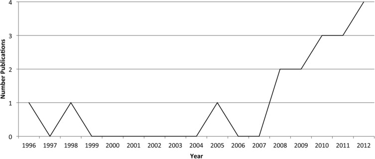
Objective: This study investigates the use of visualization techniques reported between 1996 and 2013 and evaluates innovative approaches to information visualization of electronic health record (EHR) data for knowledge discovery.
Methods: An electronic literature search was conducted May-July 2013 using MEDLINE and Web of Knowledge, supplemented by citation searching, gray literature searching, and reference list reviews. General search terms were used to assure a comprehensive document search.
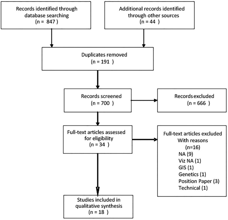
Results: Beginning with 891 articles, the number of articles was reduced by eliminating 191 duplicates. A matrix was developed for categorizing all abstracts and to assist with determining those to be excluded for review. Eighteen articles were included in the final analysis.
Discussion: Several visualization techniques have been extensively researched. The most mature system is LifeLines and its applications as LifeLines2, EventFlow, and LifeFlow. Initially, research focused on records from a single patient and visualization of the complex data related to one patient. Since 2010, the techniques under investigation are for use with large numbers of patient records and events. Most are linear and allow interaction through scaling and zooming to resize. Color, density, and filter techniques are commonly used for visualization.
Conclusions: With the burgeoning increase in the amount of electronic healthcare data, the potential for knowledge discovery is significant if data are managed in innovative and effective ways. We identify challenges discovered by previous EHR visualization research, which will help researchers who seek to design and improve visualization techniques.
Keywords: Electronic Health Records; Health care data; Information visualization; Systematic review.
© The Author 2014. Published by Oxford University Press on behalf of the American Medical Informatics Association.
Figures
References
-
- Bush GW; Office of the Press Secretary, the White House. Executive Order: Incentives for the Use of Health Information Technology and Establishing the Position of the National Health Information Technology Coordinator. Press release, April 27, 2004. http://www.whitehouse.gov/news/releases/2004/04/print/20040427-4.html2004. Accessed July 23, 2013.
-
- Bush GW. State of the Union Address, Promoting Innovation and Competitiveness, President Bush's Technology Agenda 2004.
-
- Data Show Electronic Health Records Empower Patients and Equip Doctors. Press release, July 17, 2013. http://www.cms.gov/Newsroom/MediaReleaseDatabase/Press-Releases/2013-Pre.... Accessed July 23, 2013.
-
- Spence I. William Playfair and the psychology of graphs. American Statistical Association JSM Proceedings; 2006:2426–2436.
-
- Playfair W. The statistical breviary; shewing, on a principle entirely new, the resources of every state and kingdom in Europe; illustrated with stained copper plate charts, representing the physical powers of each distinct nation with ease and perspicuity. To which is added, a similar exhibition of the ruling powers of Hindoostan London: J Wallis, 1801.
Publication types
MeSH terms
LinkOut - more resources
Full Text Sources
Other Literature Sources
