

Dissecting the phenotypic components of crop plant growth and drought responses based on high-throughput image analysis
- PMID: 25501589
- PMCID: PMC4311194
- DOI: 10.1105/tpc.114.129601
Dissecting the phenotypic components of crop plant growth and drought responses based on high-throughput image analysis
Abstract
Significantly improved crop varieties are urgently needed to feed the rapidly growing human population under changing climates. While genome sequence information and excellent genomic tools are in place for major crop species, the systematic quantification of phenotypic traits or components thereof in a high-throughput fashion remains an enormous challenge. In order to help bridge the genotype to phenotype gap, we developed a comprehensive framework for high-throughput phenotype data analysis in plants, which enables the extraction of an extensive list of phenotypic traits from nondestructive plant imaging over time. As a proof of concept, we investigated the phenotypic components of the drought responses of 18 different barley (Hordeum vulgare) cultivars during vegetative growth. We analyzed dynamic properties of trait expression over growth time based on 54 representative phenotypic features. The data are highly valuable to understand plant development and to further quantify growth and crop performance features. We tested various growth models to predict plant biomass accumulation and identified several relevant parameters that support biological interpretation of plant growth and stress tolerance. These image-based traits and model-derived parameters are promising for subsequent genetic mapping to uncover the genetic basis of complex agronomic traits. Taken together, we anticipate that the analytical framework and analysis results presented here will be useful to advance our views of phenotypic trait components underlying plant development and their responses to environmental cues.
© 2014 American Society of Plant Biologists. All rights reserved.
Figures
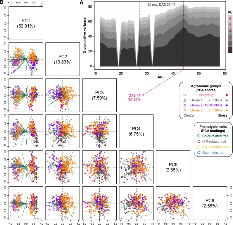
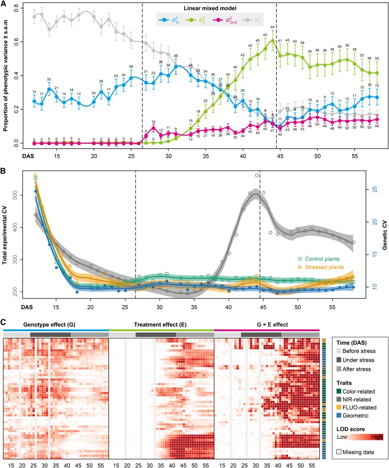
 is confounded with
  . Filled circles represent average variance of each component computed over all traits, and solid lines represent a smoothing spline fit to the supplied data. Error bars represent the
References
-
- Arvidsson S., Pérez-Rodríguez P., Mueller-Roeber B. (2011). A growth phenotyping pipeline for Arabidopsis thaliana integrating image analysis and rosette area modeling for robust quantification of genotype effects. New Phytol. 191: 895–907. - PubMed
-
- Aulchenko Y.S., Ripke S., Isaacs A., van Duijn C.M. (2007). GenABEL: an R library for genome-wide association analysis. Bioinformatics 23: 1294–1296. - PubMed
-
- Baker N.R. (2008). Chlorophyll fluorescence: a probe of photosynthesis in vivo. Annu. Rev. Plant Biol. 59: 89–113. - PubMed
-
- Benjamini Y., Hochberg Y. (1995). Controlling the false discovery rate: a practical and powerful approach to multiple testing. J. R. Stat. Soc. B 57: 289–300.
Publication types
MeSH terms
Substances
LinkOut - more resources
Full Text Sources
Other Literature Sources
Miscellaneous
