

doi: 10.1534/genetics.114.172742.
Epub 2014 Dec 18.
R/qtlcharts: interactive graphics for quantitative trait locus mapping
Affiliations
- PMID: 25527287
- PMCID: PMC4317647
- DOI: 10.1534/genetics.114.172742
Item in Clipboard
R/qtlcharts: interactive graphics for quantitative trait locus mapping
Genetics.
2015 Feb.
Abstract
Every data visualization can be improved with some level of interactivity. Interactive graphics hold particular promise for the exploration of high-dimensional data. R/qtlcharts is an R package to create interactive graphics for experiments to map quantitative trait loci (QTL) (genetic loci that influence quantitative traits). R/qtlcharts serves as a companion to the R/qtl package, providing interactive versions of R/qtl's static graphs, as well as additional interactive graphs for the exploration of high-dimensional genotype and phenotype data.
Keywords: D3; QTL; data visualization; software.
Copyright © 2015 by the Genetics Society of America.
Figures
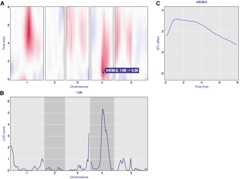
A static view of an interactive graph for QTL analysis with a phenotype measured over time, with data from Moore et al. (2013) concerning root gravitropism in Arabidopsis recombinant inbred lines (RIL), Ler × Cvi. (A) Heat map of signed LOD scores for single-QTL analysis at each individual time point. Red indicates that RIL with the Cvi allele have a larger average phenotype; blue indicates that RIL with the Ler allele have a larger average phenotype. A is linked to B and C: when hovering over the heat map, the LOD curves for the corresponding time point are shown below in B, and the estimated QTL effect, as a function of time, is shown to the right in C. For the interactive version of this figure, see http://kbroman.org/qtlcharts/example .
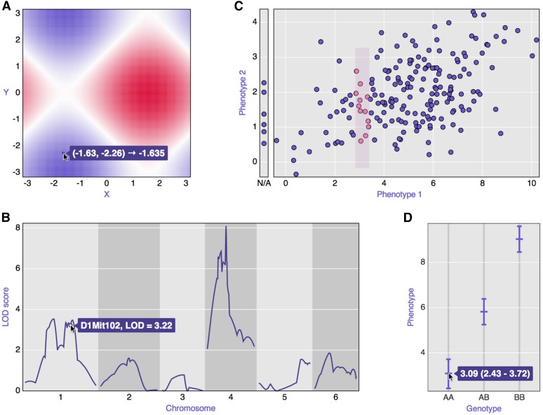
Examples of the basic panels that form the core of R/qtlcharts. (A) Heat map; (B) LOD curves; (C) scatterplot; (D) a set of confidence intervals.
References
-
- Becker R. A., Cleveland W. S., 1987. Brushing scatterplots. Technometrics 29: 127–142.
-
- Bostock M., Ogievetsky V., Heer J., 2011. D3: data-driven documents. IEEE Trans. Vis. Comp. Graph. 17: 2301–2309. - PubMed
-
- Broman K. W., Wu H., Sen S., Churchill G. A., 2003. R/qtl: QTL mapping in experimental crosses. Bioinformatics 19: 889–890. - PubMed
-
- Knuth D. E., 1984. Literate programming. Comput. J. 27: 97–111.
Publication types
MeSH terms
Grants and funding
LinkOut - more resources
Full Text Sources
Other Literature Sources
