. 2014 Dec 1;8(3):S611-30.
doi: 10.4081/gh.2014.292.

Estimating the global abundance of ground level presence of particulate matter (PM2.5)

Affiliations

Estimating the global abundance of ground level presence of particulate matter (PM2.5)

David J Lary et al. Geospat Health. .

Abstract

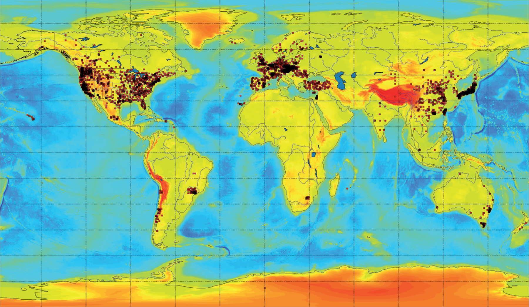
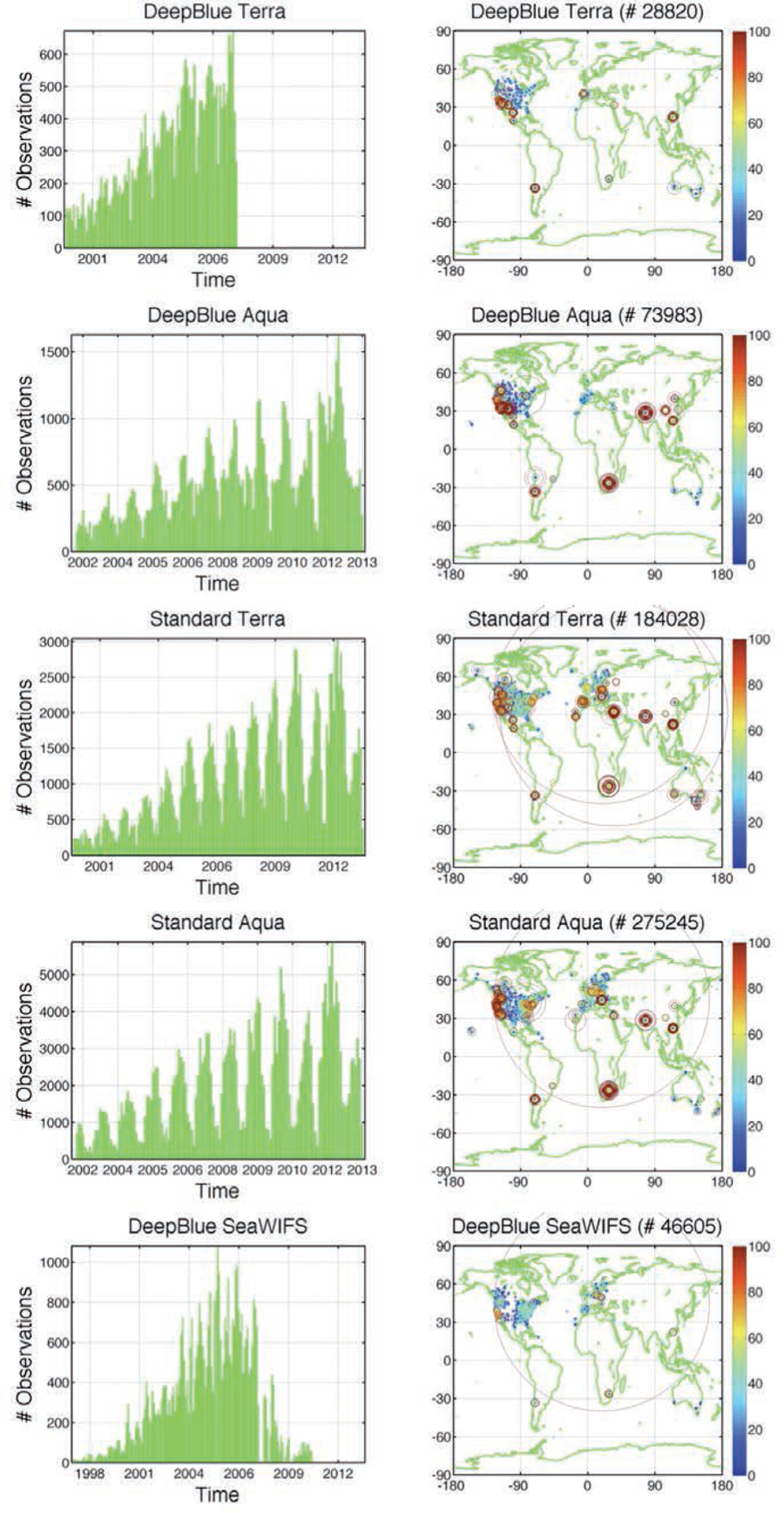
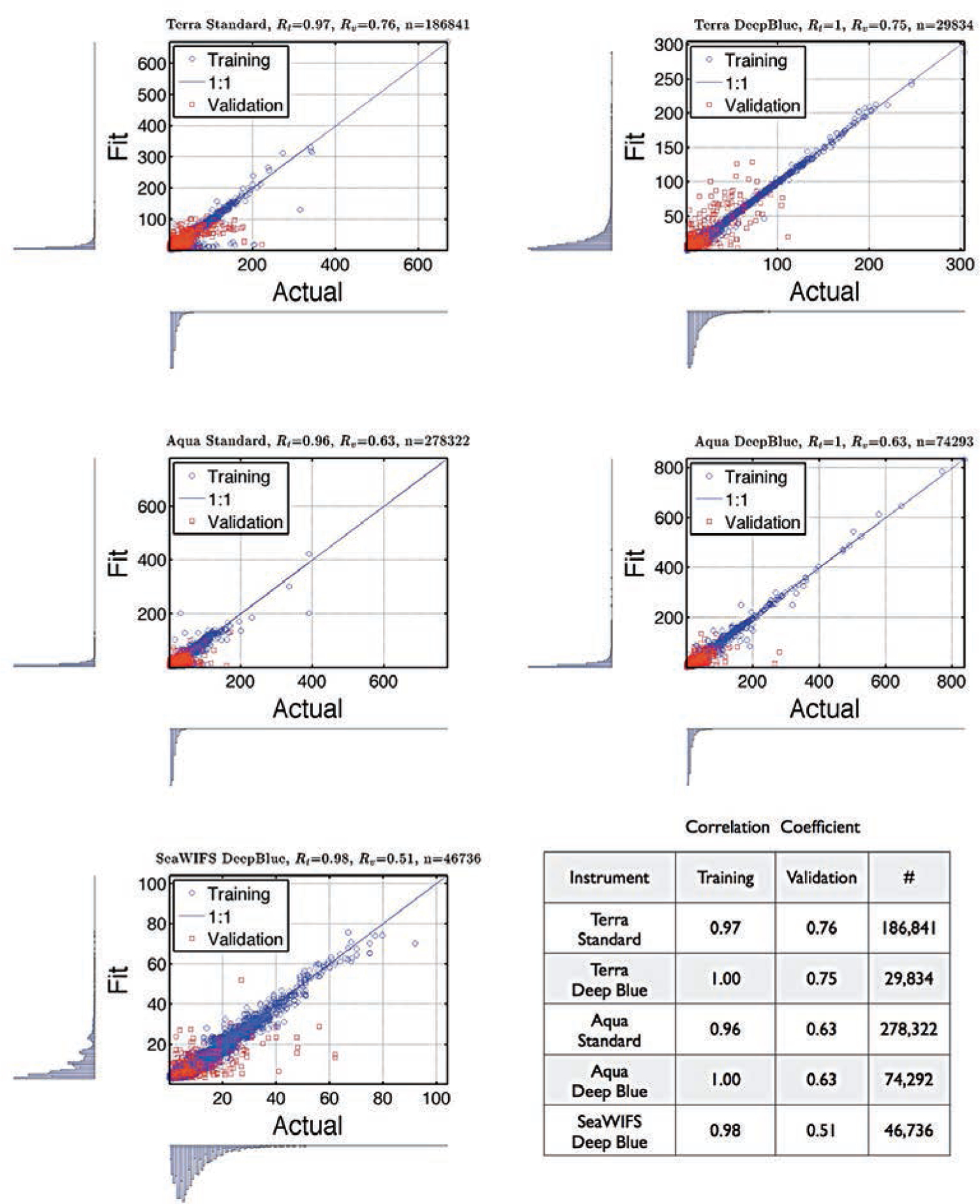
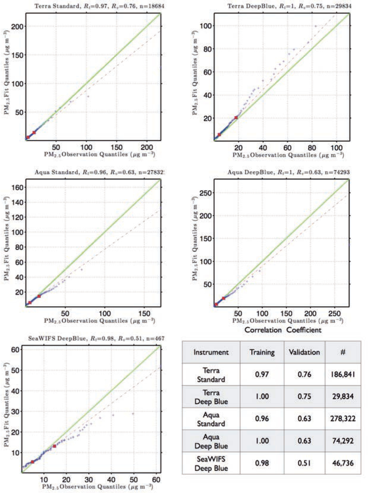
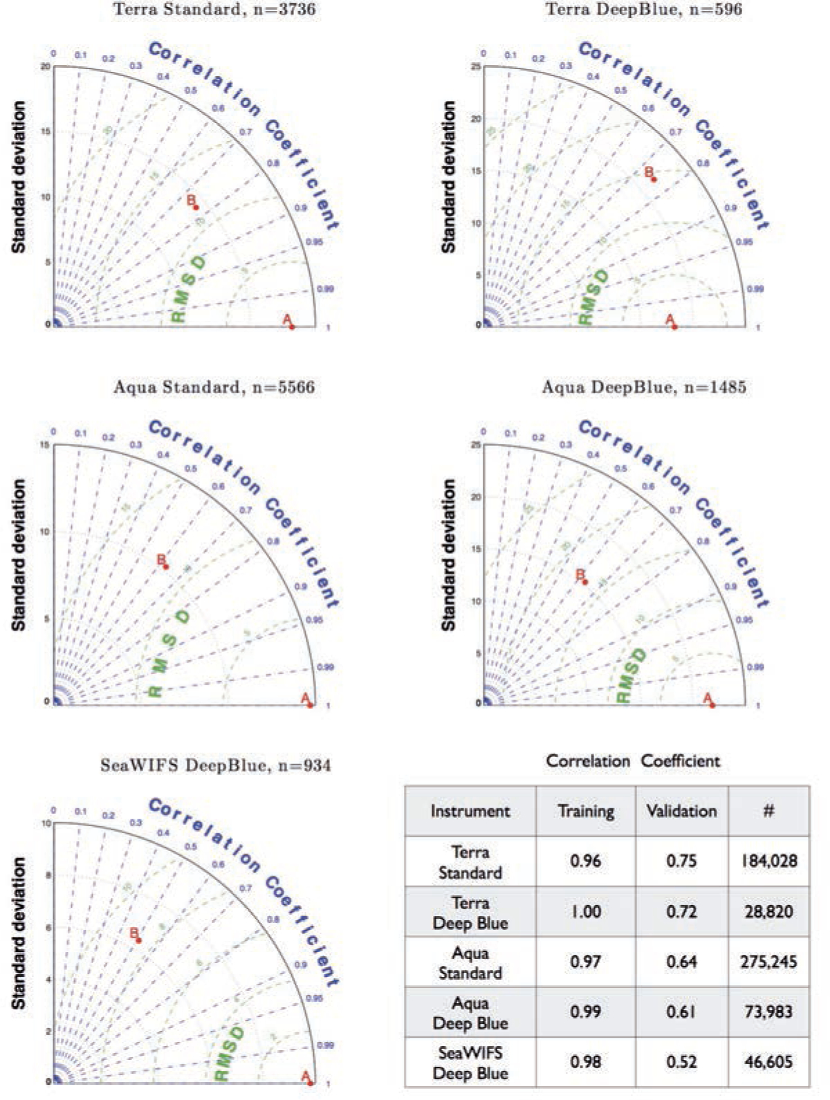
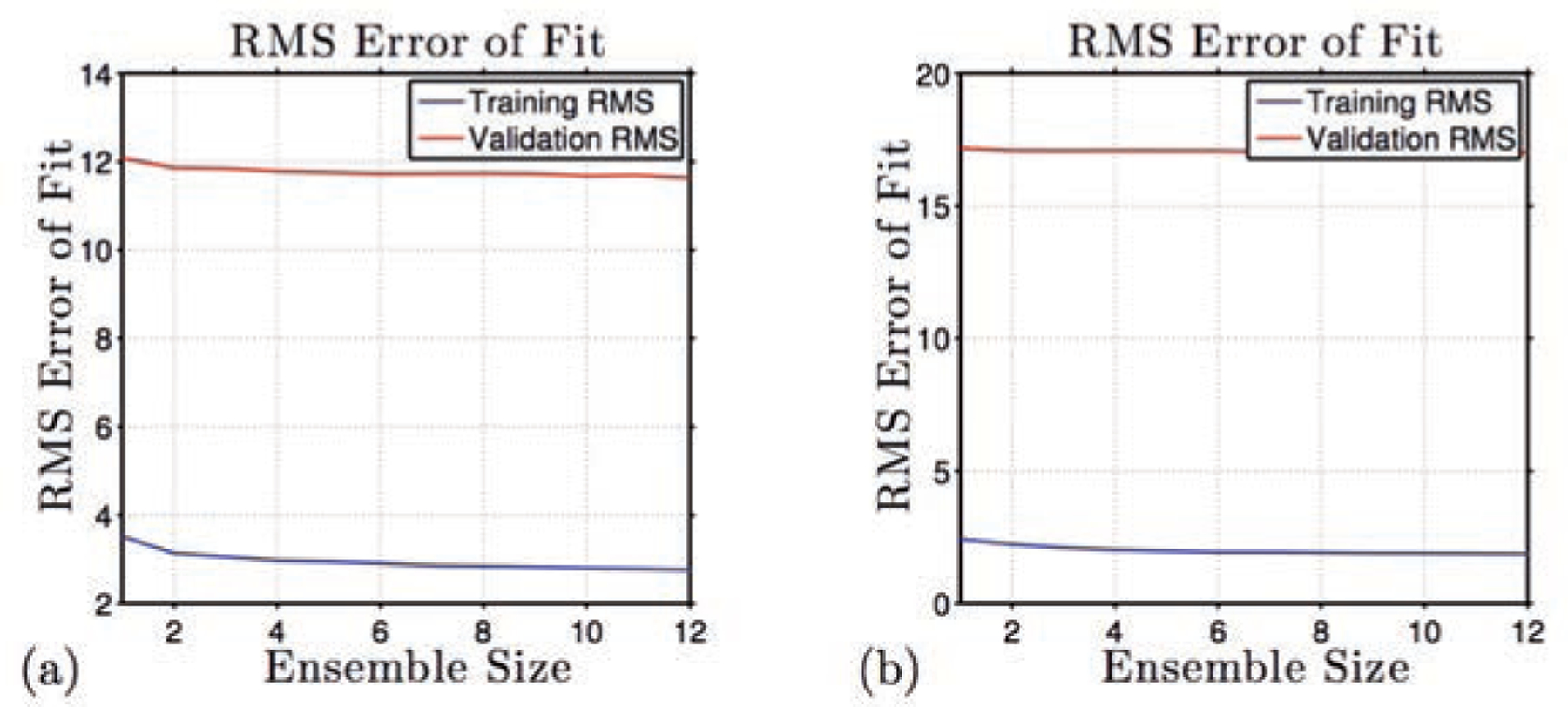
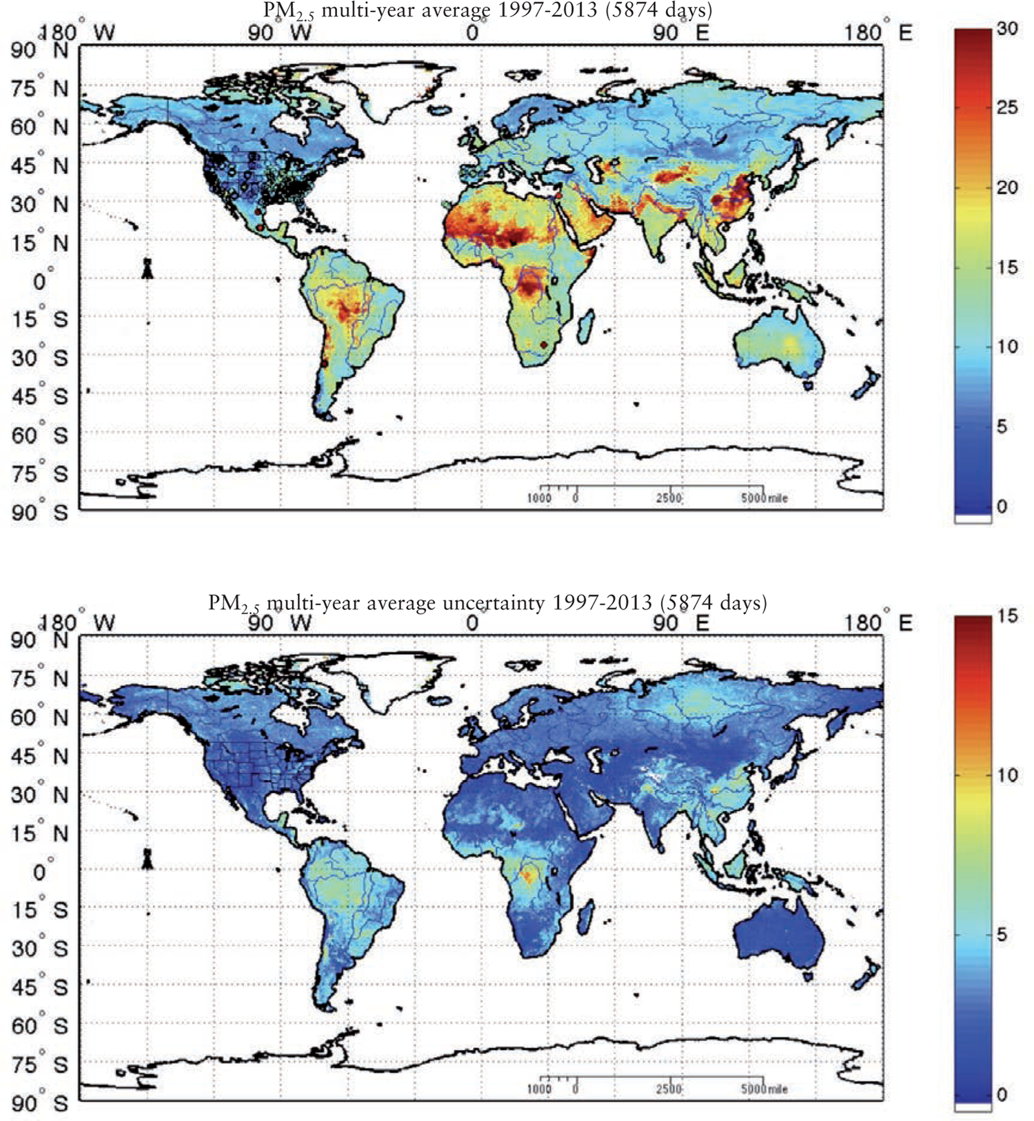
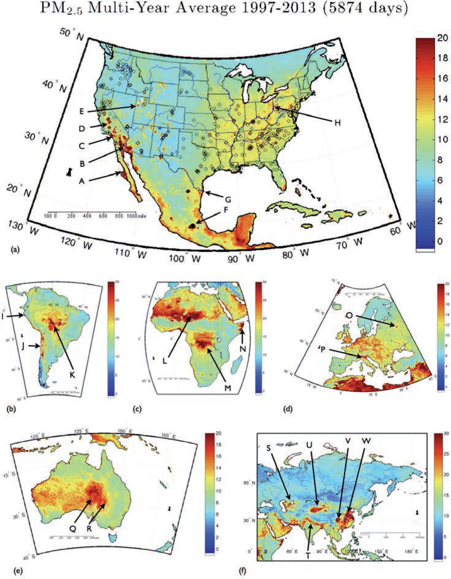
With the increasing awareness of the health impacts of particulate matter, there is a growing need to comprehend the spatial and temporal variations of the global abundance of ground level airborne particulate matter with a diameter of 2.5 microns or less (PM2.5). Here we use a suite of remote sensing and meteorological data products together with ground-based observations of particulate matter from 8,329 measurement sites in 55 countries taken 1997-2014 to train a machine-learning algorithm to estimate the daily distributions of PM2.5 from 1997 to the present. In this first paper of a series, we present the methodology and global average results from this period and demonstrate that the new PM2.5 data product can reliably represent global observations of PM2.5 for epidemiological studies.


Figures

Fig. 1.
Fig. 1.
Map showing the 8,329 PM2.5 measurement site locations from 55 countries studied 1997–2014. Black squares show sites, where measurements were made against the background colour scale of global topography and bathymetry. North America, Europe and Asia have the greatest density of sites but there are also southern hemisphere sites in South America, South Africa, Australia and New Zealand.
Fig. 2.
Fig. 2.
Temporal (left) and spatial distribution (right) of the training data. The temporal range is different for each instrument and algorithm combination. The size of the symbols in the panels to the right is proportional to the PM2.5 abundance.
Fig. 3.
Fig. 3.
Scatter diagrams showing the hourly average PM2.5 abundance. PM2.5 load in μg/m3 on the x-axis and the machine-learning estimate (or fit) on the y-axis. The associated probability density function is also shown along each axis. The title of each plot shows the MODIS product used, the correlation coefficient for the training dataset (Rt), the correlation coefficient for the independent validation dataset (the 5% random selection of data left out of the training data set for independent validation - Rv and the sample size (n)). The blue circles represent the data used in the training and the red squares the independent validation dataset. The table insert gives the correlation coefficients in descending order of the correlation coefficient for the independent validation dataset.
Fig. 4.
Fig. 4.
Quintile-quintile diagrams for the independent validation data showing the observed quintiles of in-situ hourly average PM2.5 abundance. PM2.5 abundance in μg/m3 on the x-axis and the machine-learning estimated quintiles on the y-axis. The blue circles represent the data used in the training and the red squares the independent validation dataset. The table insert gives the correlation coefficients in descending order for the independent validation dataset. Every percentile between 1 and 100 plotted.
Fig. 5.
Fig. 5.
Taylor diagrams quantify the similarity between the fit and observations and the amplitude of their variations, i.e. the similarity between fit and observations based on the correlation coefficient and the centred RMS difference on the one hand, and the amplitude of their variations using the standard deviation on the other. In each case, the observations are denoted by point A on the x-axis. The green contours around A show the centred RMS differences between fit and observations. The radial distance of a point from the origin is proportional to the amplitude of variation quantified by the standard deviation. Points lying on a radial arc, at the same distance from the origin as point A, have the same standard deviation indicating that the simulated variations have the correct amplitude.
Fig. 6.
Fig. 6.
Ensemble training errors in μg/m3 for the Aqua Standard machine-learning PM2.5 estimates (a), and the Aqua Deep Blue machine-learning PM2.5 estimates (b). The blue lines show the RMS error evaluated for the training dataset, and the red lines the RMS error for the independent validation dataset.
Fig. 7.
Fig. 7.
The global average of the surface PM2.5 abundance of the 5,874 daily estimates from August 1 1997 to August 31 2013 (upper panel) with the estimated uncertainty (lower panel). The surface load of PM2.5 is expressed in μg/m3 with the observations for those locations, for which we have both a machine-learning estimate of the surface PM2.5 abundance and an observation for at least one third of the 5,874, overlaid as colour-filled circles. The agreement between the machine-learning estimate and the in situ observations is well within the estimated uncertainty shown in the lower panel.
Fig. 8.
Fig. 8.
The average of the surface PM2.5 abundance of the 5,874 daily estimates from August 1, 1997 to August 31 2013 in μg/m3 for the world’s inhabited continents. Particularly high levels of PM2.5 are found in Muleg Municipality close to Guerrero Negro (A); the Sonoran Desert (B); Los Angeles (C); Central Valley in California (D); Great Salt Lake Desert, Utah (E); Mexico City (F); the Chihuahuan and the Big Bend deserts (G); Ohio River Valley (H);. Piura Desert (I); coast from Andean Altiplano Basin to Neuquen Basin (J); Amazon area, Bolivia (K); Bodelle depression in Chad (L); south of Congo River (M); coastal Somalia (N); Moscow (O); Po Valley (P); Lake Eyre (Q); Strzelecki Desert (R); Aral Sea (S) Ganges Valley (T); Taklimakan Desert (U); Sichuan Basin (V); and the region from Beijing to Guangxi in China (W).

References

    1. Andersen ZJ, 2012. Health effects of long-term exposure to air pollution: an overview of major respiratory and cardiovascular diseases and diabetes. Chem Ind Chem Eng Q 18, 617–622.
    1. Andersen ZJ, Raaschou-Nielsen O, Ketzel M, Jensen SS, Hvidberg M, Loft S, Tjonneland A, Overvad K, Sorensen M, 2012. Diabetes incidence and long-term exposure to air pollution a cohort study. Diabetes Care 35, 92–98. - PMC - PubMed
    1. Anderson HR, Butland BK, van Donkelaar A, Brauer M, Strachan DP, Clayton T, van Dingenen R, Amann M, Brunekreef B, Cohen A, et al. , 2012. Satellite-based estimates of ambient air pollution and global variations in childhood asthma prevalence. Environ Health Perspect 120, 1333–1339. - PMC - PubMed
    1. Anderson RR, Martello DV, White CM, Crist KC, John K, Modey WK, Eatough DJ, 2004. The regional nature of PM2.5 episodes in the upper Ohio River Valley. J Air Waste Manag Assoc 54, 971–984. - PubMed
    1. Araujo JA, 2011. Particulate air pollution, systemic oxidative stress, inflammation, and atherosclerosis. Air Qual Atmos Health 4, 79–93. - PMC - PubMed

Publication types

LinkOut - more resources