

Estimates of continental ancestry vary widely among individuals with the same mtDNA haplogroup
- PMID: 25620206
- PMCID: PMC4320259
- DOI: 10.1016/j.ajhg.2014.12.015
Estimates of continental ancestry vary widely among individuals with the same mtDNA haplogroup
Abstract
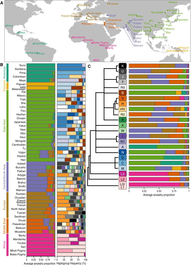
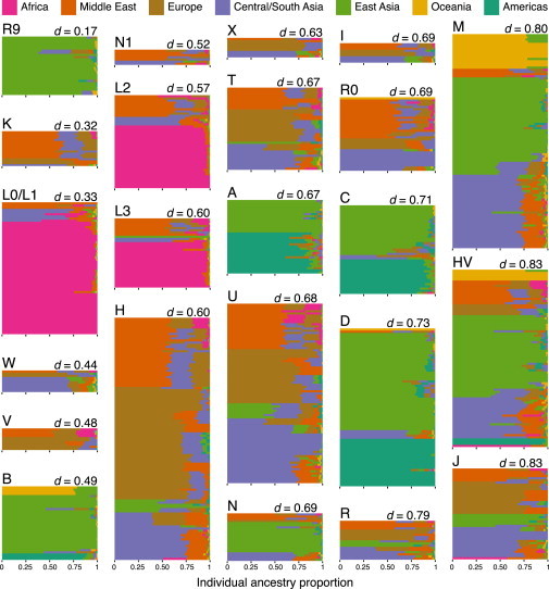
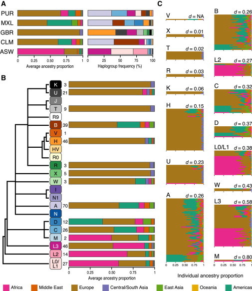
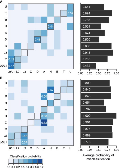
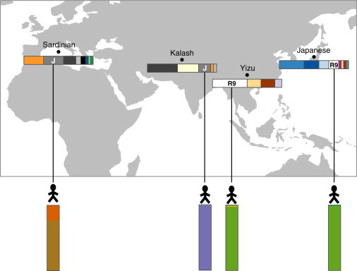
The association between a geographical region and an mtDNA haplogroup(s) has provided the basis for using mtDNA haplogroups to infer an individual's place of origin and genetic ancestry. Although it is well known that ancestry inferences using mtDNA haplogroups and those using genome-wide markers are frequently discrepant, little empirical information exists on the magnitude and scope of such discrepancies between multiple mtDNA haplogroups and worldwide populations. We compared genetic-ancestry inferences made by mtDNA-haplogroup membership to those made by autosomal SNPs in ∼940 samples of the Human Genome Diversity Panel and recently admixed populations from the 1000 Genomes Project. Continental-ancestry proportions often varied widely among individuals sharing the same mtDNA haplogroup. For only half of mtDNA haplogroups did the highest average continental-ancestry proportion match the highest continental-ancestry proportion of a majority of individuals with that haplogroup. Prediction of an individual's mtDNA haplogroup from his or her continental-ancestry proportions was often incorrect. Collectively, these results indicate that for most individuals in the worldwide populations sampled, mtDNA-haplogroup membership provides limited information about either continental ancestry or continental region of origin.
Copyright © 2015 The American Society of Human Genetics. Published by Elsevier Inc. All rights reserved.
Figures
Similar articles
-
Characterization of mitochondrial haplogroups in a large population-based sample from the United States.Hum Genet. 2014 Jul;133(7):861-8. doi: 10.1007/s00439-014-1421-9. Epub 2014 Feb 1. Hum Genet. 2014. PMID: 24488180 Free PMC article.
-
Reduced-median-network analysis of complete mitochondrial DNA coding-region sequences for the major African, Asian, and European haplogroups.Am J Hum Genet. 2002 May;70(5):1152-71. doi: 10.1086/339933. Epub 2002 Apr 5. Am J Hum Genet. 2002. PMID: 11938495 Free PMC article.
-
Microevolution in prehistoric Andean populations: chronologic mtDNA variation in the desert valleys of northern Chile.Am J Phys Anthropol. 2005 Jun;127(2):170-81. doi: 10.1002/ajpa.10438. Am J Phys Anthropol. 2005. PMID: 15503344
-
Patterns of mtDNA diversity in northwestern North America.Hum Biol. 2004 Feb;76(1):33-54. doi: 10.1353/hub.2004.0023. Hum Biol. 2004. PMID: 15222679 Review.
-
Mitochondrial haplogroups associated with lifestyle-related diseases and longevity in the Japanese population.Geriatr Gerontol Int. 2010 Jul;10 Suppl 1:S221-35. doi: 10.1111/j.1447-0594.2010.00599.x. Geriatr Gerontol Int. 2010. PMID: 20590837 Review.
Cited by
-
Mitochondrial DNA Haplogroups and Breast Cancer Risk Factors in the Avon Longitudinal Study of Parents and Children (ALSPAC).Genes (Basel). 2018 Aug 1;9(8):395. doi: 10.3390/genes9080395. Genes (Basel). 2018. PMID: 30071701 Free PMC article.
-
Mitonuclear linkage disequilibrium in human populations.Proc Biol Sci. 2015 Sep 22;282(1815):20151704. doi: 10.1098/rspb.2015.1704. Proc Biol Sci. 2015. PMID: 26378221 Free PMC article.
-
Signs of continental ancestry in urban populations of Peru through autosomal STR loci and mitochondrial DNA typing.PLoS One. 2018 Jul 18;13(7):e0200796. doi: 10.1371/journal.pone.0200796. eCollection 2018. PLoS One. 2018. PMID: 30020992 Free PMC article.
-
Complex spatio-temporal distribution and genomic ancestry of mitochondrial DNA haplogroups in 24,216 Danes.PLoS One. 2018 Dec 13;13(12):e0208829. doi: 10.1371/journal.pone.0208829. eCollection 2018. PLoS One. 2018. PMID: 30543675 Free PMC article.
-
Worldwide human mitochondrial haplogroup distribution from urban sewage.Sci Rep. 2019 Aug 12;9(1):11624. doi: 10.1038/s41598-019-48093-5. Sci Rep. 2019. PMID: 31406241 Free PMC article.
References
-
- Underhill P.A., Kivisild T. Use of y chromosome and mitochondrial DNA population structure in tracing human migrations. Annu. Rev. Genet. 2007;41:539–564. - PubMed
-
- Cavalli-Sforza L.L., Feldman M.W. The application of molecular genetic approaches to the study of human evolution. Nat. Genet. 2003;33:266–275. - PubMed
Publication types
MeSH terms
Substances
Grants and funding
LinkOut - more resources
Full Text Sources
Other Literature Sources
