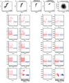
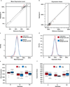
. 2015 May 21;521(7552):344-7.
doi: 10.1038/nature14244. Epub 2015 Mar 16.

Selection on noise constrains variation in a eukaryotic promoter

Affiliations

Selection on noise constrains variation in a eukaryotic promoter

Brian P H Metzger et al. Nature. .

Abstract

Genetic variation segregating within a species reflects the combined activities of mutation, selection, and genetic drift. In the absence of selection, polymorphisms are expected to be a random subset of new mutations; thus, comparing the effects of polymorphisms and new mutations provides a test for selection. When evidence of selection exists, such comparisons can identify properties of mutations that are most likely to persist in natural populations. Here we investigate how mutation and selection have shaped variation in a cis-regulatory sequence controlling gene expression by empirically determining the effects of polymorphisms segregating in the TDH3 promoter among 85 strains of Saccharomyces cerevisiae and comparing their effects to a distribution of mutational effects defined by 236 point mutations in the same promoter. Surprisingly, we find that selection on expression noise (that is, variability in expression among genetically identical cells) appears to have had a greater impact on sequence variation in the TDH3 promoter than selection on mean expression level. This is not necessarily because variation in expression noise impacts fitness more than variation in mean expression level, but rather because of differences in the distributions of mutational effects for these two phenotypes. This study shows how systematically examining the effects of new mutations can enrich our understanding of evolutionary mechanisms. It also provides rare empirical evidence of selection acting on expression noise.


Figures
Extended Data Figure 1
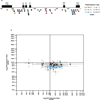
Extended Data Figure 1. TDH3 promoter polymorphisms influence TDH3 mRNA levels
a, Locations of polymorphisms within the TDH3 promoter relative to known functional elements, including RAP1 and GCR1 transcription factor binding sites, are shown. Squares are point mutations, circles are indels. red, G:C→A:T; yellow, G:C→T:A; blue, G:C→C:G; orange T:A→C:G; green, T:A→G:C; purple, T:A→A:T. b, The log2 ratio of total expression divergence between natural isolates and a reference strain (x-axis) versus the log2 ratio of total cis-regulatory expression divergence between natural isolates and the reference strain (y-axis) is shown. Error bars are 95% CI. The 25 of 48 strains with significant cis-regulatory differences from the reference strain are shown in blue. Reference strain is shown in red. These data show differences in cis- and trans- regulation among strains, but do not reveal the evolutionary changes that give rise to these differences.
Extended Data Figure 2
Extended Data Figure 2. Ancestral state reconstruction of the TDH3 promoter
a, The TDH3 promoter haplotype network is shown with the inferred ancestral strain at the left. Circles represent haplotypes observed among the 85 strains with their diameters proportional to haplotype frequency. The haplotypes are colored according to clade (Supplementary Table 1). Triangles are haplotypes that were not observed among the strains sampled, but must exist or have existed as intermediates between observed haplotypes. Squares are possible intermediates connecting two observed haplotypes, but it is unknown which of these actually exists or existed in S. cerevisiae. Solid lines connect haplotypes that differ by a single mutation; dashed lines connect haplotypes that differ by multiple mutations. Mutations on each branch are colored by the mutation type as in Extended Figure 1a. b, Relationship between the effect of a polymorphism on mean expression level and the frequency of that polymorphism among the strains sampled (p-value = 0.43). c, Relationship between the effect of a polymorphism on expression noise and the frequency of that polymorphism among the strains sampled (p-value = 0.0028).
Extended Data Figure 3
Extended Data Figure 3. No significant difference between mutation types
Distributions of effects on mean expression level from previous random mutagenesis experiments are shown partitioned by mutation type. For each mutation type, the distribution (inside) and density (outside, colored) of the effects on mean expression level are shown. The number of mutations tested for each promoter is shown in the upper right corner of each panel. a, bacteriophage SP6 promoter. b, bacteriophage T3 promoter. c, bacteriophage T7 promoter. d, human CMV promoter. e, human HBB promoter. f, human S100A4/PEL98 promoter. g, synthetic cAMP-regulated enhancer. h, interferon-B enhancer. i, ALDOB enhancer. j, ECR11 enhancer. k, LTV1 enhancer replicate 1. l, LTV1 enhancer replicate 2. m, rhodopsin promoter. Red: Patwardhan et al. 2009 bacteriophage promoters. Blue: Patwardhan et al. 2009 mammalian promoters. Green: Melnikov et al. 2012 mammalian enhancers. Yellow: Patwardhan et al. 2012 mammalian promoters. Purple: Kwasnieski et al. 2012 promoter. n, Distribution of effects for C→T (red) and G→A (blue) mutations for mean expression level in this study. o. Same as n, but for expression noise. p, Distribution of effects for C→T/G→A polymorphisms compared to other polymorphism types for mean expression level in this study. q, same as p, but for gene expression noise.
Extended Data Figure 4
Extended Data Figure 4. Correlation between mean expression level and expression noise
a, Correlation between mean expression level (x-axis) and expression noise (y-axis) for the 236 point mutations in the TDH3 promoter (R2=0.85) is shown. Gray points correspond to mutations in known transcription factor binding sites. Colored points correspond to individual mutations highlighted in c–f. b, Alternative plot showing the majority of data from a more clearly, gray and colored points are the same as in a. c, Distribution of gene expression phenotypes from a mutant (blue) with decreased mean expression level but similar expression noise as the reference strain (black). Outside of the known TFBS, 50% of mutations decreased mean expression. d, Distribution of gene expression phenotypes from a mutant (red) with increased mean expression level but similar gene expression noise as the reference strain (black). Outside of the known TFBS, 50% of mutations increased mean expression. e, Distribution of gene expression phenotypes from a mutant (brown) with decreased gene expression noise but similar mean expression level as the reference strain (black). Outside of the known TFBS, 13% of mutations decreased expression noise. f, Distribution of gene expression phenotypes from a mutant (green) with increased gene expression noise but similar mean expression level as the reference strain (black). Outside of the known TFBS, 87% of mutations increased expression noise.
Extended Data Figure 5
Extended Data Figure 5. Tests for selection
a–h, Tests for selection using likelihood. a, The distribution of likelihood values for 100,000 randomly sampled sets of 45 mutations drawn from the mutational effect distribution is shown for mean expression level. The average likelihood for all samples of mutations tested (red) as well as the likelihood of the observed polymorphisms (blue) are also shown. b, Same as a, but for expression noise. The average likelihood for all mutation samples tested is shown in brown and the likelihood of the observed polymorphisms is shown in green. c, Same as a, but with the large effect mutations in the TFBS removed from the mutational effect distribution used for sampling. d, Same as b, but after removing the mutations in the TFBS from the mutational effect distribution. e, Same as a, but using only G→A and C→T polymorphisms. f, same as b, but using only G→A and C→T polymorphisms. g, Distribution of likelihoods for 10,000 random walks along the TDH3 promoter haplotype network using the effects from the mutational distribution is shown. h, Same as e, but for expression noise. i–n, Tests for selection using average effects. i, The distribution of average effects for 100,000 randomly sampled sets of 45 mutations drawn from the mutational effect distribution is shown for mean expression level (black). Polymorphisms do not have a significantly different average mean expression (blue, 99.5%) than sets of mutations (red, 98.8%; p-value = 0.16438). This figure is comparable to Extended Data Figure 5a, but uses average effects instead of the likelihoods to test for differences in distribution between random mutations and polymorphisms. j, Same as i, but for expression noise. Polymorphisms have significantly lower average expression noise (green, 102.1%) than sets of random mutations (brown, 110.9%; p-value < 0.00001). k, Same as i, but with the large effect mutations in the TFBS removed from the mutational effect distribution used for sampling (polymorphisms, 99.5%; mutations, 99.6%; p-value = 0.37602). l, Same as j, but after removing the mutations in the TFBS from the mutational effect distribution (polymorphisms, 102.1%; mutations, 104.8%; p-value = 0.00002). m, Same as i, but using only G→A and C→T polymorphisms (polymorphisms, 99.7%; mutations, 98.8%; p-value = 0.21656). n, same as j, but using only G→A and C→T polymorphisms (polymorphisms, 100.0%; mutations, 110.9%; p-value < 0.00001).
Extended Data Figure 6
Extended Data Figure 6. Test for Selection using Alternative Metrics for Quantifying Gene Expression Noise
a–d, Distributions of effects for mutations on gene expression noise across the TDH3 promoter with expression noise quantified as σ (a), σ22 (b), σ2/μ (c), and residuals from the regression of σ on μ (d), e–h, Distributions of effects for mutations on gene expression noise (brown) compared to polymorphisms (green) with noise quantified as σ (e), σ22 (f), σ2/μ (g), and residuals from the regression of σ on μ (h). i–l, The maximum likelihood fitness function (middle, black) relating the distribution of mutational effects (top, brown) to the distribution of observed polymorphisms (bottom, green) for expression noise quantified as σ (i), σ22 (j), σ2/μ (k), and residuals from the regression of σ on μ (l). m–p, Changes in expression noise observed among haplotypes over time in the inferred haplotype network (Figure E2a) are shown in green. The brown background represents the 95th, 90th, 80th, 70th, 60th and 50th percentiles, from light to dark, for expression noise resulting from 10,000 independent simulations of phenotypic trajectories in the absence of selection where noise is quantified as σ (m), σ22 (n), σ2/μ (o), and residuals from the regression of σ on μ (p). q, p-values for tests of selection using mean expression (μ) and five metrics of expression noise, including σ/μ which is used throughout the main text.
Extended Data Figure 7
Extended Data Figure 7. Effects of Mutations and Polymorphisms on a second trans-regulatory background
a, A comparison between effects of mutations on mean expression in the original trans-regulatory background (x-axis) and a hybrid trans-regulatory background between BY4741 and YPS1000 (y-axis) is shown. Error bars are 95% confidence intervals. b, Same as a, but for gene expression noise. c, Effects of individual mutations on mean expression level in the hybrid trans-regulatory background are shown in terms of the percentage change relative to the un-mutagenized reference allele, and are plotted according to the site mutated in the 678bp region (significant mutations: red lines, t-test, Bonferroni corrected). Note that most mutations decrease expression, unlike in the original genetic background. d, Same as c., but for gene expression noise (significant mutations: brown lines, t-test, Bonferroni corrected). e, Distribution of de novo mutation effects in the second trans-regulatory background (red) compared with the effects of naturally occurring haplotypes in this trans-regulatory background (blue). Inset: the distribution of likelihood values for 100,000 randomly sampled sets of 27 mutations drawn from the mutational effect distribution is shown for mean expression level. The average likelihood for all samples of mutations tested (red) as well as the likelihood of the observed polymorphisms (blue) are also shown (p-value = 0.2584). Removing mutations in the known TFBS resulted in a significant difference between mutations and polymorphisms (p-value = 0.00781). f, Same as e, but for gene expression noise. Mutations, brown. Polymorphisms, green (p-value = 0.00037). Removing mutations in the known TFBS did not change this result (p-value < 0.00001)
Extended Data Figure 8
Extended Data Figure 8. Methodology for the analysis of flow cytometry data
a, Raw data from the flow cytometer is shown for the first control sample collected. Each point is an individual event scored by the flow cytometer, the vast majority of which are expected to be cells. FSC.A is a proxy for cell size, and FL1.A is a measure of YFP fluorescence. Log10 values are plotted for both FSC.A and FL1.A. b, The same sample is shown after events found in the negative control sample (using hard gates on FSC.A and FL1.A) were excluded. c, The same sample is shown after flowClust was used to remove events likely to be from multiple cells entering the detector simultaneously. d, The same sample is shown after flowClust was used to isolate the densest homogenous population within the sample. The R2 value shown is the correlation between YFP fluorescence and cell size. e, After correcting for differences in cell size, the correlation between YFP fluorescence and cell size was nearly 0 and not significant. In all panels, the number of events analyzed (i.e., sample size) is shown in the bottom right corner. Box plots of mean expression of control samples before (red) and after (blue) correcting for the effects of individual plates for each day on which samples were run (f), for replicates nested within day (g), for array nested within day and replicate (h), for stack nested within day (i), for depth nested within day (j), for order nested within day and replicate (k), for row nested within array (l), for column nested within array (m), for block nested within array (n), and for the final cell count (o). The y-axis is in arbitrary units. p–x, same as f–o, but for gene expression noise.
Extended Data Figure 9
Extended Data Figure 9. Consistency of mutational effects on different genetic backgrounds
a, The effects on mean expression level for each of the 28 mutations tested on both the reference haplotype (x-axis) and natural haplotype A observed in wild strains (y-axis) are shown. These two haplotypes differ by a single point mutation. Solid lines show expression from the PTDH3 haplotypes on which the two sets of mutations were created, both of which were defined as 100% activity. The gray line shows y = x. The dashed line shows the consistent increase in mean expression level when these mutations were tested on haplotype A. Error bars show 95% CI. Colored points have significantly different effects on the two backgrounds (p-value < 0.05, ANOVA, Bonferroni corrected), indicating weak epistasis. b, Same as a, but for gene expression noise. c, Distributions of mutational effects for mean expression levels are shown based on the 236 point mutations on tested on the reference haplotype (red) as well as for the 28 mutations tested on haplotype A (blue). d, Same as c, but for gene expression noise. e, The effect on mean expression of the full TDH3 promoter (red) compared to promoters containing 6 fewer bp at the 5’ end (blue). Each box plot summarizes data from 9 replicates. f, Same as e, but for expression noise.
Extended Data Figure 10
Extended Data Figure 10. Probability distributions for mutational effects
a, A histogram summarizing the mutational effects on mean expression level is shown (red), overlaid with the density curve (black line) used to calculate the likelihood of an effect on mean expression level. b, Same as a, but for expression noise. c. Density curves for the effects of one (red), two (blue), three (green), four (purple) or five (black) mutations randomly drawn from the distribution of mutational effects observed for mean expression level. d, Same as c, but for expression noise.
Figure 1
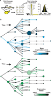
Figure 1. Effects of polymorphisms on PTDH3 activity
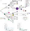
a, cis-regulatory activity was quantified as YFP fluorescence in 9 biological replicates for each PTDH3-YFP haplotype using flow cytometry. The mean (μ) and standard deviation (σ) of single-cell fluorescence phenotypes were calculated for each sample. b, Mean expression level of PTDH3-YFP for each TDH3 promoter haplotype is shown in the haplotype network (Figure E2a), with differences in mean expression level relative to the inferred common ancestor shown with different shades. Circles are haplotypes observed among the sampled strains, with the diameter of each circle proportional to frequency of that haplotype among the 85 strains. Triangles are haplotypes that were not observed among the strains sampled, but must exist, or have existed, as intermediates between observed haplotypes. Squares are possible haplotypes that might exist, or have existed, as intermediates between observed haplotypes. Dashed lines connect haplotypes by multiple mutations. Based on t-tests with a Bonferroni correction, 17 of the 45 polymorphisms present in this network caused a significant change in mean expression level (blue lines). c, Same as b, but for expression noise. 18 of the 45 polymorphisms present in this network caused a significant change in expression noise (green lines, t-test, Bonferroni corrected)
Figure 2
Figure 2. Effects of mutations on PTDH3 activity
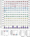
a, The structure of the 678bp region analyzed, including the TDH3 promoter with previously identified TFBS for RAP1 and GCR1, a TATA box, and UTRs for TDH3 and PDX1, is shown. The black line indicates sequence conservation across the sensu stricto genus. b, Effects of individual mutations on mean expression level are shown in terms of the percentage change relative to the un-mutagenized reference allele, and are plotted according to the site mutated in the 678bp region. 59 of 236 mutations tested significantly altered mean expression levels (red lines, t-test, Bonferroni corrected). The shaded regions correspond to the known binding sites indicated in a. c, Same as b, but for expression noise. Because the effects of mutations on expression noise relative to the reference allele were much greater in magnitude than the effects of these mutations on mean expression level, they are plotted on a log2 scale. Measurements of expression noise were more variable among replicates than measurements of mean expression level, resulting in lower power to detect small changes as significant. Nonetheless, 42 of the 236 mutations tested significantly altered expression noise (brown lines, t-test, Bonferroni corrected).
Figure 3
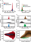
Figure 3. Effects of selection on PTDH3 activity
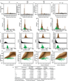
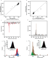
a, Histograms summarizing the effects of mutations (red) and polymorphisms (blue) on mean expression level are shown. b, Histograms summarizing the effects of mutations (brown) and polymorphisms (green) on expression noise are shown. c, The maximum likelihood fitness function (middle, black) relating the distribution of mutational effects (top, red) to the distribution of observed polymorphisms (bottom, blue) is shown for mean expression level. d, Same as c, but for expression noise. e, Changes in mean expression level observed among haplotypes over time in the inferred haplotype network (Figure E2a) are shown in blue. The red background represents the 95th, 90th, 80th, 70th, 60th and 50th percentiles, from light to dark, for mean expression level resulting from 10,000 independent simulations of phenotypic trajectories in the absence of selection. f, Same as e, but for expression noise. Effects of the mutational distribution are shown in brown. Expression noise among haplotypes is shown in green.

References

    1. Smith JD, McManus KF, Fraser HB. A novel test for selection on cis-regulatory elements reveals positive and negative selection acting on mammalian transcriptional enhancers. Mol. Biol. Evol. 2013;30:2509–2518. - PMC - PubMed
    1. Denver DR, et al. The transcriptional consequences of mutation and natural selection in Caenorhabditis elegans . Nat. Genet. 2005;37:544–548. - PubMed
    1. Stoltzfus A, Yampolsky LY. Climbing mount probable: mutation as a cause of nonrandomness in evolution. J. Hered. 2009;100:637–647. - PubMed
    1. Rice DPD, Townsend JPJ. A test for selection employing quantitative trait locus and mutation accumulation data. Genetics. 2012;190:1533–1545. - PMC - PubMed
    1. Raser JM, O’Shea EK. Control of stochasticity in eukaryotic gene expression. Science. 2004;304:1811–1814. - PMC - PubMed

Additional References for Methods section

    1. Taly J-F, et al. Using the T-Coffee package to build multiple sequence alignments of protein, RNA, DNA sequences and 3D structures. Nat. Protoc. 2011;6:1669–1682. - PubMed
    1. Löytynoja A, Goldman N. webPRANK: a phylogeny-aware multiple sequence aligner with interactive alignment browser. BMC Bioinformatics. 2010;11:579. - PMC - PubMed
    1. Libkind D, et al. Microbe domestication and the identification of the wild genetic stock of lager-brewing yeast. Proc. Natl. Acad. Sci. U. S. A. 2011;108:14539–14544. - PMC - PubMed
    1. Scannell DR, et al. The Awesome Power of Yeast Evolutionary Genetics: New Genome Sequences and Strain Resources for the Saccharomyces sensu stricto Genus. G3. 2011;1:11–25. - PMC - PubMed
    1. Liti G, et al. High quality de novo sequencing and assembly of the Saccharomyces arboricolus genome. BMC Genomics. 2013;14:69. - PMC - PubMed

Publication types

MeSH terms

Substances