. 2015 Apr 13;209(1):163-80.
doi: 10.1083/jcb.201501081. Epub 2015 Apr 6.

Open source software for quantification of cell migration, protrusions, and fluorescence intensities

Affiliations

Open source software for quantification of cell migration, protrusions, and fluorescence intensities

David J Barry et al. J Cell Biol. .

Abstract

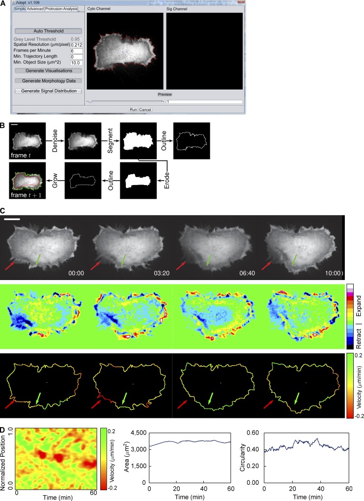
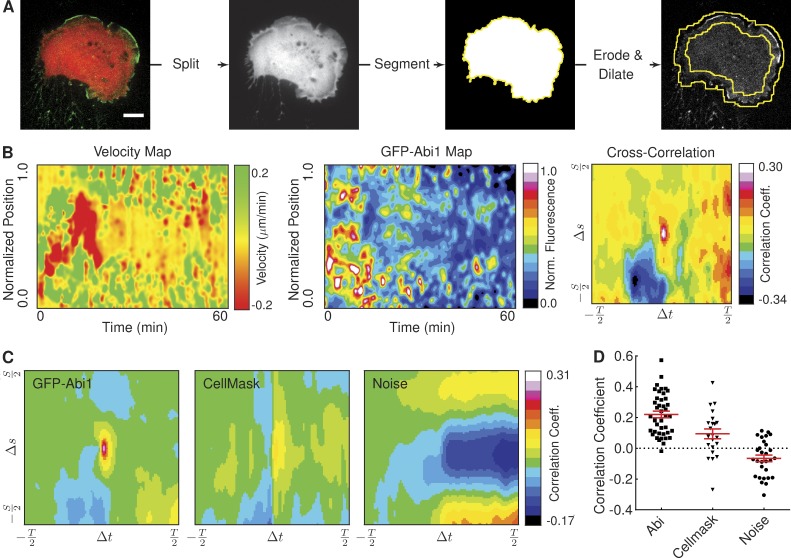
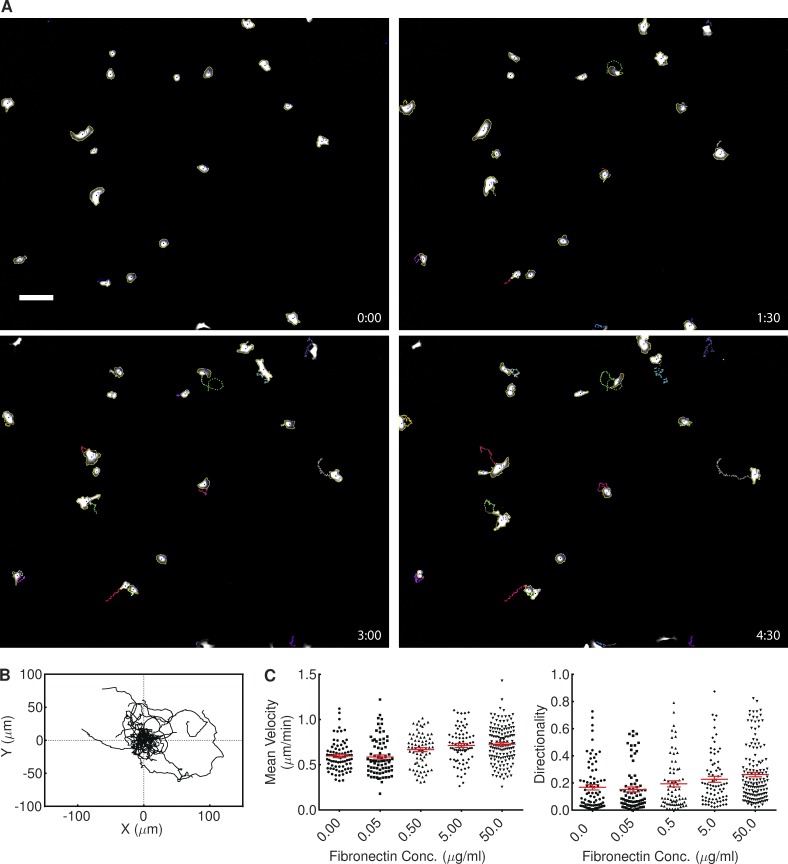
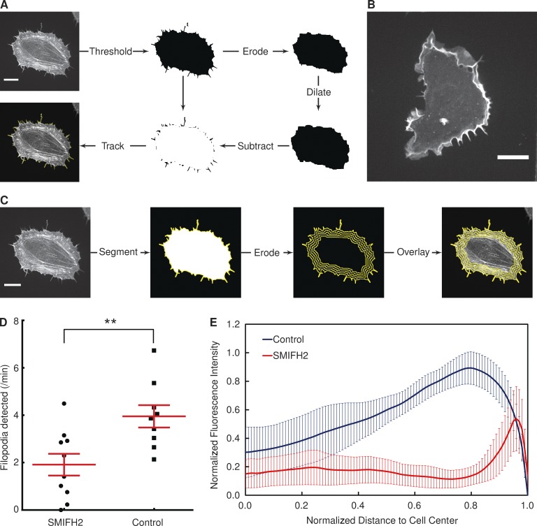
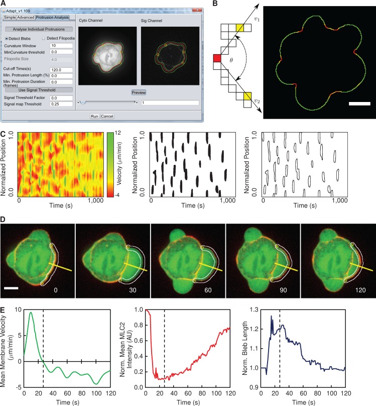
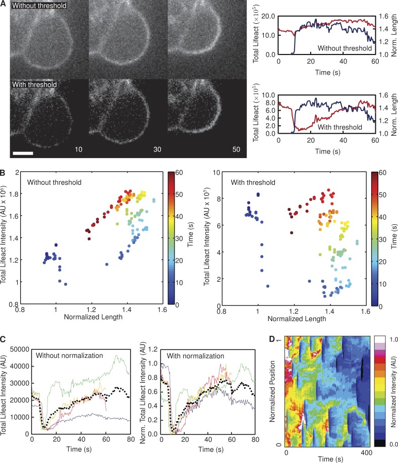
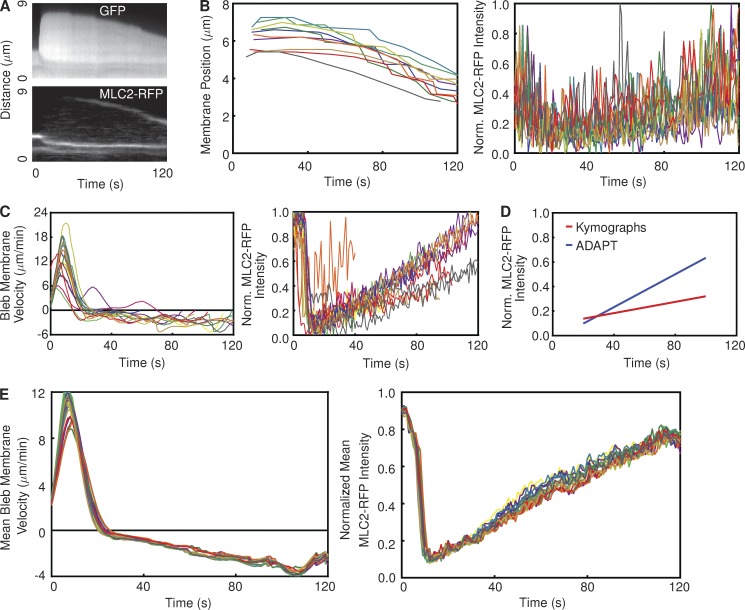
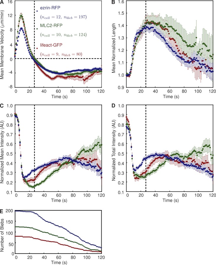
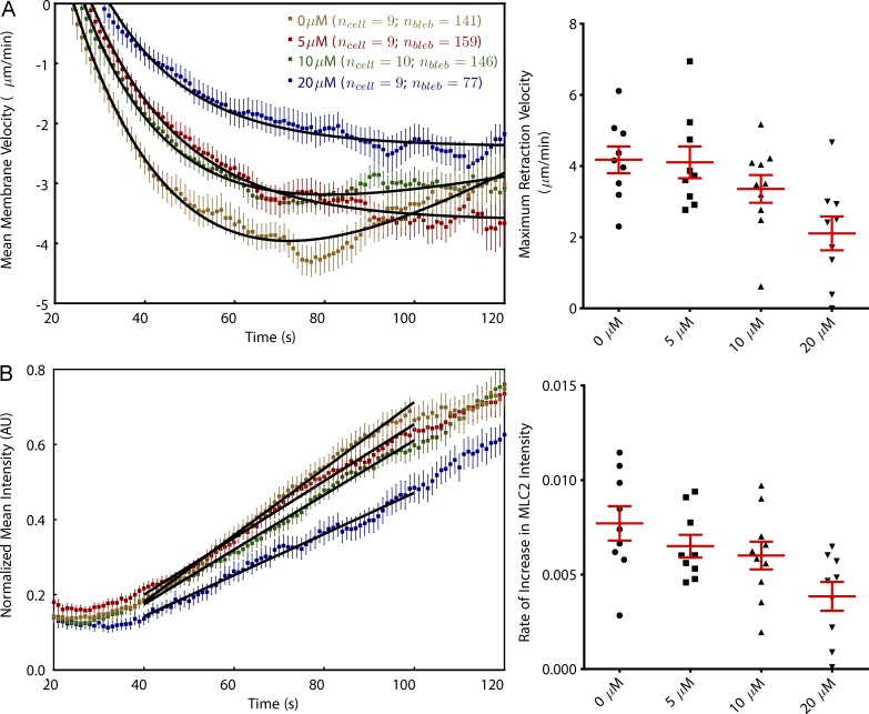
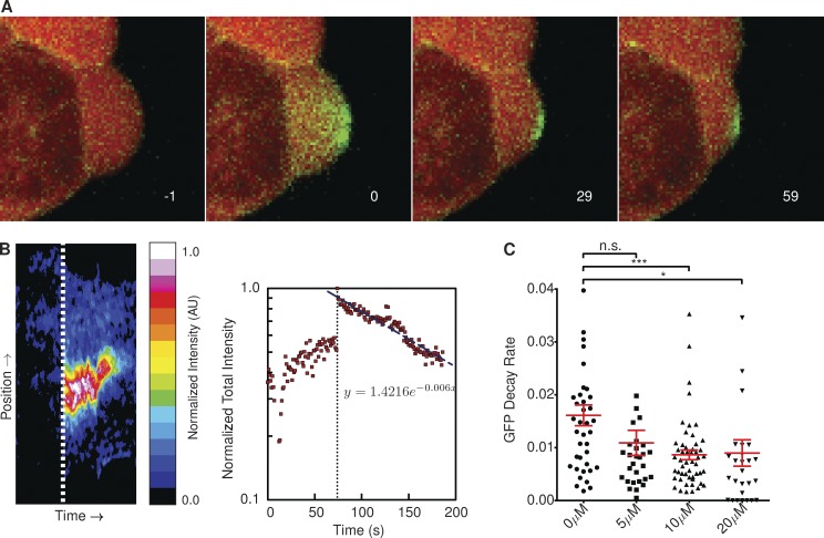
Cell migration is frequently accompanied by changes in cell morphology (morphodynamics) on a range of spatial and temporal scales. Despite recent advances in imaging techniques, the application of unbiased computational image analysis methods for morphodynamic quantification is rare. For example, manual analysis using kymographs is still commonplace, often caused by lack of access to user-friendly, automated tools. We now describe software designed for the automated quantification of cell migration and morphodynamics. Implemented as a plug-in for the open-source platform, ImageJ, ADAPT is capable of rapid, automated analysis of migration and membrane protrusions, together with associated fluorescently labeled proteins, across multiple cells. We demonstrate the ability of the software by quantifying variations in cell population migration rates on different extracellular matrices. We also show that ADAPT can detect and morphologically profile filopodia. Finally, we have used ADAPT to compile an unbiased description of a "typical" bleb formed at the plasma membrane and quantify the effect of Arp2/3 complex inhibition on bleb retraction.


Figures

Figure 1.
Figure 1.
Overview of whole cell analysis. (A) The ADAPT user interface, illustrating the preview segmentation (red line around a HeLa cell expressing mCherry). (B) Illustration of the segmentation process. Images are Gaussian filtered to suppress noise and then a gray-level threshold is applied to create a binary image. The cell boundary is taken as pixels bordering segmented regions. The resulting segmentation is used as the seed for the region-growing algorithm in the next frame. The red line denotes the eroded segmentation of the cell in frame t, whereas the green line represents the segmentation of the cell in frame t + 1. (C) Velocity is calculated at each point on the cell boundary based on the change in gray level between frames: expansion results in an increase in gray level at a particular spatial coordinate over time and retraction a decrease, as shown in the second row of images. This change in gray level can be used to calculate the membrane velocity at each point, as shown in the bottom row. The green and red arrows indicate regions undergoing expansion and retraction, respectively. (D) Resulting velocity map (left) and plots showing changes in area (center) and circularity (right) over time for a single cell (shown in Video 1). Bars, 20 µM.
Figure 2.
Figure 2.
Correlation of protein recruitment with plasma membrane protrusion velocity. (A) The image shows an HT1080 cell stably expressing GFP-Abi1 and mCherry. The image is split into constituent channels, and the mCherry signal is segmented to construct a cell mask image. Eroded and dilated versions of this mask image are used to construct the region of interest (denoted by the yellow lines) in the GFP-Abi1 image. Bar, 10 µM. (B) Velocity and GFP-Abi1 intensity maps for the cell in A, together with the result of a cross-correlation. (C) Mean cross-correlations of velocity and fluorescence intensity maps reveal a strong correlation between membrane velocity and protein localization in HT1080 cells expressing GFP-Abi1. Correlations between velocity and CellMask or noise were considerably weaker (22 ≥ ncell ≤ 41). (D) Peak values (at Δs = 0 and Δt = 0) in cross-correlations of velocity and fluorescence intensity maps for individual cells (each dot represents a single cell). A one-way analysis of variance (ANOVA) test shows the differences in mean values to be highly significant (P < 0.0001). Error bars represent standard error of the mean.
Figure 3.
Figure 3.
Application of ADAPT to tracking cell migration. (A) Still images of HT1080 cells stably expressing GFP, taken from Video 3. Image dimensions are 1,705 × 1,368 µm, with labels representing elapsed time in hours and minutes. Bar, 150 µM. (B) Trajectories of the cells shown in Video 3, relative to the starting position of each cell (ncell = 20). (C) The influence of fibronectin concentration on the velocity and directionality of HT1080 cells. Plots show the combined data from two independent experiments. A one-way ANOVA test showed fibronectin concentration (Conc.) to have a significant impact on both measures (P < 0.0001). Error bars represent standard error of the mean.
Figure 4.
Figure 4.
Influence of formin inhibition on filopodia formation and actin distribution. (A) Illustration of the filopodia detection scheme, with a HeLa cell expressing lifeact-GFP. (B) An example of a HeLa cell expressing lifeact-GFP treated with 40 µM SMIFH2 for 1 h. (C) Using a scheme similar to that shown in Fig. 2 A, the distribution of a fluorescent signal of interest (in this case, lifeact-GFP) can be quantified. The segmented image of a cell is iteratively eroded, and at each step, the fluorescence signal along the image boundary is summed. This permits the plotting of fluorescence intensity as a function of distance to the cell center. (D) The number of filopodia detected per minute by ADAPT in the presence or absence of a formin inhibitor (**, P < 0.01). Each dot represents one cell (ncell = 10 in each population). Error bars represent standard error of the mean. (E) Cellular distribution of actin in control and SMIFH2-treated cells. Error bars represent 95% confidence intervals. Bars, 20 µM.
Figure 5.
Figure 5.
Overview of bleb detection and analysis. (A) The ADAPT user interface, illustrating the preview segmentation of a vaccinia-infected HeLa cell expressing GFP (Cyto Channel) and MLC2-RFP (Sig Channel). The green lines delineate the region over which fluorescence intensities will be quantified. The yellow circles indicate detected curvature extrema. The red line outlines the segmented cell. (B) Curvature is evaluated at each point on the cell boundary as the angle (θ) subtended by vectors (v1 and v2) to two points n pixels away in each direction. When all curvature values are superimposed on the cell boundary, bleb necks are identifiable as sharp concavities (in red) on a generally convex curve (green). (C) Blebs are detected as local maxima in the velocity map. (D) Blebs are tracked using local extrema in curvature as “anchor points.” The yellow lines denote the reference for the kymograph in Fig. 7 A. Image labels show seconds after bleb initiation. The white lines delineate the region over which fluorescence intensities will be quantified. (E) The mean membrane velocity, mean fluorescence intensity of the cortical component of interest (MLC2-RFP), and the length of boundary between the two anchor points for a single bleb (shown in D). The dotted line in the plots indicates the onset of retraction, and image labels correspond to seconds after bleb initiation. AU, arbitrary unit. Bars, 5 µM.
Figure 6.
Figure 6.
Justification for postprocessing of data. (A) Images of a bleb on a HeLa cell expressing lifeact-GFP, with and without the application of a threshold to remove noise. In the absence of a threshold, the total fluorescence intensity (red lines) closely follows the length of the bleb (blue lines). Applying a threshold disrupts this correlation. Image labels correspond to seconds after bleb initiation. Data represent the analysis of a single bleb. Bar, 2.5 µM. (B) The change in total lifeact-GFP intensity along the periphery of a single bleb (shown in A) over time, with (right) and without (left) the use of a threshold value to exclude noise. (C) Each colored line in the plots represents a single bleb on the same cell (nbleb = 4), with (right) and without (left) normalization. The black dotted line represents the mean in each case. (D) The heat map represents the lifeact intensity recorded at every boundary point over the course of a video in one particular cell. It is evident that the signal intensity diminishes over extended time periods. AU, arbitrary unit.
Figure 7.
Figure 7.
Comparison between ADAPT and kymograph analysis of blebs. (A) Kymograph of a bleb on a vaccinia-infected HeLa cell expressing GFP and MLC2-RFP, corresponding to the yellow line in Fig. 5 D. (B) Each line represents the membrane displacement (left) and MLC2-RFP intensity (right) derived from one kymograph (representing one bleb; nbleb = 10). (left) The retraction speed was calculated as 1.74 ± 0.08 µm/min by fitting a straight line to the linear portions of the plots representing membrane position over time. The rate of increase in MLC2-RFP intensity was measured as 2.29 × 10⁻³ ± 1.74 × 10⁻⁴ s−1. (C) Analysis of the same cell using ADAPT. Each line represents the mean membrane velocity (left) and MLC2-RFP intensity (right) over time on a single bleb (nbleb = 10). (D) Comparison of mean MLC2-RFP recruitment rates derived from the data in B and C. The rates of increase are 1.95–2.63 × 10⁻³ and 6.44–6.97 × 10⁻³ per second for the kymograph- and ADAPT-derived data, respectively. (E) The results of 20 analyses of the same cell as that in B and C using ADAPT, with a different, random set of input parameters for each analysis.
Figure 8.
Figure 8.
Description of a “typical” bleb in vaccinia-infected, blebbing HeLa cells. (A–D) Graphs show mean bleb velocity (A), mean normalized bleb perimeter length (B), normalized mean fluorescence intensity (C), and normalized mean fluorescence intensity (D) of the indicated protein. Positive and negative velocity values are indicative of extension and retraction, respectively. Fluorescence intensities are normalized to signal strength in the cortex before bleb formation. The dotted vertical line at t = 27 s indicates the onset of bleb retraction. Error bars represent standard error of the mean. The number of blebs (nbleb) indicates the population size at t = 0. (E) The number of blebs used to derive the mean curves depicted in A–D over time. AU, arbitrary unit.
Figure 9.
Figure 9.
Inhibition of Arp2/3 complex retards bleb retraction and MLC2 recruitment. (A) Fitting curves on a per-cell basis shows that the mean maximum bleb retraction velocity decreases with increasing CK-869 dose (P < 0.001 for post-ANOVA test for linear trend). (B) MLC2 recruitment is slowed in the presence of CK-869, with the rate of recovery approximately dependent on dose (P < 0.05). Colors correspond to the concentrations shown in A. Error bars represent standard error of the mean. AU, arbitrary unit.
Figure 10.
Figure 10.
Inhibition of Arp2/3 complex slows actin turnover at bleb membrane. (A) Decay of photoactivated Cherry-GFPPA–β-actin shows actin turnover at the plasma membrane during bleb retraction. Image labels correspond to seconds post-GFP activation. (B) The heat map represents the GFP intensity at all points on the boundary of a single photoactivated bleb (shown in A) over its lifetime. Dotted lines represent the point at which the Cherry-GFPPA–β-actin is activated. The decay rate of the activated GFP signal is approximately exponential. Data represent the analysis of a single bleb. (C) Rate of actin turnover, measured as the exponential decrease in photoactivated Cherry-GFPPA–β-actin intensity, was significantly reduced in the presence of CK-869 (P < 0.05). Annotation above columns indicates results of Student’s t tests: n.s., not significant; *, P < 0.05; ***, P < 0.001. Error bars represent standard error of the mean. AU, arbitrary unit.

References

    1. Arakawa Y., Cordeiro J.V., and Way M.. 2007. F11L-mediated inhibition of RhoA-mDia signaling stimulates microtubule dynamics during vaccinia virus infection. Cell Host Microbe. 1:213–226 10.1016/j.chom.2007.04.007 - DOI - PubMed
    1. Bergert M., Chandradoss S.D., Desai R.A., and Paluch E.. 2012. Cell mechanics control rapid transitions between blebs and lamellipodia during migration. Proc. Natl. Acad. Sci. USA. 109:14434–14439 10.1073/pnas.1207968109 - DOI - PMC - PubMed
    1. Biro M., Romeo Y., Kroschwald S., Bovellan M., Boden A., Tcherkezian J., Roux P.P., Charras G., and Paluch E.K.. 2013. Cell cortex composition and homeostasis resolved by integrating proteomics and quantitative imaging. Cytoskeleton (Hoboken). 70:741–754 10.1002/cm.21142 - DOI - PubMed
    1. Bosgraaf L., and Van Haastert P.J.. 2010. Quimp3, an automated pseudopod-tracking algorithm. Cell Adhes. Migr. 4:46–55 10.4161/cam.4.1.9953 - DOI - PMC - PubMed
    1. Bosgraaf L., van Haastert P.J., and Bretschneider T.. 2009. Analysis of cell movement by simultaneous quantification of local membrane displacement and fluorescent intensities using Quimp2. Cell Motil. Cytoskeleton. 66:156–165 10.1002/cm.20338 - DOI - PubMed

Publication types

Substances