. 2015 Apr 13;10(4):e0122541.
doi: 10.1371/journal.pone.0122541. eCollection 2015.

Statistical distance as a measure of physiological dysregulation is largely robust to variation in its biomarker composition

Affiliations

Statistical distance as a measure of physiological dysregulation is largely robust to variation in its biomarker composition

Alan A Cohen et al. PLoS One. .

Abstract

Physiological dysregulation may underlie aging and many chronic diseases, but is challenging to quantify because of the complexity of the underlying systems. Recently, we described a measure of physiological dysregulation, DM, that uses statistical distance to assess the degree to which an individual's biomarker profile is normal versus aberrant. However, the sensitivity of DM to details of the calculation method has not yet been systematically assessed. In particular, the number and choice of biomarkers and the definition of the reference population (RP, the population used to define a "normal" profile) may be important. Here, we address this question by validating the method on 44 common clinical biomarkers from three longitudinal cohort studies and one cross-sectional survey. DMs calculated on different biomarker subsets show that while the signal of physiological dysregulation increases with the number of biomarkers included, the value of additional markers diminishes as more are added and inclusion of 10-15 is generally sufficient. As long as enough markers are included, individual markers have little effect on the final metric, and even DMs calculated from mutually exclusive groups of markers correlate with each other at r~0.4-0.5. We also used data subsets to generate thousands of combinations of study populations and RPs to address sensitivity to differences in age range, sex, race, data set, sample size, and their interactions. Results were largely consistent (but not identical) regardless of the choice of RP; however, the signal was generally clearer with a younger and healthier RP, and RPs too different from the study population performed poorly. Accordingly, biomarker and RP choice are not particularly important in most cases, but caution should be used across very different populations or for fine-scale analyses. Biologically, the lack of sensitivity to marker choice and better performance of younger, healthier RPs confirm an interpretation of DM physiological dysregulation and as an emergent property of a complex system.


Conflict of interest statement

Competing Interests: The authors have declared that no competing interests exist.

Figures

Fig 1
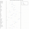
Fig 1. Mean biomarker values for NHANES in relation to reported reference ranges.
Mean values for each biomarker were normalized according to the reported minimal and maximal normal values, represented by the vertical lines. For biomarker with only one specified normal value, the other vertical line represents minimal or maximal value for the data set (see S1 Table for details). Graphs for other data sets can be found in S1–S3 Figs.
Fig 2
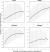
Fig 2. Mean correlation between pairwise D M values as a function of biomarker number.
Grey vertical bars indicate 2.5 to 97.5 percentiles of observed correlation coefficients calculated between ~5,000 random mutually exclusive pairs generated from a pool of 44 markers.
Fig 3
Fig 3. Mean variance of predicted D M values with age as a function of biomarker number.
Grey vertical bars indicate 2.5 to 97.5 percentiles of observed variances in age explained by D M calculated from ~5,000 random combinations generated from a pool of 44 markers.
Fig 4
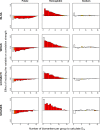
Fig 4. Contribution of selected individual biomarkers to pairwise D M correlations, as a function of biomarker number.
The X-axis represents the number of biomarkers per group (N bm) and the Y-axis reports the coefficient (β) from a linear regression of the D M pairwise correlations on N bm. βs represent the deviation from the average correlation when a given biomarker is included in the calculation of D M; positive values thus indicate improved performance of D M, and negative values decreased performance. Colors indicate the magnitude of p-values, with darker red being more significant and white not significant. Graphs for all biomarkers can be found in S8–S11 Figs.
Fig 5
Fig 5. Contribution of selected individual biomarkers to change in variance in age explained by D M.
The X-axis represents the number of biomarkers per group (N bm), while the Y-axis reports the change in how much variance in age is predicted by D M with the inclusion of the given biomarker, based on a meta-regression of all the R-squareds calculated for individual quadratic regressions of age and D M. Colors indicate the magnitude of p-values, with darker red being more significant and white not significant. Graphs for all biomarkers can be found in S12–S15 Figs.
Fig 6
Fig 6. Effects of RP age intervals on prediction of age and health outcomes.
The study population represented here is the full InCHIANTI data set with InCHIANTI RPs covering different age intervals. The width of the rectangle represents the average effect size among significant analyses, relative to the effect size of the rectangle in the leftmost column (entire study population as its own RP). The percentage of significant p-values is represented by the height of shading within the rectangle, the shading colour represents the direction of the effect (blue is a positive effect), and the hue represents the average p-value among the significant p-values, with darker hues indicating lower p-values.
Fig 7
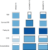
Fig 7. Effects of RPs’ survival and health status on prediction of age and health outcomes.
The study population represented here is the full InCHIANTI data set with InCHIANTI RPs defined according to survival and health status. The width of the rectangle represents the average effect size among significant analyses, relative to the effect size of the rectangle in the leftmost column (entire study population as its own RP). The percentage of significant p-values is represented by the height of shading within the rectangle, the shading colour represents the direction of the effect (blue is a positive effect), and the hue represents the average p-value among the significant p-values, with darker hues indicating lower p-values.
Fig 8
Fig 8. Effects of RP sample size on prediction of age and health outcomes.
The study population represented here are individuals aged 20–70 from the InCHIANTI data set with RPs of various sample sizes drawn randomly from the study population. The width of the rectangle represents the average effect size among significant analyses, relative to the effect size of the rectangle in the leftmost column (entire study population as its own RP). The percentage of significant p-values is represented by the height of shading within the rectangle, the shading colour represents the direction of the effect (blue is a positive effect), and the hue represents the average p-value among the significant p-values, with darker hues indicating lower p-values.
Fig 9
Fig 9. Effects of RP drawn from external young populations on prediction of age and health outcomes.
The study population represented here is the full WHAS data set with young RPs from each of the three data sets as indicated. The width of the rectangle represents the average effect size among significant analyses, relative to the effect size of the rectangle in the leftmost column (entire study population as its own RP). The percentage of significant p-values is represented by the height of shading within the rectangle, the shading colour represents the direction of the effect (blue is a positive effect), and the hue represents the average p-value among the significant p-values, with darker hues indicating lower p-values.

References

    1. Kirkwood TBL. Understanding the Odd Science of Aging. Cell. 2005; 120: 437–447. - PubMed
    1. Medvedev ZA. An attempt at a rational classification of theories of ageing. Biological Reviews. 1990; 65: 375–398. - PubMed
    1. Cohen AA, Martin LB, Wingfield JC, McWilliams SR, Dunne JA. Physiological regulatory networks: ecological roles and evolutionary constraints. Trends in Ecology & Evolution. 2012; 27: 428–435. - PubMed
    1. Ferrucci L, Windham BG, Fried LP. Frailty in older persons. Genus. 2005; 61: 39–53.
    1. Fried LP, Hadley EC, Walston JD, Newman AB, Guralnik JM, Studenski S, et al. From Bedside to Bench: Research Agenda for Frailty. Sci Aging Knowl Environ. 2005;2005: pe24-. - PubMed

Publication types