. 2015 Jul 15;10(7):e0132614.
doi: 10.1371/journal.pone.0132614. eCollection 2015.

Visualizing Risk Prediction Models

Affiliations

Visualizing Risk Prediction Models

Vanya Van Belle et al. PLoS One. .

Abstract

Objective: Risk prediction models can assist clinicians in making decisions. To boost the uptake of these models in clinical practice, it is important that end-users understand how the model works and can efficiently communicate its results. We introduce novel methods for interpretable model visualization.

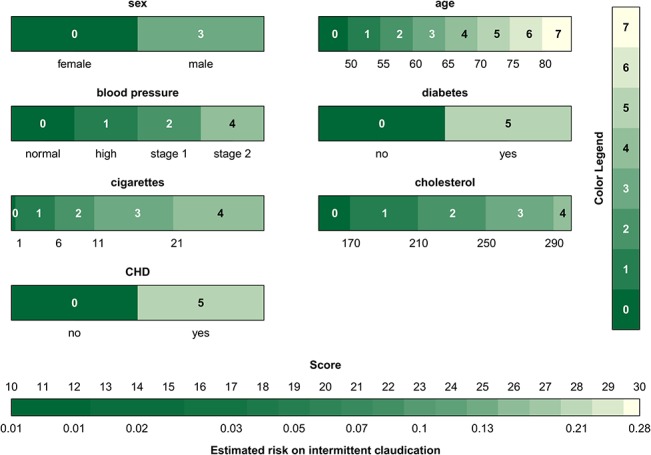
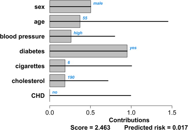
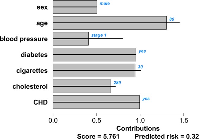
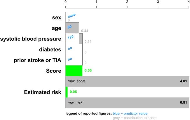
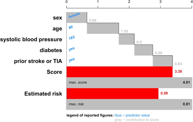
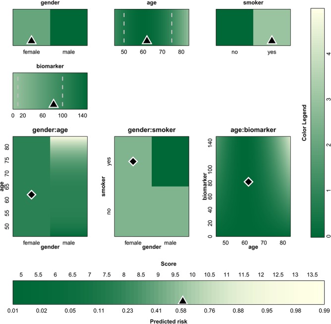
Methods: The proposed visualization techniques are applied to two prediction models from the Framingham Heart Study for the prediction of intermittent claudication and stroke after atrial fibrillation. We represent models using color bars, and visualize the risk estimation process for a specific patient using patient-specific contribution charts.

Results: The color-based model representations provide users with an attractive tool to instantly gauge the relative importance of the predictors. The patient-specific representations allow users to understand the relative contribution of each predictor to the patient's estimated risk, potentially providing insightful information on which to base further patient management. Extensions towards non-linear models and interactions are illustrated on an artificial dataset.

Conclusion: The proposed methods summarize risk prediction models and risk predictions for specific patients in an alternative way. These representations may facilitate communication between clinicians and patients.


Conflict of interest statement

Competing Interests: The authors have declared that no competing interests exist.

Figures

Fig 1
Fig 1. Nomogram for the intermittent claudication (IC) model.
Each predictor is provided with a ruler. In order to obtain the contribution of a predictor to the prognostic index, the value of the predictor needs to be indicated and a vertical line needs to be drawn from this value, up to the points ruler. Addition of the points obtained for each predictor yields the score. The corresponding risk is found by drawing a vertical line from the score to the risk ruler.
Fig 2
Fig 2. Graphical representation of the intermittent claudication score system.
The colors relate to the points that are attributed to a predictor value. Dark green indicates a low contribution and light green to ecru a high contribution to the risk. The points corresponding to the colors are indicated within each interval and by means of the color legend. It is instantly seen that older age and having diabetes or coronary heart disease have the highest contribution to the risk of intermittent claudication. Addition of all points corresponding to the predictor values of a patient gives the score which can then be converted into a risk estimate by means of the color bar at the bottom.
Fig 3
Fig 3. Graphical representation of the intermittent claudication model.
For each predictor the range is indicated below the color bar, and the color indicates the contribution to the linear predictor corresponding to the predictor value. The colors are converted to points by means of the color legend at the right of the graph. The sum of all points, i.e. the score, is then converted to the estimated risk by means of the color bar at the bottom The triangles indicate the predictor values and the corresponding risk estimate for a 55 year old man with a high blood pressure and diabetes, who smokes 6 cigarettes a day and has a cholesterol value of 190 mg/dL.
Fig 4
Fig 4. Contribution chart for the intermittent claudication model for a patient with a good prognosis: a 55 year old man with a high blood pressure and diabetes, who smokes 6 cigarettes a day and has a cholesterol value of 190 mg/dL.
The black lines indicate the range of contributions for each predictor as observed in the data set. The bars indicate the predictors’ contributions to the linear predictor for this specific patient. The patient-specific predictor values are indicated in blue. The score at the bottom of the graph is the sum of all predictor contributions. The estimated risk of intermittent claudication corresponding to this score is given as well.
Fig 5
Fig 5. Contribution chart for the intermittent claudication model for a patient with a bad prognosis: an 80-year old man with stage 1 hypertension, diabetes, a cholesterol value of 289 mg/dL and coronary heart disease, who smokes 30 cigarettes a day.
The black lines indicate the range of contributions for each predictor as observed in the data set. The bars indicate the predictors’ contributions to the linear predictor for this specific patient. The patient-specific predictor values are indicated in blue. The score at the bottom of the graph is the sum of all predictor contributions. The estimated risk of intermittent claudication corresponding to this score is given as well.
Fig 6
Fig 6. Cumulative contribution chart representing patient-specific predictor contributions for the stroke model for a patient with a good prognosis: a 60-year old man with a systolic blood pressure of 120 mm Hg.
For each predictor the contribution to the linear predictor or score is represented by means of a bar, each of which starts where the previous ended. The score is the sum of all these contributions. An extra bar indicates the maximal score observed in the data set. The estimated risks corresponding to this patient's score and the most extreme score observed in the data set is visualized as well. For this application, we chose to represent an estimated risk of 10% or higher by a red color, representing a bad prognosis. Lower risk estimates are visualized in green.
Fig 7
Fig 7. Cumulative contribution chart representing patient-specific predictor contributions for the stroke model for a patient with a bad prognosis: an 80-year old woman with a systolic blood pressure of 183 mm Hg, diabetes and a prior stroke or TIA.
For each predictor the contribution to the linear predictor or score is represented by means of a bar, each of which starts where the previous ended. The score is the sum of all these contributions. An extra bar indicates the maximal score observed in the data set. The estimated risks corresponding to this patient's score and the most extreme score observed in the data set is visualized as well. For this application, we chose to represent an estimated risk of 10% or higher by a red color, representing a bad prognosis. Lower risk estimates are visualized in green.
Fig 8
Fig 8. Graphical representation of an artificial logistic model that includes non-linear functional forms and interaction effects.
For each predictor or interaction, the range is indicated below or next to the color bars and color plots. The color indicates the contribution to the linear predictor corresponding to the predictor values. The colors are converted to points by means of the color legend at the right of the graph. The sum of all points, i.e. the score, is then converted to the estimated risk by means of the color bar at the bottom. The triangles/diamonds indicate the predictor values and the corresponding risk estimate for a specific patient. The dashed gray lines are used to show percentiles.

References

    1. Galea M, Blamey R, Elston C, Ellis I. The Nottingham Prognostic Index in primary breast cancer. Breast Cancer Res Treat. 1992; 22(3):207–219. - PubMed
    1. Knaus WA, Wagner DP, Draper EA, Zimmerman JE, Bergner M, Bastos PG, et al. The APACHE III prognostic system. Risk prediction of hospital mortality for critically ill hospitalized adults. Chest. 1991; 100(6):1619–1636. - PubMed
    1. Timmerman D, Testa AC, Bourne T, Ferrazzi E, Ameye L, Konstantinovic ML, et al. Logistic regression model to distinguish between the benign and malignant adnexal mass before surgery: a multicenter study by the International Ovarian tumor Analysis Group. J Clin Oncol. 2005; 23(34):8794–8801. - PubMed
    1. Nashef S A, Roques F, Michel P, Gauducheau E, Lemeshow S, Salamon R. European system for cardiac operative risk evaluation (EuroSCORE). Eur J Cardiothorac Surg. 1999; 16(1):9–13. - PubMed
    1. Chalmers J, Pullan M, Fabri BM, McShane J, Shaw M, Mediratta N, et al. Validation of EuroSCORE II in a modern cohort of patients undergoing cardiac surgery. Eur J CardioThorac Surg. 2013; 43(4):688–694. - PubMed

Publication types