. 2015 Aug 20;10(8):e0135749.
doi: 10.1371/journal.pone.0135749. eCollection 2015.

Air Pollution in China: Mapping of Concentrations and Sources

Affiliations

Air Pollution in China: Mapping of Concentrations and Sources

Robert A Rohde et al. PLoS One. .

Abstract

China has recently made available hourly air pollution data from over 1500 sites, including airborne particulate matter (PM), SO2, NO2, and O3. We apply Kriging interpolation to four months of data to derive pollution maps for eastern China. Consistent with prior findings, the greatest pollution occurs in the east, but significant levels are widespread across northern and central China and are not limited to major cities or geologic basins. Sources of pollution are widespread, but are particularly intense in a northeast corridor that extends from near Shanghai to north of Beijing. During our analysis period, 92% of the population of China experienced >120 hours of unhealthy air (US EPA standard), and 38% experienced average concentrations that were unhealthy. China's population-weighted average exposure to PM2.5 was 52 μg/m3. The observed air pollution is calculated to contribute to 1.6 million deaths/year in China [0.7-2.2 million deaths/year at 95% confidence], roughly 17% of all deaths in China.


Conflict of interest statement

Competing Interests: The authors have declared that no competing interests exist.

Figures

Fig 1
Fig 1. Map of real-time air pollution monitoring stations.
Map shows the locations of air quality monitoring sites in China and surrounding areas with sufficient hourly data to be included in this study. Selection criteria and data sources are described in S1 Text. The map was prepared in MATLAB using political boundaries from the Global Database of Administrative Areas (version 2; http://gadm.org/).
Fig 2
Fig 2. Time evolution of PM2.5 pollution in the vicinity of Beijing.
(Top) Time series of PM2.5 concentration at Beijing extracted from the interpolated field. Red circles indicate times shown in bottom row. (Bottom) Maps of interpolated PM2.5 concentration during a period of high pollution. Pollution concentrations were computed as described in the text from hourly data and maps were rendered in MATLAB. Concentrations are shown using color gradients and contour lines, where color tones (green, yellow, etc.) correspond to health impact categories defined by the US EPA. Bold circles show station locations with the observed value at each station indicated by the color within the circle.
Fig 3
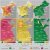
Fig 3. Average air pollution maps.
Maps of average pollutant concentration for PM2.5, PM10, and O3 for eastern China (top row) and the Beijing to Shanghai corridor (bottom row). Concentrations are shown using color gradients and contour lines; the colors (green, yellow, etc.) represent US EPA qualitative health impacts. Pollution concentrations were computed as described in the text using hourly data and then the hourly concentration fields were averaged over the four month study duration. The resulting maps were rendered using MATLAB.
Fig 4
Fig 4. Air pollution source maps.
Maps of average pollutant flux for PM2.5, PM10, SO2, and NO2 for eastern China (top row) and the Beijing to Shanghai corridor (bottom row). Pollutant fluxes were computed as described in the text from changes in the interpolated hourly pollution fields along with contemporaneous wind and weather data. Due to sparse sampling and secondary transformations of pollutants in the atmosphere, apparent source fluxes are likely to appear more diffuse than the true emissions source.
Fig 5
Fig 5. Comparison of PM2.5 observations to satellite data.
Maps of average PM2.5 concentration from this study (top) and two satellite-derived datasets restricted to the same region. The average over the 2008 to 2010 time interval was chosen for the satellite data due to the limitations of the available satellite data. Both the concentrations reported by van Donkelaar [28] (middle) and those reported by de Sherbinin [30] (bottom) rely on similar satellite observations of aerosol optical depth (obtained by NASA), but interpret those observations differently when determining pollutant concentration. The satellite-derived data was imported from concentration data files provided by their respected sources and rendered via MATLAB to use the same US EPA health category color scheme applied in Figs 2 and 3.

References

    1. World Health Organization. WHO methods and data sources for global causes of death 2000–2012. Global Health Estimates Technical Paper WHO/HIS/HSI/GHE/2014.7. 2014. Available: http://www.who.int/entity/healthinfo/global_burden_disease/GlobalCOD_met....
    1. World Health Organization. Burden of disease from the joint effects of Household and Ambient Air Pollution for 2012. WHO Technical Report. 2012. Available: http://www.who.int/phe/health_topics/outdoorair/databases/AP_jointeffect....
    1. O’Keefe B. Recent Trends in Air Quality Standards in Europe and Asia: What’s next? HEI Annual Conference 2012. 2013. Available: http://www.healtheffects.org/Slides/AnnConf2013/OKeefe-Sun.pdf.
    1. Yang G, Wang Y, Zeng Y, Gao GF, Liang X, Zhou M, et al. Rapid health transition in China, 1990–2010: findings from the Global Burden of Disease Study 2010. Lancet 2013; 381: 1987–2015. 10.1016/S0140-6736(13)61097-1 - DOI - PMC - PubMed
    1. Dockery DW, Pope CA, Xu X, Spengler JD, Ware JH, Fay ME, et al. An association between air pollution and mortality in six U.S. cities. N Engl J Med 1993; 329(24), 1753–1759. - PubMed

Publication types