. 2015 Nov 12;3(4):646-59.
doi: 10.9745/GHSP-D-15-00207.

Introduction of Mobile Health Tools to Support Ebola Surveillance and Contact Tracing in Guinea

Affiliations

Introduction of Mobile Health Tools to Support Ebola Surveillance and Contact Tracing in Guinea

Jilian A Sacks et al. Glob Health Sci Pract. .

Abstract

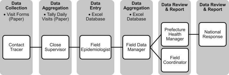
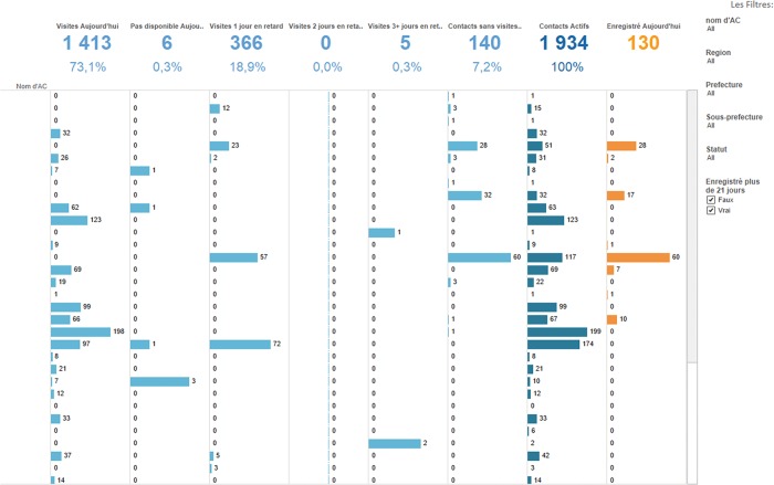
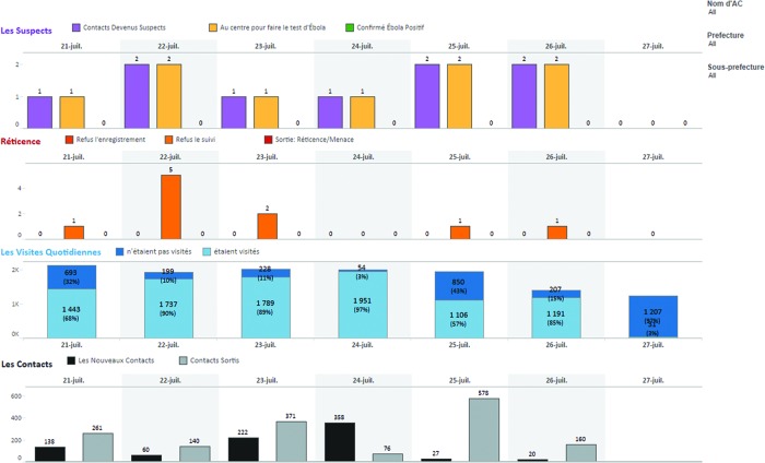
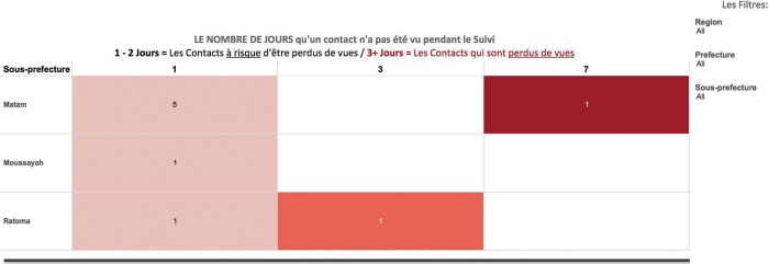
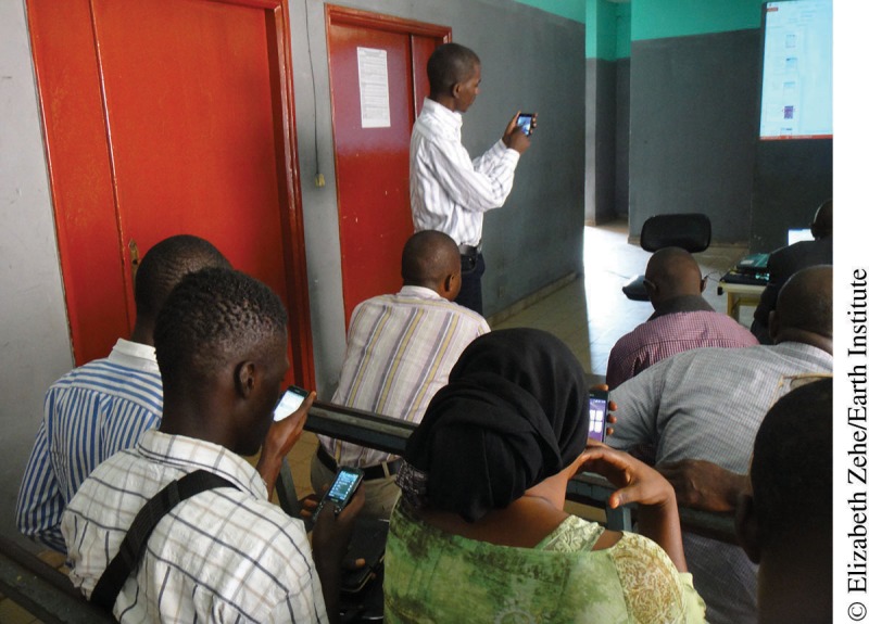
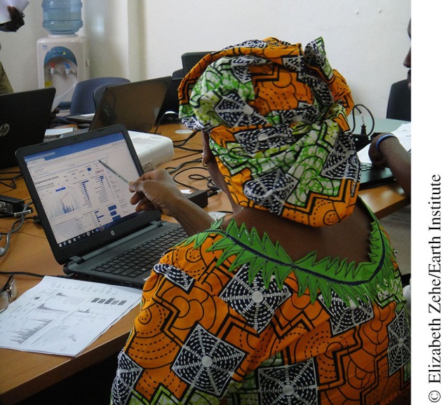
Challenges in data availability and quality have contributed to the longest and deadliest Ebola epidemic in history that began in December 2013. Accurate surveillance data, in particular, has been difficult to access, as it is often collected in remote communities. We describe the design, implementation, and challenges of implementing a smartphone-based contact tracing system that is linked to analytics and data visualization software as part of the Ebola response in Guinea. The system, built on the mobile application CommCare and business intelligence software Tableau, allows for real-time identification of contacts who have not been visited and strong accountability of contact tracers through timestamps and collection of GPS points with their surveillance data. Deployment of this system began in November 2014 in Conakry, Guinea, and was expanded to a total of 5 prefectures by April 2015. To date, the mobile system has not replaced the paper-based system in the 5 prefectures where the program is active. However, as of April 30, 2015, 210 contact tracers in the 5 prefectures were actively using the mobile system to collectively monitor 9,162 contacts. With proper training, some investment in technical hardware, and adequate managerial oversight, there is opportunity to improve access to surveillance data from difficult-to-reach communities in order to inform epidemic control strategies while strengthening health systems to reduce risk of future disease outbreaks.


Figures

FIGURE 1.
FIGURE 1.
Flow of Information Using Paper-Based Contact Tracing System in Guinea
FIGURE 2.
FIGURE 2.
Contact Tracer Performance Dashboard Numbers at the top depict the numbers of contacts for the day that: (1) received a household visit from the contact tracer; (2) were visited by the contact tracer but were unavailable; (3) were last visited by the contact tracer 1 day ago; (4) were last visited by the contact tracer 2 days ago; (5) were last visited by the contact tracer 3 or more days ago; (6) have never received a monitoring visit since being registered in CommCare; (7) are active in the system and should receive a daily visit; (8) were newly registered in the system. The username of the contact tracer is displayed in the column on the far left but the names have been removed to maintain confidentiality. The filters on the right include: the name of the contact tracer; the region, prefecture, and sub-prefecture of the contact; the status of the contact (either active or not active); and whether the contact was registered more than 21 days ago. A user with appropriate permissions can then click on any bar in the graph to view the underlying specifics, i.e., the name of the contact, the date of the visit, whether they displayed any symptoms, etc.
FIGURE 3.
FIGURE 3.
Weekly Key Performance Indicator Dashboard Four graphs are depicted, each showing data for the date specified, in this case, July 21– July 27, 2015. The top graph labeled “Les Suspects” shows the number of contacts who are calculated as suspected of having Ebola based on the display of symptoms, the number of contacts who have been transferred to a health center to be tested for Ebola, and the number of contacts who have been closed in the system because they were confirmed as having Ebola. The next graph labeled “Réticence” depicts instances of contact resistance during the initial registration visit and during the daily monitoring visit, as well as contacts who have been closed from the system and who will no longer be monitored because of resistance. The graph labeled “Les Visites Quotidiennes” depicts the number and proportion of contacts who are active and who have received their daily monitoring visit compared with those who were not visited for the day. The bottom graph titled “Les Contacts” shows the numbers of newly registered and closed contacts per day. The filters on the right allow the user to restrict the data to a specific contact tracer based on the username or to a specific prefecture or sub-prefecture. With proper access permissions, the user can click on any bar in the graphs to view the underlying specifics of the data, i.e., the username of the contact tracer and the name of the contact.
FIGURE 4.
FIGURE 4.
Contacts Lost to Follow-Up Dashboard This graph shows the number of days that have passed since contacts were available and visited by the contact tracer and were available at the household to be monitored for symptoms. (Note: Once a contact has not been seen for 3 or more days, they are considered lost to follow-up by surveillance management teams.) The column on the left indicates the sub-prefecture or commune where the contacts reside. The numbers in the colored boxes show the number of contacts who were unavailable for the daily contact tracing visit since 1 day ago (left column), 3 days ago (middle column), and 7 days ago (right column). The filters on the far right enable the user to restrict the data to contacts who reside in a specific region, prefecture, or sub-prefecture. The user can also click in an individual box to see the specific details for the contacts, i.e., the assigned contact tracer, name of the contact, source-case name, household head name, method of exposure, date the contact was registered, date the contact was last available to be monitored by the contact tracer, etc.
None
Contact tracers in Conakry, Guinea, attend a refresher training on the CommCare software.
None
A government health manager in Conakry, Guinea, uses the Tableau dashboards to review new contacts registered in her commune.

Similar articles

Cited by

References

    1. US Centers for Disease Control and Prevention (CDC) [Internet]. Atlanta (GA): CDC; 2014 Ebola outbreak in West Africa – case counts; 2014. [cited 2015 May 5] Available from: http://www.cdc.gov/vhf/ebola/outbreaks/2014-west-africa/case-counts.html
    1. Dhillon RS, Srikrishna D, Sachs J. Controlling Ebola: next steps. Lancet. 2014;384(9952): 1409–1411. 10.1016/S0140-6736(14)61696-2. - DOI - PubMed
    1. Braun R, Catalani C, Wimbush J, Israelski D. Community health workers and mobile technology: a systematic review of the literature. PLoS One. 2013;8(6): e65772. 10.1371/journal.pone.0065772. - DOI - PMC - PubMed
    1. Freifeld CC, Chunara R, Mekaru SR, Chan EH, Kass-Hout T, Ayala Iacucci A, et al. Participatory epidemiology: use of mobile phones for community-based health reporting. PLoS Med. 2010;7(12): e1000376. 10.1371/journal.pmed.1000376. - DOI - PMC - PubMed
    1. Obasola OI, Mabawonku I, Lagunju I. A review of e-Health interventions for maternal and child health in sub-Sahara Africa. Matern Child Health J. 2015;19(8): 1813–1824. 10.1007/s10995-015-1695-0. - DOI - PubMed

Publication types