. 2016 Jan 25;11(1):e0146844.
doi: 10.1371/journal.pone.0146844. eCollection 2016.

Can Immune Response Mechanisms Explain the Fecal Shedding Patterns of Cattle Infected with Mycobacterium avium Subspecies paratuberculosis?

Affiliations

Can Immune Response Mechanisms Explain the Fecal Shedding Patterns of Cattle Infected with Mycobacterium avium Subspecies paratuberculosis?

Gesham Magombedze et al. PLoS One. .

Abstract

Johne's disease (JD) is a chronic disease in ruminants and is caused by infection with Mycobacterium avium subspecies paratuberculosis (MAP). At late stages of the disease, MAP bacilli are shed via feces excretion and in turn create the potential for oral-fecal transmission. The role of the host immune response in MAP bacteria shedding patterns at different stages of JD is still unclear. We employed mathematical modeling to predict if the variation in MAP shedding could be correlated to the immune response in infected animals. We used a novel inverse modeling approach that assumed biological interactions among the antigen-specific lymphocyte proliferation response (cell-mediated response), antibody/humoral immune responses, and MAP bacteria. The modeling framework was used to predict and test possible biological interactions between the measured variables and returns only the essential interactions that are relevant in explaining the observed cattle MAP experimental infection data. Through confronting the models with data, we predicted observed effects (enhancement or suppression) and extents of interactions among the three variables. This analysis enabled classification of the infected cattle into three different groups that correspond to the unique predicted immune responses that are essential to explain the data from cattle within these groups. Our analysis highlights the strong and weak points of the modeling approach, as well as the key immune mechanisms predicted to be expressed in all animals and those that were different between animals, hence giving insight into how animals exhibit different disease dynamics and bacteria shedding patterns.


Conflict of interest statement

Competing Interests: The authors have declared that no competing interests exist.

Figures

Fig 1
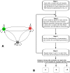
Fig 1. Model Cartoon and Model Selection Flowchart.
A. Possible immune response interactions. Lymphocyte proliferative T (LPT) cell response data is used as a proxy for a CMI response (L), ELISA data is used as proxy for the antibody response (A), and CFU data is used as a proxy of within-host population MAP bacterial density (Btot) at the site of infection. Interactions represented here assume that CMI and the antibody/humoral response cross suppress and that free bacteria will drive development of both immune responses (CMI and AMI); the immune responses are assumed to suppress the MAP population. B. Illustration of the step-by-step model selection procedure used to refine the model with all the feasible biological interactions to derive the reduced minimal models with the essential biological interactions that can explain the data.
Fig 2
Fig 2. Comparing Models to Cattle MAP Experimental Infection Data.
Through fitting the model to cattle data, all animals can be categorized into three distinct groups that correspond to three different models that predict unique immune response interactions with MAP bacteria. Group A is a set of animals with data that can be reproduced with Model A. Data for cattle in Groups B and C can be explained with Models B and C, respectively. Interactions and model equations that describe Models A, B, and C are given in Fig 3. The predicted immune interactions are different between these groups; however, within each group, different immune responses are explained by similar mechanisms with different estimated parameter values. Lines show model predicted trends, while shapes (circle, square, diamond) represent experimental data (CFU, ELISA, LPT, respectively). The red line represents the model-simulated LPT/CMI response, the green line represents the AMI response, and the black line stands for CFU kinetics.
Fig 3
Fig 3. Predicted immune interactions that explain MAP shedding patterns.
In graphs for Model A, B and C, lines ending with an arrow indicate stimulation (induction or up-regulation), lines ending with a flat bar represent suppression or inhibition and broken lines represent predicted effects that have varying effects (from strong to week) within each group, while solid lines represent strong effects within a group. Lines represented with a semi-circle with arrows represent self-stimulation/proliferation or auto-regulation.
Fig 4
Fig 4. Data regression analysis.
A multivariate linear regression analysis for B (CFUs), CMI (LPT) and antibody (ELISA) (Btot = β0 + β1L + β2A + error). CFUs (Btot) are used as the dependent variable and CMI (L) and AMI (A) responses as independent variables. The scatter plots, Panel A (Group A), Panel B (Group B), and Panel C (Group C) illustrate the differences between the 3 predicted models that are shown in Fig 3 to explain data for all the animals. Through fitting a plane, the scatters clearly makes the difference between the three groups vivid. The fitted plane for Group A shows a relatively low LPT expression to be correlated with low antibodies and low MAP shedding. The Group B fitted plane shows high CFU shedding to be correlated with low LPT expression (high LPT is associated with low MAP CFU counts and antibody expression). The plane for Group C suggests MAP shedding to be associated with low LPT expression and low levels of antibodies. Panel D, illustrates how the fitted planes for all the groups are different and distinct.
Fig 5
Fig 5. Group Summary Dynamics.
The upper row shows trajectories of CFU shedding and immune response variables using summary parameters for Group A. The middle and lower rows show corresponding summary dynamics for Groups B and C, respectively. Summary parameter statistics for each parameter were derived by finding the average of each parameter in each group, and the uncertainty in the trajectories were generated by carrying out multivariate sensitivity analysis (using LHS method), hence generating the shaded regions, where min and max correspond to the minimum and maximum group trajectories generated and the solid line represents the group mean.

References

    1. Olsen I, Sigurðardóttir Ó, Djønne B. Paratuberculosis with special reference to cattle A review. Veterinary quarterly. 2002;24(1):12–28. - PubMed
    1. Salem M, Heydel C, El-Sayed A, Ahmed SA, Zschöck M, Baljer G. Mycobacterium avium subspecies paratuberculosis: an insidious problem for the ruminant industry. Tropical animal health and production. 2013;45(2):351–66. 10.1007/s11250-012-0274-2 - DOI - PubMed
    1. Magombedze G, Ngonghala CN, Lanzas C. Evalution of the “Iceberg Phenomenon” in Johne's Disease through Mathematical Modelling. PLoS ONE. 2013;8(10):e76636 10.1371/journal.pone.0076636 - DOI - PMC - PubMed
    1. Whittington R, Sergeant E. Progress towards understanding the spread, detection and control of Mycobacterium avium subsp paratuberculosis in animal populations. Australian Veterinary Journal. 2001;79(4):267–78. - PubMed
    1. Whitlock RH, Buergelt C. Preclinical and clinical manifestations of paratuberculosis (including pathology). Veterinary Clinics of North America-Food Animal Practice. 1996;12(2):345–56. - PubMed

Publication types