. 2016 Feb 4;530(7588):85-8.
doi: 10.1038/nature16532.

Historical nectar assessment reveals the fall and rise of floral resources in Britain

Affiliations

Historical nectar assessment reveals the fall and rise of floral resources in Britain

Mathilde Baude et al. Nature. .

Abstract

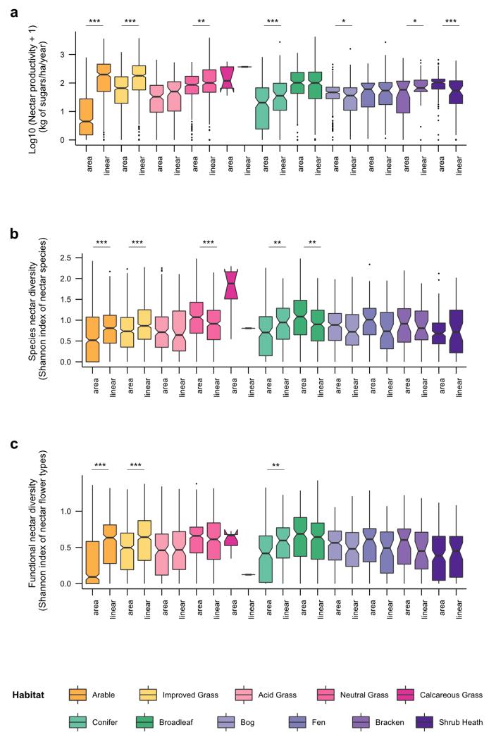
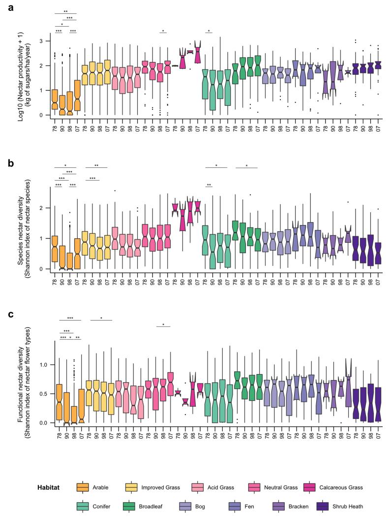
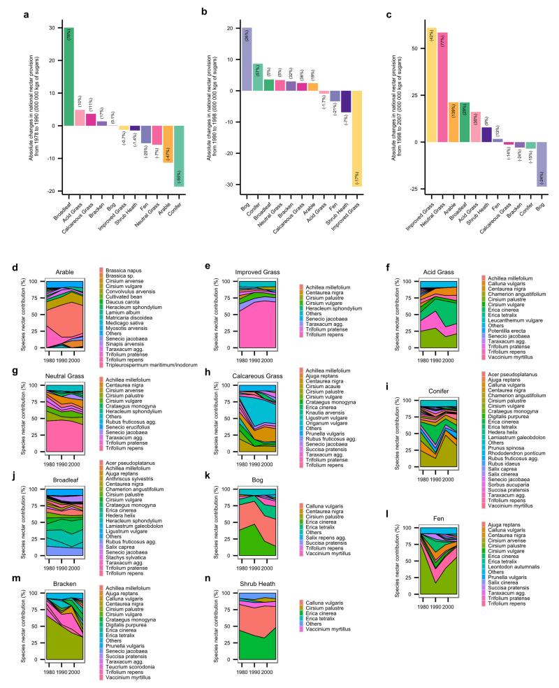
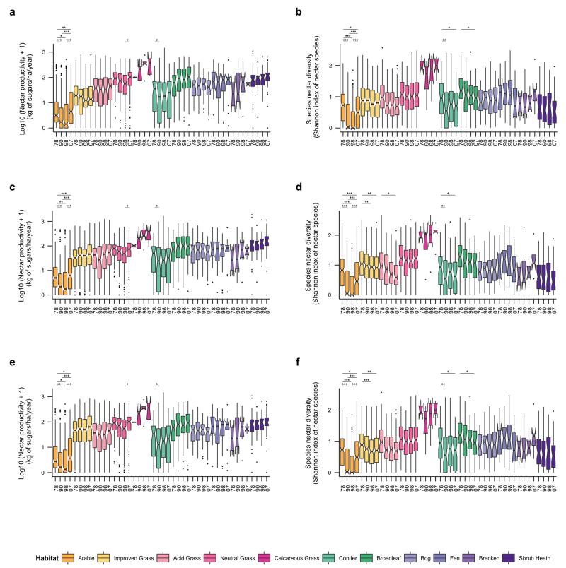
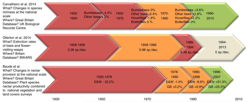
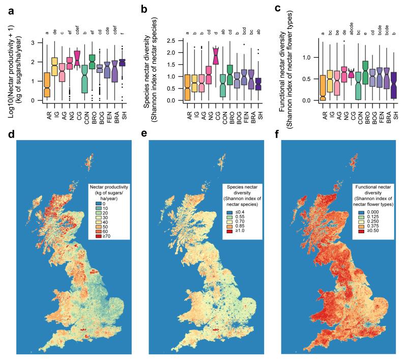
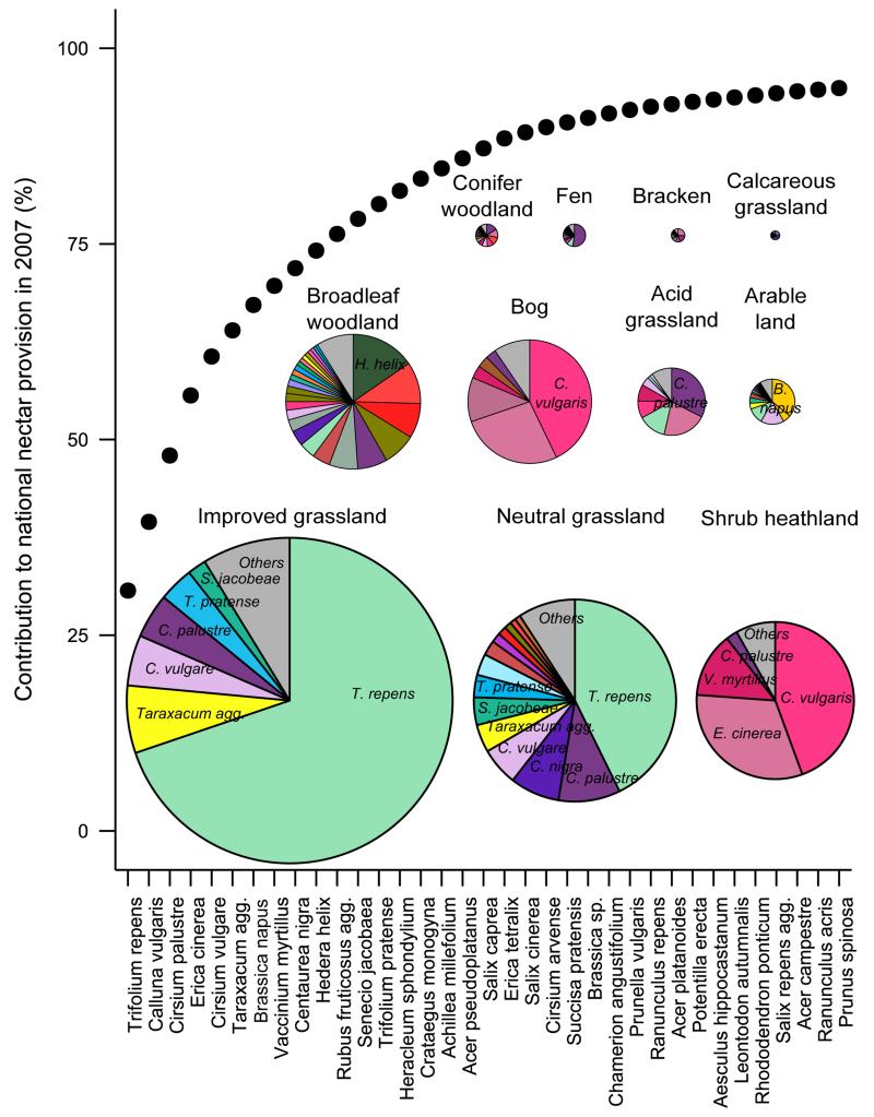
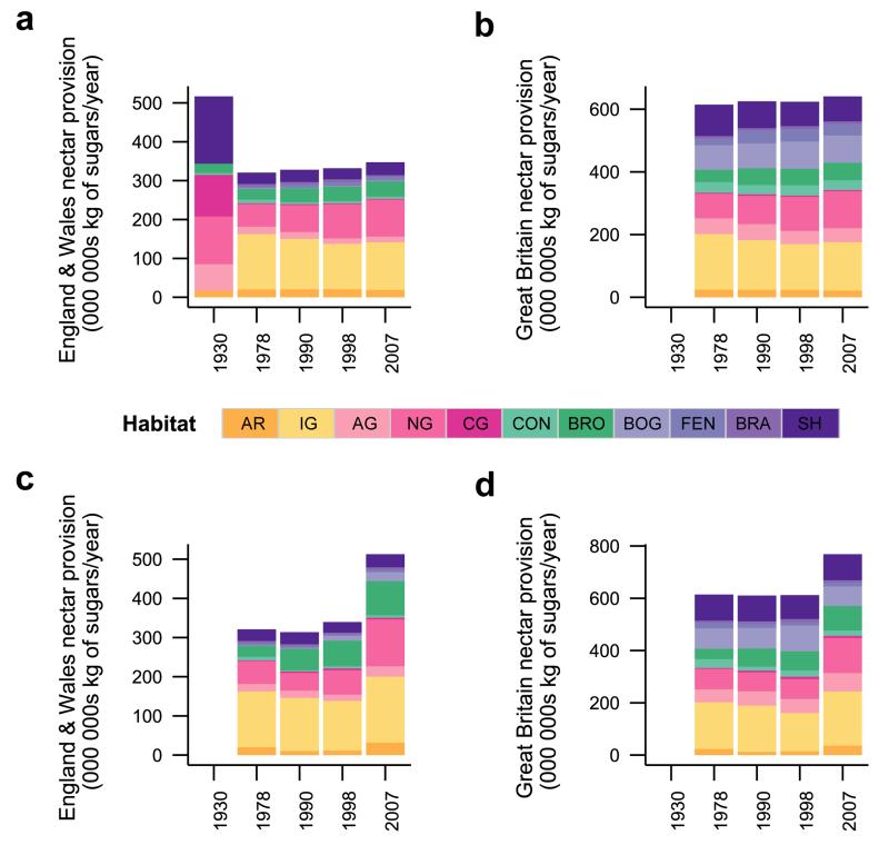
There is considerable concern over declines in insect pollinator communities and potential impacts on the pollination of crops and wildflowers. Among the multiple pressures facing pollinators, decreasing floral resources due to habitat loss and degradation has been suggested as a key contributing factor. However, a lack of quantitative data has hampered testing for historical changes in floral resources. Here we show that overall floral rewards can be estimated at a national scale by combining vegetation surveys and direct nectar measurements. We find evidence for substantial losses in nectar resources in England and Wales between the 1930s and 1970s; however, total nectar provision in Great Britain as a whole had stabilized by 1978, and increased from 1998 to 2007. These findings concur with trends in pollinator diversity, which declined in the mid-twentieth century but stabilized more recently. The diversity of nectar sources declined from 1978 to 1990 and thereafter in some habitats, with four plant species accounting for over 50% of national nectar provision in 2007. Calcareous grassland, broadleaved woodland and neutral grassland are the habitats that produce the greatest amount of nectar per unit area from the most diverse sources, whereas arable land is the poorest with respect to amount of nectar per unit area and diversity of nectar sources. Although agri-environment schemes add resources to arable landscapes, their national contribution is low. Owing to their large area, improved grasslands could add substantially to national nectar provision if they were managed to increase floral resource provision. This national-scale assessment of floral resource provision affords new insights into the links between plant and pollinator declines, and offers considerable opportunities for conservation.


Figures

<b>Extended Data Figure 1</b>.
Extended Data Figure 1.. Annual nectar productivity and diversity in linear features in 2007
a, Box plots of log10 (x+1) nectar productivity according to the location of the vegetation surveyed (non-linear vs linear features) in each habitat. b, Box plots of species nectar diversity according to the location of the vegetation surveyed (non-linear vs linear features) in each habitat. c, Box plots of functional nectar diversity according to the location of the vegetation surveyed (non-linear vs linear features) in each habitat. Significant differences of locations (linear vs nonlinear) in habitats are indicated by asterisks as follows: * for p ≤ 0.05; ** for p ≤ 0.01; *** for p ≤ 0.001. Statistical model were re-run without calcareous grassland habitat (to meet residuals homoscedasticity constraint) in order to check that significant effects remained. See Extended Data Table 1 for ANOVA results.
<b>Extended Data Figure 2</b>.
Extended Data Figure 2.. Historical changes in nectar productivity and diversity per habitat over recent decades (1978 to 2007)
a, Box plots of log 10 (x+1) nectar productivity per habitat, based on vegetation data for 1978, 1990, 1998 and 2007. b, Box plots of species nectar diversity per habitat, based on vegetation data for 1978, 1990, 1998 and 2007. c, Box plots of functional nectar diversity per habitat, based on vegetation data for 1978, 1990, 1998 and 2007. Significant differences of time periods per habitats are indicated by stars (* for p ≤ 0.05; ** for p ≤ 0.01; *** for p ≤ 0.001). See Extended Data Table 1 for ANOVA results.
<b>Extended Data Figure 3</b>.
Extended Data Figure 3.. Habitat contributions to the national nectar provision shifts and species contributions to habitats over recent decades (1978 to 2007)
Habitat contributions to the national nectar provision changes from a, 1978 to 1990 b, 1990 to 1998 and c, 1998 to 2007. All barplots represent the absolute changes (in 000 000 kg of sugars) for each habitat during the time period considered. Numbers in brackets indicate the relative changes (in %). Species contributions to nectar provision in 1978, 1990, 1998 and 2007 per habitat type (panels d-n). Only species that contribute to the first 90% are shown. See Supplementary Table 10 for main contributing species to the national changes from 1978 to 2007.
<b>Extended Data Figure 4</b>.
Extended Data Figure 4.. Sensitivity analyses of historical trends from 1978 to 2007 in nectar productivity and species diversity with alternative datasets
a, Box plots of log 10 (x+1) nectar productivity and b, Box plots of species nectar diversity per habitat based on vegetation data for 1978, 1990, 1998 and 2007 discounting the contribution of grazed white clover in improved grassland. c, Box plots of log 10 (x+1) nectar productivity and d, Box plots of species nectar diversity per habitat, based on vegetation data for 1978, 1990, 1998 and 2007 and computed with the alternative rectangular phenology function. e, Box plots of log 10 (x+1) nectar productivity and f, Box plots of species nectar diversity per habitat, based on vegetation data for 1978, 1990, 1998 and 2007 and computed considering only the species with empirical nectar values. Significant differences of time periods per habitats are indicated by stars (* for p ≤ 0.05; ** for p ≤ 0.01; *** for p ≤ 0.001). See Supplementary Table 3 for sample sizes and Supplementary Result 3 for details.
<b>Extended Data Figure 5</b>.
Extended Data Figure 5.. Historical timeline in changes in nectar resources and flower-visiting insects in Great Britain
Historical periods with the greatest negative changes in nectar resources and flower-visiting insects are indicated in red, those with intermediate changes are in orange and those with the lowest (or even reversing) changes are in green. Main historical trends from this study (Baude et al.) are presented in regard to those described in Carvalheiro et al. 2014 and Ollerton et al. 2014 studies. The white chevron indicates a provisional extinction rate that needs to be confirmed on a 20 year period of time (see supplementary materials from Ollerton et al. 2014).
<b>Extended Data Figure 6</b>.
Extended Data Figure 6.. Validity of the datasets
a, Major axis linear regression of log10 (x+1) nectar values per flower obtained in the second location against those obtained in the first one. b, Major axis linear regression of log10 (x+1) flower density values obtained in the second location against those obtained in the first one. c, Major axis linear regression of log10 (x+1) peak flower density values obtained in the second location against those obtained in the first one. d, Standardized major axis regression of the log(x+1) length of the flowering period used for analyses with those derived from IPI AgriLand floral transects (unpublished data). e, Standardized major axis regression of peak date of flowering season used for analyses with those derived from IPI AgriLand floral transects (unpublished data). f, Major axis linear regression performed on the log10 (x+1) empirical (empirical dataset) and published nectar values (literature dataset from Raine & Chittka 2007) at the flower scale. g, Standardized major axis linear regression performed on the log10 (x+1) empirical (empirical dataset) and published nectar values (literature dataset, see Supplementary Table 13 for references) at the vegetative scale. h, Standardized major axis linear regression performed on the log10 (x+1) empirical and modelled nectar values generated by a leave-one-out approach. Estimates of all equations are derived from (standardized) major axis regression (ma and sma function from ‘smatr’ package in R; see Supplementary Result 4 for details).
<b>Extended Data Figure 7</b>.
Extended Data Figure 7.. Flower number and vegetative cover relationships
Linear regressions between the number of open flowers counted in a quadrat of 0.5m2 according to the vegetative cover of the focus species in the quadrat (in %). Data are extracted from IPI AgriLand floral transects survey in 2012 (unpublished data) for 23 out of the 35 main nectar contributing species (panels a-w). The number of flowers was analyzed according to the vegetative cover (“Cover”), the month of the survey (“Month”) and the interaction between these two terms (“Cover:Month”) using negative binomial generalized linear models (see Supplementary Result 4 for details). Colored lines represent the linear regression between flower abundance and vegetative cover for each month of the survey. Black lines represent the overall linear regression between flower abundance and vegetative cover when the “Month” covariate cannot be included in the model. Line equations were derived from statistical intercept and slope estimates.
Figure 1
Figure 1. Nectar productivity and diversity in Great Britain in 2007
a, Box plots of log10 (x+1) nectar productivity (kg of sugars/ha/year) per habitat. b, Box plots of species nectar diversity (Shannon index of nectar species) per habitat. c, Box plots of functional nectar diversity (Shannon index of nectar flower types) per habitat. Box plots are based on 2007 vegetation data (see Supplementary Table 1 for sample sizes). Habitat types (AR=Arable land, IG=Improved grassland, AG=Acid grassland, NG=Neutral grassland, CG=Calcareous grassland, CON=Conifer woodland, BRO=Broadleaf woodland, BOG=Bog, FEN=Fen, BRA=Bracken, SH=Shrub heathland) significantly different from one another are indicated by different letters. d, Map of nectar productivity. e, Map of species nectar diversity. f, Map of functional nectar diversity. Maps are based on 2007 land cover and vegetation data.
Figure 2
Figure 2. Plant species’ contributions to Great Britain nectar provision and to habitat nectar provision, based on 2007 land cover and vegetation data
The dotted line represents the cumulative contribution of plant species to the national nectar provision in 2007 (only species that contribute to the first 95% are shown). The pie charts represent the contribution of plant species towards nectar production in each habitat (only the species that contribute to the first 90% are shown) in 2007. The size of each pie chart is proportional to the contribution of each habitat to national nectar provision in 2007.
Figure 3
Figure 3. Seasonal nectar productivity in Great Britain, based on 2007 land cover and vegetation data
Maps of nectar productivity in kg of sugars/ha from March to October (panels a to h). Hot colours correspond to high nectar productivity while cold colours correspond to low nectar productivity (see colours scale). Note that urban areas are assigned with nectar productivity values equal to zero, hence the blue colours in cities. Nectar productivity values for mapping correspond to back-transformed estimates of the linear mixed model fitted on log10 (x+1) nectar productivity of 2007 Countryside Survey non-linear plots with habitat, month and their interaction as fixed effects and plots nested within squares as random effects.
Figure 4
Figure 4. Historical changes in nectar provision (in kg of sugars/year) at the national scale in England & Wales (1930-2007) and in Great Britain (1978-2007)
Nectar provision partitioned by habitat, based on land cover for 1930 (England & Wales only), 1978, 1990, 1998 and 2007, using vegetation data from 1978 for all years (assuming unchanged nectar productivity within habitats across time) in a, England & Wales and b, Great Britain. Nectar provision partitioned by habitat, based on land cover and vegetation data for 1978, 1990, 1998 and 2007 in c, England & Wales and d, Great Britain. See Figure 1 for habitat type codes and Supplementary Table 5 for habitat land cover values.

References

    1. Biesmeijer J, et al. Parallel declines in pollinators and insect-pollinated plants in Britain and the Netherlands. Science. 2006;313:351–354. - PubMed
    1. Potts SG, et al. Global pollinator declines: trends, impacts and drivers. Trends Ecol. Evol. 2010;25:345–353. - PubMed
    1. Vanbergen AJ, the Insect Pollinators Initiative Threats to an ecosystem service: pressures on pollinators. Front. Ecol. Environ. 2013;11:251–259.
    1. Goulson D, Nicholls E, Botías C, Rotheray EL. Bee declines driven by combined stress from parasites, pesticides, and lack of flowers. Science. 2015;347:1255957. - PubMed
    1. Carvell C, et al. Declines in forage availability for bumblebees at a national scale. Biol. Conserv. 2006;132:481–489.

Method references

    1. Preston CD, Pearman DA, Dines TD. New Atlas of the British and Irish Flora: An Atlas of the Vascular Plants of Britain, Ireland, The Isle of Man and the Channel Island. Oxford University Press; Oxford, UK: 2002. p. 910.
    1. Fitter AH, Peat HJ. The Ecological Flora Database. J. Ecol. 1994;82:415–425. [ http://www.ecoflora.co.uk]
    1. Corbet SA, et al. Native or exotic? Double or single? Evaluating plants for pollinator-friendly gardens. Ann. Bot. 2001;87:219. - PubMed
    1. Carvalheiro LG, Barbosa ERM, Memmott J. Pollinator networks, alien species and the conservation of rare plants: Trinia glauca as a case study. J. Appl. Ecol. 2008;45:1419–1427.
    1. BSBI, Botanical Society of the British Isles 2011 [ http://www.botanicalkeys.co.uk/flora/]

Publication types