. 2016 Apr;13(2):026015.
doi: 10.1088/1741-2560/13/2/026015. Epub 2016 Feb 9.

Millimeter-scale epileptiform spike propagation patterns and their relationship to seizures

Affiliations

Millimeter-scale epileptiform spike propagation patterns and their relationship to seizures

Ann C Vanleer et al. J Neural Eng. 2016 Apr.

Abstract

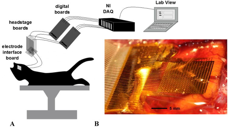
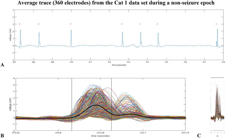
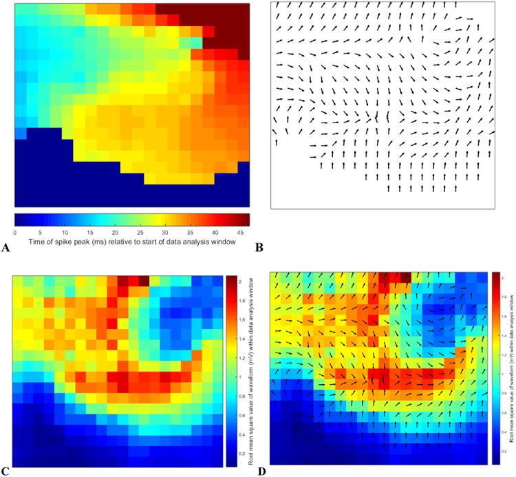
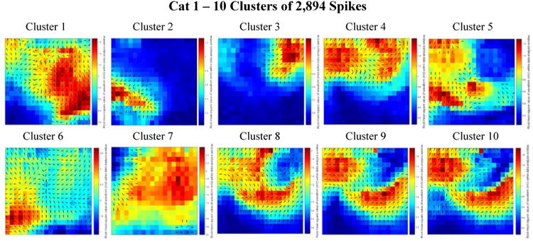
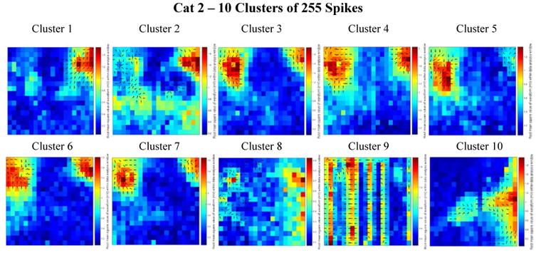
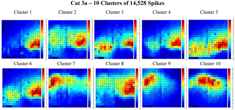
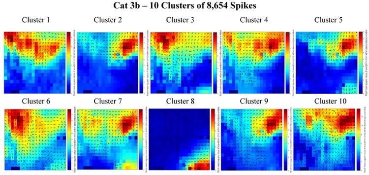
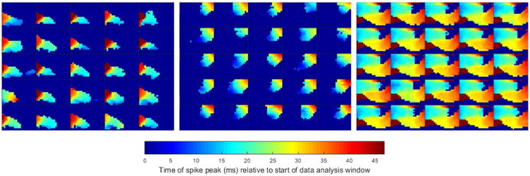
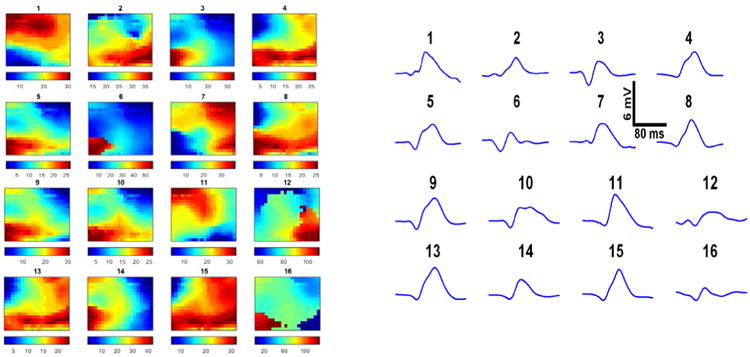
Objective: Current mapping of epileptic networks in patients prior to epilepsy surgery utilizes electrode arrays with sparse spatial sampling (∼1.0 cm inter-electrode spacing). Recent research demonstrates that sub-millimeter, cortical-column-scale domains have a role in seizure generation that may be clinically significant. We use high-resolution, active, flexible surface electrode arrays with 500 μm inter-electrode spacing to explore epileptiform local field potential (LFP) spike propagation patterns in two dimensions recorded from subdural micro-electrocorticographic signals in vivo in cat. In this study, we aimed to develop methods to quantitatively characterize the spatiotemporal dynamics of epileptiform activity at high-resolution.

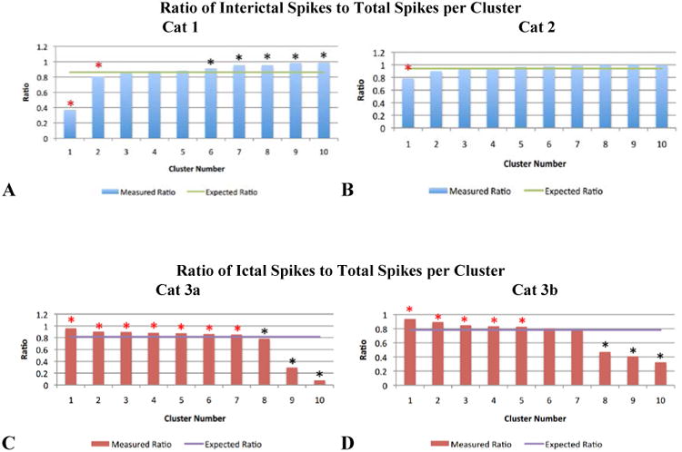
Approach: We topically administered a GABA-antagonist, picrotoxin, to induce acute neocortical epileptiform activity leading up to discrete electrographic seizures. We extracted features from LFP spikes to characterize spatiotemporal patterns in these events. We then tested the hypothesis that two-dimensional spike patterns during seizures were different from those between seizures.

Main results: We showed that spatially correlated events can be used to distinguish ictal versus interictal spikes.

Significance: We conclude that sub-millimeter-scale spatiotemporal spike patterns reveal network dynamics that are invisible to standard clinical recordings and contain information related to seizure-state.


Figures

Figure 1
Figure 1
a. A schematic of the experimental set-up. The flexible array was connected via anisotropic conductive film (ACF) ribbon to a custom electrode interface board (EIB). The EIB connected to two headstage boards which provided signal amplification and high pass filtering (Bink et al 2013). The outputs of the headstage boards were connected to custom digital boards which generated the row-select-timing signals. The outputs of the digital boards were connected to standard National Instruments (NI) digital acquisition (DAQ) PXI systems. Data were acquired and de-multiplexed in real time using custom open source LabVIEW software (Bink et al 2013). 1b. Photograph of a 360-channel, high density neural electrode array used in a feline model of epilepsy. The electrode array is placed on the cortical surface. The electrode size and spacing are 300 μm × 300 μm and 500 μm, respectively.
Figure 2
Figure 2
a. Displayed in this figure is the average voltage trace (from 360 channels on the array) during a non-seizure epoch where there were a total of seven detected spikes. The 5th detected LFP spike in the above window from the Cat 1 data set was later determined to be the spike closest to the centroid for Cluster 8. 2b. All 360 voltage waveforms for the 5th spike detection in 2a are overlaid on one axis to emphasize differences in voltage amplitude (captured by the power features map of our algorithm) and spike peak time (captured by the delay features map of our algorithm). The heavy black voltage waveform is of the average trace and the black vertical lines depict the width of the analysis window (50 msec). The various colors of the traces are random. 2c. This figure is identical to figure 2b. It has been horizontally compressed for an easier comparison of the average voltage trace waveform shape (heavy black line) to the average voltage trace waveform shape of the 5th detected spike in figure 2a.
Figure 3
Figure 3
The voltage traces from the 360 channel array for the spike depicted in figure 2. The above traces are identical to the traces in figure 2b and 2c but are here displayed according to array channel location as opposed to superimposed on one axis. The scale of the y-axis of each channel is -5 to 5 mV. The scale of the x-axis of each channel from -70 ms to 175 ms relative to the spike detection at 0 ms. (The 50 ms data analysis window is from 0 ms to 50 ms in the above figure). The data analysis window for this spike is more clearly depicted in figure 2b.
Figure 4
Figure 4
The above four subplots depict the intermediate stages of our feature extraction algorithm. We extracted a delay and power value for each channel on the 2-dimensional array obtaining a total of 720 features comprising a 720-dimension vector from each spike detection. We chose to generate these vectors to characterize the spatiotemporal patterns that we later used as the basis for our clustering algorithm. All four subplots originate from the same detected spike depicted in figures 2 and 3 and labeled as the spike closest to the centroid of Cluster 8 in figure 5. 4a. Color-coded delay map. Blue represents spike peak time early within the data analysis window and red is late. 4b. The quiver plot generated from the color-coded delay map in 4a. In the figure, the quivers only depict direction (for simplicity of display); however the feature vector data retain direction and speed. 4c. Color-coded RMS (root means square) value map to represent power features. 4d. Combined delay and power map created by overlaying figures 4b and 4c to simultaneously display the 720 extracted features from each spike detection. During subsequent stages of the data analysis, this spike was determined to be the spike closest to the centroid for Cluster 8.
Figure 5
Figure 5
Combined delay and power maps of the spike closest to each of the ten cluster centers in the Cat 1 data set. These maps were obtained following the implementation of k-medians clustering (k=10) of the spike feature set (one delay and one power feature for each of the 360 channels) to group spikes with similar features into separate clusters. Prior to clustering we employed Principal Component Analysis (PCA) to reduce the dimensionality of this feature set and retained only the number of dimensions necessary to account for 99% of the variance within the data. 251 dimensions were retained in the Cat 1 data set. The colors represent the relative amount of power recorded from each electrode within the 50 ms spike detection window. Blue is relatively low power; red is relatively high power. The black arrows on each plot depict the direction of spike wave propagation (the arrows are not scaled by speed). The speed of wave propagation varied between spikes with the wave from Cluster 1 traveling the fastest, crossing the width and length of the array in 50 ms and the wave from Cluster 7 traveling the slowest, only traveling across 25% of the array width in the 50 ms data analysis window. Every cluster is comprised of a mix of ictal and interictal spikes; the percentages of ictal labels varied between clusters.
Figure 6
Figure 6
Combined delay and power maps of the spike closest to each of the ten cluster centers in the Cat 2 data set. These maps were obtained following the implementation of k-medians clustering (k=10) of the spike feature set (one delay and one power feature for each of the 360 channels) to group spikes with similar features into separate clusters. Prior to clustering we employed Principal Component Analysis (PCA) to reduce the dimensionality of this feature set and retained only the number of dimensions necessary to account for 99% of the variance within the data. 155 dimensions were retained in the Cat 2 data set. The colors represent the relative amount of power recorded from each electrode within the 50 ms spike detection window. Blue is relatively low power; red is relatively high power. The black arrows on each plot depict the direction of spike wave propagation (the arrows are not scaled by speed). The speed of wave propagation varied between spikes with the wave from Cluster 4 traveling the fastest, crossing 33% of the length of the array (along the left side) in 4 ms and the wave from Cluster 1 traveling the slowest, crossing only 25% diagonally across the array in 17 ms. Every cluster is comprised of a mix of ictal and interictal spikes; the percentages of ictal labels varied between clusters.
Figure 7
Figure 7
Combined delay and power maps of the spike closest to each of the ten cluster centers in the Cat 3a data set. These maps were obtained following the implementation of k-medians clustering (k=10) of the spike feature set (one delay and one power feature for each of the 360 channels) to group spikes with similar features into separate clusters. Prior to clustering we employed Principal Component Analysis (PCA) to reduce the dimensionality of this feature set and retained only the number of dimensions necessary to account for 99% of the variance within the data. 281 dimensions were retained in the Cat 3a data set. The colors represent the relative amount of power recorded from each electrode within the 50 ms spike detection window. Blue is relatively low power; red is relatively high power. The black arrows on each plot depict the direction of spike wave propagation (the arrows are not scaled by speed). The speed of wave propagation varied between spikes with the wave from Cluster 8 traveling the fastest, crossing 75% of the width of the array in 16 ms and the wave from Cluster 3 traveling the slowest, crossing 50% of the width of the array in 29 ms. Every cluster is comprised of a mix of ictal and interictal spikes; the percentages of ictal labels varied between clusters.
Figure 8
Figure 8
Combined delay and power maps of the spike closest to each of the ten cluster centers in the Cat 3b data set. These maps were obtained following the implementation of k-medians clustering (k=10) of the spike feature set (one delay and one power feature for each of the 360 channels) to group spikes with similar features into separate clusters. Prior to clustering we employed Principal Component Analysis (PCA) to reduce the dimensionality of this feature set and retained only the number of dimensions necessary to account for 99% of the variance within the data. 316 dimensions were retained in the Cat 3b data set. The colors represent the relative amount of power recorded from each electrode within the 50 ms spike detection window. Blue is relatively low power; red is relatively high power. The black arrows on each plot depict the direction of spike wave propagation (the arrows are not scaled by speed). The speed of wave propagation varied between spikes with the wave from Cluster 6 traveling the fastest, crossing diagonally upward from the bottom right of the array in 16 ms and the wave from Cluster 8 traveling the slowest, crossing 40% of the width of the array in 26 ms. Every cluster is comprised of a mix of ictal and interictal spikes; the percentages of ictal labels varied between clusters.
Figure 9
Figure 9
Cluster homogeneity of delay maps from Cat 1. Delay maps from 25 detected spikes closest to their respective cluster centers (L1 distance) are depicted for three different clusters within the Cat 1 data set. The colors represent the relative delay of the spike peak for each detected spike with voltage amplitudes large enough to cross the detection threshold. Blue indicates an electrode with an early detection and red indicates an electrode with a late detection. The deep blue of the background represents the electrodes whose voltage spike amplitudes were not large enough to cross the voltage threshold.
Figure 10
Figure 10
a. Delay maps for 16 various detected spikes. Color shading represents relative timing of peak voltage detected by individual channels in each spike window. Color bars in figure 10a are in milliseconds. Blue represents the earliest time to peak of each waveform and red represents the latest relative peak time of the detected spike; colors do not correspond to the same delay values across images. The delay map for spike 1 displays a ST spike pattern of propagation across the array of a spike that enters on the bottom left and proceeds in a sweeping arc until it exits the array in the top left. The corresponding power maps of these 16 spikes are not depicted. 10b. The same 16 various detected spikes from figure 10a. are represented as they might appear had they been detected by a 1.0 cm clinical electrode. To generate the waveforms in figure 10b, we averaged the spike traces detected across all 360 electrodes of our array. Spike detection windows utilized to generate this figure are 160 ms in length; we intentionally chose spikes which occurred at a lower frequency than the majority of detected spikes to more clearly present our observation of the enhanced ability of the high-density array to provide additional spatiotemporal detail that is not captured by current clinical electrodes.
Figure 11
Figure 11
Ratios of interictal or ictal spikes to total spikes, by cluster. In 11a and 11b (the Cat 1 and 2 data sets), the majority of spikes detected occurred interictally (86.3% and 94.1% respectively, represented by the green horizontal lines). The blue bars depict the observed ratio of interictal spikes to total spikes within a given cluster. In 11c and 11d (the Cat 3a and 3b data sets), the majority of spikes detected occurred ictally (81.4% and 78.1% respectively, represented by the purple horizontal lines). The red bars depict the observed ratio of ictal spikes to total spikes within a given cluster. In all bar graphs, a red asterisk identifies the clusters that showed a statistically significant (p<0.007) preference for containing LFP spikes that occurred during seizure (ictal epochs); a black asterisk identifies the clusters that showed a statistically significant (p<0.001) preference for containing LFP spikes that occurred between seizures (interictal epochs).

Similar articles

Cited by

References

    1. Bien CG, Schulze-Bonhage A, Soeder BM, Schramm J, Elger CE, Tiemeier H. Assessment of the long-term effects of epilepsy surgery with three different reference groups. Epilepsia. 2006;47:1865–9. - PubMed
    1. Bink H, Wagenaar JB, Viventi J. Data acquisition system for high resolution, multiplexed electrode arrays. Neural Engineering (NER), 2013 6th International IEEE/EMBS Conference 1001-4 2013
    1. Bishop CM. Pattern Recognition and Machine Learning. New York: Springer Science/Business Media; 2006. p. 738.
    1. Bower MR, Buckmaster PS. Changes in granule cell firing rates precede locally recorded spontaneous seizures by minutes in an animal model of temporal lobe epilepsy. J Neurophysiol. 2008;99:2431–42. - PubMed
    1. Brodie MJ, Barry SJ, Bamagous GA, Norrie JD, Kwan P. Patterns of treatment response in newly diagnosed epilepsy. Neurology. 2012;78:1548–54. - PMC - PubMed

Publication types