. 2016 Jun 1;115(5):2456-69.
doi: 10.1152/jn.00547.2015. Epub 2016 Feb 10.

Response reliability observed with voltage-sensitive dye imaging of cortical layer 2/3: the probability of activation hypothesis

Affiliations

Response reliability observed with voltage-sensitive dye imaging of cortical layer 2/3: the probability of activation hypothesis

Clare A Gollnick et al. J Neurophysiol. .

Abstract

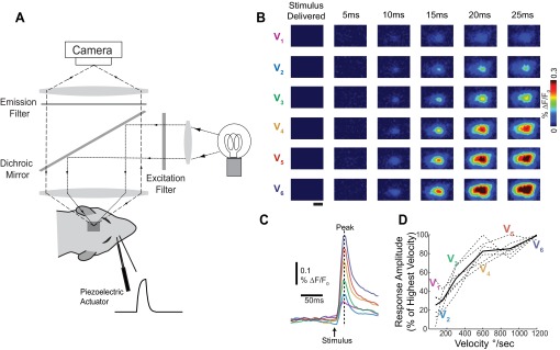
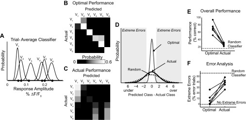
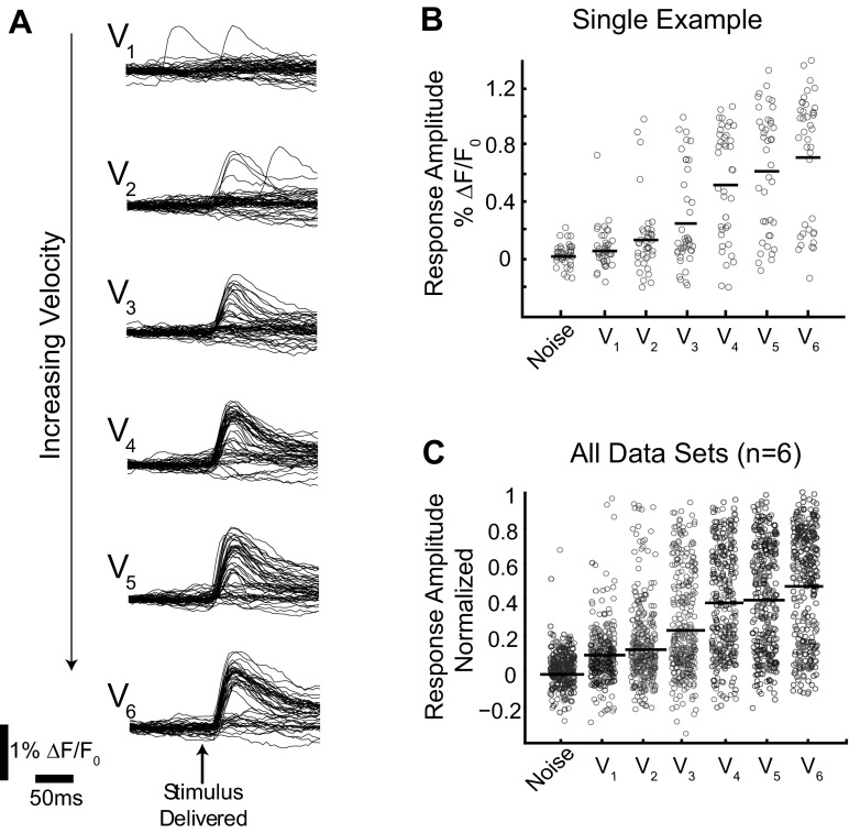
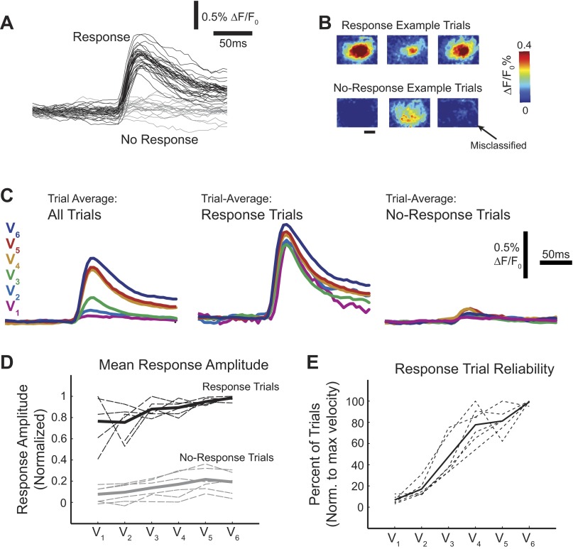
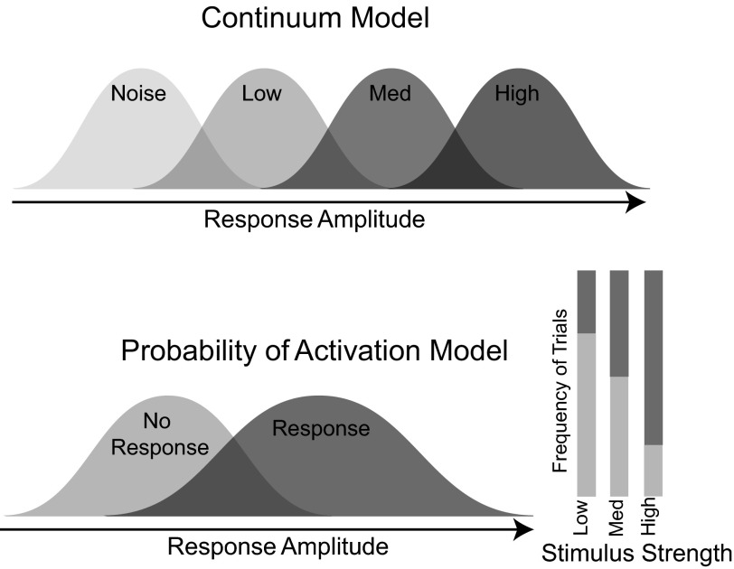
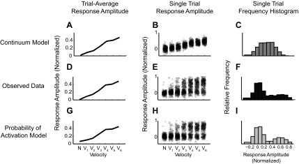
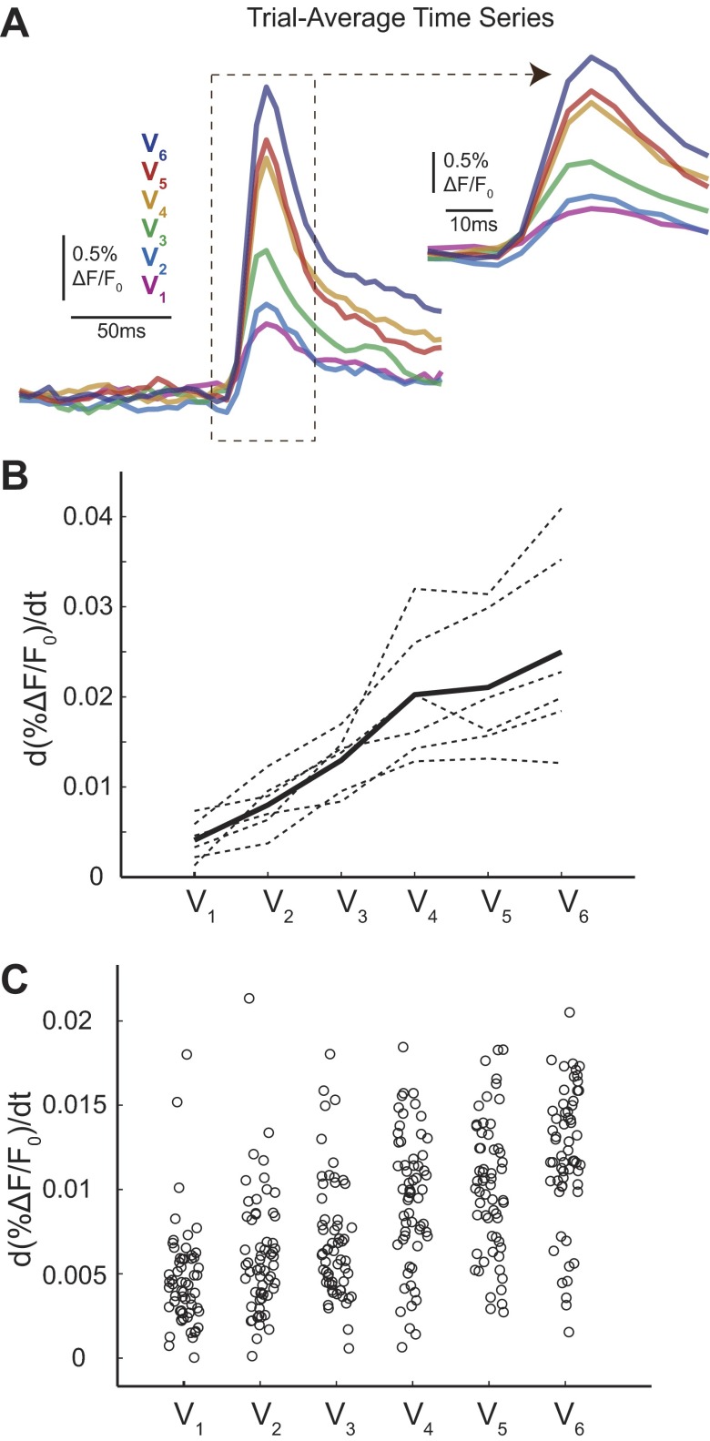
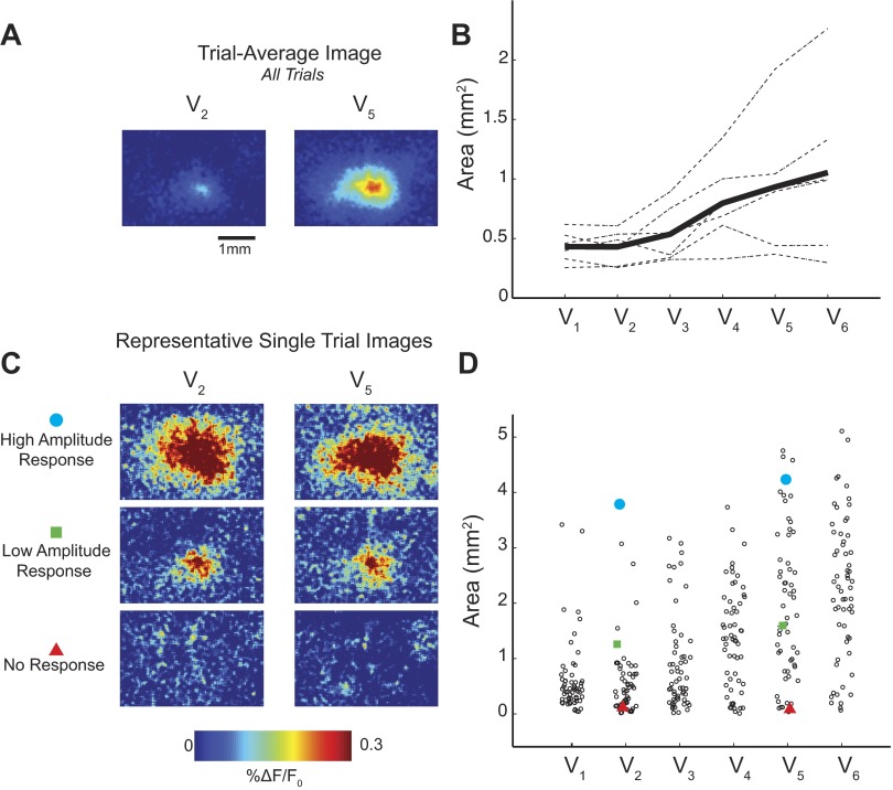
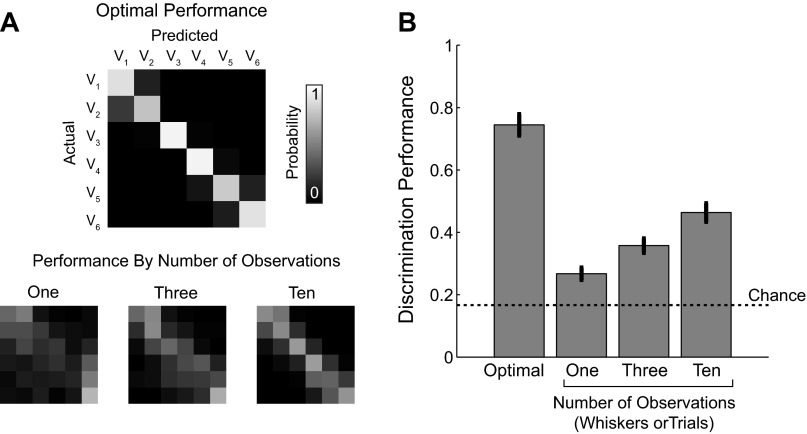
A central assertion in the study of neural processing is that our perception of the environment directly reflects the activity of our sensory neurons. This assertion reinforces the intuition that the strength of a sensory input directly modulates the amount of neural activity observed in response to that sensory feature: an increase in the strength of the input yields a graded increase in the amount of neural activity. However, cortical activity across a range of sensory pathways can be sparse, with individual neurons having remarkably low firing rates, often exhibiting suprathreshold activity on only a fraction of experimental trials. To compensate for this observed apparent unreliability, it is assumed that instead the local population of neurons, although not explicitly measured, does reliably represent the strength of the sensory input. This assumption, however, is largely untested. In this study, using wide-field voltage-sensitive dye (VSD) imaging of the somatosensory cortex in the anesthetized rat, we show that whisker deflection velocity, or stimulus strength, is not encoded by the magnitude of the population response at the level of cortex. Instead, modulation of whisker deflection velocity affects the likelihood of the cortical response, impacting the magnitude, rate of change, and spatial extent of the cortical response. An ideal observer analysis of the cortical response points to a probabilistic code based on repeated sampling across cortical columns and/or time, which we refer to as the probability of activation hypothesis. This hypothesis motivates a range of testable predictions for both future electrophysiological and future behavioral studies.

Keywords: VSD; coding; noise; reliability; tactile.


Figures

Fig. 1.
Fig. 1.
Trial-average cortical response amplitude was modulated by stimulus strength. A: a schematic of the voltage-sensitive dye (VSD) imaging system. A piezoelectric actuator delivered controlled mechanical deflections of a whisker with variable velocity. The surface of the cortex was stained with VSD, and images were recorded on a high-speed charge-coupled device camera every 5 ms. B: representative cortical responses to whisker deflections of variable velocity (V1, lowest). Images were averaged over 60 trials. Scale bar (1 mm) applies to all images. %ΔF/F0, response amplitude. C: corresponding time series to the images shown in B. Time series were calculated by averaging over a circular region of interest the size of 1 cortical column (∼400-μm diameter) centered over the barrel corresponding to the deflected whisker. The peak response frame determines the response amplitude. D: the trial-average response amplitude for each data set (dashed lines, n = 6 whiskers, 4 animals) and the resulting mean (solid black line). Trial-average response amplitude increased with velocity in all data sets.
Fig. 2.
Fig. 2.
Classification of single trials by an ideal observer performed near chance. A: representative example of a trial-average classifier. Black dots represent actual observed trial-average time series peaks and appear in velocity order (closest to origin V1, maximum V6). B: the optimal performance of the classifier shown in A is limited only by the overlap of the velocity response distributions. The probability of classifying an observation from velocity Vj as coming from Vk is represented graphically as element [j, k] in the performance matrix. The presence of a strong diagonal represents a high number of correctly sorted trials. C: the actual performance matrix of the ideal observer given true single-trial response amplitudes. D: distribution of the errors associated with classification. Using the notation described above, the error = jk. E: the percentage of trials correctly classified under both the optimal and actual conditions across all data sets. Optimal and actual performance from individual data sets are connected with a line. F: the percentage of error trials that are extreme |jk| ≥ 2 in both the optimal and actual performance conditions.
Fig. 3.
Fig. 3.
Single-trial response amplitudes were characterized by a high level of variability. A: all single-trial VSD time series from a representative data set. V1 is the lowest velocity, whereas V6 is the highest. B: the peak response amplitude from each single trial shown in A is represented as an open circle in the jittered scatter plot. C: all single-trial response amplitudes from all 6 data sets are shown in a jittered scatter plot. Data sets are normalized such that the peak single trial from any data set has a response amplitude of 1.
Fig. 4.
Fig. 4.
Response frequency was modulated by stimulus strength. A: single trials were qualitatively and quantitatively separable into 2 groups: trials with stimulus-evoked activity (response trials; black) and those without (no-response trials; gray). B: example single-trial images from trials shown in A demonstrate variability within the groups. Shown are 3 response trials with variable response amplitude (top). Three no-response trials (bottom) were chosen to represent the types of trials that comprise this category, including a misclassified trial. C: when all trials were included in the average time series of a single data set, there were large differences between the velocities (left), but when the average of only response trials (middle) or only no-response trials (right) was considered, the differences were dramatically reduced. D: results were consistent across all data sets (n = 6 whiskers, 4 animals; dashed lines) for both the response (black) and no-response (gray) average responses. The mean for both groups is depicted with a solid line. Note that higher variability is associated with conditions with the fewest number of trials (low velocities for response trials, high velocities for no-response trials). E: the frequency of response trials increased with stimulus velocity for all data sets (dotted lines), as well on average (mean; solid line).
Fig. 5.
Fig. 5.
Two possible encoding schemes. The continuum model (top) has graded response amplitude with increasing stimulus strength [low, medium (med), and high velocities]. For the probability of activation model (bottom), the frequency of response trials increases with increasing stimulus strength; however, the response and no-response distributions are conserved across stimulus strength.
Fig. 6.
Fig. 6.
Observed single-trial response distributions were consistent with the probability of activation model. A–C: continuum model simulations. A: mean response amplitude vs. velocity. B: a jittered scatter plot of the underlying single trials. C: a combined histogram of response amplitude of single trials from all velocities. The same analyses were done on the observed VSD single trials (D–F) and probability of activation model simulations (G–I). Notice that the range of achievable response amplitudes for each velocity is constrained in the continuum model but not in the probability of activation model. The observed data are consistent with the probability of activation model.
Fig. 7.
Fig. 7.
A trend in rising slope exists on trial-average time series but not on single trials. A: representative trial-average time series from 1 data set. Inset highlights the rising slope differences between the traces. B: trial-average rising slope responses for each of the 6 data sets (n = 6 whiskers, 4 animals; dotted lines). Solid line shows mean. C: jittered scattered plot for 1 representative data set (same as in A) shows that rising slope trends are not observed on single trials with significant variability similar to amplitude distributions.
Fig. 8.
Fig. 8.
A trend in area exists in trial-average images but not on single trials. A: representative trial-average images from 2 velocities (V2, 150°/s; V5, 900°/s) show apparent change in activated area. B: trial-average areas for each data set (n = 6 whiskers, 4 animals; dashed lines). Solid lines show an increasing trend (mean). C: representative amplitude-matched single trials with high (top) and low (middle) response amplitude, as well as no-response trials (bottom), demonstrate the variability of the activated area across trials. D: single-trial distributions from 1 representative example show extensive variability. Specific trials shown in C are identified by red triangles (no response), green squares (low amplitude), and blue circles (high amplitude) for V2 and V5.
Fig. 9.
Fig. 9.
Additional observations increased velocity classification performance. A: example performance matrices for the optimal discrimination performance (top) and the performance matrix for an increasing number of observations (1, 3, and 10 observations; bottom). The same labels and scale bar apply to all performance matrices. B: quantification of increased performance across all data sets (n = 6 data sets, 4 animals). Bar graph shows means ± SE.
Fig. 10.
Fig. 10.
Simultaneous whisker deflections resulted in trials with a response in only 1 whisker barrel. A: schematic of the dual whisker experimental paradigm. Trial-average image from dual whisker deflections resembled a linear sum of 2 responding whisker barrels. Single-trial responses exhibit variable response spatial profiles. Trials were sorted into 4 response categories: barrel 1 responds, barrel 2 responds, both barrels respond, and no response. B: example single-trial images (15–20 ms after stimulus presentation) from each of the 3 response categories. Scale bar (1 mm) applies to all images.

References

    1. Abbott LF, Dayan P. The effect of correlated variability on the accuracy of a population code. Neural Comput 11: 91–101, 1999. - PubMed
    1. Averbeck BB, Latham PE, Pouget A. Neural correlations, population coding and computation. Nat Rev Neurosci 7: 358–366, 2006. - PubMed
    1. Beck JM, Ma WJ, Pitkow X, Latham PE, Pouget A. Not noisy, just wrong: the role of suboptimal inference in behavioral variability. Neuron 74: 30–39, 2012. - PMC - PubMed
    1. Boloori AR, Jenks RA, Desbordes G, Stanley GB. Encoding and decoding cortical representations of tactile features in the vibrissa system. J Neurosci 30: 9990–10005, 2010. - PMC - PubMed
    1. Butts DA, Goldman MS. Tuning curves, neuronal variability, and sensory coding. PLoS Biol 4: e92, 2006. - PMC - PubMed

Publication types

LinkOut - more resources