. 2016 Apr 18;14(4):e1002436.
doi: 10.1371/journal.pbio.1002436. eCollection 2016 Apr.

Tracking Resilience to Infections by Mapping Disease Space

Affiliations

Tracking Resilience to Infections by Mapping Disease Space

Brenda Y Torres et al. PLoS Biol. .

Erratum in

Abstract

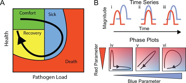
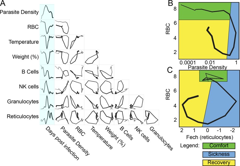
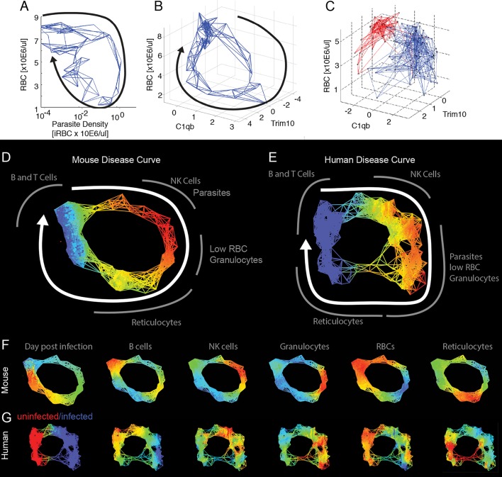
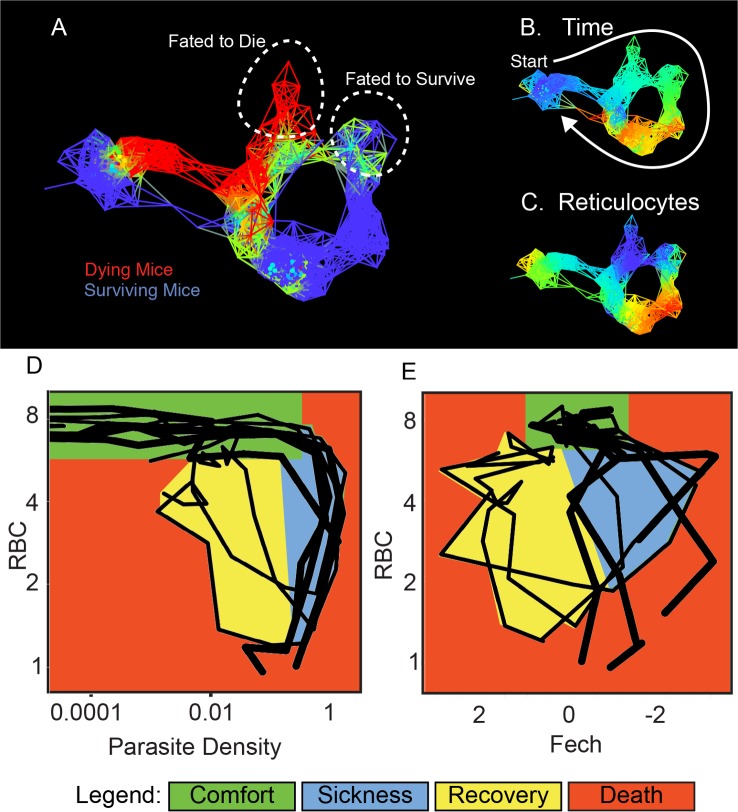
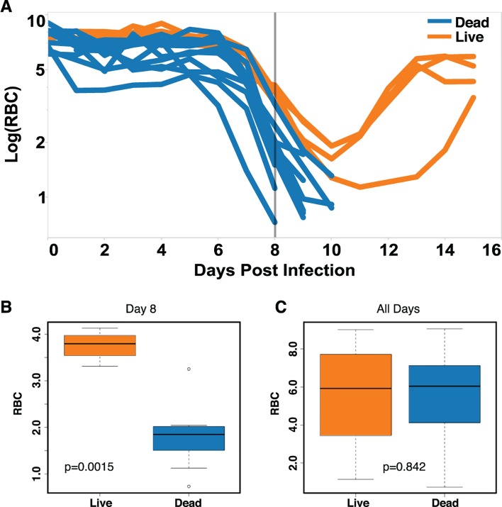
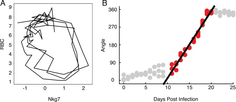
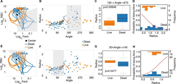
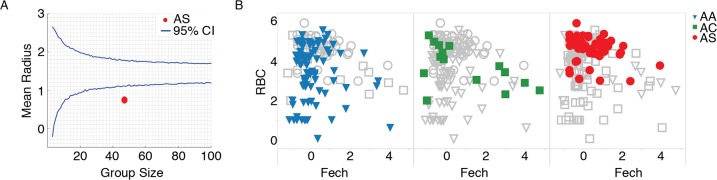
Infected hosts differ in their responses to pathogens; some hosts are resilient and recover their original health, whereas others follow a divergent path and die. To quantitate these differences, we propose mapping the routes infected individuals take through "disease space." We find that when plotting physiological parameters against each other, many pairs have hysteretic relationships that identify the current location of the host and predict the future route of the infection. These maps can readily be constructed from experimental longitudinal data, and we provide two methods to generate the maps from the cross-sectional data that is commonly gathered in field trials. We hypothesize that resilient hosts tend to take small loops through disease space, whereas nonresilient individuals take large loops. We support this hypothesis with experimental data in mice infected with Plasmodium chabaudi, finding that dying mice trace a large arc in red blood cells (RBCs) by reticulocyte space as compared to surviving mice. We find that human malaria patients who are heterozygous for sickle cell hemoglobin occupy a small area of RBCs by reticulocyte space, suggesting this approach can be used to distinguish resilience in human populations. This technique should be broadly useful in describing the in-host dynamics of infections in both model hosts and patients at both population and individual levels.


Conflict of interest statement

The authors have declared that no competing interests exist.

Figures

Fig 1
Fig 1. Predictions of disease space map behavior.
(A) This figure imagines a map tracing the path that a resilient infected individual might travel through disease space. The host starts at a position of comfort, but as pathogen load increases and health decreases, it enters a state of sickness. Once pathogen load decreases, the host starts to actively repair its health, resulting in an open loop in which every position along the path is unique. (B) For a system in which two parameters oscillate through a single cycle, they will trace three basic shapes through phase space. If the parameters do not overlap with each other in time, they will trace an L-shaped curve (i, iv). Complete overlap produces a line (ii, v), and partial overlap produces a loop (iii, vi). The color gradients show increasing concentrations of each parameter.
Fig 2
Fig 2. Disease space maps of malaria-infected mice.
(A) Average values for eight parameters for three mice measured (and averaged) daily for 20 d are plotted in a timeline marked in blue. The paths for the three mice plotted individually are shown in S2 Fig. The transcript markers used to define B cells, NK cells, granulocytes, and reticulocytes are, respectively, Cd79b, Nkg7, Camp, and Trim 10, which are reported as log2 values. Time is indicated by the increasing thickness of the curve. (B,C) Phase plots for representative looping pairs of parameters. Note that the axes have been flipped so that all graphs start at the top, and the sick mice follow a clockwise path through phase space. The graph shows “comfortable” (days 0–6, green), “sick” (days 7–10, blue) and “recovering” (days 11–15, yellow) regions. See also S1 Fig.
Fig 3
Fig 3. Reconstructed mouse and human disease space maps from longitudinal and cross-sectional data.
(A–C) show nearest neighbor networks for mouse and human data plotted in physical spaces. Arrows indicate the direction of movement through phase space. (A–B) show longitudinal data. (C) shows cross-sectional data. (A) Mouse red blood cell (RBC) by parasite density plotted by connecting five nearest neighbors. (B) Mouse RBC by C1qB by reticulocyte (Trim10) connecting five nearest neighbors. (C) Human RBC by C1qb by Trim10 map connecting five nearest neighbors. Children reported as “uninfected” are marked in red, while those infected are marked in blue. Topological network maps of mice (D) and humans (E) suffering from malaria. The known timeline in the mice runs clockwise as marked by the white arrow. The inferred human timeline is marked similarly. The color scheme in (D) and (E) marks parasite density, where blue represents low values while red represents high values. Segments of the map are marked in grey to show transcript or cell counts reporting the relative abundance of marked cell types. Red blood cells were counted directly using flow cytometry. The markers for B cells, granulocytes, NK cells, and reticulocytes are: Faim3, Lcn2, Nkg7, Trim10 for both mice and humans. (F,G) show mouse and human malaria maps reporting different parameters. Colors mark the progression of time or the relative abundance of marked parameters. Ranges for (D–G) and parameters for deriving the graphs are listed in S6 Table.
Fig 4
Fig 4. Disease maps of mice with warped disease spaces.
(A) A topological network map for malaria-infected mice following the mice for a maximum of 26 d post infection. The surviving mice are marked in blue (n = 3), while those who died are marked in red (n = 4); other colors show overlap in the map. (B–C) show the same disease map as in (A), but colored according to (B) time or (C) reticulocytes (Ferrochelatase). Phase plots for parameters parasite density by RBC (D) and Fech by RBC (E) that deviate in looping systems in dying mice. Note that the axes have been arranged (D–E) so that all graphs start at the top left and the sick mice follow a clockwise path through phase space. The graph shows “comfortable” (days 0–6, green), “sick” (days 7–10, blue), and “recovering” (days 11–15, yellow) regions. Areas not encompassed by the paths followed by surviving mice are colored red and reveal the dangerous spaces traversed by dying mice. The path of dying mice is outlined in thick lines compared to the thin lines used for survivors. Ranges for (A–C) and parameters for deriving the graphs are listed in S8 Table.
Fig 5
Fig 5. Prediction of mice fated to die based on anemia.
(A) Time series data of RBCs for survivors (n = 4, orange) and non-survivors (n = 11, blue). (B–C) Box plots of RBC counts on day 8 (B) and all days (C) of the infection. Significant difference between conditions on day 8 p-value = 0.0015. The p-value when considering all of the time points was p = 0.842. Data provided in S1 Data.
Fig 6
Fig 6. The relationship between time and angle in a disease map.
(A) Disease map of live mice (n = 3) through Nkg7 by RBC space. (B) Linear correlation between angle and days post infection from day 11 to day 20 (r2 = 0.942). Only points colored red were included in the regression analysis. Data provided in S2 Data.
Fig 7
Fig 7. Prediction of mice fated to die using polar transformed data.
(A) Disease map of live (n = 4) and dead (n = 11) mice in Fech by RBC space. Data collected through qRT-PCR. The grey area shows the range of angles analyzed just before the time of death. (B) Radius and angle for live (circle, orange) and dead mice (x, blue). (C) Box plot measuring the radius of live and dead mice. (D) Binomial generalized linear model (glm) showing the probability of survival decrease as the length of the radius increases (red line). Observed values are plotted as histograms. (E) Disease map of live (n = 4) and dead (n = 11) mice in Fech by RBC space. The grey area shows the range of angles analyzed around time zero. (F) Radius and angle for live (circle, orange) and dead (x, blue) mice at early time points. (G) Box plot measuring the radius of live and dead mice at early time points; p = 0.0477. (H) Binomial generalized linear model (glm) showing the probability of survival decrease as the length of the radius increases (red line) for early time points. Data provided in S3 Data.
Fig 8
Fig 8. Disease space analysis of malaria-infected children.
(A) The mean radius for individuals with the sickle cell trait (AS, red) is below the average random distribution for a group size of 47 patients. (B) Marking individuals with Hemoglobin A (AA, blue, triangle), Hemoglobin C (AC, green, square), and Hemoglobin S (AS, red, circle) in RBC by reticulocyte (Fech) space. Individuals with Hemoglobin S form a smaller cluster than the other two hemoglobins, suggesting a smaller route through disease space. See also S2 Fig. Data provided in S4 Data.

References

    1. Raberg l, Sim D, Read AF. Disentangling genetic variation for resistance and tolerance to infectious diseases in animals. Science. 2007;318:812–4. - PubMed
    1. Ayres JS, Schneider DS. Tolerance of Infections. Annual Review of Immunology, Vol 30. 2012;30:271–94. 10.1146/Annurev-Immunol-020711-075030 . - DOI - PubMed
    1. Medzhitov R, Schneider DS, Soares MP. Disease Tolerance as a Defense Strategy. Science. 2012;335(6071):936–41. 10.1126/science.1214935 . - DOI - PMC - PubMed
    1. Raberg L. How to live with the enemy: understanding tolerance to parasites. PLoS Biol. 2014;12(11):e1001989 10.1371/journal.pbio.1001989 - DOI - PMC - PubMed
    1. Schneider DS, Ayres JS. Two ways to survive infection: what resistance and tolerance can teach us about treating infectious diseases. Nat Rev Immunol. 2008;8(11):889–95. Epub 2008/10/18. [pii] 10.1038/nri2432 . - DOI - PMC - PubMed

Publication types