Comparative Study
. 2016 Jul;123(4):452-80.
doi: 10.1037/rev0000028. Epub 2016 May 12.

A detailed comparison of optimality and simplicity in perceptual decision making

Affiliations
Comparative Study

A detailed comparison of optimality and simplicity in perceptual decision making

Shan Shen et al. Psychol Rev. 2016 Jul.

Abstract

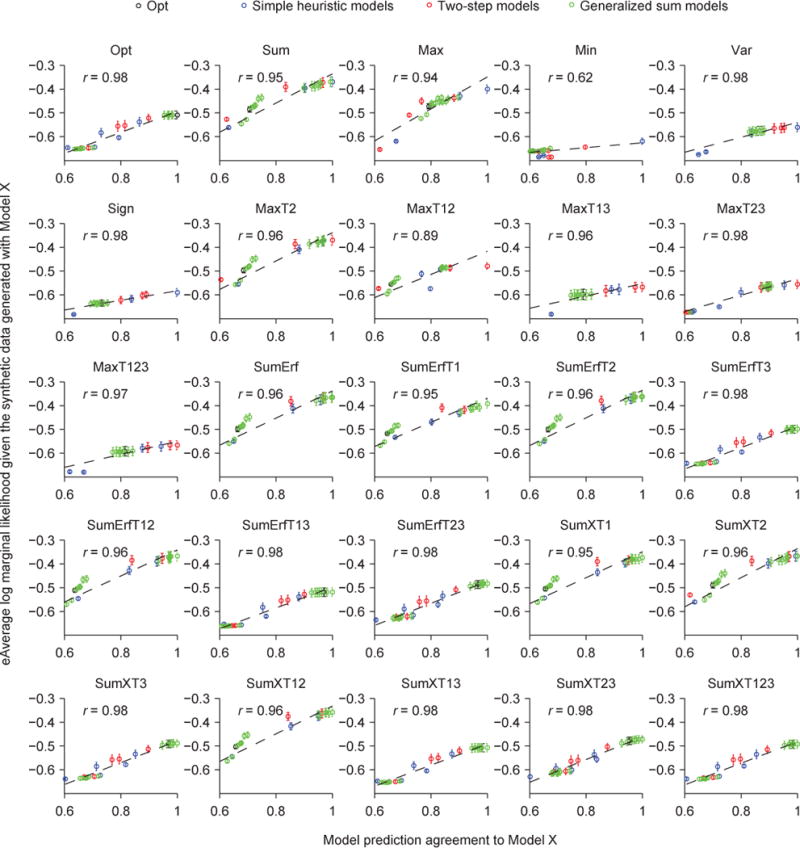
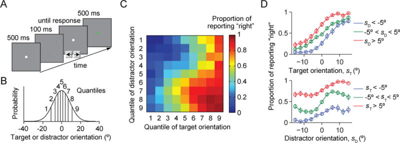
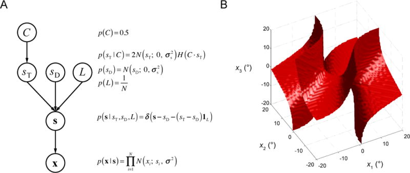
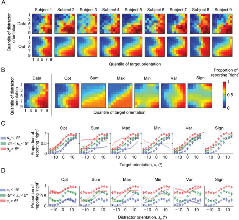
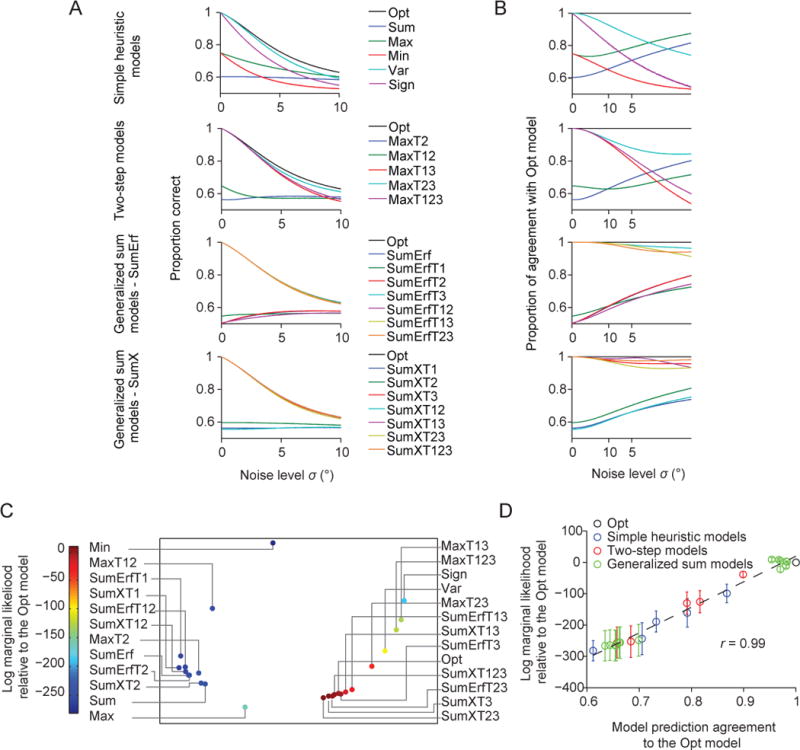
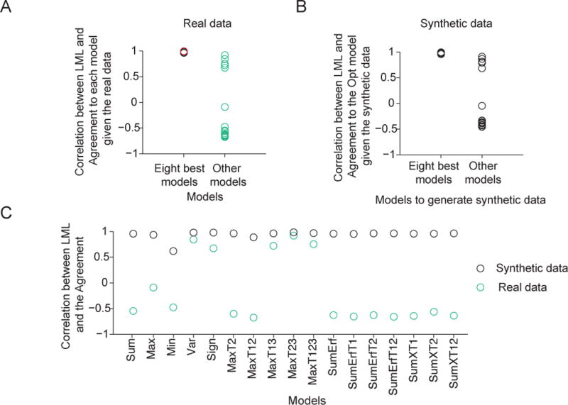
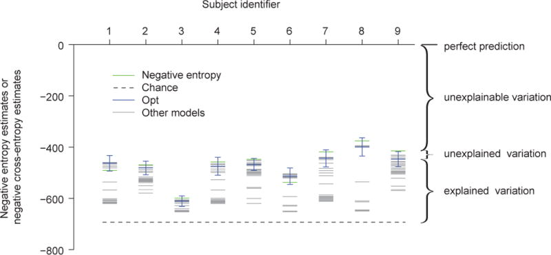
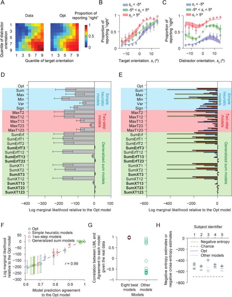
Two prominent ideas in the study of decision making have been that organisms behave near-optimally, and that they use simple heuristic rules. These principles might be operating in different types of tasks, but this possibility cannot be fully investigated without a direct, rigorous comparison within a single task. Such a comparison was lacking in most previous studies, because (a) the optimal decision rule was simple, (b) no simple suboptimal rules were considered, (c) it was unclear what was optimal, or (d) a simple rule could closely approximate the optimal rule. Here, we used a perceptual decision-making task in which the optimal decision rule is well-defined and complex, and makes qualitatively distinct predictions from many simple suboptimal rules. We find that all simple rules tested fail to describe human behavior, that the optimal rule accounts well for the data, and that several complex suboptimal rules are indistinguishable from the optimal one. Moreover, we found evidence that the optimal model is close to the true model: First, the better the trial-to-trial predictions of a suboptimal model agree with those of the optimal model, the better that suboptimal model fits; second, our estimate of the Kullback-Leibler divergence between the optimal model and the true model is not significantly different from zero. When observers receive no feedback, the optimal model still describes behavior best, suggesting that sensory uncertainty is implicitly represented and taken into account. Beyond the task and models studied here, our results have implications for best practices of model comparison. (PsycINFO Database Record


Conflict of interest statement

Conflict of interest: The authors declare no competing financial interests.

Figures

Figure A1
Figure A1. Model recovery analysis
We tested how well synthetic data sets generated from each model (rows) were fitted by each model (columns). (A) Model confusion matrix. The color in a cell represents the difference in log marginal likelihood between a model and the winning model for the corresponding data set. Dark red on the diagonal means that the model used to generate the data was found to be most likely. (B) As in (A), but with models clustered by Agreement. Models in red are models with high Agreement to the Opt model. Models in blue are from a different model set with low Agreement to the Opt model, but similar to each other. Models in orange have higher Agreement to the Opt than to the blues models, but they are still well distinguishable from the Opt model. Also refer to Fig. 8C.
Figure A2
Figure A2. Model comparison based on information criteria
Mean and s.e.m. across subjects of the difference in information criterion (AICc or BIC) between each model and the Opt model. Note that all models have two parameters, therefore all information criteria yield the same differences between models.
Figure A3
Figure A3. Correlation between log marginal likelihood and Agreement with any one model given the real data
Related to Fig. 8D and Fig. 9A. Each plot shows, given the real data, the mean (open circle) and s.e.m. (error bar) across subjects of a model’s average log marginal likelihood per trial as a function of its Agreement with a reference model; the reference model differs between plots. The dashed line represents the best linear fit. r is the Pearson correlation. The names of eight best models are in boldface.
Figure A4
Figure A4. Correlation between log marginal likelihood and Agreement with the Opt model given synthetic data generated from any one model
Related to Fig. 9B. For each plot, we generated 9 synthetic data sets from a different generating model. The plot shows the mean (open circle) and s.e.m. (error bar) of a model’s average log marginal likelihood per trial as a function of its Agreement with the Opt model based on those data sets. The dashed line represents the best linear fit. r is the Pearson correlation. The names of eight best models are in boldface. Given synthetic data generated from one of the eight best models, the correlation is high. Given synthetic data generated from a model outside of the eight best, the correlation is low.
Figure A5
Figure A5. Correlation between log marginal likelihood and Agreement with a reference model given synthetic data generated from that reference model
Related to Fig. 9C. For each plot, we generated 9 synthetic data sets from a different generating model. The plot shows the mean (open circle) and s.e.m. (error bar) of a model’s average log marginal likelihood per trial as a function of its Agreement with the generating model. The dashed line represents the best linear fit. r is the Pearson correlation. Given synthetic data generated from any one model, the correlation is high.
Figure 1
Figure 1. Task and data
(A) Trial procedure. Each display contains four items, three of which have a common orientation; these are the distractors. Subjects report whether the fourth item (the target) is tilted to the left or to the right with respect to vertical. The target location is randomly chosen on every trial. (B) The target orientation and the common distractor orientation are independently drawn from the same Gaussian distribution with a mean of 0° (vertical) and a standard deviation of 9.06°. For plotting purposes, we divided orientation space into 9 quantiles. (C) Proportion of reporting “right” (color) as a function of target and distractor orientation quantiles. (D) Proportion of reporting “right” as a function of target orientation sT (top) and distractor orientation sD (top). Error bars are s.e.m. The top curves are not expected to be monotonic (see text).
Figure 2
Figure 2. Generative model
(A) Each node represents a random variable, each arrow a conditional probability distribution. Distributions are shown in the equations on the side. N(x; 0, σ2) denotes a normal distribution with a mean of 0 and a variance of σ2. H(x) denotes the Heaviside function. 1L denotes a vector in which the Lth entry equals 1 and all others equal 0. δ(x) is the Dirac delta function. This diagram specifies the distribution of the measurements, x. The optimal observer inverts the generative model and computes the conditional probability of C given x. (B) Decision boundary of the optimal decision rule if the set size N were equal to 3. Each point in the three-dimensional space represents a set of measurements x = (x1, x2, x3). On one side of the boundary (the side that includes the all-positive octant), the optimal observer reports “right”, on the other side, “left”.
Figure 3
Figure 3. Model fits of the Opt model and the simple heuristic models
The Opt model fits better than the heuristic models. (A) Proportion of reporting “right” (color) as a function of target and distractor orientation quantiles, for individual subjects. The top plot shows the data, the top the fits of the Opt model. (B) As (A), averaged over subjects. The leftmost plot shows the data from Fig. 1C, the other plots the model fits. (C) Proportion of reporting “right” as a function of target orientation sT. Circles and error bars: data; shaded areas: model fits. (D) Proportion of reporting “right” as a function of distractor orientation sD.
Figure 4
Figure 4. Model fits of the two-step models
The Opt model fits better than the two-step models. (A) Proportion of reporting “right” (color) as a function of target and distractor orientation quantiles, averaged over subjects. The leftmost plot shows the data from Fig. 1C, the other plots the model fits. (B) Proportion of reporting “right” as a function of target orientation sT. Circles and error bars: data; shaded areas: model fits. (C) Proportion of reporting “right” as a function of distractor orientation sD.
Figure 5
Figure 5. Model fits of the generalized sum models of the SumErfT* type
Models contain term 3 (SumErfT3, SumErfT13, and SumErfT23) fit about as well as the Opt model. (A) Proportion of reporting “right” (color) as a function of target and distractor orientation quantiles, averaged over subjects. The leftmost plot shows the data from Fig. 1C, the other plots the model fits. (B) Proportion of reporting “right” as a function of target orientation sT. Circles and error bars: data; shaded areas: model fits. (C) Proportion of reporting “right” as a function of distractor orientation sD.
Figure 6
Figure 6. Model fits of generalized sum models of the SumXT* type
Models contain term 3 (SumXT3, SumXT13, SumXT13, and SumXT123) fit about as well as the Opt model. (A) Proportion of reporting “right” (color) as a function of target and distractor orientation quantiles, averaged over subjects. The leftmost plot shows the data from Fig. 1C, the other plots the model fits. (B) Proportion of reporting “right” as a function of target orientation sT. Circles and error bars: data; shaded areas: model fits. (C) Proportion of reporting “right” as a function of distractor orientation sD.
Figure 7
Figure 7. Model comparison
(A) Mean and s.e.m. across subjects of the difference in log marginal likelihood between each model and the Opt model. (B) Difference in log marginal likelihood between each model and the Opt model for individual subjects; bars of different colors represent different subjects.
Figure 8
Figure 8. Model similarity and goodness of fit
(A) Proportion correct as a function of the noise level σ for all models. (B) Proportion of trials for which a model makes the same prediction as the Opt model, as a function of σ. (C) Averaged prediction agreement (“Agreement”) visualized using multi-dimensional scaling. Each dot represents a model, and the distance between two models represents the disagreement between those models. The color of a dot represents its log marginal likelihood. Models that agree more with the Opt model tend to have a higher log marginal likelihood. (D) Mean (open circle) and s.e.m. (error bar) across subjects of a model’s log marginal likelihood as a function of its Agreement with the Opt model. Each dot indicates a model. The solid line represents the best linear fit. r is the Pearson correlation.
Figure 9
Figure 9. Correlation between log marginal likelihood and Agreement (CLA) as a potential measure of the global maximum of goodness of fit in model space
(A) Agreement, and therefore CLA, is computed relative to a reference model. CLA is high when the reference model is the Opt model (red circle, see also Fig. 8D) or one of the seven other best models (see also Fig. A3). CLA is significantly lower when the reference model is a different model (Wilcoxon rank-sum test, p = 8.4×10⁻⁵). (B) Given synthetic data generated from one of the eight best models, CLA with the Opt model as the reference is high. Given synthetic data generated from a model outside of the eight best, CLA with the Opt model as the reference is significantly lower (Wilcoxon rank-sum test, p = 8.4×10⁻⁵, see also Fig. A4). This serves as a negative control for the high CLA with the Opt model as a reference (red circle in (A) and Fig. 8D). (C) Given synthetic data generated from any one model, the CLA with that model as the reference is high (> 0.9). Moreover, given synthetic data generated from a model outside of the eight best, the CLA with that model as a reference is significantly higher than given the real data (Wilcoxon signed-rank test, p = 2.9×10⁻⁴, see also Fig. A5). This serves as a positive control for the low CLAs with the models outside of the eight best as reference models (green circles in (A)).
Figure 10
Figure 10. Information-theoretical estimate of how good the eight best models are
Each column represents a subject. For each subject, the green line represents an estimate of the negative entropy of the data, the dashed black line the negative cross-entropy between a coin-flip model and the true model, the blue line an estimate of the negative cross-entropy between the Opt model and the true model, and the grey lines estimates of the negative cross-entropies between other models and the true model. The error bar represents an estimate of the 95% credible interval of the negative cross-entropy between the Opt model and the true model. The estimate of the negative cross-entropy between the Opt model and the true model is not significantly different from the estimate of the negative entropy of the data (one-sided Wilcoxon signed-rank test, p = 0.15), suggesting that the Opt model explains most of the explainable variation. The same holds for the seven other best models (see main text).
Figure 11
Figure 11. Results of Experiment 2, in which feedback was withheld
(A) Proportion of reporting “right” (color) as a function of each combination of target and distractor orientation quantiles (1 to 9), averaged over all 5 subjects. The left plot shows the data, the right the fits of the Opt model. (B) Proportion of reporting “right” as a function of target orientation. Circles and error bars: data; shaded areas: Opt model fits. (C) Proportion of reporting “right” as a function of distractor orientation. (D) Mean and s.e.m. across subjects of the log marginal likelihood of each model relative to the Opt model. Shades of different colors indicate the category of a model. (E) Log marginal likelihood of each model minus that of the Opt model, for individual subjects. In the bar plots, each color represents a different subject. (F) As Fig. 8D, for Experiment 2. (G) As Fig. 9A, for Experiment 2. CLA is high when the reference model is the Opt model (red circle) or one of the seven other best models, and significantly lower otherwise (Wilcoxon rank-sum test, p = 8.4×10⁻⁵). (H) As Fig. 10, for Experiment 2. The estimate of the negative cross-entropy between the Opt model and the true model is not significantly different from the estimate of the negative entropy of the data (one-sided Wilcoxon signed-rank test, p = 0.31), suggesting that the Opt model explains most of the explainable variation. The same conclusion holds for the seven other best models.
Figure 12
Figure 12. Comparison between probability matching version of the Opt model and the Opt model
Difference in log marginal likelihood between the probability matching model and the Opt model for individual subjects. The last column shows the mean and s.e.m. of this difference.

Similar articles

Cited by

References

    1. Acuna DE, Berniker M, Fernandes HL, Kording KP. Using psychophysics to ask if the brain samples or maximizes. Journal of Vision. 2015;15:1–16. - PMC - PubMed
    1. Alais D, Burr D. Ventriloquist Effect Results from Near-Optimal Bimodal Integration. Current Biology. 2004;14(3):257–262. - PubMed
    1. Ashby FG, Maddox WT. Human category learning. Annual Review of Psychology. 2005;56:149–178. - PubMed
    1. Baldassi S, Burr DC. Feature-based integration of orientation signals in visual search. Vision Research. 2000;40:1293–1300. - PubMed
    1. Baldassi S, Verghese P. Comparing integration rules in visual search. Journal of Vision. 2002;2:559–570. - PubMed

Publication types