. 2016 Jun 7;7(3):e00809-16.
doi: 10.1128/mBio.00809-16.

The Prevalence of Inappropriate Image Duplication in Biomedical Research Publications

Affiliations

The Prevalence of Inappropriate Image Duplication in Biomedical Research Publications

Elisabeth M Bik et al. mBio. .

Abstract

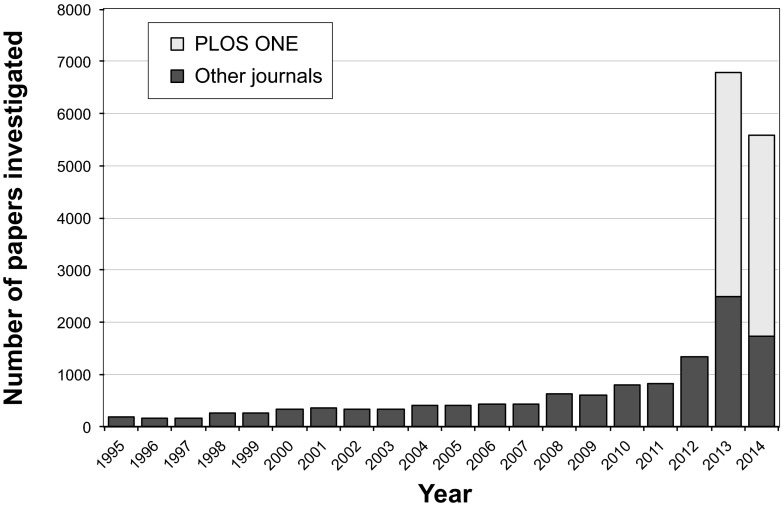
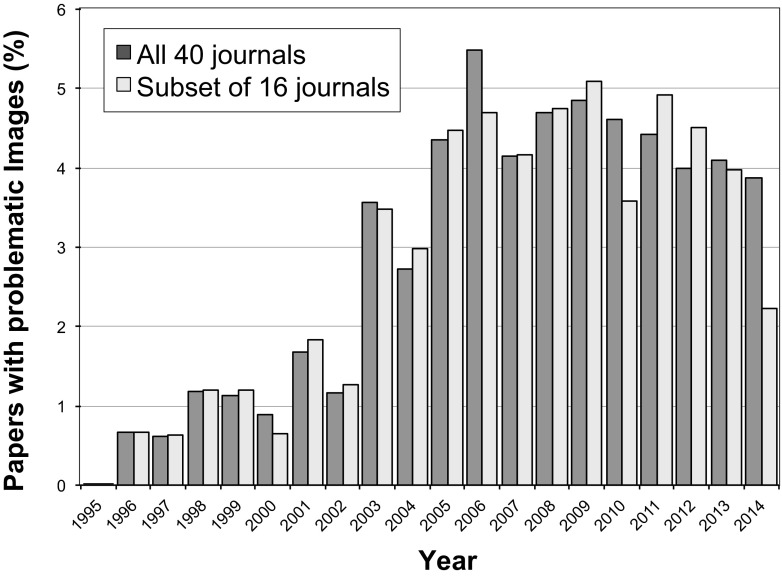
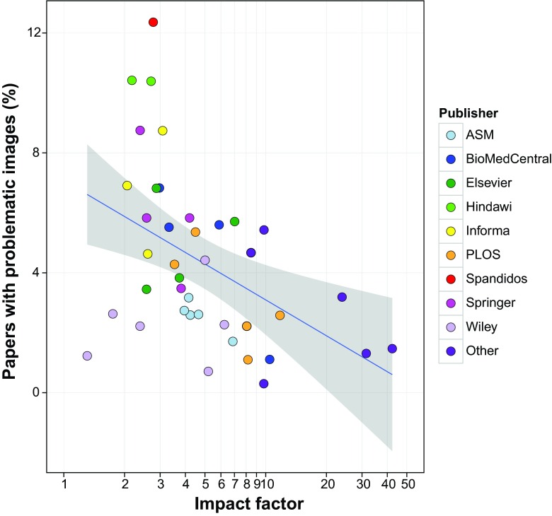
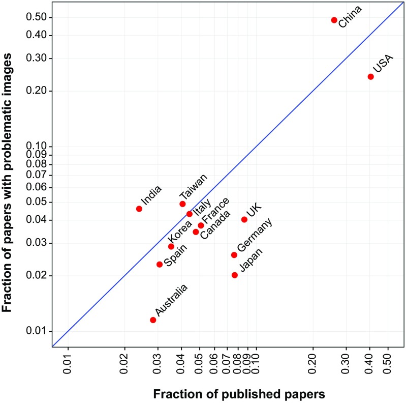
Inaccurate data in scientific papers can result from honest error or intentional falsification. This study attempted to determine the percentage of published papers that contain inappropriate image duplication, a specific type of inaccurate data. The images from a total of 20,621 papers published in 40 scientific journals from 1995 to 2014 were visually screened. Overall, 3.8% of published papers contained problematic figures, with at least half exhibiting features suggestive of deliberate manipulation. The prevalence of papers with problematic images has risen markedly during the past decade. Additional papers written by authors of papers with problematic images had an increased likelihood of containing problematic images as well. As this analysis focused only on one type of data, it is likely that the actual prevalence of inaccurate data in the published literature is higher. The marked variation in the frequency of problematic images among journals suggests that journal practices, such as prepublication image screening, influence the quality of the scientific literature.


Figures

FIG 1
FIG 1
Publications investigated by year of publication. The majority of screened papers were published in 2013 and 2014, due to the large proportion of PLoS One papers (39.5%) in the data set. The lowest number of papers (n = 151) screened in this study was published in 1996.
FIG 2
FIG 2
Examples of simple duplications (category I). (A) The beta-actin control panel in the top left is identical to the panel in the bottom right (green boxes), although each panel represents a different experimental condition. This figure appeared in reference and was corrected in reference . (Reproduced with permission from the publisher.) (B) The panels shown here were derived from two different figures within the same paper (reference ; corrected in reference 30). Two of the top panels appear identical to two of the bottom panels, but they represent different experimental conditions (red and blue boxes). (Figure reproduced under the Creative Commons [CC BY] license.) All duplications might have been caused by honest errors during assembly of the figures.
FIG 3
FIG 3
Examples of duplication with repositioning (category II). (A) Although the panels represent four different experimental conditions, three of the four panels appear to show a region of overlap (green and blue boxes), suggesting that these photographs were actually obtained from the same specimen. These panels originally appeared in reference and were corrected in reference . (B) Western blot panels that purportedly depict different proteins and cellular fractions, but the blots appear very similar, albeit shifted by two lanes (red boxes). Panels originally appeared in reference , and were corrected in reference . (Figures in both panels were reproduced under the Creative Commons [CC BY] license.)
FIG 4
FIG 4
Examples of duplication with alteration (category III). (A) The left and right FACS panels represent different experimental conditions and show different percentages of cell subsets, but regions of identity (colored boxes) between the panels suggest that the images have been altered. (This illustration originally appeared in reference ; the article was retracted in reference .) (Reproduced with permission from the publisher.) (B) The figure shown here displays Western blotting results for 10 different protein fractions isolated from a density gradient. The figure appears to show a single blot, but the last two lanes (red circles) appear to contain an identical band. Exposure was altered to bring out details in reference ; the figure was corrected in reference . (Figure reproduced under the Creative Commons [CC BY] license.)
FIG 5
FIG 5
Percentage of papers containing inappropriate image duplications by year of publication. No papers with duplications were found in 1995. The dark gray bars show the data for all 40 journals. The light gray bars show a subset of 16 journals for which papers spanning the complete timespan of 20 years were scanned. The total numbers of papers screened in each year are shown in Fig. 1.
FIG 6
FIG 6
Correlation between journal impact factor and percentage of papers with image duplication. Only papers from 2005 to 2014 (n = 17,816) were included in this analysis. Each data point represents a journal included in this study (n = 40), with data points color-coded according to the publisher (n = 14; journals published by AAAS, Nature, Cell Press, the National Academy of Sciences, and the Rockefeller University Press are grouped under “other.”) The x axis is shown on a logarithmic scale due to the small number of journals with a high impact factor included in this study. The blue line shows a linear regression model. The gray zone depicts the 95% confidence interval.
FIG 7
FIG 7
Proportion of papers with image duplications by country. The proportion of papers affiliated with specific countries submitted to PLoS One during a 16-month period in the years 2013 and 2014 (n = 8,138) plotted versus the proportion of PLoS One papers from that same period containing inappropriate image duplication, affiliated with specific countries (n = 348). Each data point represents a country for which 100 or more papers were screened. Some papers were affiliated with more than one country. The blue line represents where data points are expected to fall if problematic papers are distributed as expected according to their representation in the journal. Countries plotted above the blue line had a higher-than-expected proportion of problematic papers; countries plotted below the line had a lower-than-expected ratio.

References

    1. Casadevall A, Steen RG, Fang FC. 2014. Sources of error in the retracted scientific literature. FASEB J 28:3847–3855. doi:10.1096/fj.14-256735. - DOI - PMC - PubMed
    1. Steneck NH. 2006. Fostering integrity in research: definitions, current knowledge, and future directions. Sci Eng Ethics 12:53–74. doi:10.1007/s11948-006-0006-y. - DOI - PubMed
    1. Fanelli D. 2009. How many scientists fabricate and falsify research? A systematic review and meta-analysis of survey data. PLoS One 4:e00809-16. doi:10.1371/journal.pone.0005738. - DOI - PMC - PubMed
    1. Lüscher TF. 2013. The codex of science: honesty, precision, and truth—and its violations. Eur Heart J 34:1018–1023. doi:10.1093/eurheartj/eht063. - DOI - PubMed
    1. Geison GL. 1996. The private science of Louis Pasteur illustrated, revised. Princeton University Press, Princeton, NJ.