. 2016 Aug 11;536(7615):165-70.
doi: 10.1038/nature18959. Epub 2016 Aug 1.

Tempo and mode of genome evolution in a 50,000-generation experiment

Tempo and mode of genome evolution in a 50,000-generation experiment

Olivier Tenaillon et al. Nature. .

Abstract

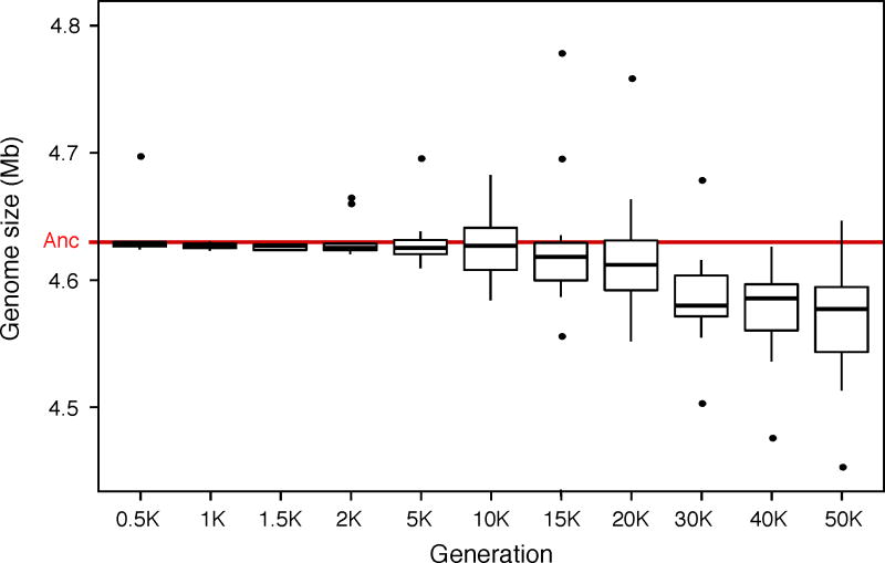
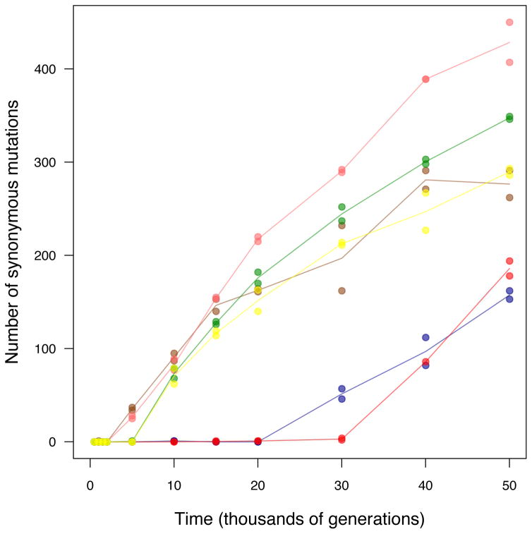
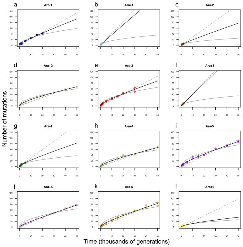
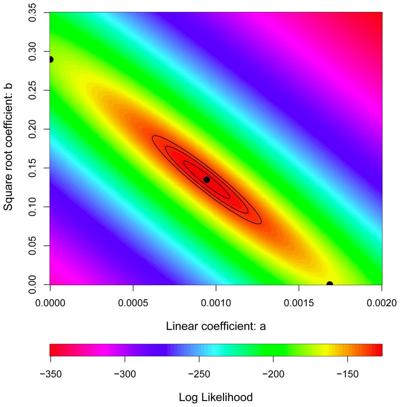
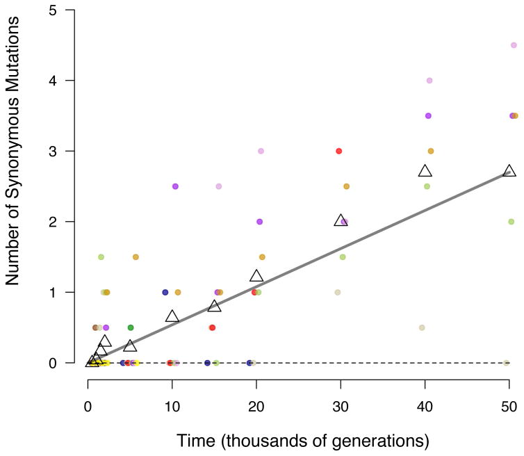
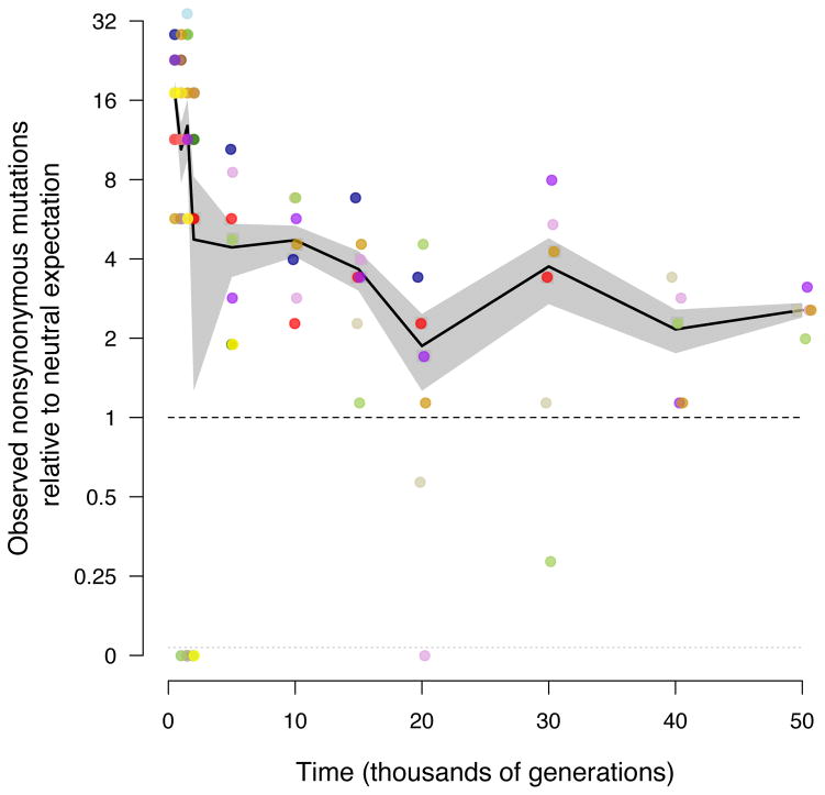
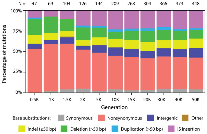
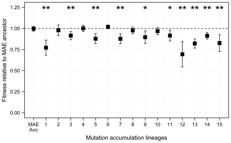
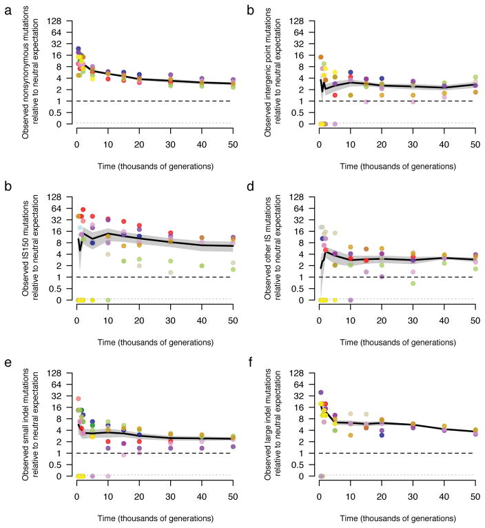
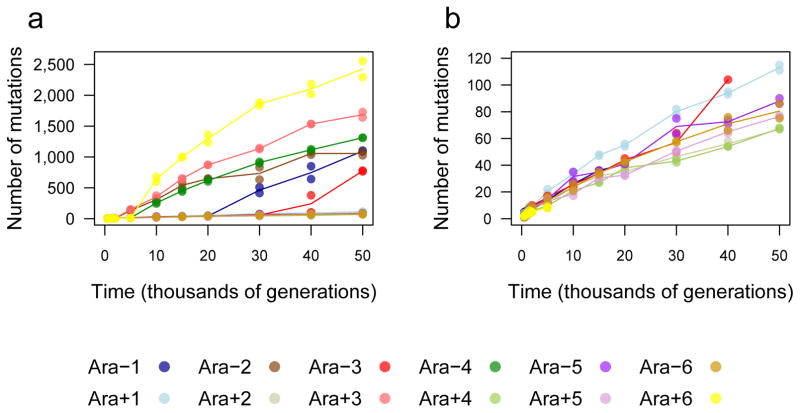
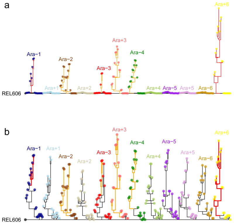
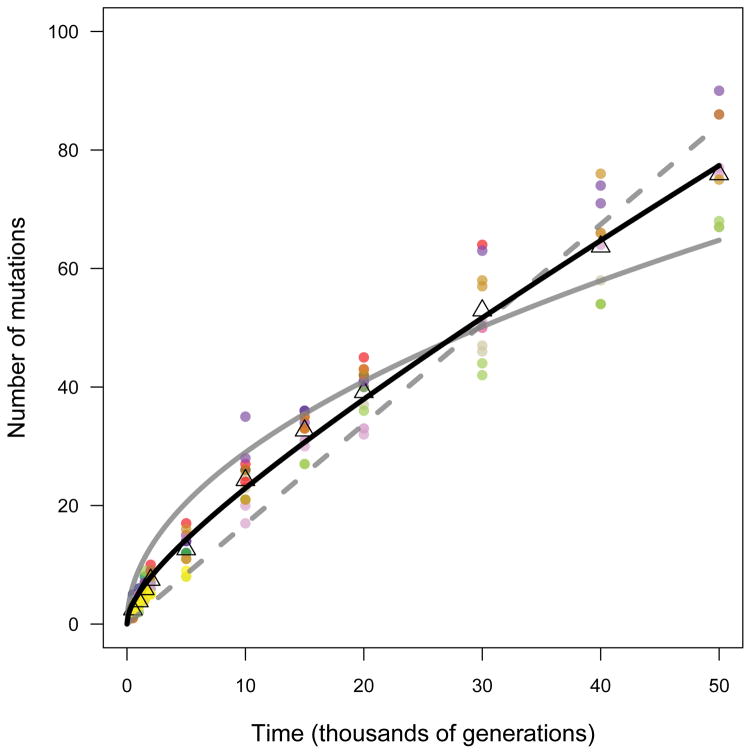
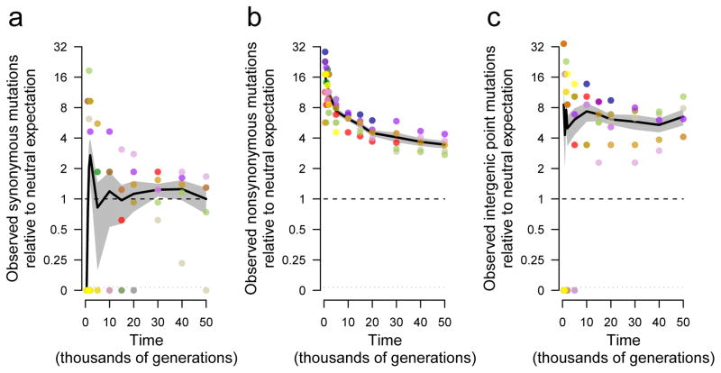
Adaptation by natural selection depends on the rates, effects and interactions of many mutations, making it difficult to determine what proportion of mutations in an evolving lineage are beneficial. Here we analysed 264 complete genomes from 12 Escherichia coli populations to characterize their dynamics over 50,000 generations. The populations that retained the ancestral mutation rate support a model in which most fixed mutations are beneficial, the fraction of beneficial mutations declines as fitness rises, and neutral mutations accumulate at a constant rate. We also compared these populations to mutation-accumulation lines evolved under a bottlenecking regime that minimizes selection. Nonsynonymous mutations, intergenic mutations, insertions and deletions are overrepresented in the long-term populations, further supporting the inference that most mutations that reached high frequency were favoured by selection. These results illuminate the shifting balance of forces that govern genome evolution in populations adapting to a new environment.


Conflict of interest statement

The authors declare no competing financial interests.

Figures

Extended Data Figure 1
Extended Data Figure 1. Changes in genome size during the LTEE
Box-and-whiskers plot showing the distribution of average genome length (Mb, million bp) for each of the 12 LTEE populations based on the two clones sequenced at each time point shown from 500 to 50,000 generations. The red line shows the length of the ancestral genome. The boxes are the interquartile range (IQR), which spans the second and third quartiles of the data (25th to 75th percentiles); the thick black lines are medians; the whiskers extend to the outermost values that are within 1.5 times the IQR; and the points show all outlier values beyond the whiskers.
Extended Data Figure 2
Extended Data Figure 2. Accumulation of synonymous mutations in populations that evolved point-mutation hypermutability
Each symbol shows a sequenced genome from a hypermutable lineage. Colours are the same as those in Fig. 1. The accumulation of synonymous substitutions serves as a proxy for the underlying point-mutation rate. All four of the populations that became hypermutable before 10,000 generations accumulated synonymous mutations at higher rates between 10,000 and 20,000 generations than between 40,000 and 50,000 generations, indicating the evolution of reduced mutability.
Extended Data Figure 3
Extended Data Figure 3. Alternative models fit to trajectory of genome evolution for each LTEE population
a, Ara−1. b, Ara+1. c, Ara−2. d, Ara+2. e, Ara−3. f, Ara+3. g, Ara−4. h, Ara+4. i, Ara−5. j, Ara+5. k, Ara−6. l, Ara+6. Each symbol shows the total mutations in a sequenced genome; in many cases, the symbols for the two genomes from the same population and generation are not distinguishable because they have the same, or almost the same, number of mutations. For the populations that evolved hypermutability, data are shown only for time points before mutators arose. In each panel, the dashed grey line shows the best fit to the linear model; the solid grey curve shows the best fit to the square-root model; and the solid black curve shows the best fit to the composite model with both linear and square-root terms.
Extended Data Figure 4
Extended Data Figure 4. Uncertainty in parameter estimation for model describing the rates of accumulation for neutral and beneficial mutations
Contours show relative likelihoods for simultaneously estimating the linear and square-root coefficients from the observed numbers of mutations that accumulated over time in nonmutator and premutator lineages (Fig. 3). The black central point shows the maximum likelihood estimates, and the three black contours show solutions 2, 6, and 10 log units away. The points on the horizontal and vertical axes show values for the best one-parameter models.
Extended Data Figure 5
Extended Data Figure 5. Accumulation of synonymous substitutions in nonmutator lineages
Each filled symbol shows the mean number of synonymous mutations in the (usually two) nonmutator genomes from an LTEE population that were sequenced at that time point; noninteger values can occur if the two genomes have different numbers. Small horizontal offsets were added so that overlapping points are visible. Colours are the same as in Fig. 1. Open triangles show the grand means of the replicate populations. The grey line extends from the intercept to the final grand mean. The slope of that line was used to scale the relative rates of synonymous, nonsynonymous, and intergenic point mutations in Fig. 5.
Extended Data Figure 6
Extended Data Figure 6. Temporal trend in accumulation of nonsynonymous mutations relative to the neutral expectation in nonmutator lineages
Interval-specific accumulation of nonsynonymous mutations calculated from changes in the total number of nonsynonymous mutations between successive samples. As with the cumulative data in Fig. 5b, values are scaled by the average rate of accumulation for synonymous mutations over 50,000 generations, after adjusting for the numbers of genomic sites at risk for nonsynonymous and synonymous mutations. Each point shows the average rate calculated for a nonmutator or premutator population; small horizontal offsets were added so that overlapping points are visible. Note the discontinuous scale; populations with no additional mutations over an interval are plotted below. Colours are the same as in Fig. 1. Black lines connect grand means; the grey shading shows standard errors calculated from the replicate populations.
Extended Data Figure 7
Extended Data Figure 7. Mutational spectrum for nonmutator lineages in the LTEE
Shaded bars show the distribution of different types of genetic change for all independent mutations found in the set of nonmutator clones that were sequenced at each generation. The total number of mutations in this set at each time point (N) is shown above each column. Base substitutions are divided into synonymous, nonsynonymous, intergenic, and other categories; the nonsynonymous category includes nonsense mutations, and the “other” category includes rare point mutations in noncoding RNA genes and pseudogenes.
Extended Data Figure 8
Extended Data Figure 8. Changes in fitness of MAE lines after 550 single-cell bottlenecks and ~13,750 generations
Each point shows the mean fitness based on 9 competition assays between the MAE ancestor (REL1207) or one of the 15 MAE lineages (JEB807–JEB821) and the Ara variant of the MAE ancestor (REL1206). One-day competition assays were performed using the standard procedures and same conditions as for the LTEE,. Error bars show 95% confidence intervals. Above each mean, one or two asterisks indicate p < 0.05 or p < 0.01, respectively, based on two-tailed t-tests of the null hypothesis that relative fitness equals 1. Ten of the 15 MAE lines experienced significant fitness declines, while none had significant gains.
Extended Data Figure 9
Extended Data Figure 9. Trajectories for mutations by class in the LTEE in comparison with neutral expectations based on the MAE
Accumulation of a, nonsynonymous mutations, b, intergenic point mutations, c, IS150 insertions, d, all other IS-element insertions, e, small indels, and f, large indels. Colours are the same as in Fig. 1. All values are expressed relative to the rate at which synonymous mutations accumulated in nonmutator LTEE lineages over 50,000 generations (Fig. 5a), and then scaled by the ratio of the number of the indicated class of mutation relative to the number of synonymous mutations in the MAE lines. In all panels, each symbol shows a nonmutator or premutator population. Note the discontinuous scale, in which populations with no mutations of the indicated type are plotted below. Black lines connect grand means over the replicate LTEE populations; the grey shading shows the corresponding standard errors.
Figure 1
Figure 1. Total number of mutations over time in the 12 LTEE populations
a, Total mutations in each population. b, Total mutations rescaled to reveal the trajectories for the six populations that did not become hypermutable for point mutations, and for the other six before they evolved hypermutability. Each symbol shows a sequenced genome; some points are hidden behind others. Each line passes through the average of the genomes from the same population and generation.
Figure 2
Figure 2. Phylogenetic trees for LTEE populations
a, Phylogenies for 22 genomes from each population, based on point mutations. b, The same trees, except branches are rescaled as followed: branches for lineages with mismatch-repair defects are orange and shortened by a factor of 25; branches for mutT mutators are red and shortened by a factor of 50. Strain REL606 (at left) is the ancestor. No early mutations are shared between any populations, confirming their independent evolution. Most populations have multiple basal lineages that reflect early diversification and extinction; some have deeply divergent lineages with sustained persistence, most notably Ara −2.
Figure 3
Figure 3. Alternative models fit to the trajectory of genome evolution
Each symbol shows total mutations in a clone from five populations that never became mutators and seven before point-mutation or IS150 hypermutability evolved. Colours are the same as in Figure 1; open triangles indicate grand means. Dashed grey line shows the best fit to the linear model, m = at. Solid grey curve shows the fit to the square-root model, m = b sqrt(t). Black curve is fit to the composite model, m = at + b sqrt(t), where a = 0.000944 and b = 0.134856. See text for statistical analysis.
Figure 4
Figure 4. Trajectories for synonymous, nonsynonymous, and intergenic point mutations
a, Synonymous mutations, scaled so mean of five nonmutator populations (excluding point-mutation and IS150 hypermutators) is unity at 50,000 generations. b, Nonsynonymous mutations, scaled using same rate as synonymous mutations after adjusting for sites at risk for both classes. c, Intergenic point mutations, scaled using same rate as synonymous mutations after adjusting for sites at risk. Each symbol shows the mean for sequenced genomes from a nonmutator or premutator lineage. Colours are as in Figure 1. Note discontinuous scale; populations with zero mutations are plotted below. Black lines connect grand means; shading shows standard errors calculated from replicate populations.

References

    1. Bersaglieri T, et al. Genetic signatures of strong recent positive selection at the lactase gene. Am J Hum Genet. 2004;74:1111–1120. - PMC - PubMed
    1. Hufford MB, et al. Comparative population genomics of maize domestication and improvement. Nat Genet. 2012;44:808–811. - PMC - PubMed
    1. vonHoldt BM, et al. Genome-wide SNP and haplotype analyses reveal a rich history underlying dog domestication. Nature. 2010;464:898–902. - PMC - PubMed
    1. Lieberman TD, et al. Parallel bacterial evolution within multiple patients identifies candidate pathogenicity genes. Nat Genet. 2011;43:1275–1280. - PMC - PubMed
    1. Yang Z. PAML 4: phylogenetic analysis by maximum likelihood. Mol Biol Evol. 2007;24:1586–1591. - PubMed

Publication types

Substances