. 2016 Jun 20:5:1438.
doi: 10.12688/f1000research.8987.2. eCollection 2016.

From reads to genes to pathways: differential expression analysis of RNA-Seq experiments using Rsubread and the edgeR quasi-likelihood pipeline

Affiliations

From reads to genes to pathways: differential expression analysis of RNA-Seq experiments using Rsubread and the edgeR quasi-likelihood pipeline

Yunshun Chen et al. F1000Res. .

Abstract

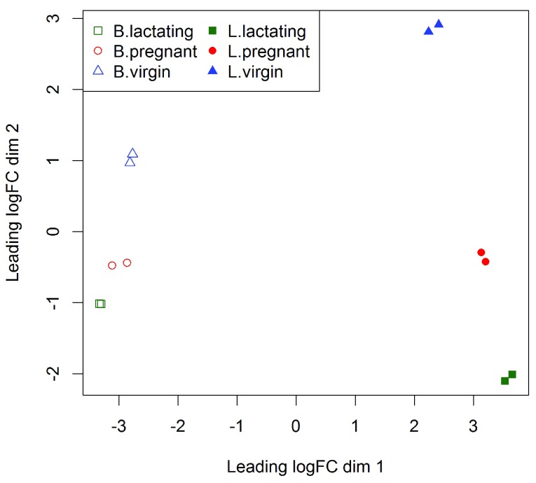
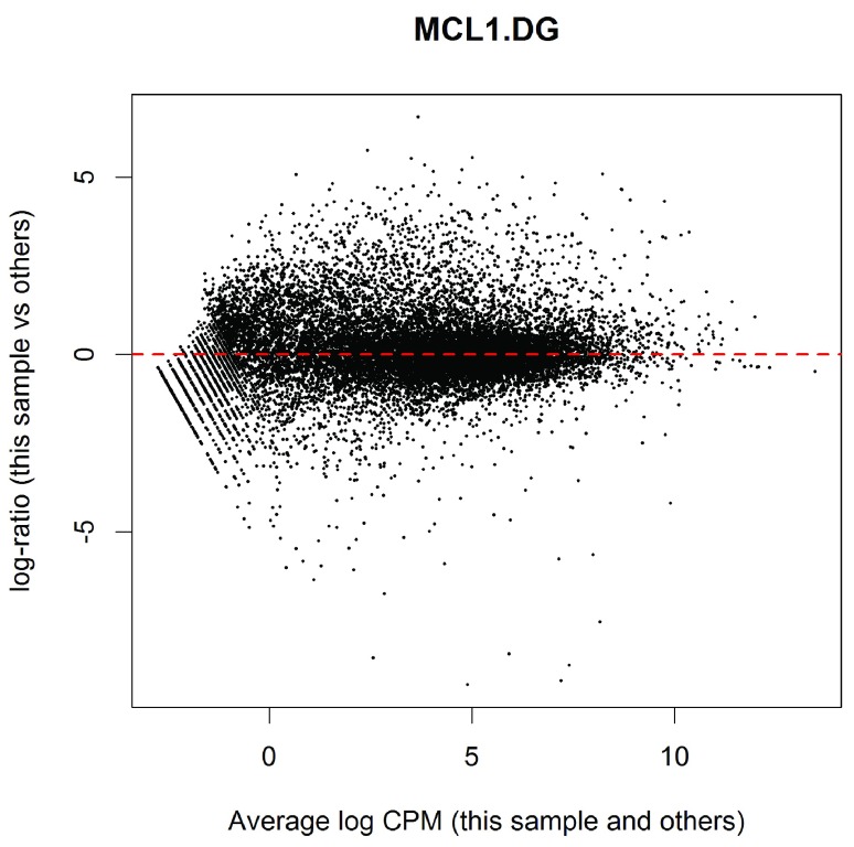
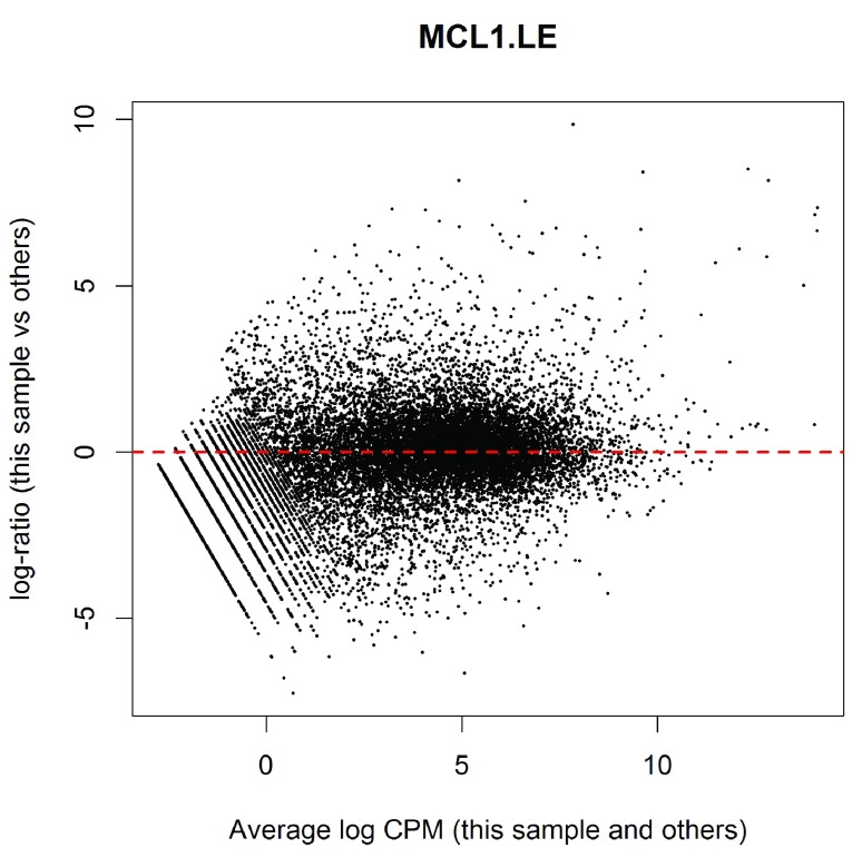
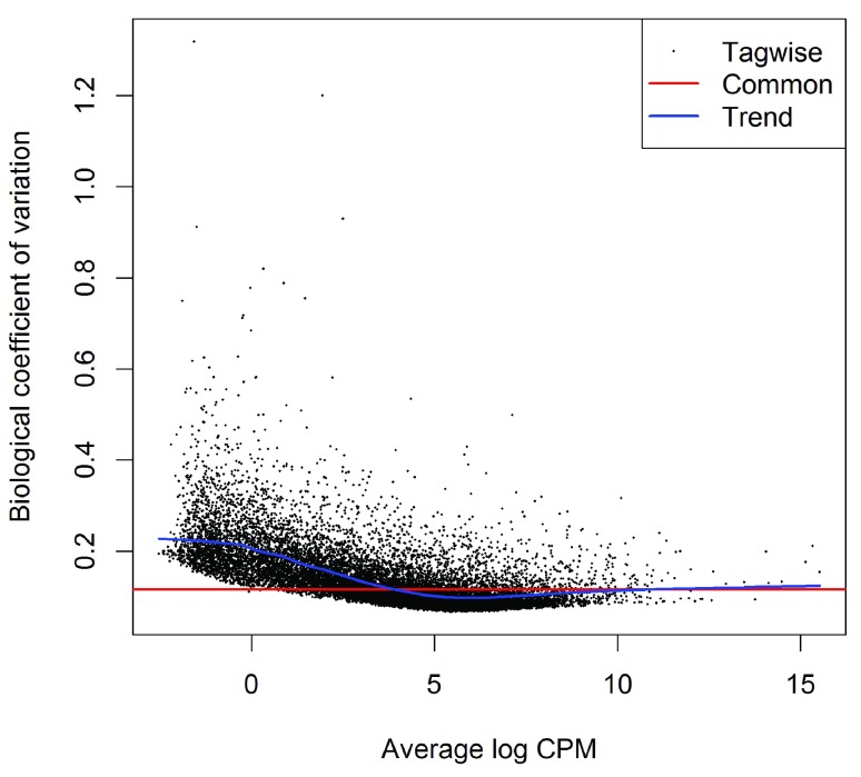
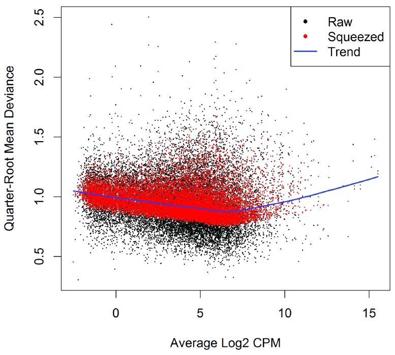
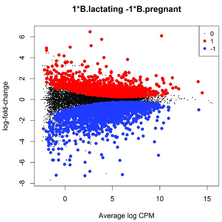
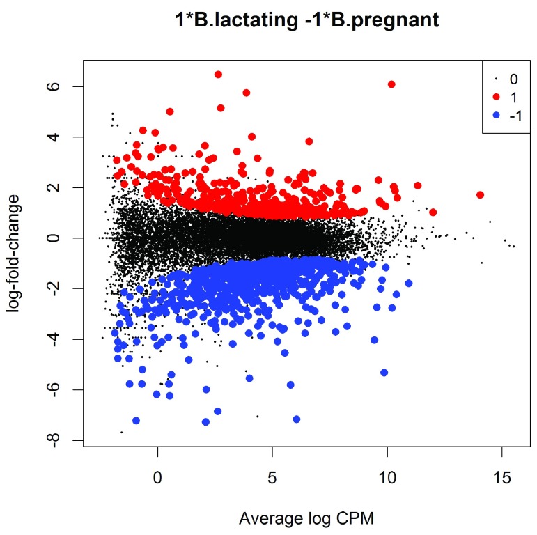
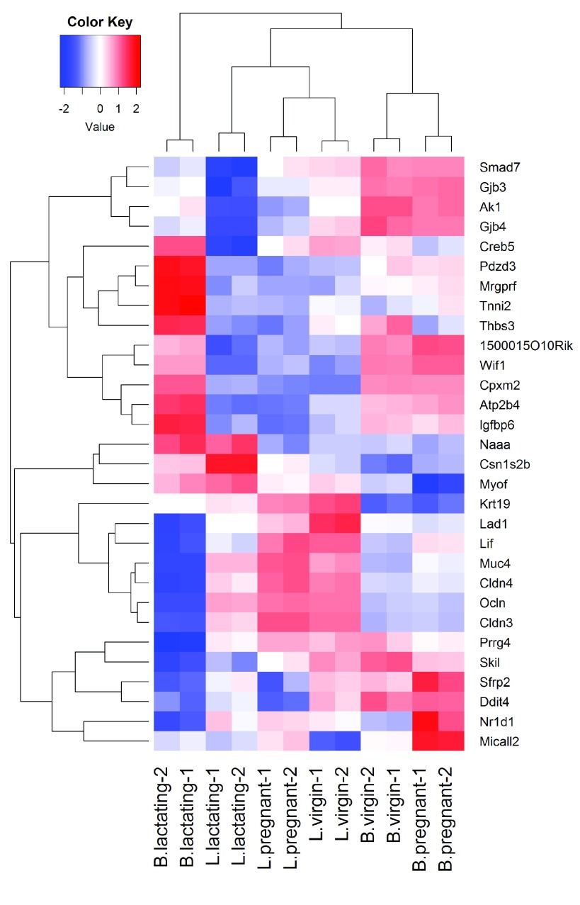
In recent years, RNA sequencing (RNA-seq) has become a very widely used technology for profiling gene expression. One of the most common aims of RNA-seq profiling is to identify genes or molecular pathways that are differentially expressed (DE) between two or more biological conditions. This article demonstrates a computational workflow for the detection of DE genes and pathways from RNA-seq data by providing a complete analysis of an RNA-seq experiment profiling epithelial cell subsets in the mouse mammary gland. The workflow uses R software packages from the open-source Bioconductor project and covers all steps of the analysis pipeline, including alignment of read sequences, data exploration, differential expression analysis, visualization and pathway analysis. Read alignment and count quantification is conducted using the Rsubread package and the statistical analyses are performed using the edgeR package. The differential expression analysis uses the quasi-likelihood functionality of edgeR.

Keywords: R software; RNA sequencing; gene expression; molecular pathways.


Conflict of interest statement

Competing interests: No competing interests were disclosed.

Figures

Figure 1.
Figure 1.. The MDS plot of the data set.
Samples are separated by the cell type in the first dimension, and by the mouse status in the second dimension.
Figure 2.
Figure 2.. MD plot of log2-expression in sample 1 versus the average log2-expression across all other samples.
Each point represents a gene, and the red line indicates a log-ratio of zero. The majority of points cluster around the red line.
Figure 3.
Figure 3.. MD plot of log2-expression in sample 11 versus the average log2-expression across all other samples.
The plot shows a number of genes that are both highly expressed and highly up-regulated.
Figure 4.
Figure 4.. Scatterplot of the biological coefficient of variation (BCV) against the average abundance of each gene.
The plot shows the square-root estimates of the common, trended and tagwise NB dispersions.
Figure 5.
Figure 5.. A plot of the quarter-root QL dispersion against the average abundance of each gene.
Estimates are shown for the raw (before EB moderation), trended and squeezed (after EB moderation) dispersions. Note that the QL dispersions and trend shown here are relative to the NB dispersion trend shown in Figure 4.
Figure 6.
Figure 6.. MD plot showing the log-fold change and average abundance of each gene.
Significantly up and down DE genes are highlighted in red and blue, respectively.
Figure 7.
Figure 7.. MD plot showing the log-fold change and average abundance of each gene.
Genes with fold-changes significantly greater than 1.5 are highlighted.
Figure 8.
Figure 8.. Heat map across all the samples using the top 30 most DE genes between the basal lactating group and the basal pregnancy group.
Figure 9.
Figure 9.. Barcode plot showing enrichment of the GO term GO:0032465 in the basal virgin group compared to the basal lactating group.
X-axis shows logFC for B.virgin vs B.lactating. Black bars represent genes annotated with the GO term. The worm shows relative enrichment.
Figure 10.
Figure 10.. Barcode plot showing strong enrichment of mammary stem cell signature in the stem cell vs luminal cell comparison.
Red bars show up signature genes, blue bars show down genes. The worms show relative enrichment.
Figure 11.
Figure 11.. Boxplots of quality scores by base position for the first FASTQ file.

References

    1. Huber W, Carey VJ, Gentleman R, et al. : Orchestrating high-throughput genomic analysis with Bioconductor. Nat Methods. 2015;12(2):115–121. 10.1038/nmeth.3252 - DOI - PMC - PubMed
    1. Fu NY, Rios AC, Pal B, et al. : EGF-mediated induction of Mcl-1 at the switch to lactation is essential for alveolar cell survival. Nat Cell Biol. 2015;17(4):365–375. 10.1038/ncb3117 - DOI - PubMed
    1. Liao Y, Smyth GK, Shi W: The Subread aligner: fast, accurate and scalable read mapping by seed-and-vote. Nucleic Acids Res. 2013;41(10):e108. 10.1093/nar/gkt214 - DOI - PMC - PubMed
    1. Robinson MD, McCarthy DJ, Smyth GK: edgeR: a Bioconductor package for differential expression analysis of digital gene expression data. Bioinformatics. 2010;26(1):139–140. 10.1093/bioinformatics/btp616 - DOI - PMC - PubMed
    1. Liao Y, Smyth GK, Shi W: featureCounts: an efficient general purpose program for assigning sequence reads to genomic features. Bioinformatics. 2014;30(7):923–930. 10.1093/bioinformatics/btt656 - DOI - PubMed