Characterizing the pain score trajectories of hospitalized adult medical and surgical patients: a retrospective cohort study
- PMID: 27548045
- PMCID: PMC5113285
- DOI: 10.1097/j.pain.0000000000000693
Characterizing the pain score trajectories of hospitalized adult medical and surgical patients: a retrospective cohort study
Abstract
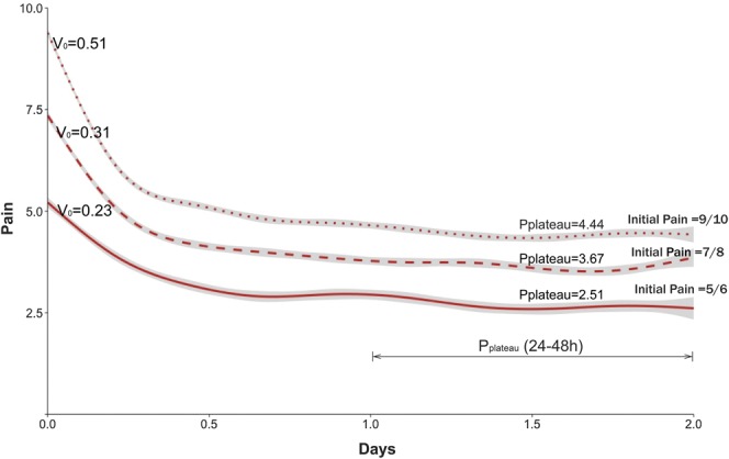
Pain care for hospitalized patients is often suboptimal. Representing pain scores as a graphical trajectory may provide insights into the understanding and treatment of pain. We describe a 1-year, retrospective, observational study to characterize pain trajectories of hospitalized adults during the first 48 hours after admission at an urban academic medical center. Using a subgroup of patients who presented with significant pain (pain score >4; n = 7762 encounters), we characterized pain trajectories and measured area under the curve, slope of the trajectory for the first 2 hours after admission, and pain intensity at plateau. We used mixed-effects regression to assess the association between pain score and sociodemographics (age, race, and gender), pain medication orders (opioids, nonopioids, and no medications), and medical service (obstetrics, psychiatry, surgery, sickle cell, intensive care unit, and medicine). K-means clustering was used to identify patient subgroups with similar trajectories. Trajectories showed differences based on race, gender, service, and initial pain score. Patients presumed to have dissimilar pain experiences (eg, sickle vs obstetrical) had markedly different pain trajectories. Patients with higher initial pain had a more rapid reduction during their first 2 hours of treatment. Pain reduction achieved in the 48 hours after admission was approximately 50% of the initial pain, regardless of the initial pain. Most patients' pain failed to fully resolve, plateauing at a pain score of 4 or greater. Visualizing pain scores as graphical trajectories illustrates the dynamic variability in pain, highlighting pain responses over a period of observation, and may yield new insights for quality improvement and research.
Conflict of interest statement
Sponsorships or competing interests that may be relevant to content are disclosed at the end of this article.
Figures


Comment in
-
The time course of acute pain in hospitalized patients: exciting progress in data and methods.Pain. 2016 Dec;157(12):2623-2624. doi: 10.1097/j.pain.0000000000000714. Pain. 2016. PMID: 27682211 Free PMC article. No abstract available.
References
-
- Center for Medicare and Medicaid Services data.medicare.gov. 2015. Available from: https://data.medicare.gov/Hospital-Compare/Patient-survey-HCAHPS-Nationa.... Accessed June 6, 2016.
-
- Clark WC, Yang JC, Tsui SL, Ng KF, Clark SB. Unidimensional pain rating scales: a multidimensional affect and pain survey (MAPS) analysis of what they really measure. PAIN 2002;98:241–7. - PubMed
Publication types
MeSH terms
Grants and funding
LinkOut - more resources
Full Text Sources
Other Literature Sources
Medical