Visualization of Multidimensional Data in Nursing Science
- PMID: 27756850
- PMCID: PMC5395350
- DOI: 10.1177/0193945916672448
Visualization of Multidimensional Data in Nursing Science
Abstract
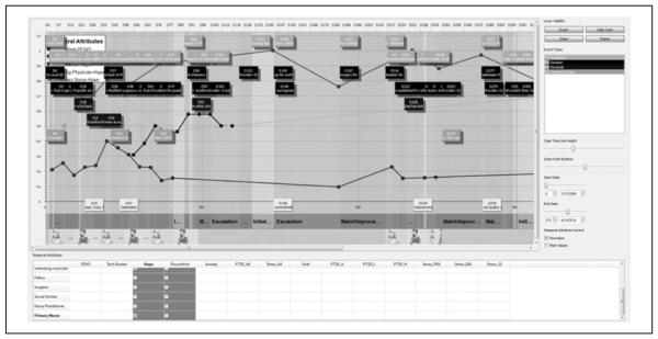
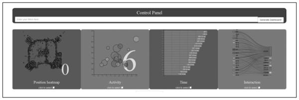
Nursing scientists have long been interested in complex, context-dependent questions addressing individual- and population-level challenges in health and illness. These critical questions require multilevel data (e.g., genetic, physiologic, biologic, behavioral, affective, and social). Advances in data-gathering methods have resulted in the collection of large sets of complex, multifaceted, and often non-comparable data. Scientific visualization is a powerful methodological tool for facilitating understanding of these multidimensional data sets. Our purpose is to demonstrate the utility of scientific visualization as a method for identifying associations, patterns, and trends in multidimensional data as exemplified in two studies. We describe a brief history of visual analysis, processes involved in scientific visualization, and opportunities and challenges in the use of visualization methods. Scientific visualization can play a crucial role in helping nurse scientists make sense of the structure and underlying patterns in their data to answer vital questions in the field.
Keywords: Big Data; data analysis; data integration; data science; multidimensional data; visualization.
Figures

References
-
- Cameron D, Jones IG. John Snow, the broad street pump and modern epidemiology. International Journal of Epidemiology. 1983;12:393–396. - PubMed
-
- Card SK, Mackinlay JD, Shneiderman B, editors. Readings in information visualization: Using vision to think. Morgan Kaufman; San Francisco, CA: 1999.
-
- Chen C, Hou H, Hu Z, Liu S. An illuminated path: The impact of the work of Jim Thomas. In: Dill J, Earnshaw R, editors. Explanding the frontiers of visual analytics and visualization. Springer; New York, NY: 2012. pp. 9–20.
-
- Clark D. Four things you need to know in the Big Data era. Forbes. 2013 Aug; Retrieved from http://www.forbes.com/sites/dorieclark/2013/08/08/four-things-you-need-t....
Grants and funding
LinkOut - more resources
Full Text Sources
Other Literature Sources