. 2016 Nov 17;167(5):1369-1384.e19.
doi: 10.1016/j.cell.2016.09.037.

Lineage-Specific Genome Architecture Links Enhancers and Non-coding Disease Variants to Target Gene Promoters

Collaborators, Affiliations

Lineage-Specific Genome Architecture Links Enhancers and Non-coding Disease Variants to Target Gene Promoters

Biola M Javierre et al. Cell. .

Abstract

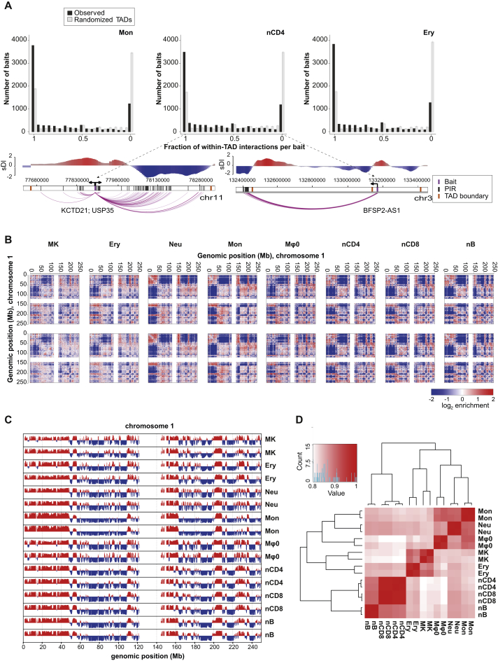
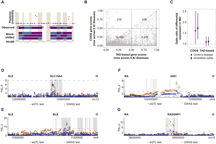
Long-range interactions between regulatory elements and gene promoters play key roles in transcriptional regulation. The vast majority of interactions are uncharted, constituting a major missing link in understanding genome control. Here, we use promoter capture Hi-C to identify interacting regions of 31,253 promoters in 17 human primary hematopoietic cell types. We show that promoter interactions are highly cell type specific and enriched for links between active promoters and epigenetically marked enhancers. Promoter interactomes reflect lineage relationships of the hematopoietic tree, consistent with dynamic remodeling of nuclear architecture during differentiation. Interacting regions are enriched in genetic variants linked with altered expression of genes they contact, highlighting their functional role. We exploit this rich resource to connect non-coding disease variants to putative target promoters, prioritizing thousands of disease-candidate genes and implicating disease pathways. Our results demonstrate the power of primary cell promoter interactomes to reveal insights into genomic regulatory mechanisms underlying common diseases.

Keywords: chromosome conformation; disease gene prioritization; gene regulation; non-coding genetic variation; promoter capture Hi-C.


Figures

None
Graphical abstract
Figure 1
Figure 1
Promoter Capture Hi-C across 17 Human Primary Blood Cell Types (A) Schematic representation of the project. (B) Interaction landscape of INPP4B gene promoter along a 5-Mb region in naive CD4+ (nCD4) cells (PCHi-C, top panel). Each dot denotes a sequenced di-tag mapping, on one end, to the captured HindIII fragment containing INPP4B gene promoter, and on the other end, to another HindIII fragment located as per the x axis coordinate; the y axis shows read counts per di-tag. Red dots denote high-confidence PIRs (CHiCAGO score ≥5), and their interactions with INPP4B promoter are shown as red arcs. Gray lines denote expected counts per di-tag according to the CHiCAGO background model, and dashed lines show the upper bound of the 95% confidence interval. Genes whose promoters were found to physically interact with INPP4B promoter are labeled in bold. Promoters selectively interact with specific DNase hypersensitivity sites (DHSs, middle panel) defined in the same cell type from the ENCODE project. Some of these interactions occur within the same topologically associated domain (TADs, black line, as defined according to the standardized directionality index score, sDI), while others span TAD boundaries. A conventional Hi-C profile for the same locus in nCD4 cells is shown in the bottom panel. (C) Interaction landscape of the INPP4B, RHAG, ZEB2-AS, and ALAD promoters in naive CD4+ cells (nCD4), erythroblasts (Ery), and monocytes (Mon). Dot plots as in (B), with high-confidence PIRs shown in red (CHiCAGO score ≥5) and sub-threshold PIRs (3 < CHiCAGO score < 5) shown in blue. (D) The numbers of unique interactions (left) and PIRs (right) detected for a given number of analyzed cell types. Lines and dots show the mean values over 100 random orderings of cell types; gray ribbons show SDs. (E) Proportions of interactions crossing TAD boundaries per cell type; observed and expected frequencies of TAD boundary-crossing interactions. Error bars show ±SD across 1000 permutations (see Quantification and Statistical Analysis). See also Figures S1 and S2, Table S1, and Data S1.
Figure 2
Figure 2
Promoter Interactions Reflect the Lineage Relationships of the Hematopoietic Tree (A) Principal Component Analysis (PCA) of the CHiCAGO interaction scores for each individual biological replicate (nB, naive B cells; tB, total B cells; FetT, fetal thymus; aCD4, activated CD4+ T cells; naCD4, non-activated CD4+ T cells; tCD4, total CD4+ T cells; nCD8, naive CD8+ T cells; nCD4, naive CD4+ T cells; tCD8, total CD8+ T cells; Mon, monocytes; Neu, neutrophils; Mφ0–2, Macrophages M0, M1, M2; EndP, endothelial precursors; MK, megakaryocytes; Ery, erythroblasts). The inset shows the results of a separately performed PCA for CD4+ and CD8+ T cells only. (B) Top (dendrogram): hierarchical clustering of the cell types according to their promoter interaction profiles. Bottom (heatmap): Autoclass Bayesian clustering of interactions according to their cell-type specificity. Cluster IDs are shown on the right. Cluster 9 containing 108,066 interactions is not shown for clarity. (C) Cell-type specificity of interaction clusters. The heatmap shows cluster specificity scores in each cell type (see Quantification and Statistical Analysis for details). Cell types and clusters are arranged as in (B). See also Figures S3A and S3B.
Figure 3
Figure 3
Promoters Preferentially Connect to Active Enhancers (A) PIR enrichment for histone marks compared with distance-matched random regions. Error bars show SD across 100 draws of random regions. (B) Significance of PIR enrichment for histone marks from (A), expressed in terms of Z scores. (C) Promoter interactions and chromatin features in the β-globin locus. PCHi-C data from three cell types, showing regulatory element annotations from the Ensembl Regulatory Build, colored by feature, and chromatin activities based on ChromHMM segmentations of BLUEPRINT histone modification data. The image is based on a screenshot produced with Ensembl v83 using GRCh37 assembly and GENCODE v19 gene annotations. The β-globin Locus Control Region (LCR) is highlighted (blue box). (D) Enrichment of PIRs for active distal enhancers (shown per biological replicate). (E) Enrichment of promoter-enhancer interactions for links between active promoters and active enhancers. The observed to expected ratios of each combination of promoter and enhancer activity connected by an interaction are color coded. The p value is for the overdispersion-adjusted χ2 test of independence of promoter and enhancer states at either ends of interactions. The non-active category includes the “poised,” “Polycomb-repressed,” and “inactive” states defined with chromHMM. (F) Interactions between an active promoter and an enhancer are preferentially found in cell types, in which the enhancer is active. Observed to expected ratios for each combination of enhancer activity and the presence or absence of interaction are color coded. The p value is for the overdispersion-adjusted χ2 test of independence of the enhancer state and the presence of interaction. The non-active category is as in (E). See also Figure S3C.
Figure 4
Figure 4
Active Enhancers at PIRs Associate with Lineage-Specific Gene Expression (A) Plot of log2-gene expression as a function of the number of interacting active enhancers in cell types, where the promoter is active. Trendline shows linear regression. Asterisks above and below the boxplots reflect the fact that some outlying observations have been cropped. (B) Heatmap of “gene specificity scores” for 7,004 protein-coding genes uniquely mapping to a captured fragment (rows), based on their interactions with active enhancers in each of eight cell types (columns). Genes are partitioned using k-means clustering. (C) Mean gene specificity score (based on interactions with active enhancers) for each of the clusters in (B) plotted against analogous mean gene specificity scores based on expression data for nCD4, MK, Ery and Neu cells. Error bars indicate ±SD. Plots for Mon and Mφ1–3 are shown in Figure S4B. (D) Subset of the heatmap in (B), showing interaction-based gene specificity scores for the top 100 nCD4-specifically expressed genes, together with cluster IDs. (E) Enrichment of the 12 clusters shown in (B) for the 100 genes expressed with highest specificity in each analyzed cell type (see Quantification and Statistical Analysis for details). See also Figure S4.
Figure 5
Figure 5
Promoter-Interacting Regions Are Enriched for Interacting Gene eQTLs (A and B) The proportion of SNPs that are eQTLs for the PIR-connected gene compared with the equivalent proportion at matched random regions (“randomized PIRs”) in monocytes (A) and total B cells (B). Asterisks represent the significance of enrichment at observed versus randomized PIRs (permutation test p < 0.05; ∗∗p < 0.01; ∗∗∗p < 0.001). (C and D) Examples of a single common eQTL SNP identified for two genes (ARID1A and ZDHHC18, C; NDUFAF4 and ZBTB2, D) with either the opposite (C) or the same (D) directionality of effect. SNPs have been tested within PIRs plus additional 500-bp windows on both sides of them. The Manhattan plots (bottom panel) depict the eQTL signals for both genes. The gray dashed line represents the significance threshold. See also Figure S5 and Table S2.
Figure 6
Figure 6
Promoter Interactions Link GWAS SNPs with Putative Target Genes (A) Enrichment of GWAS summary statistics at PIRs by tissue type. Axes reflect blockshifter Z scores for two different tissue group comparisons, first lymphoid versus myeloid, then additionally within the myeloid lineage. Traits are labeled and colored by category (BMI, body mass index; BP_D, diastolic blood pressure; BP_S, systolic blood pressure; CD, Crohn’s disease; CEL, celiac disease; FNBMD, Femoral neck bone mineral density; GLC, glucose sensitivity; GLC_B, glucose sensitivity BMI-adjusted; HB, hemoglobin; HDL, high-density lipoprotein; HEIGHT, height; INS, insulin sensitivity; INS_B, insulin sensitivity BMI-adjusted; LDL, low-density lipoprotein; LSBMD, lumbar spine bone mineral density; MCH, mean corpuscular hemoglobin; MCHC, mean corpuscular hemoglobin concentration; MCV, mean corpuscular volume; MS, multiple sclerosis; PBC, primary biliary cirrhosis; PCV, packed cell volume; PLT, platelet count; PV, platelet volume; RA, rheumatoid arthritis; RBC, red blood cell count; SLE, systemic lupus erythrematosis; T1D, type 1 diabetes; T2D = type 2 diabetes; TC, total cholesterol; TG, triglycerides; UC, ulcerative colitis). (B) Blockshifter enrichment Z scores of GWAS summary statistics in PIRs by individual tissue type using endothelial cells as a control. Red indicates enrichment in the labeled tissue; green indicates enrichment in the endothelial cell control. (C) Example of the COGS gene prioritization method in 1p13.1 RA susceptibility region. GWAS summary p values for association with RA (Okada et al., 2012) (top) are transformed into posterior probabilities for variant being causal (middle), which are then aggregated at all PIRs interacting with a given gene, accounting for LD, to compute gene scores. Arcs representing promoter-PIR interactions are color coded with genes. (D) Bubble plot of traits with significant enrichment (p.adj < 0.05) in one or more pathways from the Reactome database (Fabregat et al., 2016). Top numbers indicate the total number of genes analyzed for each trait (gene score >0.5), bubble size indicates the ratio of test genes to those in the pathway, and blue to red corresponds to decreasing adjusted p value for enrichment. (E) The “core autoimmune disease network” containing the 421 highest-scoring genes prioritized for autoimmune disease. Genes (nodes) are color coded based on diseases for which they were prioritized as candidates by the COGS algorithm. Edges between genes are drawn based on prior knowledge about their physical interactions, predicted interactions and pathway associations obtained from GeneMania (Montojo et al., 2010) and are color coded accordingly. Inset shows gene names for the highest-connected central part of the network. See Quantification and Statistical Analysis. See also Figure S6 and Table S3.
Figure S1
Figure S1
Higher-Order Topological Properties of Eight Blood Cell Types, Related to Figure 1 (A) Top panel: Distributions of the frequencies of promoter interactions (per bait) that cross the cognate TAD boundaries in three representative cell types. Black bars show the observed frequencies, and gray bars show expected frequencies computed by permuting TAD boundaries 1000 times (see Quantification and Statistical Analysis). The error bars show ± standard deviations of 1000 permutations. On the x axis, 1 corresponds to a scenario whereby all interactions of a given bait localize within the same TAD as the bait, and 0 corresponds to a scenario whereby all interactions of a given bait cross TAD boundaries. Bottom panel: examples of baits with PIRs mapping fully within (left) or fully outside (right) the baits’ TADs. Purple bars show baited regions, black arrows show the direction of the corresponding genes' transcription, purple arcs show high-confidence interactions called by CHiCAGO (score >= 5), orange bars show TAD boundaries. Plots above show the directionality index (DI) profiles in the displayed regions, with TAD boundaries defined on the basis of a switch from a negative to a positive DI. (B) Coverage-and-distance corrected Hi-C matrices of chromosome 1 show the log2-enrichment of interactions between chromatin segments binned at 1Mb resolution. The eight analyzed cell types (MK, megakaryocytes; Ery, erythroblasts; Neu, neutrophils; Mon, monocytes; Mφ0, macrophages M0; nCD4, naive CD4+ T cells; nCD8, naive CD8+ T cells; nB, naive B cells) are shown in columns, and the respective biological replicates are in rows. (C) The first principal component of the 100kb-binned interaction correlation matrix for chromosome 1 shows compartmentalisation (positive values are associated with A and negative values with B compartment). Each biological replicate of the eight analyzed cell types is shown. (D) Correlation matrices of the genome-wide concatenated first principal components with dendrograms from hierarchical clustering show the grouping of cell types according to the compartment signal.
Figure S2
Figure S2
Validation of Promoter Interactions Using Reciprocal Capture Hi-C, Related to Figure 1 (A) Cumulative density plots showing the distributions of asinh-transformed CHiCAGO interaction scores for promoter-containing reciprocal capture Hi-C fragment pairs that are detected as high-confidence interactions (HCI) in the PCHi-C analyses in the respective cell types (blue line - HCI; CHiCAGO score > = 5) versus those that are not detected as HCI in PCHi-C (gray line). Vertical lines show the high-confidence CHiCAGO score cutoff of 5 on the asinh-transformed scale (∼2.31) for the reciprocal capture Hi-C samples and the q2 cutoffs minimizing the total misclassification error across the PCHi-C and reciprocal capture Hi-C samples for each cell type (Blangiardo and Richardson, 2007). See Quantification and Statistical Analysis. (B and C) Comparison of interactions detected with PCHi-C (top) and reciprocal capture (bottom two panels) for two example regions in erythroblasts (Ery, panel B) and non-activated CD4 cells (naCD4, panel C). The PCHi-C baits capture the TRPC3 and TES promoters, respectively, while reciprocal capture baits were designed to capture their selected PIRs. Interactions are plotted in the same way as in Figure 1C.
Figure S3
Figure S3
Additional Properties of Promoter Interactions, Related to Figures 2 and 3 (A) Venn diagram showing the numbers of promoter baits with interactions mapping to the “myeloid”, “lymphoid” and “invariant” sets of clusters. See Figures 2B and 2C and the main text for details. Includes 141 non-promoter-containing baits that are not considered in further analyses. (B) Evidence that promoters preferentially have interactions with a similar cell type specificity. A histogram of the observed variance of the specificity scores across interactions of the same bait (blue) versus the same obtained by permuting cluster labels (expected, gray). The specificity score for a given interaction was taken to be the maximum of the interaction’s cluster specificity scores across all cell types. See Quantification and Statistical Analysis. (C) Significance of PIR enrichment for chromatin accessibility regions detected by ATAC-seq in five blood cell types (tB, total B cells; tCD4, total CD4+ T cells; tCD8, total CD8+ T cells; Ery, erythroblasts; Mon, monocytes) (Corces et al., 2016) in comparison with distance-matched random regions, expressed in terms of z-scores. Error bars show ± SD across 100 draws of random regions. (D) A zoomed-out view of promoter interactions and chromatin features in and around the β-globin locus. PCHi-C data from 3 cell types (Ery, erythroblasts; Mon, monocytes; nCD8, naive CD8+ T cells), showing regulatory element annotations from the Ensembl Regulatory Build, colored by feature, and chromatin activities based on ChromHMM segmentations of BLUEPRINT histone modification data. (ChromHMM activities included four states: “active”, “poised”, “Polycomb-repressed”, and “inactive”, with only “active” and “inactive” states observed in the region shown). The image is based on a screenshot produced with Ensembl v83 using GRCh37 assembly and GENCODE v19 gene annotations. The β-globin Locus Control Region (LCR) is highlighted in a blue box.
Figure S4
Figure S4
Additional Evidence of the Link between Promoter Interactions and Gene Expression, Related to Figure 4 (A) Partial residual plot of log2-gene expression as a function of the number of PIRs interacting with the respective baited region in the cell types, where the promoter is active in all analyzed cell types. The trendline is from a linear regression using iterated reweighted least-squares (see Quantification and Statistical Analysis). (B) Mean gene specificity score (based on interactions with active enhancers) for each of the clusters in Figure 4B is plotted against analogous mean gene specificity scores based on expression data for monocytes (Mon) and macrophages M0, M1, M2 (Mφ0-2). Error bars indicate ± SD. Plots for nCD4, MK, Ery and Neu are shown in Figure 4C. See Quantification and Statistical Analysis for details. (C) A subset of the heatmap in Figure 4B, showing interaction-based gene specificity scores for the top 100 monocyte-specifically expressed genes (obtained by ranking genes according to their monocyte (Mon) expression-based specificity scores), together with cluster IDs.
Figure S5
Figure S5
Further Details on the Enrichment of eQTLs at Promoter-Interacting Regions, Related to Figure 5 (A and B) The proportion of genes with at least one eQTL SNP per gene expression probe located within PIRs compared with the equivalent proportion of eQTL SNPs located within matched random regions (“randomised PIRs”) in monocytes (A) and total B cells (B). See Quantification and Statistical Analysis for details on the randomization strategy. Asterisks represent the significance of enrichment at observed versus randomized PIRs (permutation test p < 0.05; ∗∗p < 0.01; ∗∗∗p < 0.001). (C) Number of lead cis-eQTLs in whole blood (FDR < 10%) physically contacting regulated gene promoters (accounting for linkage disequilibrium). Results obtained with randomized PIRs are shown as controls. Asterisks represent the significance of enrichment at observed versus randomized PIRs (permutation test p < 0.05; ∗∗p < 0.01; ∗∗∗p < 0.001). (D) An example of an extremely long-range eQTL association between rs3817995 and AURKA expression in total B cells, with the SNP located > 30 Mb away from AURKA transcription start site (TSS). The gray dashed line represents the significance threshold. (E) An example of two independent eQTL signals detected for NCOA4 in monocytes, with the primary eQTL SNP (rs4948673) located > 5 Mb away from the TSS. The second, independent eQTL SNP (rs10821610) is located close (< 20kb) to the NCOA4 TSS. The gray dashed line represents the significance threshold.
Figure S6
Figure S6
Colocalization of GWAS and eQTL Signals at Prioritized Candidate Genes, Related to Figure 6 (A) A schematic of the permutation strategy implemented in blockshifter. GWAS summary statistics are converted to posterior probabilities for a given SNP to be causal (red dots depict SNPs likely to be causal, blue dots depict other SNPs). Blocks of adjacent PIRs found in either test (purple) or control (cyan) tissue sets, separated by two or more non-PIR HindIII fragments (gray), are then defined. Labels of HindIII fragments within each block are then rotated (‘block-shifted’) to generate test sets for estimating the empirical variance of the test statistic under the null while accounting for genomic structure. (B) Comparison of COGS prioritization scores with those obtained using a “brute-force” algorithm based on shared TADs for eight autoimmune (AI) diseases (see Quantification and Statistical Analysis for details). Quadrants correspond to genes not exceeding the score cutoff of 0.5 with both methods, and exceeding it with just one or both methods. Counts of genes in each quadrant are shown. (C) Odds ratios of differential expression in the immune cells of irritable bowel disease (IBD) patients (FDR < 5%) (Peters et al., 2016) for genes prioritized for Crohn’s disease (purple) and ulcerative colitis (blue) by the PCHi-C-based COGS or a TAD-based algorithm (score > 0.5). (D–G). 2 Mb windows around the genes prioritized by the GWAS/PCHi-C based algorithm in rheumatoid arthritis (RA) and systemic lupus erythematosus (SLE) were overlapped with eQTLs for the same genes in B cells. In five cases high LD (r2 > 0.8) was detected between the GWAS lead SNP and the eQTL lead SNP in the 2Mb regions. Shown are Manhattan plots for two SLE-prioritized genes (SLC15A4, panel D; BLK, panel E) and two RA-prioritized genes (GIN1, panel F; RASGRP1, panel G), for which high LD (r2 > 0.8) was detected between the GWAS lead SNP and the eQTL lead SNP, providing evidence for colocalization of the GWAS and eQTL signals in these regions.

References

    1. Anderson C.A., Boucher G., Lees C.W., Franke A., D’Amato M., Taylor K.D., Lee J.C., Goyette P., Imielinski M., Latiano A. Meta-analysis identifies 29 additional ulcerative colitis risk loci, increasing the number of confirmed associations to 47. Nat. Genet. 2011;43:246–252. - PMC - PubMed
    1. Auton A., Brooks L.D., Durbin R.M., Garrison E.P., Kang H.M., Korbel J.O., Marchini J.L., McCarthy S., McVean G.A., Abecasis G.R., 1000 Genomes Project Consortium A global reference for human genetic variation. Nature. 2015;526:68–74. - PMC - PubMed
    1. Barrett J.C., Clayton D.G., Concannon P., Akolkar B., Cooper J.D., Erlich H.A., Julier C., Morahan G., Nerup J., Nierras C., Type 1 Diabetes Genetics Consortium Genome-wide association study and meta-analysis find that over 40 loci affect risk of type 1 diabetes. Nat. Genet. 2009;41:703–707. - PMC - PubMed
    1. Bentham J., Morris D.L., Cunninghame Graham D.S., Pinder C.L., Tombleson P., Behrens T.W., Martín J., Fairfax B.P., Knight J.C., Chen L. Genetic association analyses implicate aberrant regulation of innate and adaptive immunity genes in the pathogenesis of systemic lupus erythematosus. Nat. Genet. 2015;47:1457–1464. - PMC - PubMed
    1. Blangiardo M., Richardson S. Statistical tools for synthesizing lists of differentially expressed features in related experiments. Genome Biol. 2007;8:R54. - PMC - PubMed

Publication types