. 2016;30(2):29-52.
doi: 10.1257/jep.30.2.29.

Mortality Inequality: The Good News from a County-Level Approach

Affiliations

Mortality Inequality: The Good News from a County-Level Approach

Janet Currie et al. J Econ Perspect. 2016.
No abstract available


Figures

Figure 1
Figure 1. Life Expectancy at Birth by Gender and Year
Source: Authors using data from HMD (2015).
Figure 2
Figure 2. Life Expectancy at Birth across Poverty Percentiles
Source: Authors using data from the Vital Statistics, the US Census, and the American Community Survey. Note: Counties are ranked by their poverty rate in 1990, 2000, and 2010, and divided into groups each representing about 1 percent of the overall population. Each marker represents the life expectancy at birth in a given county group. Lines are fitted using OLS regression. For 2000, markers are omitted and only the regression line is shown. Table A2 provides magnitudes for individual life expectancy estimates and for the slopes of the fitted lines.
Figure 3
Figure 3. Three-Year Mortality Rates across Groups of Counties Ranked by their Poverty Rate
Source: Authors using data from the Vital Statistics, the US Census, and the American Community Survey. Note: Three-year mortality rates for four different age groups are plotted across county groups ranked by their poverty rate. Mortality rates in 2000 and 2010 are age-adjusted using the 1990 population, that is, they account for changes in the age structure within age, gender, and county groups since 1990. Table A3 provides magnitudes for individual mortality estimates and for the slopes of the fitted lines.
Figure 4
Figure 4. Fraction of the Black and White US Population Reporting Multiple Races
Source: Authors using data from the US Census. Note: Figure 4A plots the fraction of people reporting multiple races among all those reporting that they are black (or white) alone or in combination, in the 2000 and 2010 Census. Figure 4B forecasts the fraction reporting multiple races among future birth cohorts. Assuming that the exponential growth continues, we fit a linear trend through the log fraction reporting multiple races for birth cohorts 1970 to 2010 in the 2010 Census and project this trend up to the 2080 birth cohort. The projected fraction reaches unity in 2051 for blacks and in 2081 for whites.
Figure 5
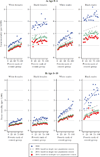
Figure 5. Three-Year White and Black Mortality Rates across Poverty Percentiles, Based on Single and Multiple Race Population Counts
Source: Authors using data from the Vital Statistics, the US Census, and the American Community Survey. Note: Three-year mortality rates for four different age groups are plotted separately for whites and African Americans across county groups ranked by their overall poverty rate. For further details see the comments below Figure 2 and in the text. Circles represent mortality rates constructed as the ratio of race-specific death counts in the Vital Statistics divided by single race population counts in the 2010 Census. The mortality rates represented by squares are based on the same death counts, but divided by population counts including multiple race reports. Mortality rates in 2000 and 2010 are age-adjusted using the 1990 population, that is they account for changes in the age structure within age, gender, race, and county groups since 1990.
Figure 6
Figure 6. Fraction That Ever Smoked in Old and Young Population by Poverty Status and Gender, 1990–2010
Source: Authors using data the National Health Interview Survey. Note: Smoking rates in the overall old and young adult US population, by poverty status, are plotted from 1990 to 2010. Lines are fitted based on ordinary least squares regressions.

References

    1. Aizer Anna, Currie Janet. The Intergenerational Transmission of Inequality: Maternal Disadvantage and Health at Birth. Science. 2014 May 23;344(6186):856–861. - PMC - PubMed
    1. Almond Douglas, Currie Janet. Human Capital Development Before Age Five. In: Card David, Ashenfelter Orley., editors. Handbook of Labor Economics. 4B. Amsterdam: Elsevier; 2011. Chapter 15.
    1. Arias Elizabeth, Eschbach Karl, Schauman William S, Bucklund Eric, Sorlie Paul D. The Hispanic Mortality Advantage and Ethnic Misclassification on US Death Certificates. American Journal of Public Health. 2010;100(S1):S171–S177. - PMC - PubMed
    1. Arias Elizabeth, Schauman William S, Eschbach Karl, Sorlie Paul D, Bucklund Eric. Vital and Health Statistics Series 2. 148. National Center for Health Statistics; 2008. Oct, The Validity of Race and Hispanic Origin Reporting on Death Certificates in the United States. - PubMed
    1. Banks James, Marmot Michael, Oldfield Zoe, Smith James P. Disease and Disadvantage in the United States and in England. JAMA. 2006;295(17):2037–2045. - PubMed

Publication types

LinkOut - more resources