Statistical Approaches to Candidate Biomarker Panel Selection
- PMID: 27975231
- PMCID: PMC7885896
- DOI: 10.1007/978-3-319-41448-5_22
Statistical Approaches to Candidate Biomarker Panel Selection
Abstract
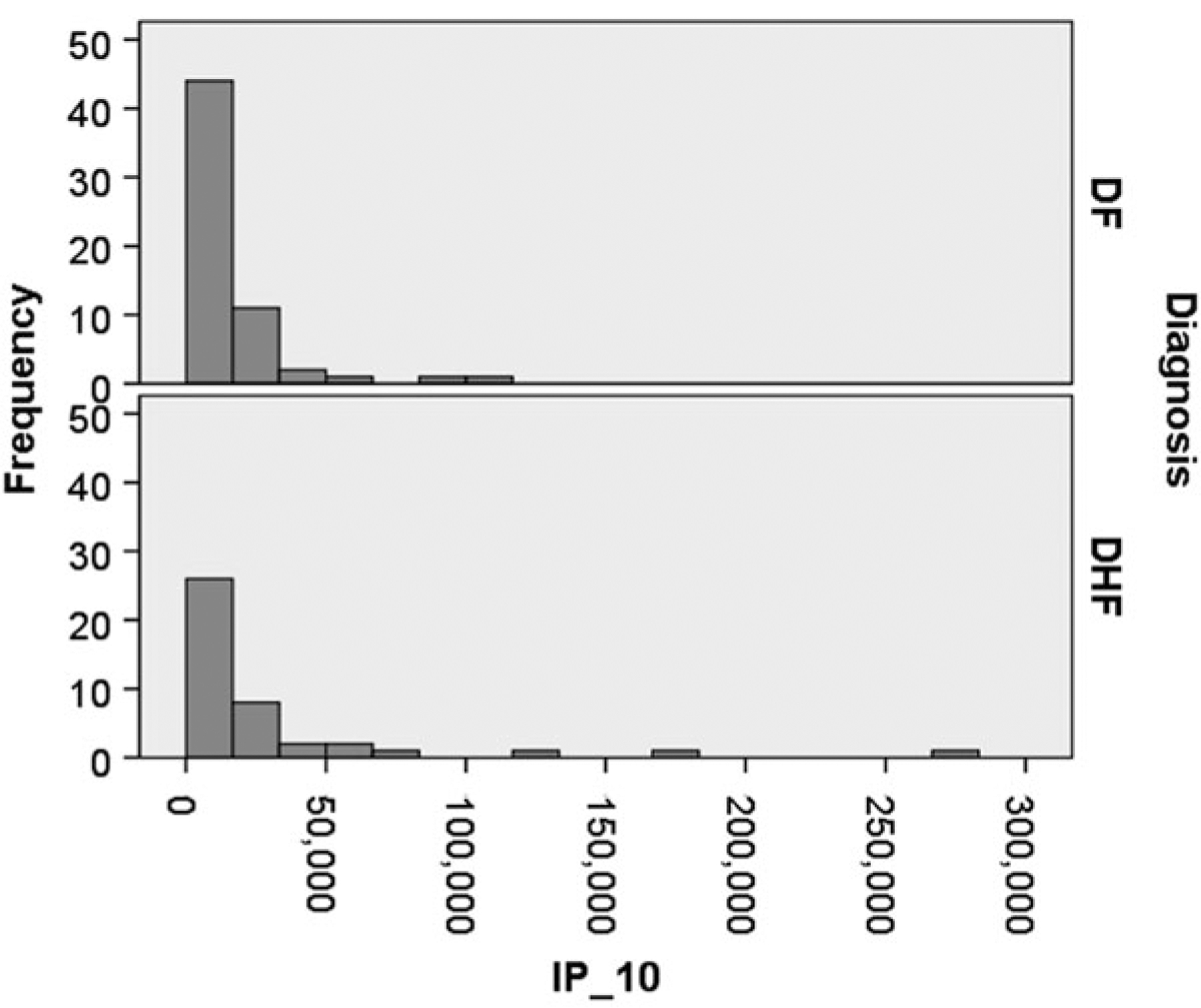
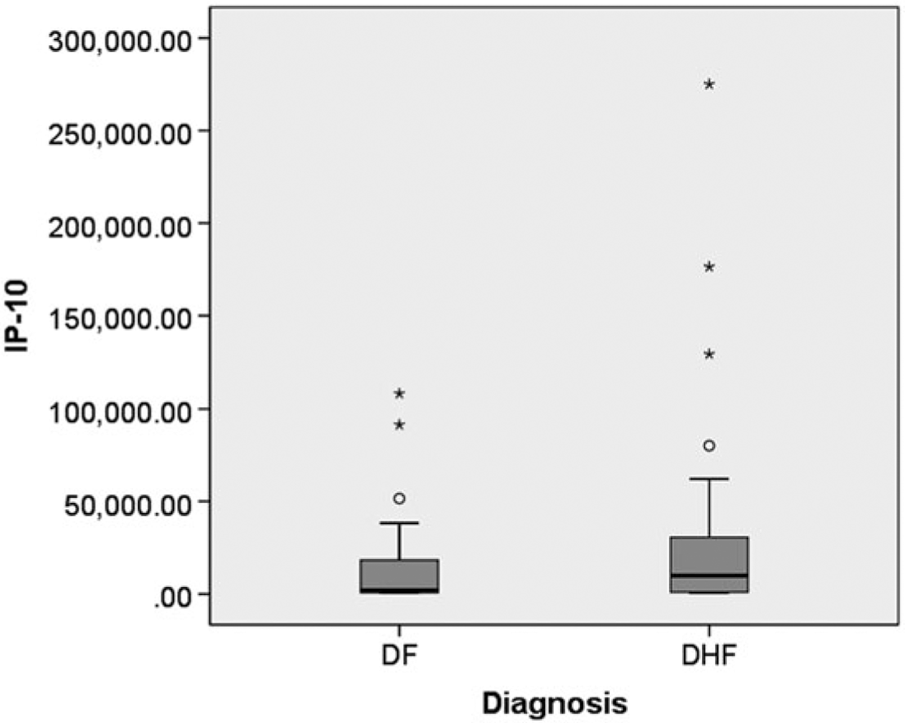
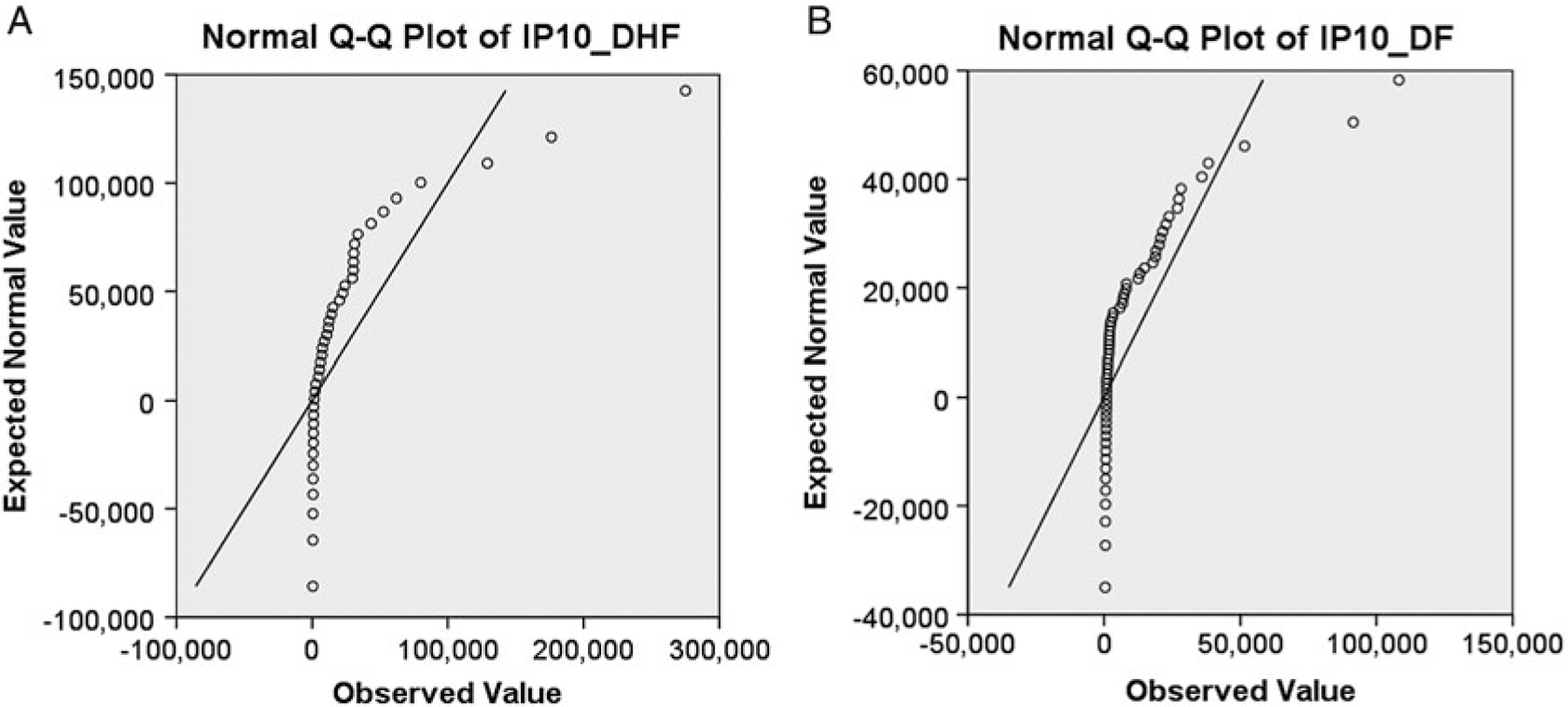
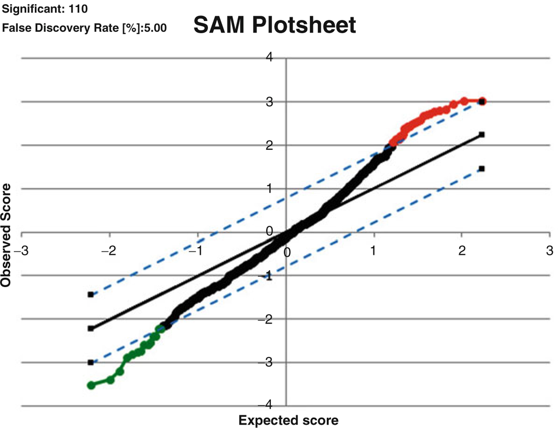
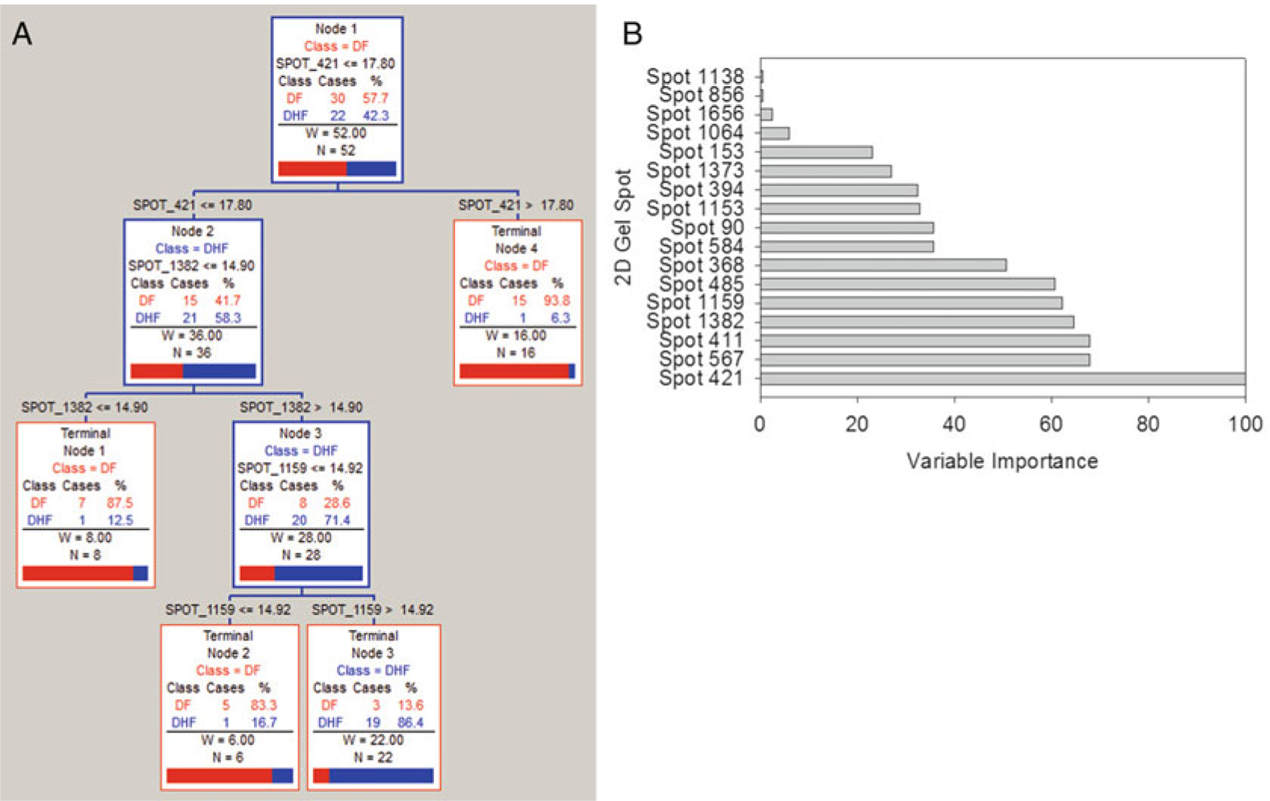
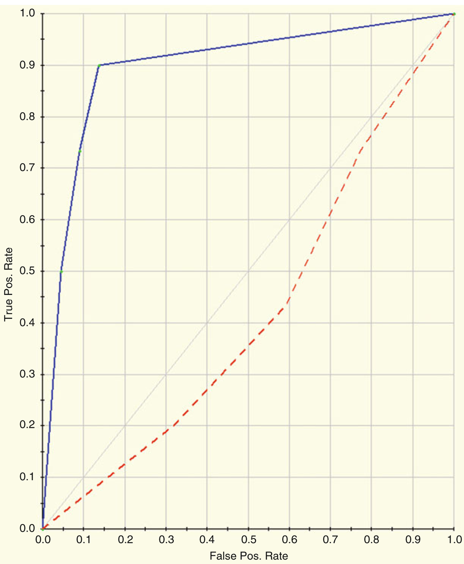
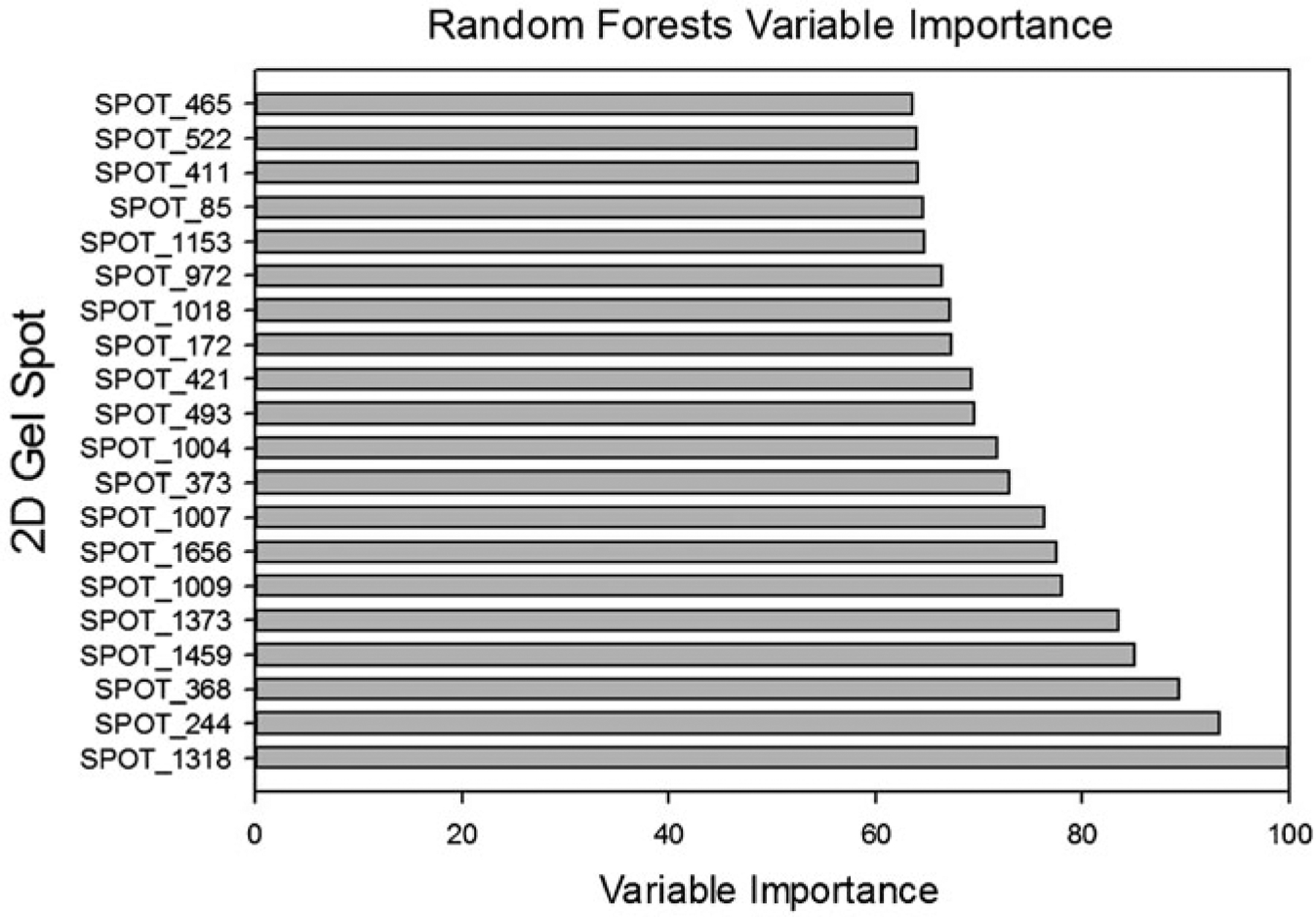
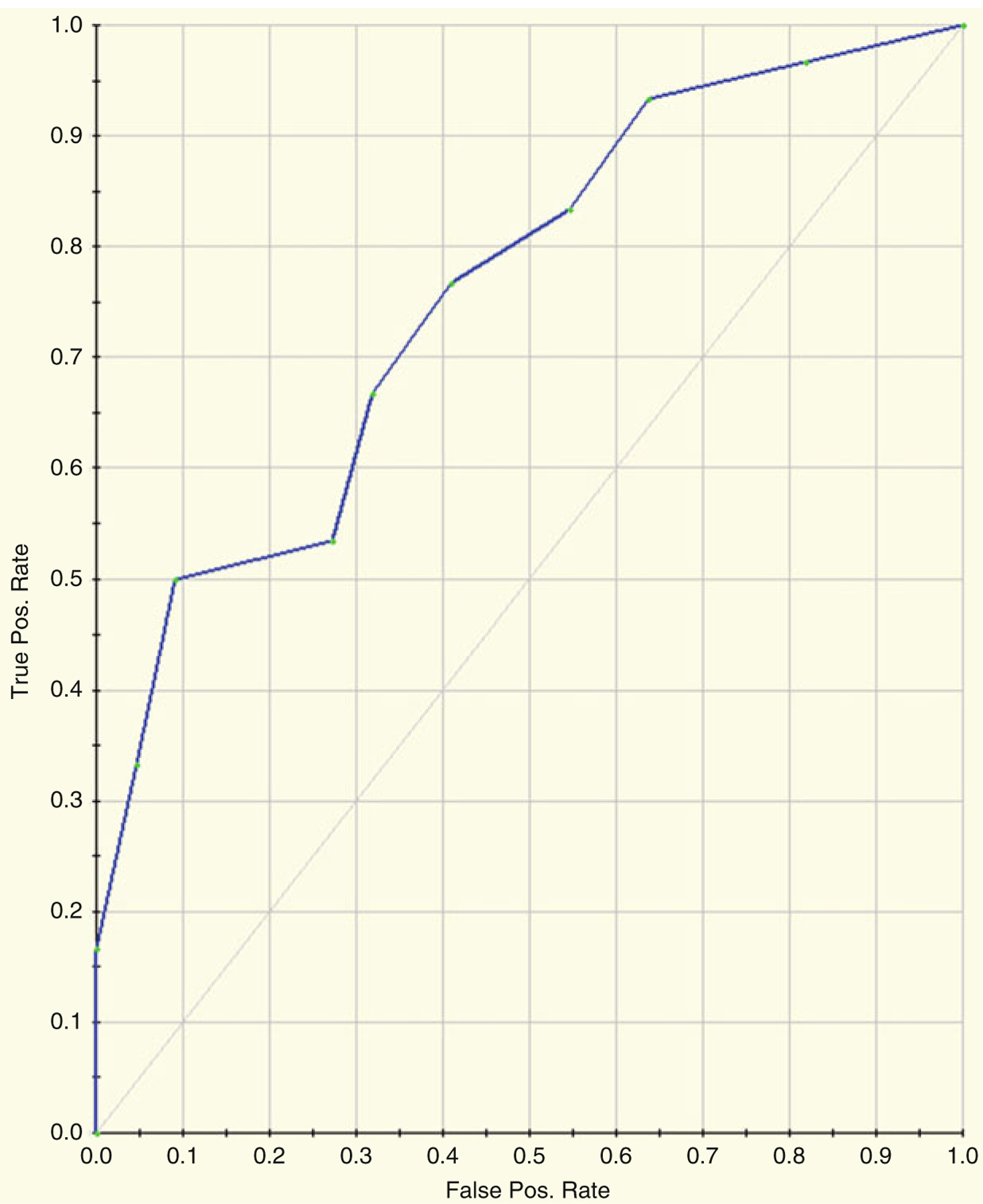
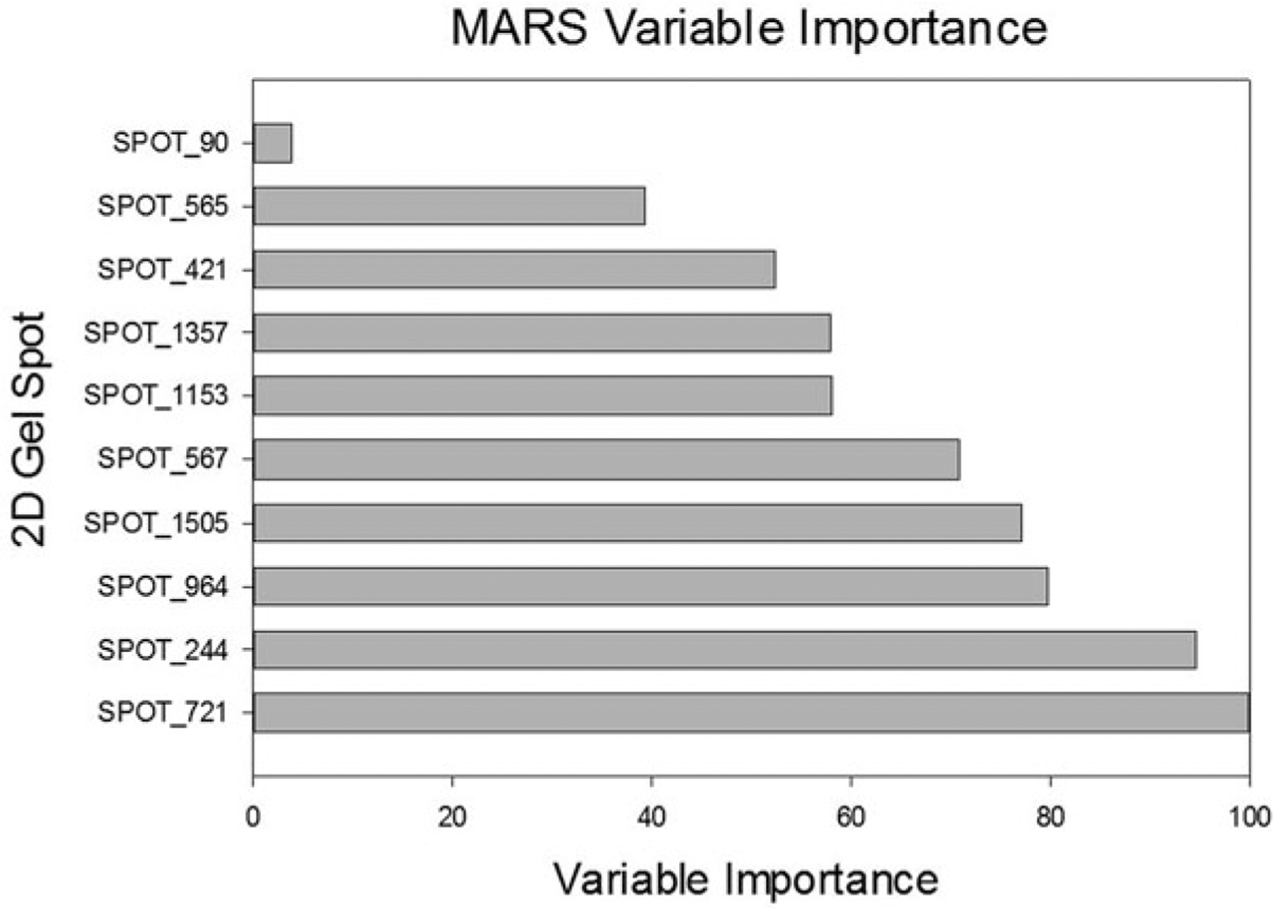
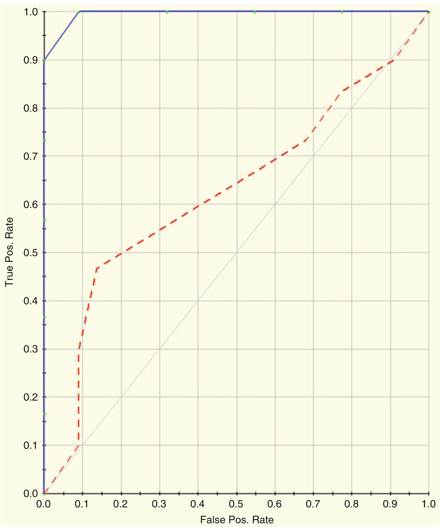
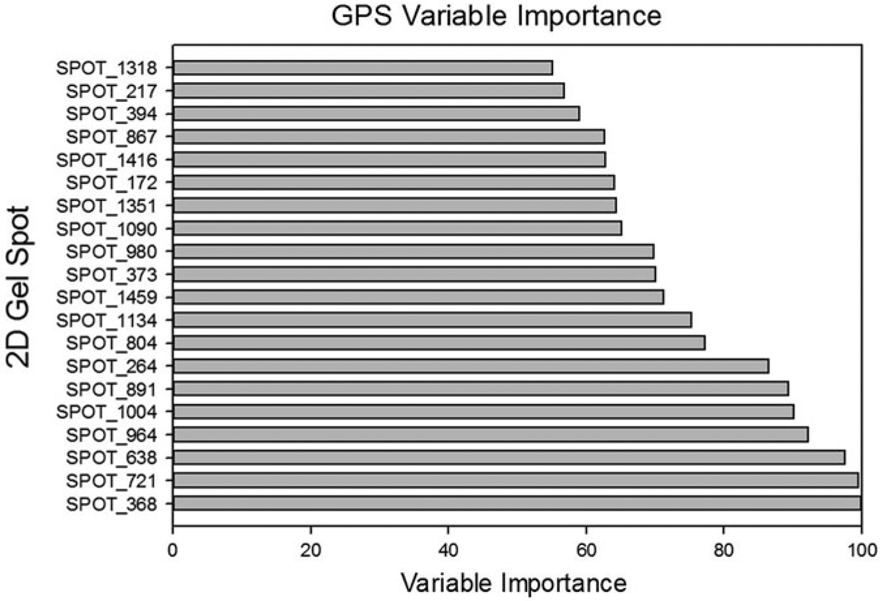
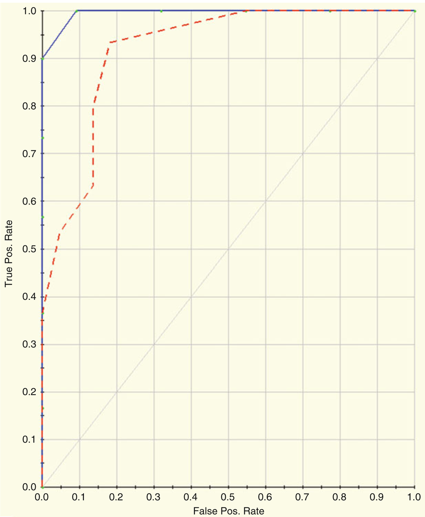
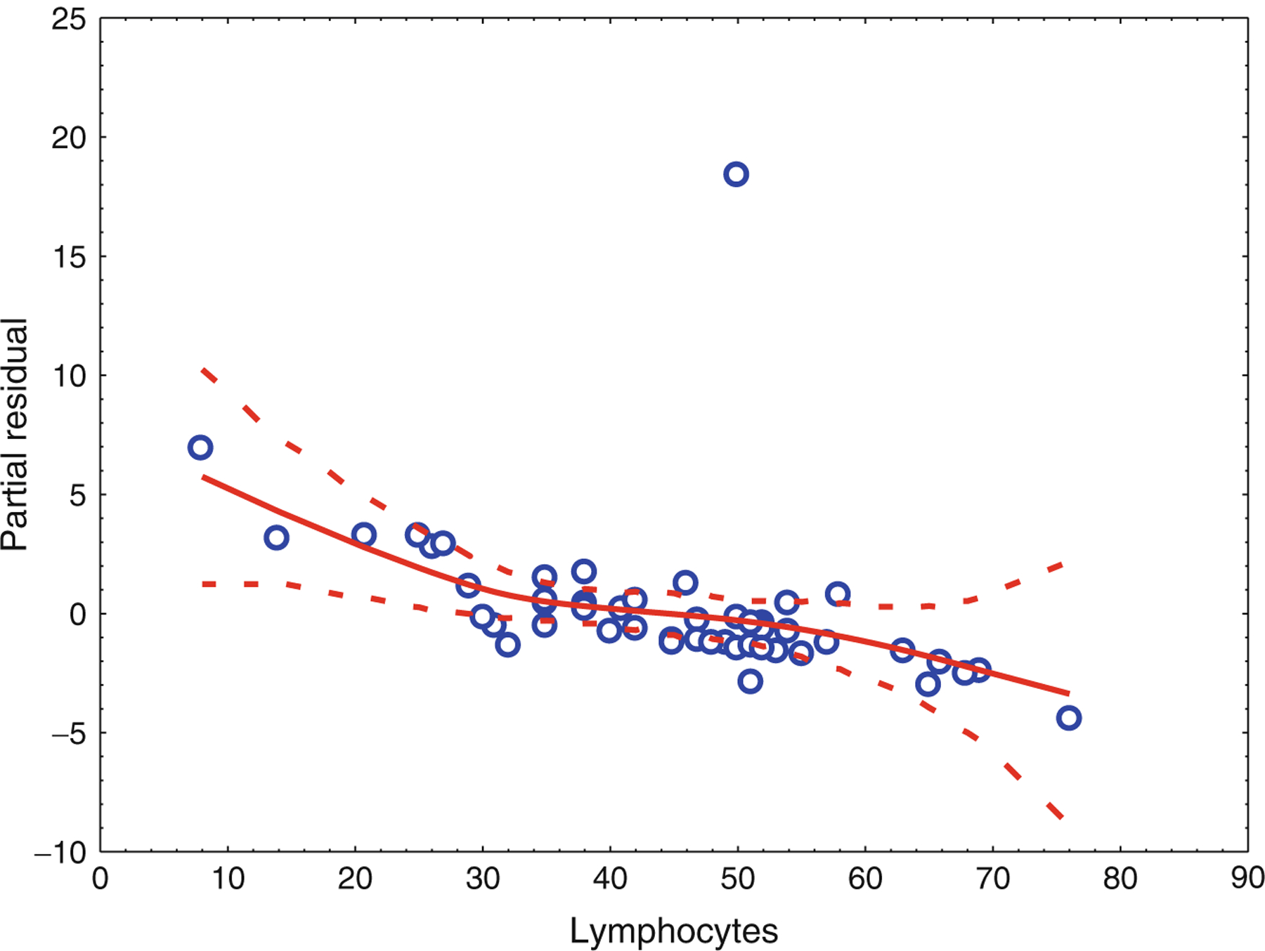
The statistical analysis of robust biomarker candidates is a complex process, and is involved in several key steps in the overall biomarker development pipeline (see Fig. 22.1, Chap. 19 ). Initially, data visualization (Sect. 22.1, below) is important to determine outliers and to get a feel for the nature of the data and whether there appear to be any differences among the groups being examined. From there, the data must be pre-processed (Sect. 22.2) so that outliers are handled, missing values are dealt with, and normality is assessed. Once the processed data has been cleaned and is ready for downstream analysis, hypothesis tests (Sect. 22.3) are performed, and proteins that are differentially expressed are identified. Since the number of differentially expressed proteins is usually larger than warrants further investigation (50+ proteins versus just a handful that will be considered for a biomarker panel), some sort of feature reduction (Sect. 22.4) should be performed to narrow the list of candidate biomarkers down to a more reasonable number. Once the list of proteins has been reduced to those that are likely most useful for downstream classification purposes, unsupervised or supervised learning is performed (Sects. 22.5 and 22.6, respectively).
Keywords: Candidate biomarker selection; Data clustering; Data consistency; Data inspection; Data normalization; Data transformations; Machine learning; Outlier detection.
Figures

Similar articles
-
Qualification and Verification of Protein Biomarker Candidates.Adv Exp Med Biol. 2016;919:493-514. doi: 10.1007/978-3-319-41448-5_23. Adv Exp Med Biol. 2016. PMID: 27975232 Review.
-
Discovery of Candidate Biomarkers.Adv Exp Med Biol. 2016;919:443-462. doi: 10.1007/978-3-319-41448-5_21. Adv Exp Med Biol. 2016. PMID: 27975230 Review.
-
Introduction to Clinical Proteomics.Adv Exp Med Biol. 2016;919:435-441. doi: 10.1007/978-3-319-41448-5_20. Adv Exp Med Biol. 2016. PMID: 27975229 Review.
-
Mass Spectrometry-Based Protein Quantification.Adv Exp Med Biol. 2016;919:255-279. doi: 10.1007/978-3-319-41448-5_15. Adv Exp Med Biol. 2016. PMID: 27975224 Review.
-
Platforms and Pipelines for Proteomics Data Analysis and Management.Adv Exp Med Biol. 2016;919:203-215. doi: 10.1007/978-3-319-41448-5_9. Adv Exp Med Biol. 2016. PMID: 27975218 Review.
Cited by
-
Application of SWATH Mass Spectrometry and Machine Learning in the Diagnosis of Inflammatory Bowel Disease Based on the Stool Proteome.Biomedicines. 2024 Feb 1;12(2):333. doi: 10.3390/biomedicines12020333. Biomedicines. 2024. PMID: 38397935 Free PMC article.
-
Computational advances of tumor marker selection and sample classification in cancer proteomics.Comput Struct Biotechnol J. 2020 Jul 17;18:2012-2025. doi: 10.1016/j.csbj.2020.07.009. eCollection 2020. Comput Struct Biotechnol J. 2020. PMID: 32802273 Free PMC article. Review.
-
Breath Biopsy® to Identify Exhaled Volatile Organic Compounds Biomarkers for Liver Cirrhosis Detection.J Clin Transl Hepatol. 2023 Jun 28;11(3):638-648. doi: 10.14218/JCTH.2022.00309. Epub 2023 Feb 2. J Clin Transl Hepatol. 2023. PMID: 36969895 Free PMC article.
-
Lessons and tips for designing a machine learning study using EHR data.J Clin Transl Sci. 2020 Jul 24;5(1):e21. doi: 10.1017/cts.2020.513. J Clin Transl Sci. 2020. PMID: 33948244 Free PMC article. Review.
References
-
- Batista G, Monard M (2002) A study of K-nearest neighbour as an imputation method. Hybrid Intelligent Systems, Santiago, Chile, pp 251–260
-
- Benjamini Y, Hochberg Y (1995) Controlling the false discovery rate: a practical and powerful approach to multiple testing. J R Stat Soc Ser B 57:125–133
-
- Breiman L, Friedman J, Olshen R, Stone C (1984) Classification and regression trees. Wadsworth, Belmont
-
- Breiman L (2001) Random forests-random features. University of California, Berkeley
-
- Carroll R, Ruppert A, Stefanski L, Crainiceanu C (2006) Measurement error in nonlinear models: a modern perspective, 2nd edn. CRC Press, London
Publication types
MeSH terms
Substances
Grants and funding
LinkOut - more resources
Full Text Sources
Other Literature Sources