. 2017 Apr 6;20(4):518-532.e9.
doi: 10.1016/j.stem.2016.11.005. Epub 2016 Dec 22.

Analysis of Transcriptional Variability in a Large Human iPSC Library Reveals Genetic and Non-genetic Determinants of Heterogeneity

Affiliations

Analysis of Transcriptional Variability in a Large Human iPSC Library Reveals Genetic and Non-genetic Determinants of Heterogeneity

Ivan Carcamo-Orive et al. Cell Stem Cell. .

Erratum in

Abstract

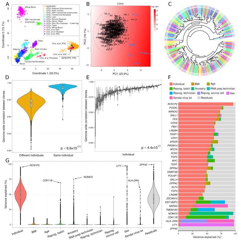
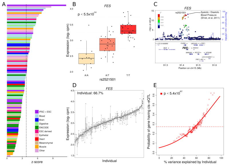
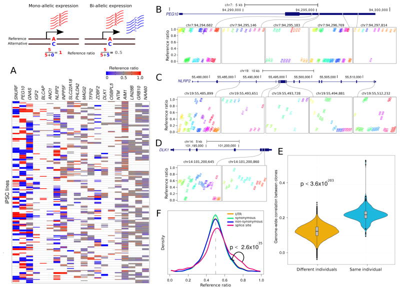
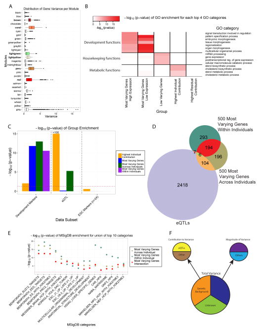
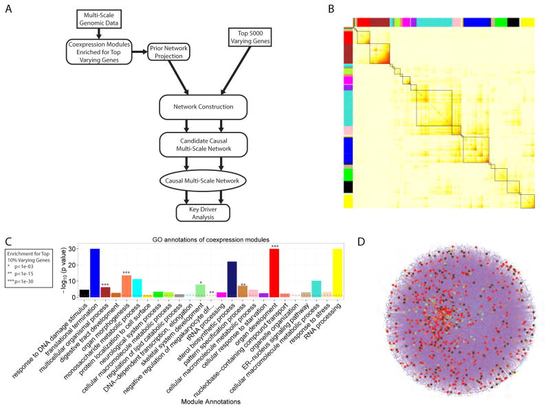
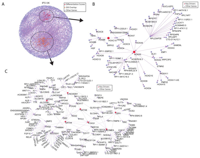
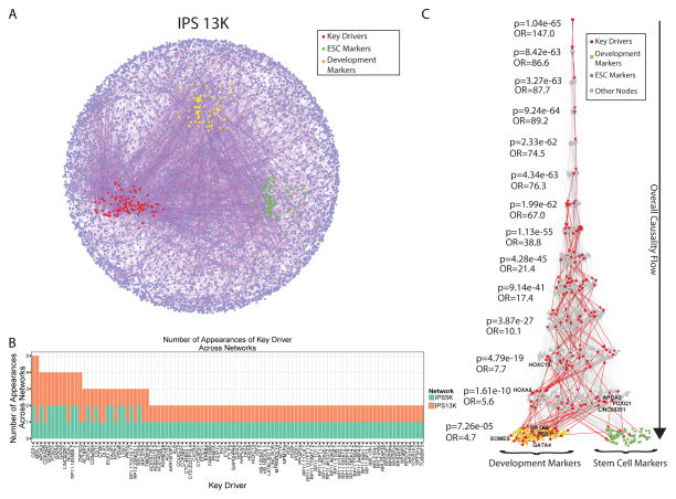
Variability in induced pluripotent stem cell (iPSC) lines remains a concern for disease modeling and regenerative medicine. We have used RNA-sequencing analysis and linear mixed models to examine the sources of gene expression variability in 317 human iPSC lines from 101 individuals. We found that ∼50% of genome-wide expression variability is explained by variation across individuals and identified a set of expression quantitative trait loci that contribute to this variation. These analyses coupled with allele-specific expression show that iPSCs retain a donor-specific gene expression pattern. Network, pathway, and key driver analyses showed that Polycomb targets contribute significantly to the non-genetic variability seen within and across individuals, highlighting this chromatin regulator as a likely source of reprogramming-based variability. Our findings therefore shed light on variation between iPSC lines and illustrate the potential for our dataset and other similar large-scale analyses to identify underlying drivers relevant to iPSC applications.

Keywords: Polycomb targets; allelic imbalance; differentiation variability; eQTL; iPSC library; key drivers; network analysis; transcriptional variability; variance partition.


Figures

Figure 1
Figure 1. Sources of iPSC Gene Expression Variability
A) iPSCs from the current dataset cluster with previously characterized iPSCs and ESCs (Choi et al., 2015) and are distant from tissues studied in GTEx, based on multi-dimensional scaling. B) Outliers were identified with principal component analysis of 24 key stem cell genes. The color gradient represents smoothed expression of CDH2. Ellipses indicate 1, 2 and 3 standard deviations from the centroid. C) Hierarchical clustering of RNA-seq data indicates that multiple iPSC lines from the same individual cluster together (same color). D) Correlation of genome-wide gene expression profiles between multiple iPSC lines from the same individual are substantially higher than the correlation between profiles from different individuals. Violin plots represent the distribution of similarity scores with the width of the curve indicating the number of data points that fall in the region. E) The correlation between multiple lines from the same individual show substantial differences. Each bar represents an individual and shows the distribution of pairwise similarity values within the multiple iPSC lines from that individual. F) Expression variance is partitioned into fractions attributable to each experimental variable. Genes shown include 24 key stem cell genes, and genes for which one of the experimental variables explains a large fraction of total variance. G) Violin plots of the percentage of variance explained by each experimental variable over all the genes. For a small number of genes also shown in (F), the data point corresponding to the largest source of variation is indicated with an arrow. See also Figure S2, S3, S4 and Table S2
Figure 2
Figure 2. Function and Interpretation of eQTLs
A) eQTLs show highest enrichment in enhancers in iPSCs and ESCs. Z-scores indicate the degree of enrichment in enhancers represented in cells and tissues samples from (Roadmap Epigenomics Consortium, 2015). Bars are colored based on tissue origin and the dashed line indicates the Bonferroni cutoff for multiple testing. B) rs2521501 is the most significant eQTL for the exemplary FES locus. Expression of FES is shown stratified by genotype at this SNP. C) LocusZoom plot shows −log10 p-values for variants in the FES locus. rs2521501 is an eQTL for FES and is also associated with systolic and diastolic blood pressure. D) FES shows high variation across individuals and low variation within individuals. Each bar represents an individual and the size of the bar represents the variation in FES expression within that individual. E) Probability of each gene having a cis-eQTL plotted against the percent variance explained by individual. Dashed lines indicate the genome-wide average probability, and curves indicate logistic regression smoothed probabilities as a function of the percent variance explained by individual. Points indicate a sliding window average of the probability of genes in each window having a cis-eQTL (window size is 200 genes with an overlap of 100 genes between windows). The p-value shown indicates the probability that an association as strong as between percent variance and eQTL probability occurs by chance according to the logistic regression smoothing. See also Figure S5
Figure 3
Figure 3. Allele-Specific Expression
Diagram illustrates mono- and bi-allelic expression. A) Reference ratios for each set of canonically imprinted genes show the consistency of allele-specific expression (ASE) within multiple iPSC lines from the same individual. Red indicates expression of the reference allele, blue indicates expression of the alternative allele and grey indicates a mix. White indicates that ASE could not be assessed due to the lack of a heterozygous SNP with sufficient coverage. B) PEG10 exhibits strong allelic imbalance at 5 sites where the expressed allele is consistent in multiple iPSC lines from the same individual. Reference ratios are shown at 5 sites for individuals that are heterozygous at each site. Multiple iPSC lines from the same individual have the same color and labels indicate the individual identifier for each iPSC line. C) NLRP2 exhibits more variation in allele imbalance across individuals, but retains consistency in multiple iPSC lines from the same individual. D) DLK1 shows loss of imprinting but retains consistency within multiple iPSC lines from the same individual. E) Genome-wide correlation based on allelic imbalance at sites shared by each pair of individuals indicates that iPSC lines from the same individuals show higher similarity in ASE than iPSC lines from different individuals. F) Genome wide reference ratios for SNPs in splice site regions show increased expression of the reference allele, compared to SNPs in UTRs, or SNPs that cause synonymous or non-synonymous changes in coding regions.
Figure 4
Figure 4. Magnitude of Variance Defines High and Low Variable Genes and Pathways in Human iPSC Lines
A) Distribution (boxplot) of the variance of all the genes in each module in the co-expression network. The grey module represents the ‘trash’ module (in which genes are not co-expressed). The 6 modules significantly enriched for the top 3000 most varying genes are colored according to the module name. B) Heatmap of the −log10 (p-value) for the top enriched Gene Ontology (GO) terms, grouped into general functional classes, for each category of genes considered. The categories are: (1) the 1000 most varying genes divided into 2 groups, the highly expressed ones (230 genes) and the nominally expressed ones (770 genes), (2) the 1000 least varying genes, (3) the 1000 genes with the highest individual contribution to variance, and (4) the 1000 genes with the highest residual contribution to variance. C) Distribution (bar-plot) of the −log10 (p-value) of the enrichment, assessed using the Fisher’s exact test, of the groups in the legend for development markers, eQTLs and ESC markers. D) Venn diagram of the top 500 most varying genes within individuals, across individuals and eQTL genes (1% FDR), E) −log10 (p-values) for the enrichment of the union of the 3 groups shown in (D) for top 10 MSigDB categories. F) Diagram recapitulating the different sources influencing the different types of gene expression variation in iPSCs. See also Figure S2B, S2C, S2D and Table S2, S3 and S4
Figure 5
Figure 5. Predictive Network Modeling Analysis Pipeline, co-Expression Network Results and Mapping onto Prior Network
A) Diagram showing the different analysis steps from multi-scale data to predictive network modeling. B) The topological overlap matrix (TOM) of the iPSC co-expression network. Only genes included in co-expression modules are shown. C) Annotation of the modules with the most significantly enriched GO term. Modules significantly enriched for the top 3000 most varying genes are indicated. D) iPSC-specific prior network constructed from public databases (CPDB and MetaCore) and Roadmap Epigenomics Consortium iPSC data, with genes in the modules of interest mapped onto the network shown by dots colored according to the modules identity.
Figure 6
Figure 6. 13K Sub-Networks Downstream of Key Driver Genes of Interest Contribute to iPSC Variability
A) Causal network covering the 13,990 genes comprising the co-expression modules enriched for the top 3000 most varying genes, the pathways related to development of these modules, and the mapping onto the prior network. The sub-networks 2 steps away from the key drivers of interest are shown in B) and C), with the key drivers shown in red and yellow respectively. See also Figure S6, S7 and Table S5 and S6
Figure 7
Figure 7. Bayesian Causal Gene Networks, Key Driver Gene Discovery and Network Validation with Prior Information
A) Causal molecular networks covering the 13,990 genes comprising the co-expression modules enriched for the top 3000 most varying genes, the pathways related to development of these modules, and the mapping onto the prior network. The key drivers genes are highlighted in red, the stem cell markers in green and the development markers in orange. B) Distribution (histogram) of the number of appearances of any key driver gene in both networks, ranked by their total number of appearances. C) The Eiffel Tower plot shows the overall causality flow (top to bottom) from any stem cell (green) or development (yellow) markers to any upstream causal gene in the 13K network. It also shows the enrichment p-value of key driver genes (red) at every step upstream of the markers, assessed using a level-associated Fisher’s exact test. See also Figure S6, S7 and Table S5 and S7

References

    1. Aloia L, Di Stefano B, Di Croce L. Polycomb complexes in stem cells and embryonic development. Development. 2013;140:2525–2534. - PubMed
    1. Bahrami SB, Veiseh M, Dunn AA, Boudreau NJ. Temporal changes in Hox gene expression accompany endothelial cell differentiation of embryonic stem cells. Cell adhesion & migration. 2011;5:133–141. - PMC - PubMed
    1. Bar-Nur O, Russ HA, Efrat S, Benvenisty N. Epigenetic memory and preferential lineage-specific differentiation in induced pluripotent stem cells derived from human pancreatic islet beta cells. Cell stem cell. 2011;9:17–23. - PubMed
    1. Ben-David U, Mayshar Y, Benvenisty N. Large-scale analysis reveals acquisition of lineage-specific chromosomal aberrations in human adult stem cells. Cell stem cell. 2011;9:97–102. - PubMed
    1. Benetatos L, Vartholomatos G, Hatzimichael E. DLK1-DIO3 imprinted cluster in induced pluripotency: landscape in the mist. Cellular and molecular life sciences: CMLS. 2014;71:4421–4430. - PMC - PubMed

Publication types

Substances