. 2017 Jan 24;317(4):388-406.
doi: 10.1001/jama.2016.20324.

Trends and Patterns of Disparities in Cancer Mortality Among US Counties, 1980-2014

Affiliations

Trends and Patterns of Disparities in Cancer Mortality Among US Counties, 1980-2014

Ali H Mokdad et al. JAMA. .

Abstract

Introduction: Cancer is a leading cause of morbidity and mortality in the United States and results in a high economic burden.

Objective: To estimate age-standardized mortality rates by US county from 29 cancers.

Design and setting: Deidentified death records from the National Center for Health Statistics (NCHS) and population counts from the Census Bureau, the NCHS, and the Human Mortality Database from 1980 to 2014 were used. Validated small area estimation models were used to estimate county-level mortality rates from 29 cancers: lip and oral cavity; nasopharynx; other pharynx; esophageal; stomach; colon and rectum; liver; gallbladder and biliary; pancreatic; larynx; tracheal, bronchus, and lung; malignant skin melanoma; nonmelanoma skin cancer; breast; cervical; uterine; ovarian; prostate; testicular; kidney; bladder; brain and nervous system; thyroid; mesothelioma; Hodgkin lymphoma; non-Hodgkin lymphoma; multiple myeloma; leukemia; and all other cancers combined.

Exposure: County of residence.

Main outcomes and measures: Age-standardized cancer mortality rates by county, year, sex, and cancer type.

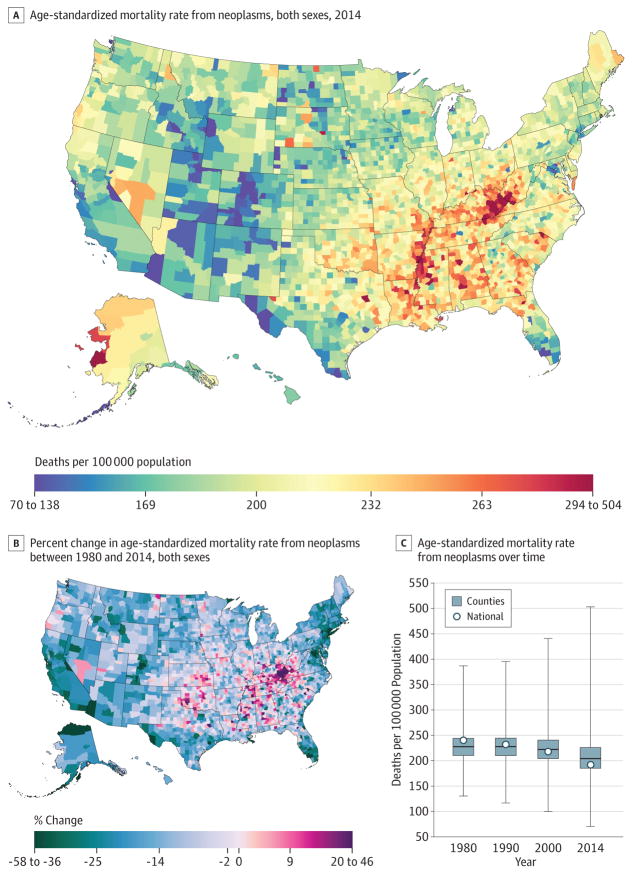
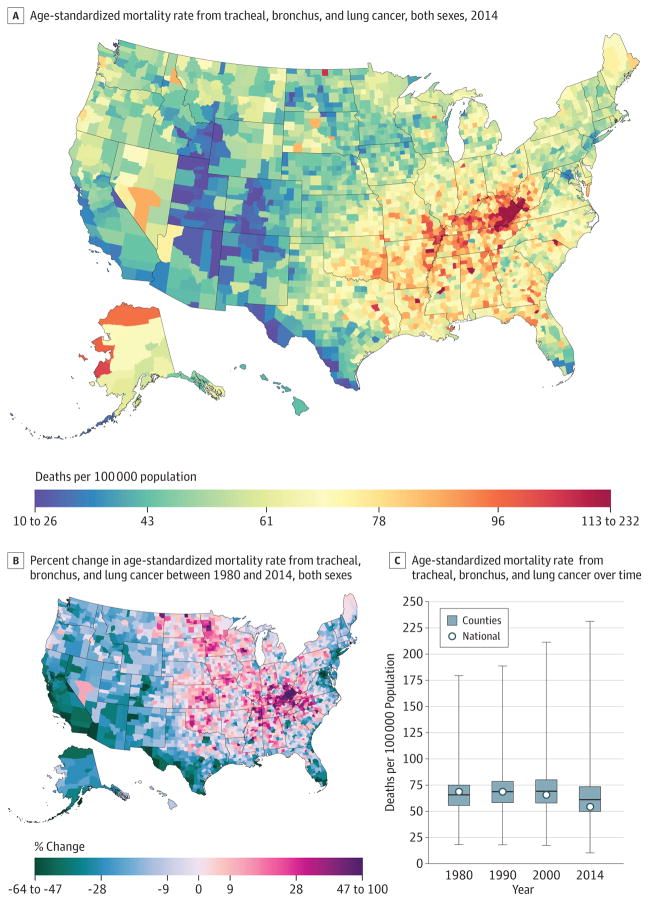
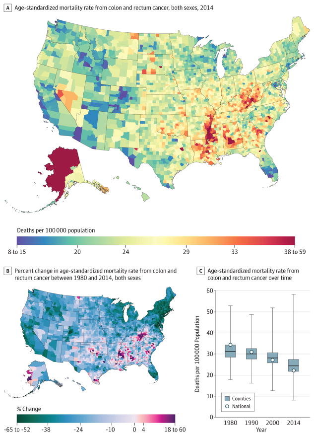
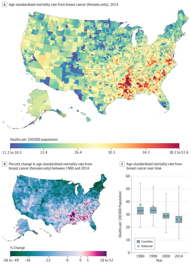
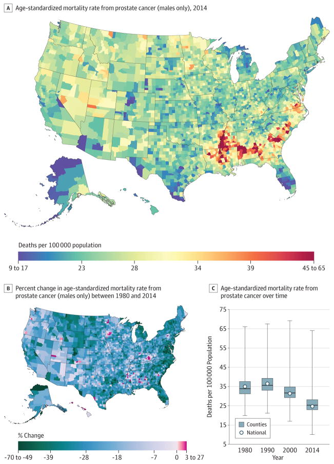
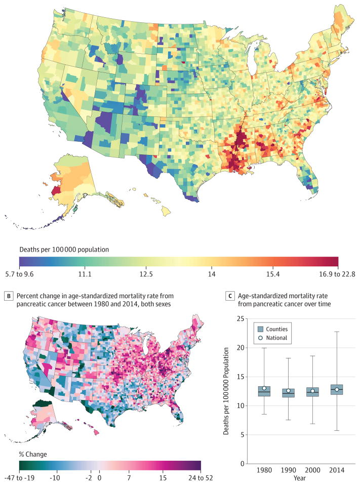
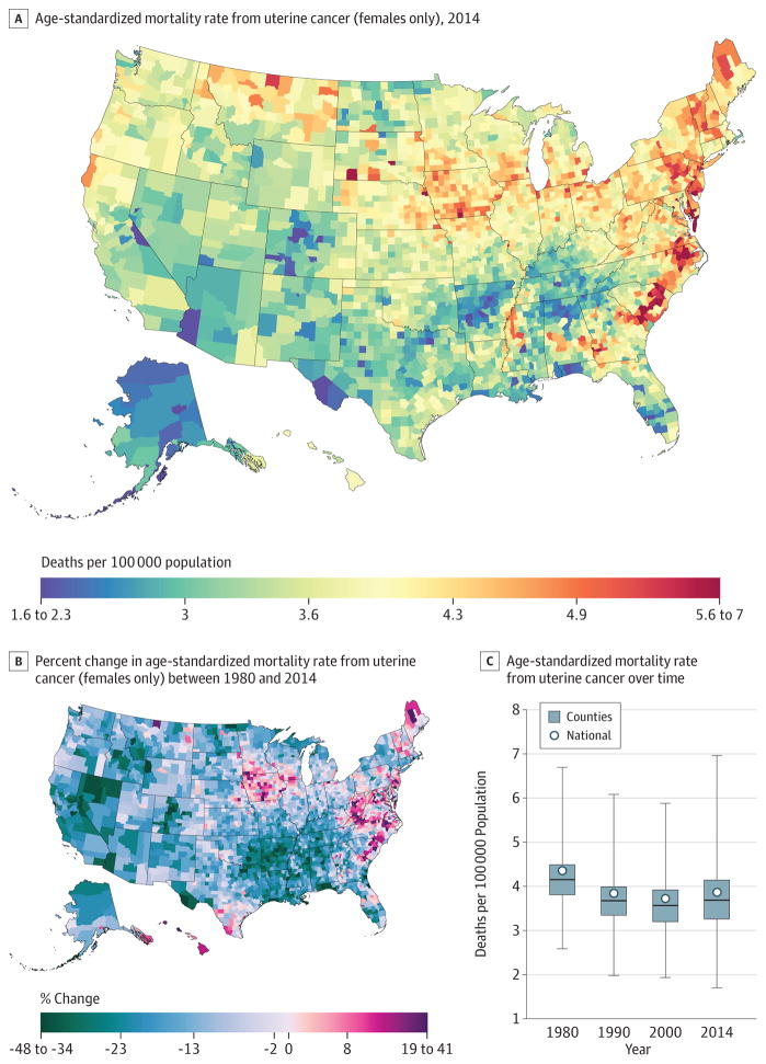
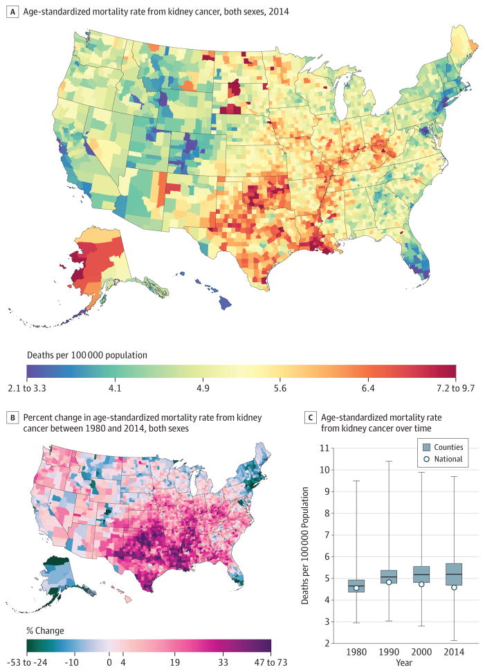
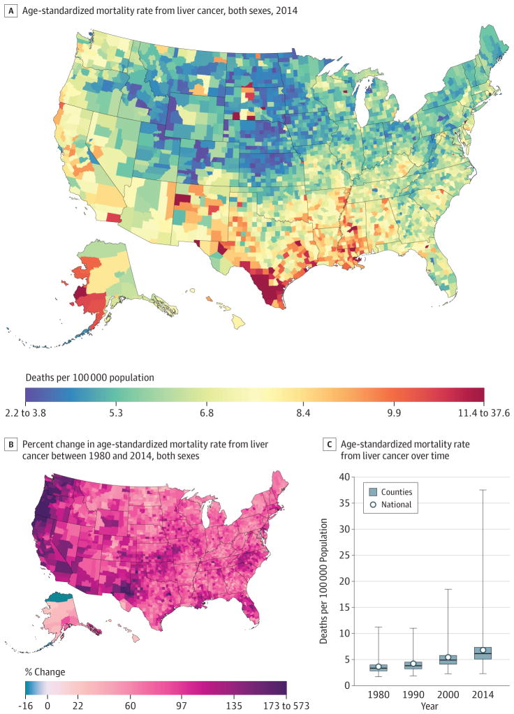
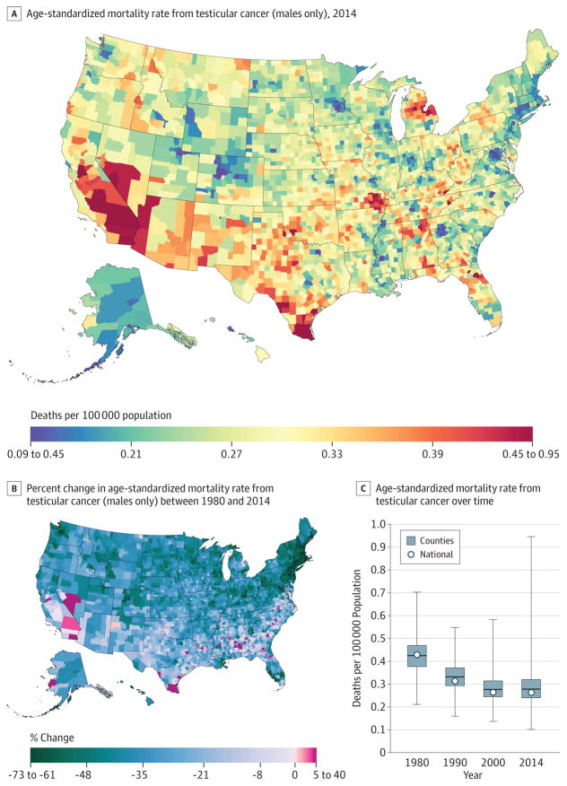
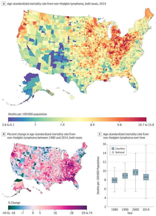
Results: A total of 19 511 910 cancer deaths were recorded in the United States between 1980 and 2014, including 5 656 423 due to tracheal, bronchus, and lung cancer; 2 484 476 due to colon and rectum cancer; 1 573 593 due to breast cancer; 1 077 030 due to prostate cancer; 1 157 878 due to pancreatic cancer; 209 314 due to uterine cancer; 421 628 due to kidney cancer; 487 518 due to liver cancer; 13 927 due to testicular cancer; and 829 396 due to non-Hodgkin lymphoma. Cancer mortality decreased by 20.1% (95% uncertainty interval [UI], 18.2%-21.4%) between 1980 and 2014, from 240.2 (95% UI, 235.8-244.1) to 192.0 (95% UI, 188.6-197.7) deaths per 100 000 population. There were large differences in the mortality rate among counties throughout the period: in 1980, cancer mortality ranged from 130.6 (95% UI, 114.7-146.0) per 100 000 population in Summit County, Colorado, to 386.9 (95% UI, 330.5-450.7) in North Slope Borough, Alaska, and in 2014 from 70.7 (95% UI, 63.2-79.0) in Summit County, Colorado, to 503.1 (95% UI, 464.9-545.4) in Union County, Florida. For many cancers, there were distinct clusters of counties with especially high mortality. The location of these clusters varied by type of cancer and were spread in different regions of the United States. Clusters of breast cancer were present in the southern belt and along the Mississippi River, while liver cancer was high along the Texas-Mexico border, and clusters of kidney cancer were observed in North and South Dakota and counties in West Virginia, Ohio, Indiana, Louisiana, Oklahoma, Texas, Alaska, and Illinois.

Conclusions and relevance: Cancer mortality declined overall in the United States between 1980 and 2014. Over this same period, there were important changes in trends, patterns, and differences in cancer mortality among US counties. These patterns may inform further research into improving prevention and treatment.


Conflict of interest statement

Conflict of Interest Disclosures: All authors have completed and submitted the ICMJE Form for Disclosure of Potential Conflicts of Interest and none were reported.

Figures

Figure 1
Figure 1. County-Level Mortality From Neoplasms
A, Age-standardized mortality rate for both sexes combined in 2014. B, Relative percent change in the age-standardized mortality rate for both sexes combined between 1980 and 2014. In panels A, and B, the color scale is truncated at approximately the first and 99th percentiles as indicated by the range given in the color scale. C, Age-standardized mortality rate in 1980, 1990, 2000, and 2014. The bottom border, middle line, and top border of the boxes indicate the 25th, 50th, and 75th percentiles, respectively, across all counties; whiskers, the full range across counties; and circles, the national-level rate.
Figure 2
Figure 2. County-Level Mortality From Tracheal, Bronchus, and Lung Cancer
A, Age-standardized mortality rate for both sexes combined in 2014. B, Relative percent change in the age-standardized mortality rate for both sexes combined between 1980 and 2014. In panels A, and B, the color scale is truncated at approximately the first and 99th percentiles as indicated by the range given in the color scale. C, Age-standardized mortality rate in 1980, 1990, 2000, and 2014. The bottom border, middle line, and top border of the boxes indicate the 25th, 50th, and 75th percentiles, respectively, across all counties; whiskers, the full range across counties; and circles, the national-level rate.
Figure 3
Figure 3. County-Level Mortality From Colon and Rectum Cancer
A, Age-standardized mortality rate for both sexes combined in 2014. B, Relative percent change in the age-standardized mortality rate for both sexes combined between 1980 and 2014. In panels A, and B, the color scale is truncated at approximately the first and 99th percentiles as indicated by the range given in the color scale. C, Age-standardized mortality rate in 1980, 1990, 2000, and 2014. The bottom border, middle line, and top border of the boxes indicate the 25th, 50th, and 75th percentiles, respectively, across all counties; whiskers, the full range across counties; and circles, the national-level rate.
Figure 4
Figure 4. County-Level Mortality From Breast Cancer (Females Only)
A, Age-standardized mortality rate for females in 2014. B, Relative percent change in the age-standardized mortality rate for females between 1980 and 2014. In panels A, and B, the color scale is truncated at approximately the first and 99th percentiles as indicated by the range given in the color scale. C, Age-standardized mortality rate in 1980, 1990, 2000, and 2014. The bottom border, middle line, and top border of the boxes indicate the 25th, 50th, and 75th percentiles, respectively, across all counties; whiskers, the full range across counties; and circles, the national-level rate.
Figure 5
Figure 5. County-Level Mortality From Prostate Cancer (Males Only)
A, Age-standardized mortality rate for males in 2014. B, Relative percent change in the age-standardized mortality rate for males between 1980 and 2014. In panels A, and B, the color scale is truncated at approximately the first and 99th percentiles as indicated by the range given in the color scale. C, Age-standardized mortality rate in 1980, 1990, 2000, and 2014. The bottom border, middle line, and top border of the boxes indicate the 25th, 50th, and 75th percentiles, respectively, across all counties; whiskers, the full range across counties; and circles, the national-level rate.
Figure 6
Figure 6. County-Level Mortality From Pancreatic Cancer
A, Age-standardized mortality rate for both sexes combined in 2014. B, Relative percent change in the age-standardized mortality rate for both sexes combined between 1980 and 2014. In panels A, and B, the color scale is truncated at approximately the first and 99th percentiles as indicated by the range given in the color scale. C, Age-standardized mortality rate in 1980, 1990, 2000, and 2014. The bottom border, middle line, and top border of the boxes indicate the 25th, 50th, and 75th percentiles, respectively, across all counties; whiskers, the full range across counties; and circles, the national-level rate.
Figure 7
Figure 7. County-Level Mortality From Uterine Cancer (Females Only)
A, Age-standardized mortality rate for females in 2014. B, Relative percent change in the age-standardized mortality rate for females between 1980 and 2014. In panels A, and B, the color scale is truncated at approximately the first and 99th percentiles as indicated by the range given in the color scale. C, Age-standardized mortality rate in 1980, 1990, 2000, and 2014. The bottom border, middle line, and top border of the boxes indicate the 25th, 50th, and 75th percentiles, respectively, across all counties; whiskers, the full range across counties; and circles, the national-level rate.
Figure 8
Figure 8. County-Level Mortality From Kidney Cancer
A, Age-standardized mortality rate for both sexes combined in 2014. B, Relative percent change in the age-standardized mortality rate for both sexes combined between 1980 and 2014. In panels A, and B, the color scale is truncated at approximately the first and 99th percentiles as indicated by the range given in the color scale. C, Age-standardized mortality rate in 1980, 1990, 2000, and 2014. The bottom border, middle line, and top border of the boxes indicate the 25th, 50th, and 75th percentiles, respectively, across all counties; whiskers, the full range across counties; and circles, the national-level rate.
Figure 9
Figure 9. County-Level Mortality From Liver Cancer
A, Age-standardized mortality rate for both sexes combined in 2014. The color scale is truncated at approximately the first and 99th percentiles as indicated by the range given in the color scale. B, Relative percent change in the age-standardized mortality rate for both sexes combined between 1980 and 2014. The color scale is truncated similarly to panel A at the 99th percentile but not at the first percentile to avoid combining counties with decreases in the mortality rate and counties with increases in the mortality rate into a single group. C, Age-standardized mortality rate in 1980, 1990, 2000, and 2014. The bottom border, middle line, and top border of the boxes indicate the 25th, 50th, and 75th percentiles, respectively, across all counties; whiskers, the full range across counties; and circles, the national-level rate.
Figure 10
Figure 10. County-Level Mortality From Testicular Cancer (Males Only)
A, Age-standardized mortality rate for males in 2014. B, Relative percent change in the age-standardized mortality rate for males between 1980 and 2014. In panels A, and B, the color scale is truncated at approximately the first and 99th percentiles as indicated by the range given in the color scale. C, Age-standardized mortality rate in 1980, 1990, 2000, and 2014. The bottom border, middle line, and top border of the boxes indicate the 25th, 50th, and 75th percentiles, respectively, across all counties; whiskers, the full range across counties; and circles, the national-level rate.
Figure 11
Figure 11. County-Level Mortality From Non-Hodgkin Lymphoma
A, Age-standardized mortality rate for both sexes combined in 2014. B, Relative percent change in the age-standardized mortality rate for both sexes combined between 1980 and 2014. In panels A, and B, the color scale is truncated at approximately the first and 99th percentiles as indicated by the range given in the color scale. C, Age-standardized mortality rate in 1980, 1990, 2000, and 2014. The bottom border, middle line, and top border of the boxes indicate the 25th, 50th, and 75th percentiles, respectively, across all counties; whiskers, the full range across counties; and circles, the national-level rate.

Comment in

References

    1. GBD 2015 Mortality and Causes of Death Collaborators. Global, regional, and national life expectancy, all-cause mortality, and cause-specific mortality for 249 causes of death, 1980–2015: a systematic analysis for the Global Burden of Disease Study 2015. Lancet. 2016;388(10053):1459–1544. - PMC - PubMed
    1. Yabroff KR, Lund J, Kepka D, Mariotto A. Economic burden of cancer in the US: estimates, projections, and future research. Cancer Epidemiol Biomarkers Prev. 2011;20(10):2006–2014. - PMC - PubMed
    1. Ryerson AB, Eheman CR, Altekruse SF, et al. Annual report to the nation on the status of cancer, 1975–2012, featuring the increasing incidence of liver cancer. Cancer. 2016;122(9):1312–1337. - PMC - PubMed
    1. US Cancer Statistics Working Group. United States Cancer Statistics: 1999–2013 Incidence and Mortality Web-Based Report. Atlanta, GA: Department of Health and Human Services, Centers for Disease Control and Prevention, and National Cancer Institute; 2015. [Accessed May 13, 2016]. https://nccd.cdc.gov/uscs/
    1. Lansdorp-Vogelaar I, Goede SL, Ma J, et al. State disparities in colorectal cancer rates: contributions of risk factors, screening, and survival differences. Cancer. 2015;121(20):3676–3683. - PMC - PubMed

Publication types