. 2017 Mar 13;7(1):166.
doi: 10.1038/s41598-017-00244-2.

Surface Current in "Hotspot" Serves as a New and Effective Precursor for El Niño Prediction

Affiliations

Surface Current in "Hotspot" Serves as a New and Effective Precursor for El Niño Prediction

Jianing Wang et al. Sci Rep. .

Abstract

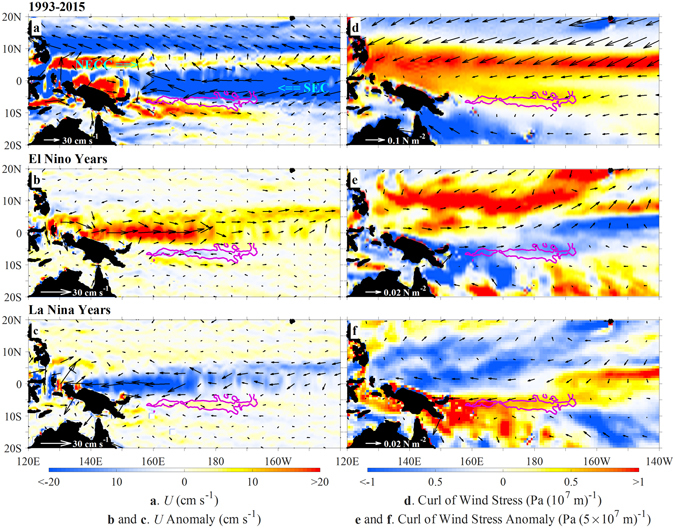
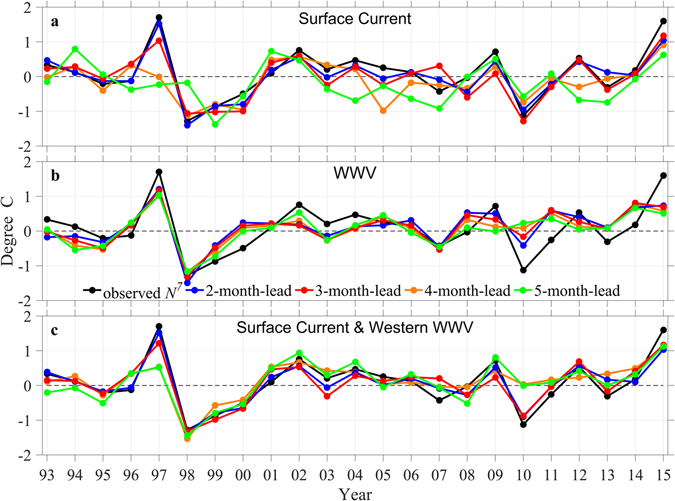
The El Niño and Southern Oscillation (ENSO) is the most prominent sources of inter-annual climate variability. Related to the seasonal phase-locking, ENSO's prediction across the low-persistence barrier in the boreal spring remains a challenge. Here we identify regions where surface current variability influences the short-lead time predictions of the July Niño 3.4 index by applying a regression analysis. A highly influential region, related to the distribution of wind-stress curl and sea surface temperature, is located near the dateline and the southern edge of the South Equatorial Current. During El Niño years, a westward current anomaly in the identified high-influence region favours the accumulation of warm water in the western Pacific. The opposite occurs during La Niña years. This process is seen to serve as the "goal shot" for ENSO development, which provides an effective precursor for the prediction of the July Niño 3.4 index with a lead time of 2-4 months. The prediction skill based on surface current precursor beats that based on the warm water volume and persistence in the subsequent months after July. In particular, prediction based on surface current precursor shows skill in all years, while predictions based on other precursors show reduced skill after 2002.


Conflict of interest statement

The authors declare that they have no competing interests.

Figures

Figure 1
Figure 1
Phase locking of the Niño 3.4 index to the seasonal cycle. (a) Calendar-year structure function S(m) (m = 1, 2, … 12 correspond to April, May, … next March) and (b) annual amplitude (Y(t)) of the first EOF mode of the Niño 3.4 index as a function of years from 1993 to 2015. The first EOF mode explains 92% of the total variance. In (b), red and blue bars denote El Niño or La Niña years, defined according to S(m)Y(t) > 0.5 °C or S(m)Y(t) < −0.5 °C persisting for at least three months, respectively; green bars denote the remaining neutral years. (c) Monthly time series of the Niño 3.4 index (black) and S(m)Y(t) (red), the two having a correlation of 0.96. The figure is plotted using MATLAB R2015b (http://www.mathworks.com/).
Figure 2
Figure 2
Regression relationships between the Niño 3.4 index and surface currents. Colour shading: correlations (r) between annual time series of N 7-N t and regressed αU it + βV it that are significant at the 0.01 level. Vectors: regression coefficients (α, β). N 7 and N t denote the Niño 3.4 index in July and in month t, respectively; (U it, V it) denote surface currents averaged from month i to t. (a) t = i = 5 (May). (b) t = 4 (April) and i = 2 (February). (c) t = 3 (March) and i = 1 (January). (d) t = 2 (February) and i = 1 (January). The figure is plotted using MATLAB R2015b (http://www.mathworks.com/). The maps in this figure are generated by MATLAB R2015b with Basemap (a mapping package, http://stockage.univ-brest.fr/~scott/MatLab/basemap.m).
Figure 3
Figure 3
Surface current and wind stress curl averaged over February-April during 1993–2015. Left: surface current (vectors) and the zonal velocity (color shading). Right: wind stress (vectors) and its curl (color shading). Top, Middle and Bottom: the time-mean over all the years, and anomalies during El Niño and La Niña years, respectively. Pink contours: correlation r = 0.65 between N 7-N 4 and regressed surface currents over the southern hotspot shown in Fig. 2b. The figure is plotted using MATLAB R2015b (http://www.mathworks.com/). The maps in this figure are generated by MATLAB R2015b with Basemap (a mapping package, http://stockage.univ-brest.fr/~scott/MatLab/basemap.m).
Figure 4
Figure 4
SST averaged over El Niño (left) and La Niña (right) years during 1993–2015. Results in (from top to bottom) May, February-April, January-March, and January–February. Green contours: isotherms from 29.5 to 29.9 °C with an interval of 0.1 °C. Black contours: correlation r = 0.65 between N 7-N t and regressed surface currents over the southern hotspot shown in Fig. 2a, b, c and d. The figure is plotted using MATLAB R2015b (http://www.mathworks.com/). The maps in this figure are generated by MATLAB R2015b with Basemap (a mapping package, http://stockage.univ-brest.fr/~scott/MatLab/basemap.m).
Figure 5
Figure 5
Retrospective prediction of the July Niño 3.4 index (N 7). Annual time series of N 7 from observation (black) and prediction using (a), surface currents (U and V), (b) total WWV and (c), both surface current and western WWV. Blue, red, orange and green lines correspond to predictions with lead time of 2, 3, 4 and 5 months, respectively. Surface currents are taken from locations in the southern hotspot denoted by black squares in Fig. 2 and given in Table 1. The figure is plotted using MATLAB R2015b (http://www.mathworks.com/).
Figure 6
Figure 6
Skills of retrospective predictions of the Niño 3.4 index as a function of lead months. Skills are measured by correlation (left) and rms error (right) between the predicted and observed monthly times series of the Niño 3.4 index. Predictions are initialized in (from top to bottom) May, April, March, and February, respectively, based on surface currents (red), WWV (blue), both surface current and western WWV (orange), and persistence (black). Both the training and prediction periods are from 1993 to 2015. The figure is plotted using MATLAB R2015b (http://www.mathworks.com/).
Figure 7
Figure 7
Skills of retrospective predictions of the Niño 3.4 index as a function of lead months, with varying training and application periods. All predictions are made based on surface currents. Skills are measured by correlation (left) and rms error (right) between the predicted and observed monthly times series of the Niño 3.4 index. Predictions are initialized in (from top to bottom) May, April, March, and February, respectively. The training (application) periods are from 1993–2015 (1993–2015) (black), 1993–2007 (1993–2015) (orange), 1993–2004 (2005–2015) (blue), and 2005–2015 (1993–2004) (red), respectively. The figure is plotted using MATLAB R2015b (http://www.mathworks.com/).

Similar articles

References

    1. McPhaden MJ, Zebiak SE, Glantz MH. ENSO as an integrating concept in Earth science. Science. 2006;314:1740–1745. doi: 10.1126/science.1132588. - DOI - PubMed
    1. Barnston AG, et al. Skill of real-time seasonal ENSO model predictions during 2002–11: Is our capability increasing? B. Am. Meteorol. Soc. 2012;93:631–651. doi: 10.1175/BAMS-D-11-00111.1. - DOI
    1. Zhang R-H, Zebiak SE, Kleeman R, Keenlyside N. Retrospective El Niño forecast using an improved intermediate coupled model. Mon. Wea. Rev. 2005;133:2777–2802. doi: 10.1175/MWR3000.1. - DOI
    1. Zhu J, et al. Salinity anomaly as a trigger for ENSO events. Sci. Repts. 2014;4:6821. doi: 10.1038/srep06821. - DOI - PMC - PubMed
    1. Zhu J, et al. The role of off-equatorial surface temperature anomalies in the 2014 El Niño prediction. Sci. Repts. 2016;6:19677. doi: 10.1038/srep19677. - DOI - PMC - PubMed

Publication types

LinkOut - more resources