. 2017 Mar 20;18(1):177.
doi: 10.1186/s12859-017-1600-5.

NaviGO: interactive tool for visualization and functional similarity and coherence analysis with gene ontology

Affiliations

NaviGO: interactive tool for visualization and functional similarity and coherence analysis with gene ontology

Qing Wei et al. BMC Bioinformatics. .

Abstract

Background: The number of genomics and proteomics experiments is growing rapidly, producing an ever-increasing amount of data that are awaiting functional interpretation. A number of function prediction algorithms were developed and improved to enable fast and automatic function annotation. With the well-defined structure and manual curation, Gene Ontology (GO) is the most frequently used vocabulary for representing gene functions. To understand relationship and similarity between GO annotations of genes, it is important to have a convenient pipeline that quantifies and visualizes the GO function analyses in a systematic fashion.

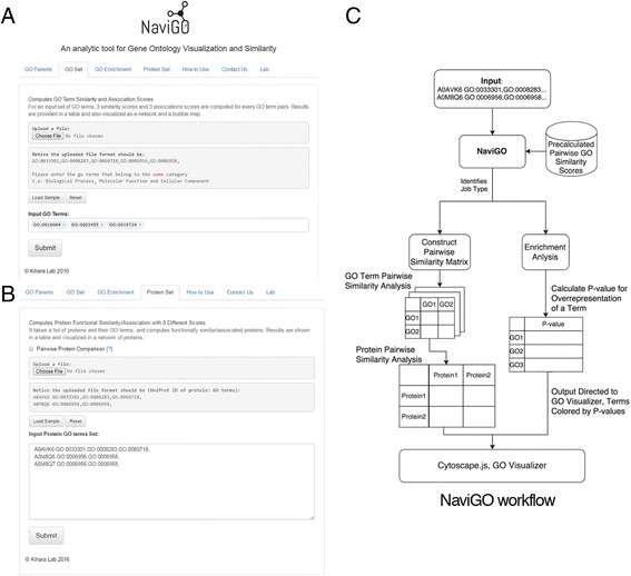
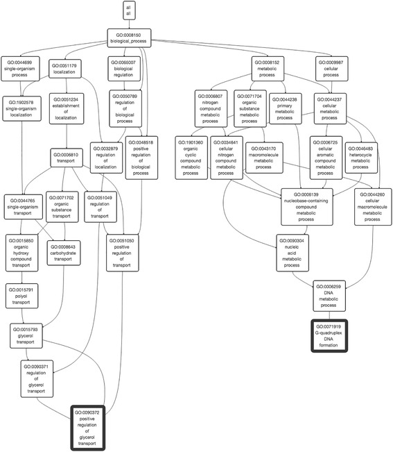
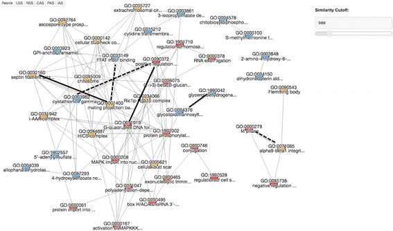
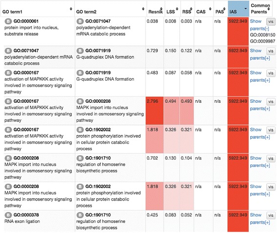
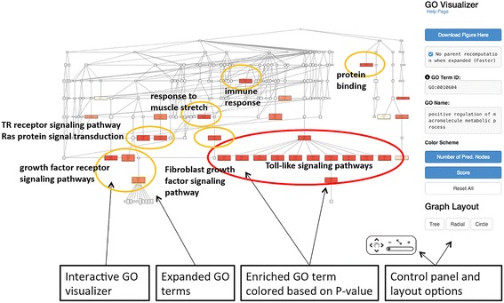
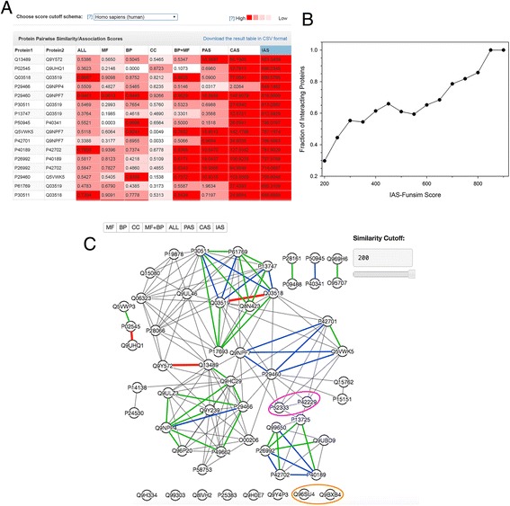
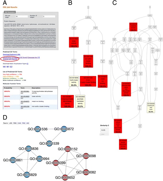
Results: NaviGO is a web-based tool for interactive visualization, retrieval, and computation of functional similarity and associations of GO terms and genes. Similarity of GO terms and gene functions is quantified with six different scores including protein-protein interaction and context based association scores we have developed in our previous works. Interactive navigation of the GO function space provides intuitive and effective real-time visualization of functional groupings of GO terms and genes as well as statistical analysis of enriched functions.

Conclusions: We developed NaviGO, which visualizes and analyses functional similarity and associations of GO terms and genes. The NaviGO webserver is freely available at: http://kiharalab.org/web/navigo .

Keywords: Function similarity; GO; GO annotation; GO association score; GO directed acyclic graph; GO parental terms; Gene function; Gene function prediction; Gene ontology; Ontology; function enrichment analysis.


Figures

Fig. 1
Fig. 1
NaviGO input screens and workflow pipeline. a, A screenshot of the input page for GO term similarity analysis (GO Set tab). b, A screenshot of the protein analysis page (Protein Set tab). c, The workflow of NaviGO, which shows how an input dataset of GO terms and gene annotations is processed
Fig. 2
Fig. 2
Screenshot of GO visualizer. The GO visualizer GO terms in the GO hierarchy. Common parents of input GO terms that are highlighted with a bold border are shown. GO terms in the visualizer are expandable by clicking a node and layout will be dynamically adjusted when expanded. A static figure of the GO DAG can be downloaded
Fig. 3
Fig. 3
Network view of GO term association. A screenshot of the network view of GO term association in the resulted page. The score to consider can be switched by clicking the bottom panel on the upper left corner. GO terms from different GO categories are mapped in different colors (BP: red; MF: blue; CC: yellow). Upper right corner panel is used for adjusting a score cut-off threshold. Six GO pairs discussed as examples in Table 1 are highlighted in bold (dashed lines for cross-domain pairs)
Fig. 4
Fig. 4
Bubble chart view of the GO term association. A screenshot of the bubble chart view in the resulted page. A bubble chart maps GO terms in the two dimensional space by considering their similarity in terms of two scores shown on the two axes. Score scheme to be used for each axis can be chosen by the option fields in the middle of the axis. Users can zoom in by holding down the mouse button and then dragging it to the desired area. The right panel shows GO terms that are currently visible on the chart. The example of shown here are visualization of the same set of 48 GO terms as used in Fig. 3. In this example plot, the X-axis is the Resnik semantic similarity score and the Y-axis chosen is IAS. For illustration, in this figure GO terms are colored according to their GO category, MF, blue; BP: black; and CC: green. GO terms listed in Table 1 are labelled
Fig. 5
Fig. 5
Table view of GO scores. The six different scores of all the GO term pairs are shown. CAS, PAS, and IAS of some GO term pairs are not available. This happens if the underlined statistics of the GO term pair was not sufficient at the time of the development of the CAS, PAS, and IAS. B in a circle at the left shoulder of a GO term indicates that the term belongs to the Biological Process (BP) category. Terms in Molecular Function and Cellular Component are labelled with M and C
Fig. 6
Fig. 6
Visualization for enrichment analysis. The top 30 enriched GO terms from MAPK pathway proteins visualized in the GO hierarchy. Enriched GO terms are enlarged and colored by their p-value. The analysis is for 20 annotated proteins that are associated with MAPK signalling pathway. See text for the details
Fig. 7
Fig. 7
Example of the protein set analysis. Pairwise IAS scores among all protein pairs in the human genome were computed. a, A snap shot of the table of protein pairs in the result page sorted by the IAS score. The color level shows the significance of the scores. b, The fraction of the protein pairs that are actually physically interacting among those above IAS score cutoffs (x-axis). Pairs that have a score of 200 or higher are considered. Physically interacting protein pairs were checked with the BIOGRID database. For example, 100% of pairs that have a score of 850 or higher and 78.5% of pairs with a score of 700 or higher actually interact with each other. c, A network view of the 56 unique proteins from the top high-scoring 33 protein pairs. Protein pairs that have an IAS score of 200 or higher are connected by edges. Protein pairs that have a high IAS score of over 850, 650, and 450, are connected with thick color lines in red, blue, and green. There are three, 19, and 47 such pairs, respectively. Two protein pairs that are discussed in Table 2 are circled. The magenta circle shows an example of physically interacting pairs and the circle in orange shows a functionally similar protein pair that do not physically interact with each other, which is correctly identified with a low IAS. See text for more details
Fig. 8
Fig. 8
Analysing function prediction results with NaviGO. NaviGO is linked from the PFP and ESG function prediction webservers, which predict GO terms for input protein sequence. This example shows function prediction for human aconitate hydrolase (UniProt ID: Q99798). This protein is a moonlighting protein, which has two distinct function, aconitase and involvement of iron homeostatis. a, An output page of ESG. The output page has a link to NaviGO, which is indicated by a red circle in the figure. Clicking this link will send predicted GO terms of the query protein listed below in the table, which has the medium confidence or higher, to NaviGO’s GO Set input page, so that users can further analyse the predicted GO terms. b, Predicted GO terms in the MF category visualized in NaviGO. Color codes shows the confidence of prediction. c, Predicted GO terms in the BP category visualized in NaviGO. d, The network view of the predicted GO terms in NaviGO using the RSS, showing functionally similar GO terms in clusters. GO terms in MF and BP are colored in blue and red, respectively. We see two clusters for MF, indicating that this protein has two distinct functions
Fig. 9
Fig. 9
Computation of IAS. An example of a PPI network from which IAS of GO term pairs can be computed. Five proteins, P1 to P5, are in this network, and edges indicate that connected protein pairs interact with each other. GO annotation of each protein is listed next to the protein

References

    1. Gene Ontology Consortium Gene ontology annotations and resources. Nucleic Acids Res. 2013;41:D530–D535. doi: 10.1093/nar/gks1050. - DOI - PMC - PubMed
    1. Ashburner M, Ball C, Blake J, Botstein D, Butler H, Cherry J, Davis A, Dolinski K, Dwight S, Eppig J, et al. Gene ontology: tool for the unification of biology. The gene ontology consortium. Nat Genet. 2000;25:25–34. doi: 10.1038/75556. - DOI - PMC - PubMed
    1. Carbon S, Ireland A, Mungall CJ, Shu S, Marshall B, Lewis S, AmiGO Hub, Web Presence Working Group AmiGO: online access to ontology and annotation data. Bioinformatics. 2009;25:288–289. doi: 10.1093/bioinformatics/btn615. - DOI - PMC - PubMed
    1. Supek F, Bošnjak M, Škunca N, Šmuc T. REVIGO summarizes and visualizes long lists of Gene Ontology terms. PLoS ONE 2011;6(7): e21800. - PMC - PubMed
    1. Eden E, Navon R, Steinfeld I, Lipson D, Yakhini Z. GOrilla: a tool for discovery and visualization of enriched GO terms in ranked gene lists. BMC Bioinf. 2009;10:48. doi: 10.1186/1471-2105-10-48. - DOI - PMC - PubMed

MeSH terms

LinkOut - more resources