. 2018 Sep 28;19(5):765-775.
doi: 10.1093/bib/bbx012.

Strategies for processing and quality control of Illumina genotyping arrays

Affiliations

Strategies for processing and quality control of Illumina genotyping arrays

Shilin Zhao et al. Brief Bioinform. .

Abstract

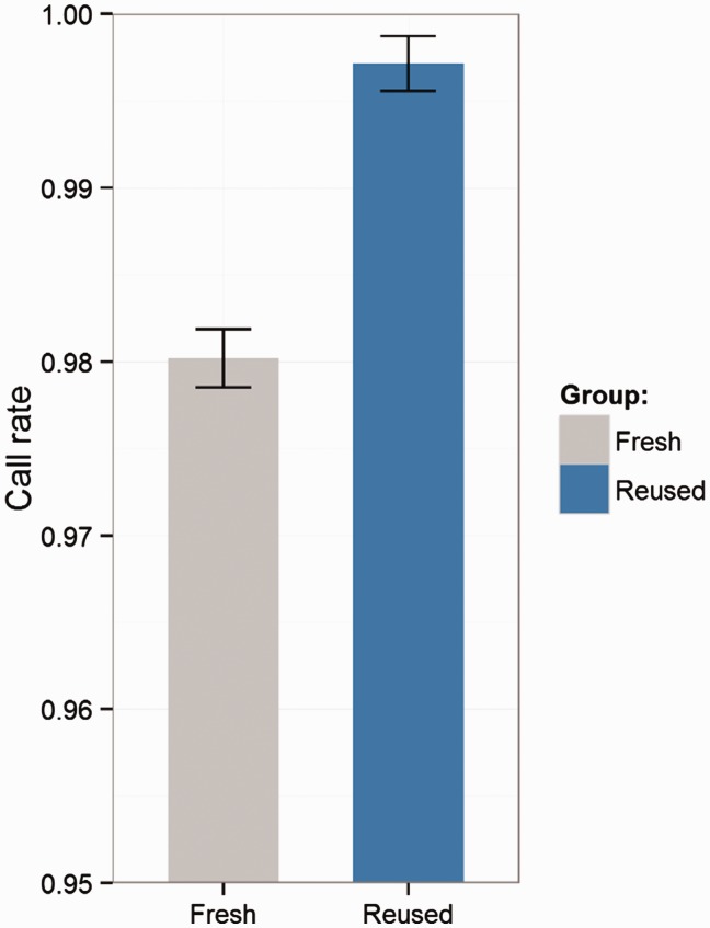
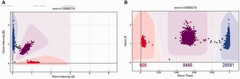
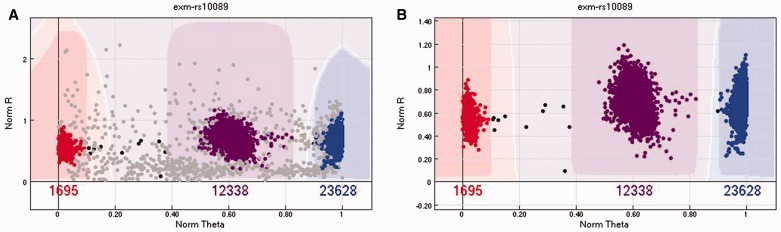
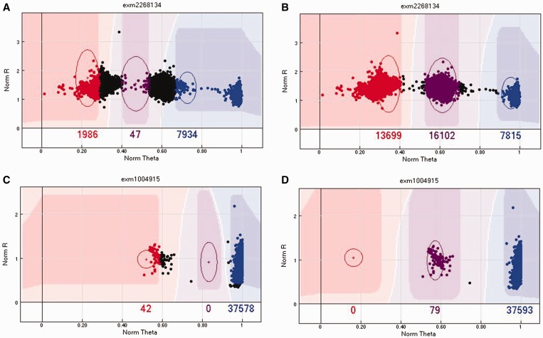
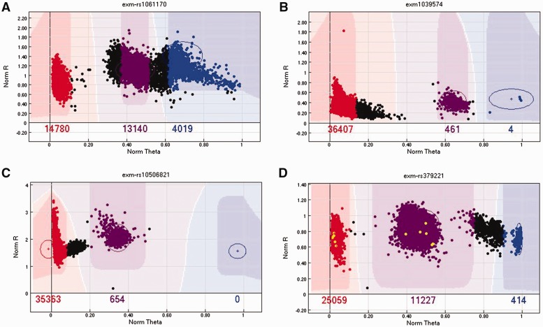
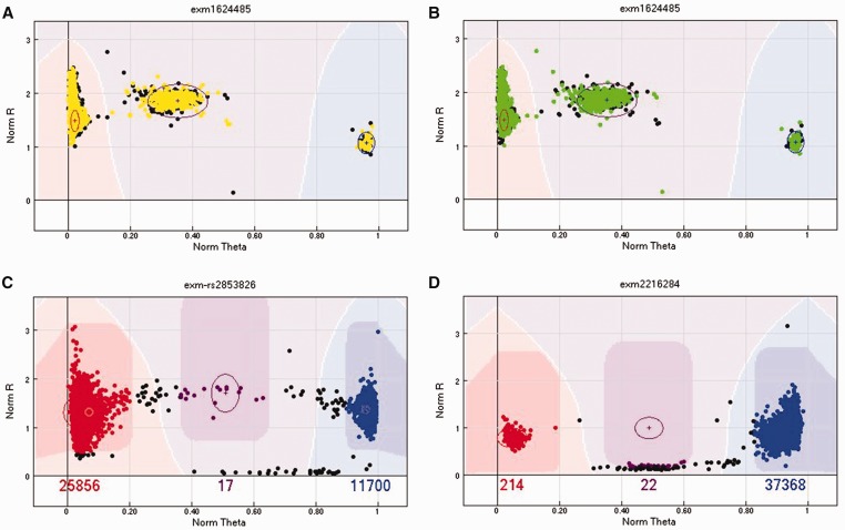
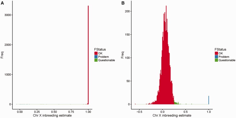
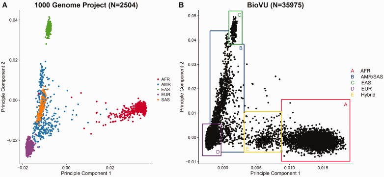
Illumina genotyping arrays have powered thousands of large-scale genome-wide association studies over the past decade. Yet, because of the tremendous volume and complicated genetic assumptions of Illumina genotyping data, processing and quality control (QC) of these data remain a challenge. Thorough QC ensures the accurate identification of single-nucleotide polymorphisms and is required for the correct interpretation of genetic association results. By processing genotyping data on > 100 000 subjects from >10 major Illumina genotyping arrays, we have accumulated extensive experience in handling some of the most peculiar scenarios related to the processing and QC of Illumina genotyping data. Here, we describe strategies for processing Illumina genotyping data from the raw data to an analysis ready format, and we elaborate on the necessary QC procedures required at each processing step. High-quality Illumina genotyping data sets can be obtained by following our detailed QC strategies.


Figures

Figure 1
Figure 1
Improvement through use of a previous clustering file. In this example, a cluster file was exported from a genotyping project using the MEGAEX array of 7300 subjects after thorough QC. A new genotyping project using the same array on 64 subjects was clustered with and without the exported cluster file from the previous 7300 subjects. We observed an average of 1.70% (range: 1.34–1.90%) call rate increase per sample when clustering with a previously quality controlled cluster file. This evidence proves that using a well quality controlled cluster file can significantly (paired t-test P-value <0.0001) improve the call rate of samples.
Figure 2
Figure 2
(A) The cluster plot presented in Cartesian coordinates. The x-axis is the normalized intensity for allele A. The y-axis is the normalized intensity for allele B. (B) The same cluster plot presented in polar coordinates. The x-axis is the normalized θ, which is computed as θ=2πarctan(1AB). The y-axis is the normalized R, which is computed as R=A+B. In both plots, the red cluster (Left in A and Right in B) denotes the AA genotype, the purple cluster (middle) denotes the AB genotype and the blue cluster (Left in A and Right in B) denotes the BB cluster. The samples in between clusters (black) were not assigned a genotype. A colour version of this figure is available at BIB online: https://academic.oup.com/bib.
Figure 3
Figure 3
(A) An example of a SNP cluster with plot with samples that should be removed because of low sample quality. (B) The same SNP with the poor-quality samples removed. The cluster became much clearer. A colour version of this figure is available at BIB online: https://academic.oup.com/bib.
Figure 4
Figure 4
(A) An example of a SNP with low GenTrain score (0.42). (B) By manually realigning the cluster positions, the cluster becomes much clearer and the GenTrain score improves to 0.8. (C) An example of miss-cluster by the GenTrain algorithm, with a cluster separation score of 0.65. (D) The same SNP was re-clustered by manually realigning the cluster positions, and the cluster separation score increased to 1. A colour version of this figure is available at BIB online: https://academic.oup.com/bib.
Figure 5
Figure 5
(A) An example of a SNP with presumed AB and BB clusters closely connected. In this scenario, either remove the SNP (preferred) or remove the samples between the clusters. (B) An example of a SNP with a long tail in the AA cluster. We recommend removing the samples of the tail to be conservative. (C) An example of a SNP with a strange extension or tail in the AA cluster. The exact cause of this pattern is unknown. We recommend either removing the SNP or removing the samples in the extension. (D) An example of a SNP with four visible clusters that does not make biological sense. We recommend removing this SNP. A colour version of this figure is available at BIB online: https://academic.oup.com/bib.
Figure 6
Figure 6
(A) An example of a problematic SNP on chromosome X. The male subjects are presented in yellow (Gray when printing in grayscale), and they should not appear in the AB cluster because males are haploid on chromosome X. (B) An example of a problematic SNP on chromosome Y. The female subjects are presented in green (Gray when printing in grayscale), and they should not be included in any cluster because females do not have chromosome Y. (C) An example of an mtDNA SNP. The AB cluster indicates the presence of heteroplasmy in numerous samples at this site. (D) An example of an mtDNA SNP where the AB cluster included a few samples with low R values by mistake. This problem can be resolved by moving the AB cluster slightly up. A colour version of this figure is available at BIB online: https://academic.oup.com/bib.
Figure 7
Figure 7
(A) An example of a histogram for the chromosome X inbreeding estimate computed by PLINK for males. (B) An example of a histogram for chromosome X inbreeding estimate computed by PLINK for females. The red color (Right in A and Left in B) indicates subjects with no obvious problems; the blue color (Left in A and Right in B) indicates samples with definitive problems that could be caused by blood transfusion, self-reporting or data entry errors. The green color (middle) indicates questionable samples, as they are outside the normal range for inbreeding estimates, but not strong enough to be defined as outliers. We recommend flagging these samples and deciding whether to exclude them based on other QC metrics. A colour version of this figure is available at BIB online: https://academic.oup.com/bib.
Figure 8
Figure 8
(A) Scatter plot of PC1 versus PC2 computed by EIGENSTRAT from 1000G genotyping data. The samples are closely clustered by race. AFR=African ancestry populations, AMR=American Hispanics, EAS=East Asians, EUR=Caucasians, SAS=South Asians. Few outliers of race can be observed in the 1000 Genome Project data beyond that attributable to admixture. (B) Scatter plot of PC1 versus PC2 computed by EIGENSTRAT from Illumina exome array data. The shape of the clusters roughly resembles the one from the 1000 Genome Project. Instead of using self-reported race, we can determine the race by drawing boxes around clusters. Samples on the borders or outside the border of the boxes are ambiguous, as they could be results of blood transfusion or self-reporting or data entry errors. The Box E (yellow) indicates a group of likely first-generation mixed-race subjects between African and Caucasian ancestors. Such detailed ancestry information is usually not captured by self-report of race. This supports the rational that during association analysis, PCs should be used as surrogates of self-reported race. A colour version of this figure is available at BIB online: https://academic.oup.com/bib.
Figure 9
Figure 9
(A) An example of the distribution of HWE P-values computed by PLINK from a genotyping data set of Caucasians obtained from the Illumina MEGAEX array. Only SNPs with extreme P-values (right) should be candidates for removal. (B) An example of the distribution for heterozygosity computed by PLINK from a genotyping data set of Caucasians obtained from the Illumina MEGAEX array. The majority of samples has heterozygosity values between 0.35 and 0.45. Only samples with extreme heterozygosity values are candidates for removal. Note that the expected heterozygosity value can differ by race [40].
Figure 10
Figure 10
(A) An example of scatter plot of allele frequencies from the 1000 Genome Project versus allele frequencies from an Illumina MEGAEX genotyping data set. All subjects are Caucasians. A majority (>99%) of the SNPs have similar allele frequencies. There are some outliers visible from the plot. (B) The distribution of allele frequency differences. To identify the obvious outliers by allele frequency, we can compute the absolute difference in allele frequencies and sort them from high to low.
Figure 11
Figure 11
(A) The first example is for SNP rs144249066 in the MEGAEX array. First, all subjects were called heterozygous [A/T], which strongly violates the HWE assumption. The HWE test had P<10−8 for this SNP in Caucasians, which means this SNP could be potentially filtered out by the HWE test. In 1000G data, this SNP was inferred as homozygous [A/A] for all Caucasians. Possible explanations are (1) the probe sequences were designed wrong or (2) they mapped to highly homologous regions. (B) The second example is for SNP rs113094557 on the MEGAEX array. This SNP does not violate HWE, and the genotype type call is [G/G] for all Caucasians; however, the genotype call for all Caucasians in 1000G is [A/A]. The SNP has two probes designed to capture alleles A and G. As the two alleles are not reverse complementary, this could not be caused by a strand issue. The only plausible explanation is that the two alleles were switched or mislabeled by Illumina during design.
Figure 12
Figure 12
An example of allele frequency comparisons among multiple batches. High correlation of the allele frequency between batches indicates no batch effect.

References

    1. Wang Z, Gerstein M, Snyder M.. RNA-Seq: a revolutionary tool for transcriptomics. Nat Rev Genet 2009;10:57–63. - PMC - PubMed
    1. Marioni JC, Mason CE, Mane SM, et al.RNA-seq: an assessment of technical reproducibility and comparison with gene expression arrays. Genome Res 2008;18:1509–17. - PMC - PubMed
    1. Asmann YW, Klee EW, Thompson EA, et al.3' tag digital gene expression profiling of human brain and universal reference RNA using Illumina genome analyzer. BMC Genomics 2009;10:531.. - PMC - PubMed
    1. Cloonan N, Forrest AR, Kolle G, et al.Stem cell transcriptome profiling via massive-scale mRNA sequencing. Nat Methods 2008;5:613–19. - PubMed
    1. Guo Y, Sheng Q, Li J, et al.Large scale comparison of gene expression levels by microarrays and RNAseq using TCGA data. PLoS One 2013;8:e71462.. - PMC - PubMed

Publication types

MeSH terms