. 2016 Dec 18:4:17-26.
doi: 10.1016/j.omtm.2016.11.003. eCollection 2017 Mar 17.

INSPIIRED: Quantification and Visualization Tools for Analyzing Integration Site Distributions

Affiliations

INSPIIRED: Quantification and Visualization Tools for Analyzing Integration Site Distributions

Charles C Berry et al. Mol Ther Methods Clin Dev. .

Abstract

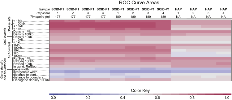
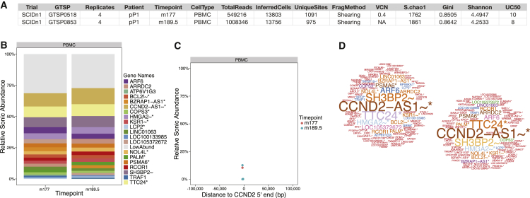
Analysis of sites of newly integrated DNA in cellular genomes is important to several fields, but methods for analyzing and visualizing these datasets are still under development. Here, we describe tools for data analysis and visualization that take as input integration site data from our INSPIIRED pipeline. Paired-end sequencing allows inference of the numbers of transduced cells as well as the distributions of integration sites in target genomes. We present interactive heatmaps that allow comparison of distributions of integration sites to genomic features and that support numerous user-defined statistical tests. To summarize integration site data from human gene therapy samples, we developed a reproducible report format that catalogs sample population structure, longitudinal dynamics, and integration frequency near cancer-associated genes. We also introduce a novel summary statistic, the UC50 (unique cell progenitors contributing the most expanded 50% of progeny cell clones), which provides a single number summarizing possible clonal expansion. Using these tools, we characterize ongoing longitudinal characterization of a patient from the first trial to treat severe combined immunodeficiency-X1 (SCID-X1), showing successful reconstitution for 15 years accompanied by persistence of a cell clone with an integration site near the cancer-associated gene CCND2. Software is available at https://github.com/BushmanLab/INSPIIRED.

Keywords: SCID-X1; data visualization; gammaretrovirus; gene therapy; insertional mutagenesis; lentivirus; mutagenesis; recombination; retrovirus; vector; vector driving.


Figures

Figure 1
Figure 1
Diagram of the INSPIIRED Pipeline File types generated at each step are indicated on the right. RData files of Unique Sites, Multihit Clusters, and Annotated objects contain GRanges objects from the Bioconductor GenomicRanges R package.
Figure 2
Figure 2
Heatmap Summarizing the Density of Integration Sites versus the Density of Sites of Epigenetic Modification on the Human Genome Integration site distributions are compared with the density within a 10 kb window of epigenetic marks mapped in CD133+ progenitor cells. Samples are shown in the columns, and bound proteins recovered by ChIP-seq are shown in rows. Associations are quantified using the ROC area method. The values of ROC areas are shown in the color key at the bottom. ChIP-seq data are from Raney et al.
Figure 3
Figure 3
Probing Statistical Associations between Epigenetic Marks and Integration Site Density Using Interactive Heatmaps Interactive heatmaps are available in Supplemental Information and Data S1. Labeling is as in Figure 2. Once heatmaps are loaded into an internet browser, clicking on different points on the image results in specific statistical tests, where results are summarized as asterisks on each tile of the heatmap (*p < 0.05; **p < 0.01; ***p < 0.001). The heavy black arrow in each panel indicates the selection by point and click. (A) Clicking on the text “Compare to area=0.05” yields statistical tests comparing the value for integration site data in each cell with random controls. (B) Comparison of outcome for each integration site dataset with the leftmost replicate of the data for lentiviral integration in HAP-1 cells (clicking on the leftmost HAP-1 column as indicated). All of the SCID-X1 gammaretroviral samples are different for each mark (indicated by the three asterisks [***]) except H3K27me3 and H4K20me1. (C) Comparison of distributions of integration sites relative to Pol II with the distribution of integration sites relative to other marks (click on Pol II). Seven out of eight are different, although for H2AZ in the gammaretroviral data, most show similar distributions (no asterisks).
Figure 4
Figure 4
Heatmap Summarizing the Density of Integration Sites Relative to Genomic Features Samples are shown in the columns, and features mapped onto the human genome are shown in rows. Associations are quantified using the ROC area method. The values of ROC areas are shown in the color key at the bottom. The numbers on the left indicate the lengths of genomic intervals used in comparisons with random controls. Oncogene density (bottom row) involves asking how frequently integration sites are found with 100 kb of transcription start sites for genes in the allOnco gene list (http://www.bushmanlab.org/links/genelists) compared with random controls.
Figure 5
Figure 5
Excerpts from a Reproducible Report on SCID-X1 Patient 1 (A) Table summarizing sample metadata, including the trial, internal tracking number (GTSP), number of replicates, patient, time point queried, cell type, total number of sequence reads (TotalReads), inferred number of cells queried from SonicAbundance (InferredCells), the number of integration sites recovered after dereplication (UniqueSites), the method used to break the DNA (shearing in this case), the vector copy number if available (VCN) determined from qPCR, the minimum population size inferred from sharing among replicates (S.chao1), the asymmetry of clonal distribution (Gini), the diversity summarized as the Shannon index (Shannon), and the number of unique clones making up the top 50% of the sample abundance (UC50). (B) Stacked bar graph showing the most abundant clones, named after the nearest gene. Genes are annotated by whether the site is within a transcription unit (*), whether the site is within 50 kb of a cancer-related gene (∼), or whether the site is associated with a gene strongly associated with human lymphoma (!). (C) Graph indicating the position of integration sites near CCND2, and their proportions as inferred by SonicAbundance. (D) Word bubbles summarizing the proportions of integration sites near each named gene. The size of the gene name in the word bubble is a function of the SonicAbundance of that site. Note that there is an antisense transcript upstream of the CCND2 transcription start site; thus, the integration site upstream is reported as CCND2-AS1 because it is within the DNA transcribed in the antisense transcript.

References

    1. Bushman F.D. Cold Spring Harbor Laboratory Press; 2001. Lateral DNA Transfer: Mechanisms and Consequences.
    1. Craig N.L., Craigie R., Gellert M., Lambowitz A.M. American Society for Microbiology Press; Washington, D.C.: 2002. Mobile DNA II.
    1. Schröder A.R., Shinn P., Chen H., Berry C., Ecker J.R., Bushman F. HIV-1 integration in the human genome favors active genes and local hotspots. Cell. 2002;110:521–529. - PubMed
    1. Mitchell R.S., Beitzel B.F., Schroder A.R., Shinn P., Chen H., Berry C.C., Ecker J.R., Bushman F.D. Retroviral DNA integration: ASLV, HIV, and MLV show distinct target site preferences. PLoS Biol. 2004;2:E234. - PMC - PubMed
    1. Coffin J.M., Hughes S.H., Varmus H.E. Cold Spring Harbor Laboratory Press; 1997. Retroviruses. - PubMed