. 2017 May 4;169(4):736-749.e18.
doi: 10.1016/j.cell.2017.04.016.

An Immune Atlas of Clear Cell Renal Cell Carcinoma

Affiliations

An Immune Atlas of Clear Cell Renal Cell Carcinoma

Stéphane Chevrier et al. Cell. .

Abstract

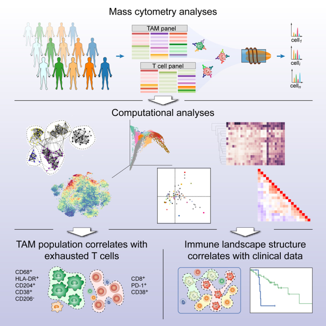
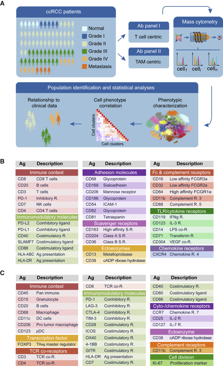
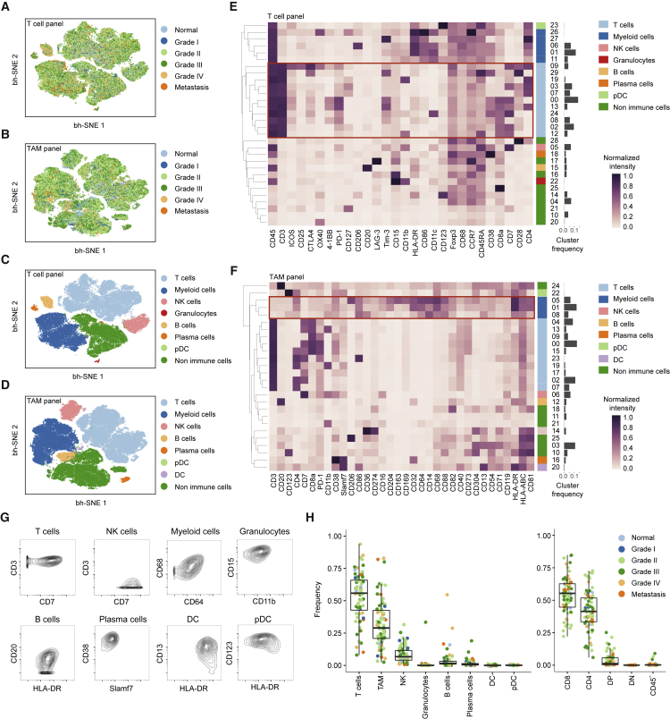
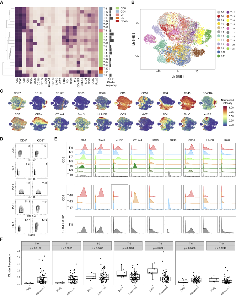
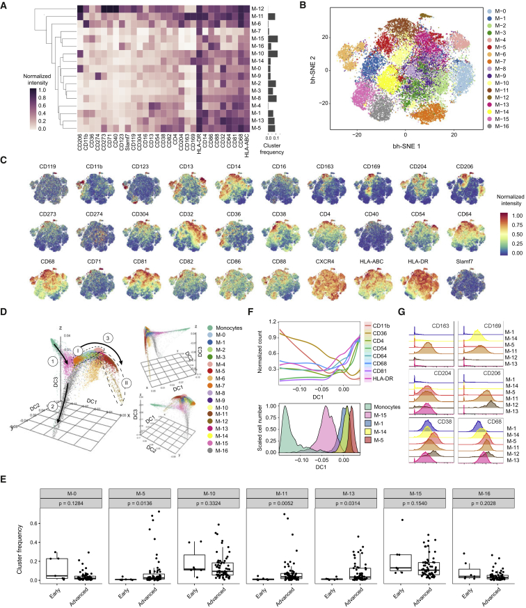
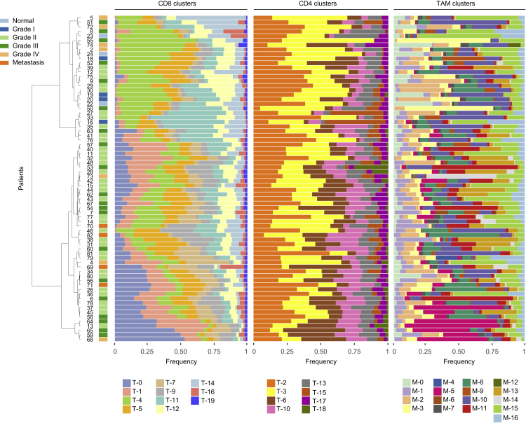
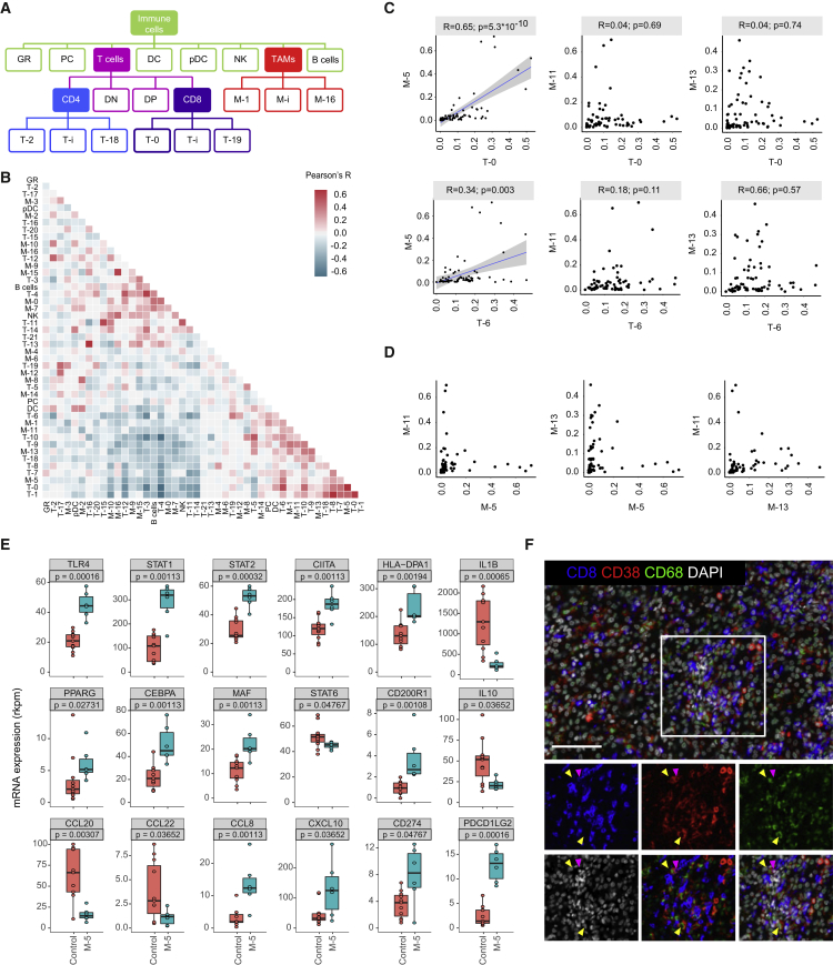
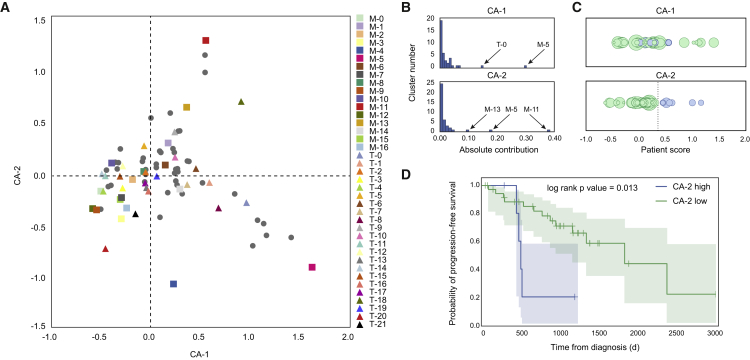
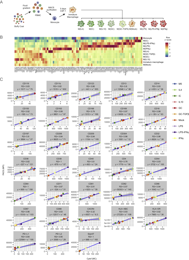
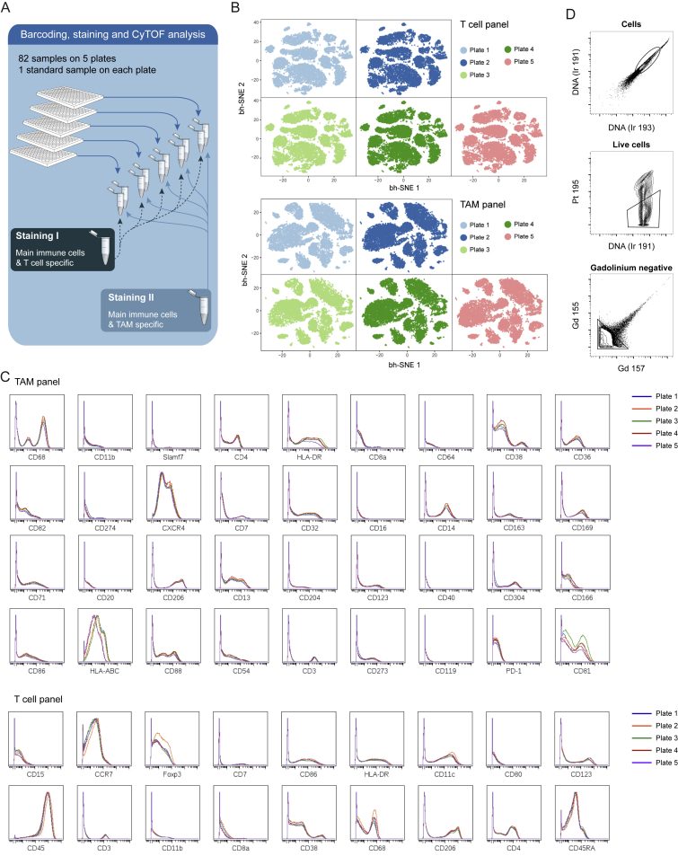
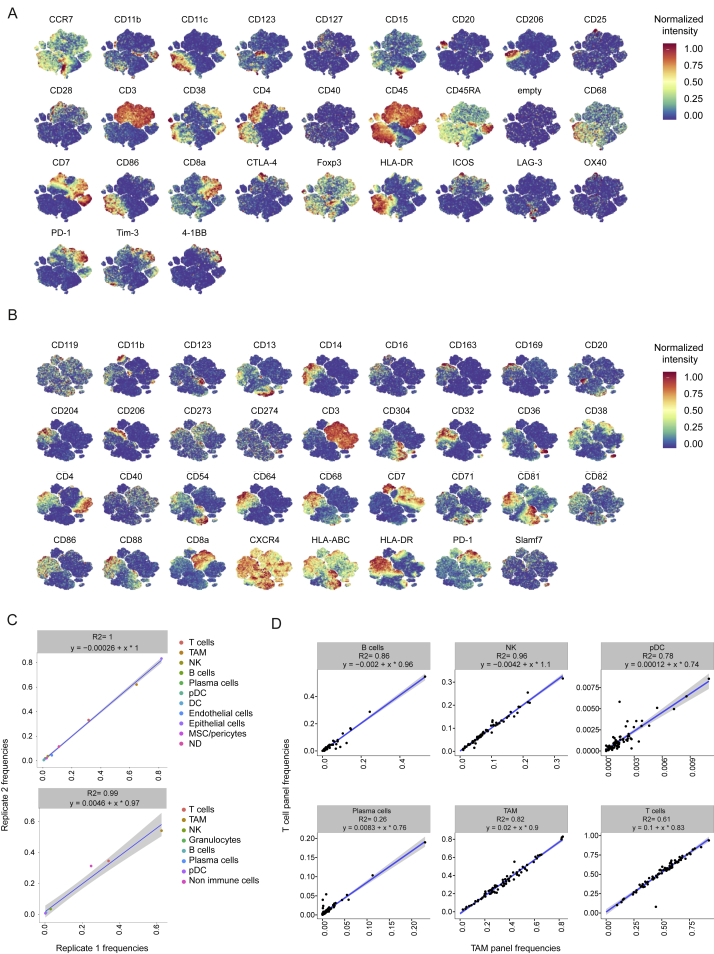
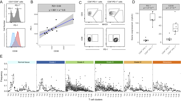
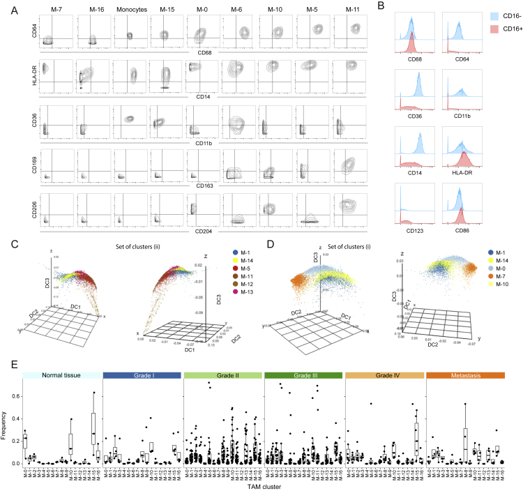
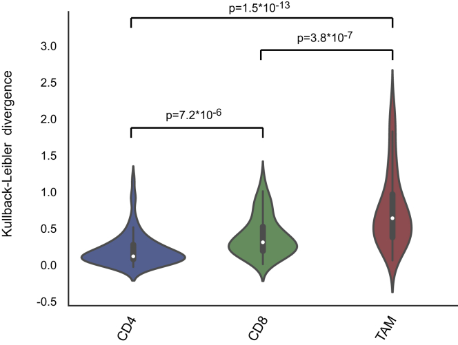
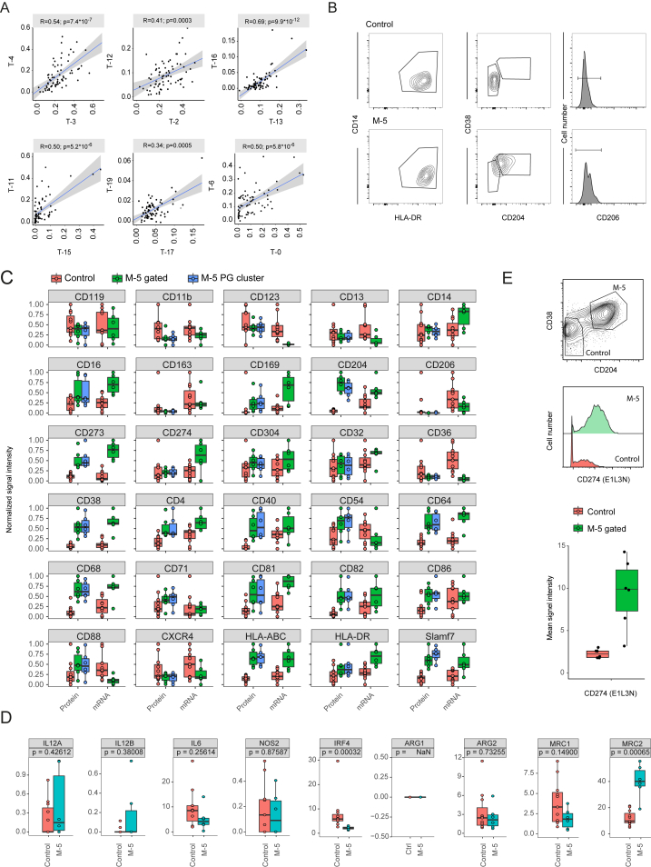
Immune cells in the tumor microenvironment modulate cancer progression and are attractive therapeutic targets. Macrophages and T cells are key components of the microenvironment, yet their phenotypes and relationships in this ecosystem and to clinical outcomes are ill defined. We used mass cytometry with extensive antibody panels to perform in-depth immune profiling of samples from 73 clear cell renal cell carcinoma (ccRCC) patients and five healthy controls. In 3.5 million measured cells, we identified 17 tumor-associated macrophage phenotypes, 22 T cell phenotypes, and a distinct immune composition correlated with progression-free survival, thereby presenting an in-depth human atlas of the immune tumor microenvironment in this disease. This study revealed potential biomarkers and targets for immunotherapy development and validated tools that can be used for immune profiling of other tumor types.

Keywords: T cell; clear cell renal cell carcinoma; immune cell atlas; immunosuppression; macrophage; mass cytometry; single-cell analysis.


Figures

None
Graphical abstract
Figure 1
Figure 1
Characterization of T cells and TAMs in the ccRCC TME Using Mass Cytometry (A) Experimental approach used in this study. (B) Markers used to characterize TAM phenotypes. (C) Markers used to characterize T cell phenotypes. Ag, antigen; DC, dendritic cells; pDC, plasmacytoid dendritic cells; NK, natural killer; R, receptor; SR, scavenger receptor; TCR, T cell receptor; TLR, toll-like receptor. See also Figure S1 and Tables S1 and S2.
Figure 2
Figure 2
Identification of the Main Immune Components of the ccRCC TME (A and B) t-SNE maps displaying 100,000 cells from the ccRCC cohort analyzed with (A) T cell and (B) TAM panels and colored by grade. (C and D) t-SNE maps displaying 100,000 cells from the ccRCC cohort analyzed with (C) T cell and (D) TAM panels and colored by the main cell populations based on manual annotation of PhenoGraph clustering. (E and F) Heatmaps showing normalized expression of the markers from (E) T cell and (F) TAM panels for PhenoGraph clusters. Clusters are grouped by expression profiles and cell types are indicated by color. The cluster IDs and relative frequencies are displayed as a bar graph on the right. (G) Contour plots for the indicated markers demonstrate the “purity” of the main cell types identified with the T cell panel and with the TAM panel. (H) Dot plots showing the population frequency for each ccRCC sample among all immune cell types (left panel) and among T cell subsets (right panel). Dots are colored by grade. DC, dendritic cells; pDC, plasmacytoid dendritic cells; NK, natural killer; DP, double positive; DN, double negative; CD45-, CD45-CD3+ cells. See also Figures S2 and S3.
Figure 3
Figure 3
In-Depth Characterization of the T Cell Compartment (A) Heatmap showing normalized expression of the T cell panel markers for the 22 T cell clusters identified with PhenoGraph. Clusters are grouped by expression profile and were manually assigned to the main T cell subsets as indicated with the color code. The cluster IDs and relative frequencies are displayed as a bar graph on the right. (B) t-SNE map displaying 2,000 cells from each PhenoGraph cluster identified in (A) colored by cluster. (C) Cells colored by normalized expression of indicated markers on the t-SNE map. (D) Contour plots showing expression of indicated markers for eight clusters with similar phenotypes in CD4+ and CD8+ T cell populations. (E) Histograms showing expression of indicated costimulatory molecules, activation markers, and cell cycle markers of clusters of PD-1-expressing CD8+ cells (upper panel), CD4+ cells (middle panel), and CD8+/CD4+ double-positive cells (lower panel). (F) Boxplots showing the frequencies of the indicated T cell clusters grouped into early stages (normal tissue and grade I) and late stages (grades II–IV and metastatic tissue). p values calculated with a Mann-Whitney-Wilcoxon test are shown for each cluster. See also Figure S4 and Table S3.
Figure 4
Figure 4
In-Depth Characterization of TAM Phenotypes (A) Heatmap showing normalized expression of markers from the TAM panel for the 17 cell clusters identified with PhenoGraph. Relative frequencies are displayed as a bar graph to the right. (B) t-SNE map, colored by clusters, displaying 2,000 cells from each PhenoGraph cluster identified in (A). (C) Normalized expression of indicated markers on the t-SNE map. (D) Visualization of blood monocytes and TAM clusters using first, second, and third components of a diffusion map. Cells are colored by PhenoGraph clusters. The three main branches are indicated with solid arrows and two sets of clusters are circled with dashed lines. (E) Boxplots showing the frequencies of the TAM clusters grouped in early stage (normal and grade 1) and advanced stage (grades 2–4 and metastatic) samples. p values calculated with a Mann-Whitney-Wilcoxon test are shown for each cluster. (F) Conditional mean expression of the indicated markers along diffusion component one (top panel). Histograms displaying the TAM clusters used to calculate the conditional mean expression along diffusion component one (bottom panel). (G) Histogram overlay showing expression of indicated markers of TAM clusters. See also Figure S5 and Table S4.
Figure 5
Figure 5
Frequencies of CD8+, CD4+, and TAM Clusters for Each ccRCC Sample Data hierarchically clustered based on CD8+ subsets using Ward’s method. Sample types are indicated by color. See also Figure S6.
Figure 6
Figure 6
Relationships between TAM and T Cell Clusters in ccRCC Samples (A) Schematic showing how clusters are related to parent populations. (B) Heatmap showing Pearson coefficients of correlation for relationships between immune cell phenotypes. (C) Scatterplots showing relationships between T-0 exhausted T cells and T-6 regulatory T cells with the pro-tumor TAM phenotypes M-5, M-11, and M-13. Pearson correlations and p values are indicated. For significant correlations, linear models are shown as blue lines. (D) Pairwise relationships between the frequencies of pro-tumor TAM phenotypes M-5, M-11, and M-13. (E) Boxplots showing RNA-sequencing data on sorted populations for indicated genes in control (n = 11) and M-5 (n = 6) macrophage populations. Mann-Whitney-Wilcoxon test p values are shown. (F) Representative ccRCC tissue stained for CD68 (green), CD38 (red), CD8 (blue), and DNA (white). Arrows in selected area highlight cells positive for CD68 and CD38 (yellow) and for CD8 and CD38 (magenta). Scale bar, 100 μm. See also Figure S7 and Tables S3, S5, and S7.
Figure 7
Figure 7
Relationships between Immune Landscape and Clinical Outcomes (A) The first two components of correspondence analysis, accounting for 30% of the co-association structure between immune subsets and patients in the cohort, are shown. Immune phenotypes are displayed as squares (TAMs) and triangles (T cells), and patient samples as circles. (B) Contributions of the immune subsets to CA-1 and CA-2. (C) Projection of each patient onto the first and second component of the correspondence analysis. Circle size represents progression-free survival time. CA-2 assigns high scores (right of dotted line and labeled in blue) to six patients with low progression-free survival times. (D) Kaplan-Meier analysis of the six patients with low progression-free survival times (blue curve) versus the remaining patients (green curve). Shaded regions represent 95% confidence intervals. See also Tables S1 and S6.
Figure S1
Figure S1
Comparison of FACS and Mass Cytometry Analyses, Related to Figure 1 (A) Scheme illustrating the in vitro system used to generate the monocyte-derived macrophage (MDM) populations from monocytes isolated from the blood of healthy donors. (B) Heatmap showing the mean expression of the indicated surface markers among the different MDMs and blood monocyte populations. Only markers showing a 2-fold change among the MDM populations were included. (C) Correlations between FACS and mass cytometry measurements for the 33 antibodies present both in the mass cytometry antibody panel and in the cell surface flow cytometry antibody screen were assessed using a linear regression model. The coefficient of determination R2 and the linear model are shown for each antibody. MFI, mean fluorescent intensity; MC, metal count.
Figure S2
Figure S2
Consistency of Mass Cytometry Data, Related to Figure 2 (A) Schematic representation of the experimental approach used to stain cells from all normal and patient samples with two antibody panels after barcoding on five plates. (B) t-SNE maps derived from the standard cells measured on each of the five plates after staining with the T cell panel (upper panel) and the TAM panel (lower panel). (C) Histogram overlays showing the expression of the markers included in the TAM and T cell panels on the standard cells measured on each of the five plates. Only markers with positive expression on the standard cells are shown. (D) Gating strategy to identify cells (upper panel), live cells (middle panel), and gadolinium-negative cells (lower panel).
Figure S3
Figure S3
Consistency between Immune Populations Identified Using TAM and T Cell Panels, Related to Figure 2 (A) t-SNE map showing the expression of each marker included in the T cell panel after a 0 to 1 normalization based on the 99th percentile. (B) t-SNE map showing the expression of each marker included in the TAM cell panel after a 0 to 1 normalization based on the 99th percentile. (C) Scatterplot showing the frequencies of the indicated populations identified with the T cell panel (upper panel) and with the TAM panel (lower panel) for sample 26, which was loaded in duplicate on two different plates. (D) Scatterplots showing the correlations for the indicated immune cell population frequencies established by automatic cell detection based on the T cell panel and the TAM panel. For each relationship, the R2 and the linear models are indicated. DC, dendritic cells, pDC, plasmacytoid dendritic cells, NK, natural killer.
Figure S4
Figure S4
In-Depth Characterization of T Cell Subsets, Related to Figure 3 (A) Histogram showing PD-1 expression on FACS-analyzed CD8 T cells identified as live cells, CD45+, CD3+, and CD8+ (top panel). The expression of CD38 among PD-1 and PD-1+ cells is shown as overlaid histograms (bottom panel). (B) Dot plot showing the correlation between CD38 and PD-1 expression on 14 different PD-1+ CD8 T cell populations analyzed by FACS and gated as described in (A). (C) Scatterplots showing the gating strategy used to sort CD8+/PD-1 and CD8+/PD-1+ cells. (D) Boxplots showing the reads per kilobase of transcript per million mapped reads (rpkm) for PD-1 (PDCD1) and CD38 based on 6 samples of CD8+/PD-1+ and CD8+/PD-1- sorted cells analyzed by RNA-seq. The p values calculated with a Mann-Whitney-Wilcoxon test are shown. (E) Boxplots showing the frequencies of the different T cell clusters by ccRCC grade and in normal and metastatic tissues.
Figure S5
Figure S5
In-Depth Characterization of TAM Subsets, Related to Figure 4 (A) Contour plots showing the expression of the indicated markers for blood monocytes and the indicated TAM clusters. (B) Histogram overlays showing expression levels of the indicated proteins on the surface of CD16- monocytes (blue) and CD16+ monocytes (red) isolated from the blood of a healthy donor. (C and D) Diffusion maps showing the clusters M-1 and M-14 and the clusters constituting the groups I (C) and II (D) of branch three as defined in Figure 3D in three dimensional space defined by the first (DC1), second (DC2), and third (DC3) diffusion components. (E) Boxplots showing the frequencies of the different T cell clusters by ccRCC grade and in normal and metastatic tissues.
Figure S6
Figure S6
Variability across CD4+ and CD8+ T Cell and TAM Compartments, Related to Figure 5 Violin plot showing the Kullback-Leibler divergence computed for each patient for CD4+ and CD8+ T cell and TAM compartments. The Welsch t test was used to calculate differences between means, and the p value is shown for each relationship.
Figure S7
Figure S7
FACS Isolation of Macrophage Subsets and Deep-Sequencing Results, Related to Figure 6 (A) Scatterplots showing the relationships between pairs of phenotypically similar CD4+ and CD8+ subsets (see Figure 3D). For each relationship, the Pearson correlation score and the p value are indicated. The linear model describing the relationship is depicted as a blue line. (B) Contour plots showing the gating strategy used to sort CD14+/HLA-DR+/CD204/CD38/CD206 (Control) and CD14+/HLA-DR+/CD204+/CD38+/CD206 (M-5) macrophage populations. (C) Boxplots comparing the expression levels of the 30 macrophage-specific markers present in the TAM panel as assessed by mass cytometry (Protein) and by deep sequencing (mRNA). The surface phenotypes of the manually gated M-5 population (CD68+/HLA-DR+/CD204+/CD38+/CD206) and the PhenoGraph identified M-5 cluster in the 6 populations used for deep sequencing were compared (M-5 gated versus M-5 PG cluster) highlighting the consistency of the different analysis modalities. (D) Boxplots showing the expression level of the indicated genes in control (n = 11) and M-5 (n = 6) macrophage populations as assessed by deep sequencing. The p values calculated using a Mann-Whitney-Wilcoxon test are shown. (E) Another antibody clone against CD274 provides a higher dynamic range and recapitulates the expression difference observed in (C). Top: Contour plot showing the gating strategy to identify CD68+/CD204+/CD38+ macrophage and CD68+/CD204/CD38 control cells. Middle: Histogram overlay showing the expression of CD274 in control versus M-5 macrophage populations. Bottom: Boxplot showing the median intensity of CD274 on control cells (n = 6) and M-5 (n = 6) macrophage populations.

Comment in

References

    1. Ahmadzadeh M., Johnson L.A., Heemskerk B., Wunderlich J.R., Dudley M.E., White D.E., Rosenberg S.A. Tumor antigen-specific CD8 T cells infiltrating the tumor express high levels of PD-1 and are functionally impaired. Blood. 2009;114:1537–1544. - PMC - PubMed
    1. Amir A.D., Davis K.L., Tadmor M.D., Simonds E.F., Levine J.H., Bendall S.C., Shenfeld D.K., Krishnaswamy S., Nolan G.P., Pe’er D. viSNE enables visualization of high dimensional single-cell data and reveals phenotypic heterogeneity of leukemia. Nat. Biotechnol. 2013;31:545–552. - PMC - PubMed
    1. Angerer P., Haghverdi L., Büttner M., Theis F.J., Marr C., Buettner F. destiny: diffusion maps for large-scale single-cell data in R. Bioinformatics. 2016;32:1241–1243. - PubMed
    1. Asano K., Nabeyama A., Miyake Y., Qiu C.H., Kurita A., Tomura M., Kanagawa O., Fujii S., Tanaka M. CD169-positive macrophages dominate antitumor immunity by crosspresenting dead cell-associated antigens. Immunity. 2011;34:85–95. - PubMed
    1. Bandura D.R., Baranov V.I., Ornatsky O.I., Antonov A., Kinach R., Lou X., Pavlov S., Vorobiev S., Dick J.E., Tanner S.D. Mass cytometry: technique for real time single cell multitarget immunoassay based on inductively coupled plasma time-of-flight mass spectrometry. Anal. Chem. 2009;81:6813–6822. - PubMed

Publication types