

Visualizing statistical significance of disease clusters using cartograms
- PMID: 28506288
- PMCID: PMC5433035
- DOI: 10.1186/s12942-017-0093-9
Visualizing statistical significance of disease clusters using cartograms
Abstract
Background: Health officials and epidemiological researchers often use maps of disease rates to identify potential disease clusters. Because these maps exaggerate the prominence of low-density districts and hide potential clusters in urban (high-density) areas, many researchers have used density-equalizing maps (cartograms) as a basis for epidemiological mapping. However, we do not have existing guidelines for visual assessment of statistical uncertainty. To address this shortcoming, we develop techniques for visual determination of statistical significance of clusters spanning one or more districts on a cartogram. We developed the techniques within a geovisual analytics framework that does not rely on automated significance testing, and can therefore facilitate visual analysis to detect clusters that automated techniques might miss.
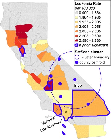
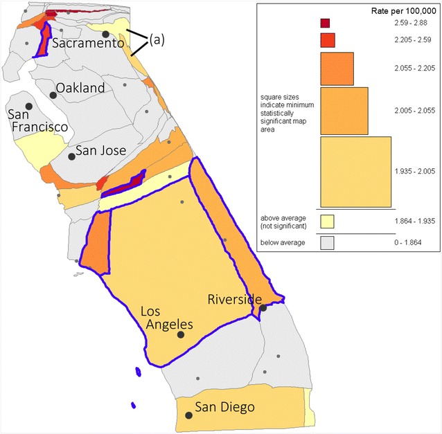
Results: On a cartogram of the at-risk population, the statistical significance of a disease cluster is determinate from the rate, area and shape of the cluster under standard hypothesis testing scenarios. We develop formulae to determine, for a given rate, the area required for statistical significance of a priori and a posteriori designated regions under certain test assumptions. Uniquely, our approach enables dynamic inference of aggregate regions formed by combining individual districts. The method is implemented in interactive tools that provide choropleth mapping, automated legend construction and dynamic search tools to facilitate cluster detection and assessment of the validity of tested assumptions. A case study of leukemia incidence analysis in California demonstrates the ability to visually distinguish between statistically significant and insignificant regions.
Conclusion: The proposed geovisual analytics approach enables intuitive visual assessment of statistical significance of arbitrarily defined regions on a cartogram. Our research prompts a broader discussion of the role of geovisual exploratory analyses in disease mapping and the appropriate framework for visually assessing the statistical significance of spatial clusters.
Keywords: Cartograms; Density equalizing maps; Disease mapping; Geovisual analytics; Scan statistics.
Figures


References
-
- Aylin P, Maheswaran R, Wakefield J, Cockings S, Jarup L, Arnold R, Wheeler G, Elliott P. A national facility for small area disease mapping and rapid initial assessment of apparent disease clusters around a point source: the UK Small Area Health Statistics Unit. J Public Health Med. 1999;21(3):289–298. doi: 10.1093/pubmed/21.3.289. - DOI - PubMed
-
- California Cancer Registry. Age-adjusted invasive cancer incidence rates by county in California, 2009–2013. Based on December 2015 Extract. http://cancer-rates.info/ca/. Accessed on Jun 19, 2016.
-
- Wartenberg D. Analysis and interpretation of disease clusters and ecological studies. J R Stat Soc Ser A Stat Soc. 2001;164(1):13–22. doi: 10.1111/1467-985X.00181. - DOI
MeSH terms
Grants and funding
LinkOut - more resources
Full Text Sources
Other Literature Sources
